North star · Let warm canvas, dark uppercase typography and authentic reclaimed-oak photography carry the page; keep interface decoration minimal.
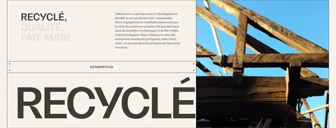
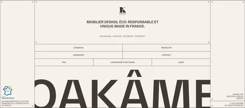
The visual identity is built on a near-monochrome pairing: warm canvas #f6f1eb and deep brown-charcoal #403a34. The canvas continues across the page rather than alternating into conspicuous colour bands; the dark tone carries navigation, headings, body text, borders and outlined controls. Furniture and architectural photography supply the richer oak, stone, greenery and sky hues, so those image colours should not become interface accents. BwGradual is used throughout, from monumental uppercase display lettering to compact uppercase navigation and fine caption text. The layout feels editorial and spacious: a framed, full-bleed hero, broad stretches of open canvas, asymmetric image-and-copy arrangements, and product images arranged in loose grids. Hairline borders structure the header, buttons and information panels without adding shadow-heavy cards. Keep the experience tactile through real material photography, strong type contrast and generous breathing room rather than decorative effects.
配色
点色块复制色值。用途说明来自对页面的实测位置(背景、文字、描边、按钮)与截图判读。
品牌色
表层色
页面底色 · Linen Canvas表层 · Oak Charcoal主文字 · Oak Charcoal描边 · Oak Charcoal
A spacious editorial composition within a measured page maximum of 1380px. The opening is a nearly full-bleed image framed by a thin dark outline and a compact segmented navigation bar. Later sections mix asymmetrical two-column image-and-copy layouts with loose product grids and broad open intervals. Keep alignment varied but deliberate: left-anchored statements, offset images and occasional centered footer content. The measured spacing scale is broad and the page density is spacious; avoid compressing its long-form section rhythm.
圆角与层次
没有测到阴影:页面是扁平的,层次靠底色和描边区分。
The page is predominantly flat: no measured shadows, gradients or rounded-corner scale. Use thin #403a34 outlines to define the navigation, button-like links and information panels. Images provide depth through their lighting and composition; avoid floating card treatments, heavy borders or artificial elevation.
组件
下面的预览按实测的按钮、输入框、徽标、卡片样式重建(字体用替代字体)。
Segmented header
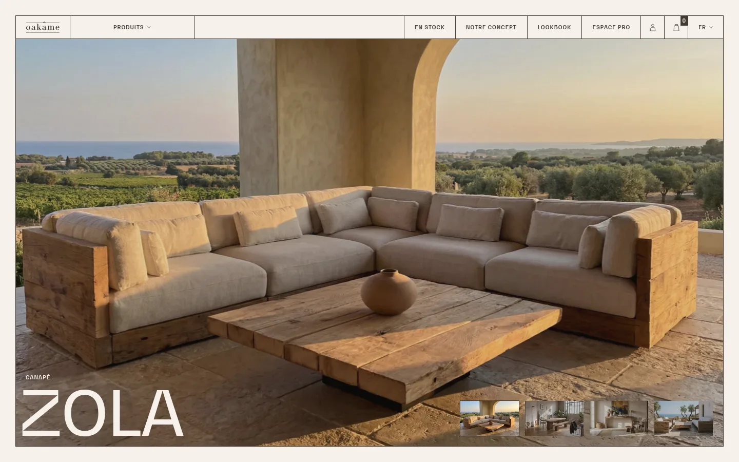
A thin outlined navigation bar on #f6f1eb, divided into cells for the logo, product menu, stock, concept, lookbook and utility links.
Immersive product hero
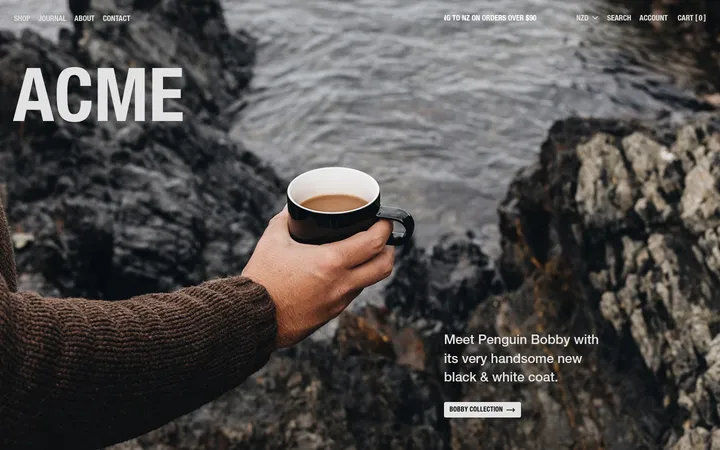
Large lifestyle photograph with a small uppercase product category, oversized white product name and a row of image thumbnails along the lower edge.
Outlined text CTA
Square-corner, unfilled control with a 1px #403a34 border, uppercase BwGradual label and generous horizontal padding.
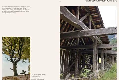
Asymmetric feature section
Editorial copy and photography placed in offset columns, with ample #f6f1eb space between content elements.
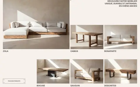
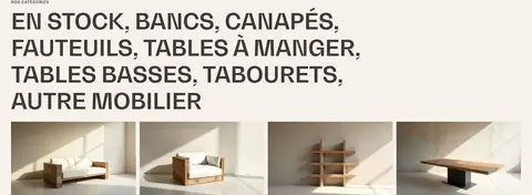
Furniture product grid
Clean product photographs in an airy, uneven grid, accompanied by compact uppercase item names and restrained discovery links.
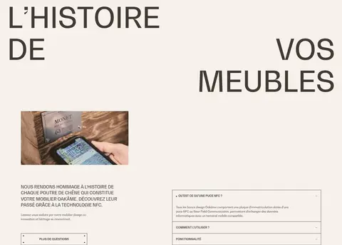
Information accordion
Flat, finely ruled rows for NFC provenance questions, using compact text and no shadow or rounded container.
Oversized footer wordmark
Structured footer with thin outlined link rows, centered brand details and a very large cropped uppercase Oakâme wordmark.
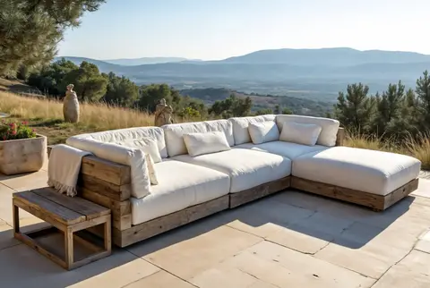
Imagery · Use large, natural-light photographs of furniture in architectural settings, reclaimed timber, old beams and calm interiors. Hero imagery is immersive and wide, with product name typography overlaid near the lower edge and small image thumbnails nearby. Product imagery is cleanly framed against neutral interiors; documentary material photos add provenance. Treat the photographs as the source of wood, stone, landscape and textile colour, not as a cue to add new UI colours.
Use BwGradual-style uppercase display and navigation typography.
Show furniture in authentic, naturally lit settings.
Build hierarchy with whitespace and image scale.
Use thin square-corner outlines for controls and dividers.
✕ 不该做
Do not introduce unmeasured accent colours into the interface.
Do not alternate the page with invented coloured section bands.
Do not add gradients, shadows or rounded cards.
Do not replace the photographic material story with illustrations.
Do not make the layout dense or uniformly centered.
Do not use decorative lowercase styling for prominent headings.
给 AI 的提示词
想快速出一个同风格的新页面,把这段话连同 DESIGN.md 一起发给 AI。
Build a new Oakâme-style furniture page as an airy editorial storefront. Use Linen Canvas (#f6f1eb) for the continuous background and Oak Charcoal (#403a34) for typography, links, navigation and hairline borders. Use a BwGradual-like geometric sans, with bold uppercase display headings, compact uppercase navigation and small restrained captions. Lead with a wide, immersive photograph of reclaimed-oak furniture in a naturally lit architectural setting; let the image provide the wood and landscape colours. Compose the rest with asymmetrical image-and-copy sections, open product grids, fine outlined CTAs and flat information rows. Preserve generous spacing and varied alignment within a measured max-width of 1380px. Keep corners square and avoid shadows, gradients, extra UI colours or dense card layouts.