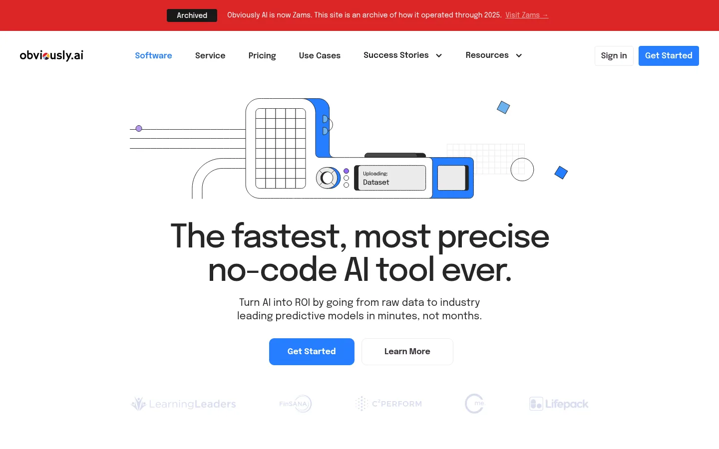
首页以明亮的视觉和居中的首屏,介绍无需代码的 AI 建模服务,并通过彩色功能卡片与产品展示引导浏览。清晰的无衬线字体、技术插画和深色评价区兼顾亲和力与专业感。
North star · Keep the page airy and product-led: use white space and crisp Epilogue typography to make colorful AI illustrations and blue actions immediately legible.
The page uses white as its main canvas, letting large, dark Epilogue headlines and electric-blue calls to action carry the first impression. A narrow red archive announcement is a distinct contextual banner rather than part of the core palette. Pale blue-gray marks the product-feature band, while deep plum grounds testimonials and news; neutral gray closes the page. Saturated blue, green, and purple distinguish AI model categories and recur in interface illustrations, so color signals product variety without overwhelming the white layout. The centered hero pairs a technical upload illustration with a concise headline, supporting copy, and two clear actions. Further down, modular cards alternate between explanatory text and product imagery. Generous section gaps preserve a spacious rhythm, while repeated white cards make dense feature content easy to scan. The visual tone is polished and approachable: thin outlined diagrams, restrained borders, compact labels, and bright accents replace heavy effects.
配色
点色块复制色值。用途说明来自对页面的实测位置(背景、文字、描边、按钮)与截图判读。
品牌色
强调色
表层色
中性色
功能色
页面底色 · Gallery White表层 · Cloud Lavender表层 2 · Deep Plum表层 3 · Footer Mist主文字 · Soft Ink次要文字 · Deep Plum弱文字 · Gallery White描边 · Deep Plum强调 · Signal Blue强调 2 · Violet Signal强调 3 · Fresh Green
All measured page typography, from display headings to navigation, body copy, labels, and buttons.
角色
示例
字号
字重
行高
字距
特大标题
Oversized hero headline.
Obviously AI
64px
500
1.04
-0.04em
一级标题
Primary page-level heading where used.
Obviously AI
48px
500
1
-0.04em
二级标题
Major section headings, including hero and feature bands.
Obviously AI
40px
500
1
-0.04em
三级标题
Feature-card and subsection headings.
Obviously AI
32px
500
1.03
-0.04em
四级标题
Smaller card or content headings.
The quick brown fox 敏捷的狐狸
24px
500
1.17
-0.04em
正文
Explanatory paragraphs and testimonial copy.
The quick brown fox 敏捷的狐狸
16px
400
1.5
0
辅助文字
Compact labels, metadata, and supporting details.
The quick brown fox 敏捷的狐狸
14px
400
1.43
0
按钮
Bold primary call-to-action labels.
The quick brown fox 敏捷的狐狸
16px
700
1.5
-0.01em
导航
Semibold desktop navigation items.
The quick brown fox 敏捷的狐狸
16px
600
1.5
0
链接
Inline and footer text links.
The quick brown fox 敏捷的狐狸
15px
400
1.33
0
间距与布局
基准单位 4px · 密度:宽松
102px版块间距
16px元素间距
26px卡片内边距
1110px内容最大宽度
1px
2px
5px
8px
10px
12px
13px
14px
15px
16px
20px
24px
30px
32px
36px
40px
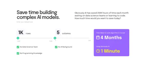
The measured content max width is 1110px, with spacious section gaps and 16px element gaps. A single centered hero gives way to multi-column category and feature layouts, then a two-column calculator area and a three-column testimonial grid. Headings are centered for broad product and social-proof sections, with left-aligned copy in focused feature and CTA blocks. White sections alternate with pale blue-gray, deep plum, and light gray bands to mark changes in content.
圆角与层次
按钮 · 10px
卡片 · 10px
图片 · 50%
徽标 · 4px
hairline · other
hairline · card
Most surfaces are flat, with white cards separated from their backgrounds by whitespace rather than heavy shadows. Cards and buttons use measured rounded corners, while subtle borders define secondary controls. A small purple offset hairline is measured on a card; avoid turning this into a broad shadow system. Layering comes mainly from colored illustrations and contrasting section bands.
组件
下面的预览按实测的按钮、输入框、徽标、卡片样式重建(字体用替代字体)。
Archive announcement
A full-width red banner above navigation, with a dark Archived badge, concise notice, and a light Visit Zams link.
Primary CTA
Signal Blue (#267dff) background, white bold Epilogue label, and rounded button treatment; used for Get Started actions.
Hero
Centered technical upload illustration above a large two-line headline, short supporting paragraph, paired actions, and a faint customer-logo row.
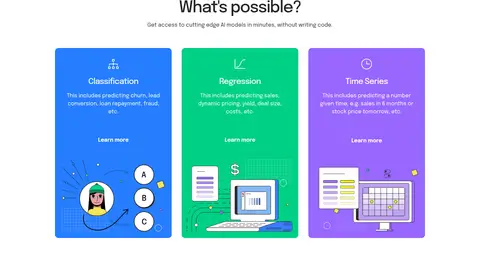
Model-category cards
Three saturated blue, green, and purple cards explain classification, regression, and time series, each with a compact label, link, and illustration.
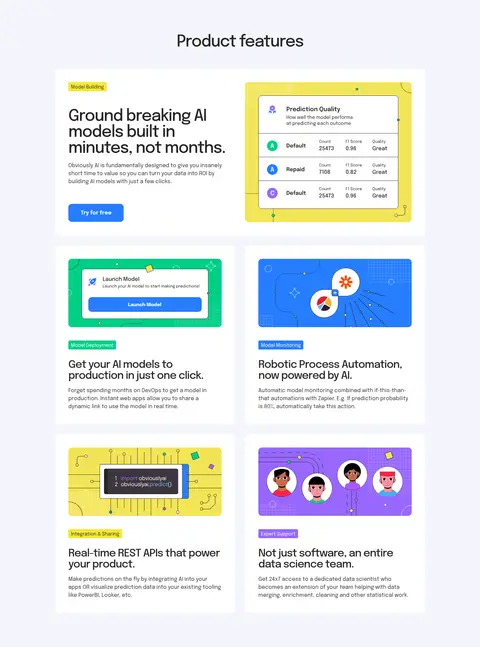
Product feature cards
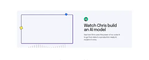
White rounded cards on Cloud Lavender (#f3f5fc), pairing short copy and category badges with interface screenshots or technical illustrations.
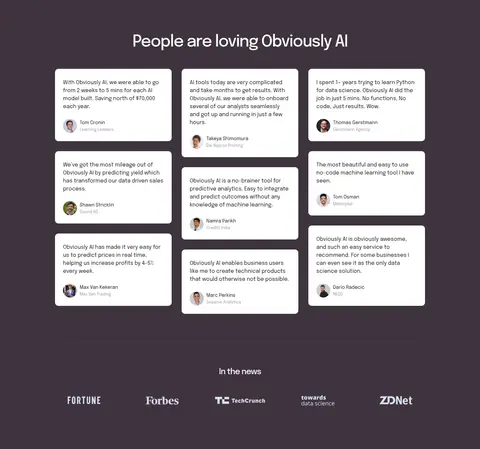
Testimonial cards
A Deep Plum (#3e343f) section contains a three-column array of white quote cards with compact copy, portrait, and attribution.
Footer
Light gray band with brand statement, grouped navigation links, and small compliance marks.
Imagery · The visual system relies on product illustrations and interface mockups rather than prominent photography. Thin-line technical diagrams, upload and prediction interfaces, and colorful model-category artwork use blue, green, purple, and yellow accents on light grounds. The hero image sits above centered copy; feature imagery is embedded in white cards. Customer portraits and publication marks appear as small supporting assets, not as dominant page imagery.
Use Epilogue throughout, with tightly tracked display headings.
Keep the primary canvas white and use section bands selectively.
Reserve Signal Blue (#267dff) for prominent actions and key accents.
Use illustrations to explain the product rather than adding decorative photography.
Give feature cards clear copy-to-image hierarchy and generous breathing room.
Use Deep Plum (#3e343f) to distinguish testimonial and news content.
✕ 不该做
Do not introduce gradients as a dominant page treatment.
Do not use heavy shadows to separate every card.
Do not make every section a saturated color block.
Do not crowd the hero with extra copy or competing actions.
Do not treat illustration-only yellow and purple details as the primary brand canvas.
Do not replace the measured palette with generic black-and-blue SaaS styling.
给 AI 的提示词
想快速出一个同风格的新页面,把这段话连同 DESIGN.md 一起发给 AI。
Build a new page in the Obviously AI visual style. Use a white Gallery White (#ffffff) canvas, Epilogue typography, and dark Soft Ink (#262626) headlines with compact negative tracking. Make Signal Blue (#267dff) the clear primary action color; keep Mint Green (#00d085) and Violet Signal (#9867ff) for product categories and illustration details. Use Cloud Lavender (#f3f5fc) behind feature content, Deep Plum (#3e343f) for a contrasting testimonial band, and Footer Mist (#ebebeb) for the footer. Keep the layout spacious and centered, with a strong hero, modular feature cards, and distinct section bands. Favor thin-line technical illustrations and interface mockups over large photos. Use restrained borders and rounded cards, not pervasive shadows. Maintain clear copy hierarchy, concise calls to action, and easy scanning across responsive columns.