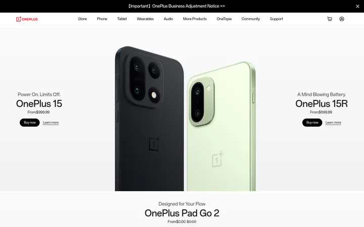
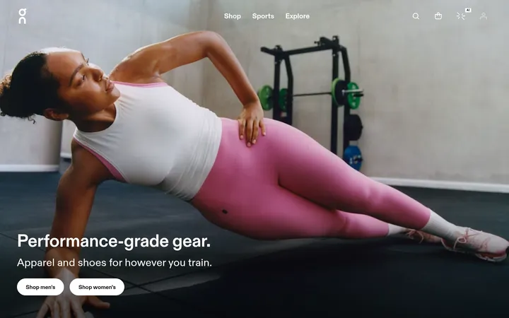
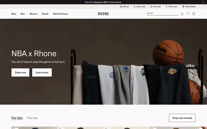
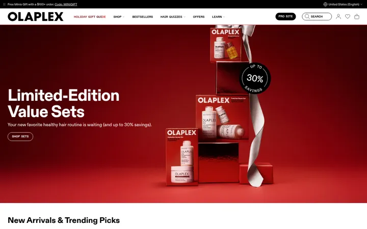
North star · Let full-scale fitness photography create energy, while a disciplined monochrome interface keeps shopping and navigation clear.
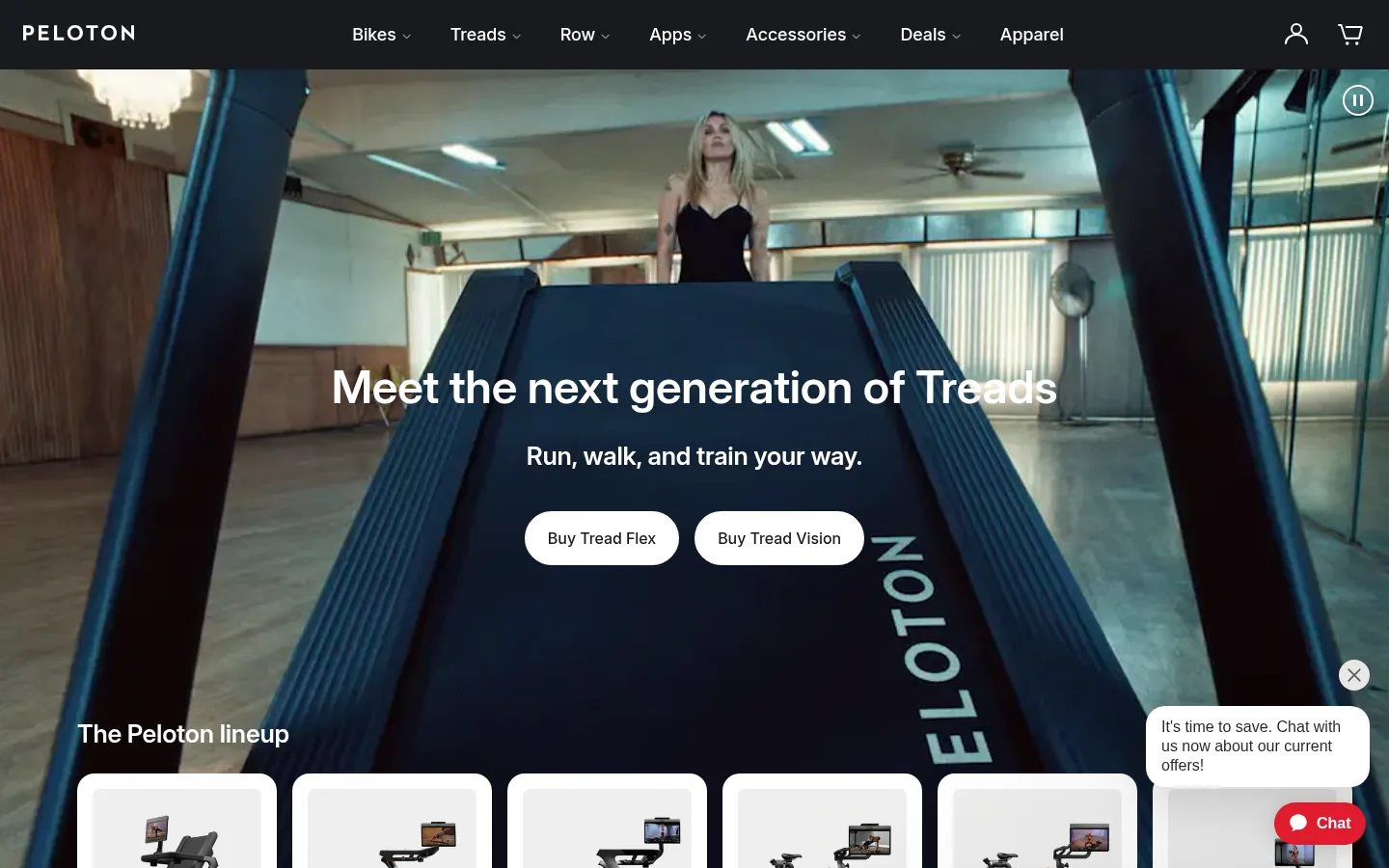
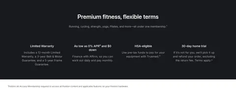
The visual system lets fitness imagery carry the emotion while interface elements stay restrained. Cool Gallery Gray (#f5f7f9) and white create quiet section backgrounds; Ink (#181a1d) anchors the navigation, text, dark promotional bands, and primary actions. Inter is used throughout, with large centered semibold headlines and compact, lighter supporting copy. The page alternates expansive media-led moments with product and class browsing, so the long scroll feels varied without changing its core visual language. Full-bleed video and photography are balanced by clean cards, centered copy, and small neutral controls. Product imagery is presented on bright surfaces, while occasional dark sections and image overlays provide contrast. Rounded pill buttons make purchase actions distinct, and the product and testimonial cards use soft elevation sparingly. The overall impression is contemporary, premium, active, and intentionally uncluttered.
Site-wide typography for navigation, headings, body copy, buttons, links, and form controls.
角色
示例
字号
字重
行高
字距
一级标题
Large centered hero and primary page headlines.
Peloton
48px
600
1.3
-0.004em
二级标题
Major section headings, usually centered.
Peloton
36px
600
1.3
-0.006em
三级标题
Product, class, and content-card headings.
Peloton
32px
600
1.3
-0.006em
四级标题
Smaller feature and promotional headings.
The quick brown fox 敏捷的狐狸
26px
600
1.3
-0.008em
正文
Light-weight explanatory copy and product descriptions.
The quick brown fox 敏捷的狐狸
13px
300
1.54
0
辅助文字
Compact class previews, labels, and fine-print details.
The quick brown fox 敏捷的狐狸
12px
400
1.33
0
按钮
Purchase, discovery, and form action labels.
The quick brown fox 敏捷的狐狸
16px
500
1.3
0
链接
Small secondary text links and class previews.
The quick brown fox 敏捷的狐狸
12px
400
1.33
0
间距与布局
基准单位 8px · 密度:适中
80px版块间距
12px元素间距
16px卡片内边距
1224px内容最大宽度
6px
8px
10px
12px
16px
22px
24px
32px
40px
48px
80px
Use a wide, centered content frame with a measured maximum width of 1224px, while allowing media-led hero and campaign sections to run full bleed. The page is a long editorial storefront rather than a uniform grid: centered headings introduce product and class browsing, three-column feature areas, and horizontally browsable card rows. Keep generous section pauses, with the measured section gap at 80px, and compact element spacing around 12px. The measured density is comfortable. The top navigation is a dark horizontal band; the footer returns to structured columns and fine-print rows.
圆角与层次
按钮 · 50%
输入框 · 2px
卡片 · 18px
图片 · 6px
hairline · button, media
lg · card
sm · other
Most page sections are flat, with separation created by white and pale-gray backgrounds rather than prominent borders. Cards receive restrained layering: the measured large card shadow is soft and broad, while smaller incidental elevation remains subtle. Use rounded card edges and pill-shaped purchase buttons; reserve fine outlines for inputs and understated controls.
组件
下面的预览按实测的按钮、输入框、徽标、卡片样式重建(字体用替代字体)。
Top navigation
Dark horizontal header with the Peloton wordmark, centered category links, and account and cart icons. Keep navigation text compact and understated.
Video hero
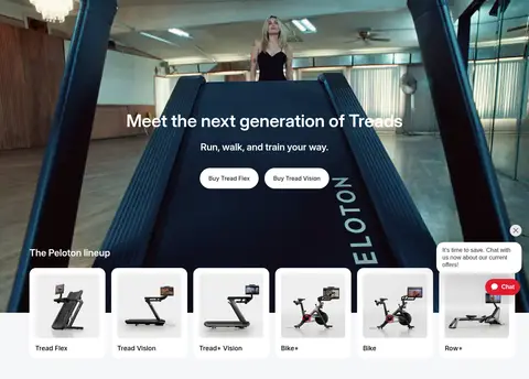
Full-bleed treadmill footage with centered white headline and supporting line, paired with white pill purchase buttons and a product-lineup row near the bottom.
Product lineup cards
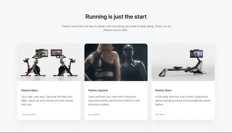
Bright product tiles display treadmill, bike, and rower imagery with compact names and clean white surfaces.
Pill action buttons
Measured purchase actions use Inter at 16px and weight 500, with 22px horizontal padding and a fully rounded shape; white-on-ink or ink-on-white variants.
Class carousel
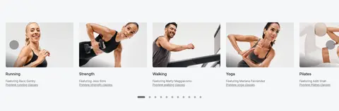
Horizontal row of instructor and workout imagery with short category names, muted preview links, and pagination controls.
Feature cards
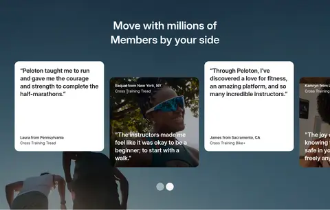
Three-column cards pair product or lifestyle media with a title, light-weight description, and understated link; measured cards use rounded corners and soft elevation.
Footer signup
Structured footer columns sit beside a compact email input and dark Submit button, followed by legal links on a pale-gray base.
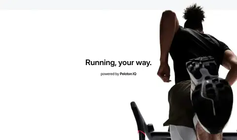
Imagery · Prioritize real workout and product photography, with video in the opening treadmill hero and additional full-width campaign moments. Frame athletes in motion and let the image fill the section rather than placing it inside a decorative illustration. Product cards use clean, bright backgrounds that keep equipment silhouettes legible. Some media uses dark gradient overlays to preserve readable white copy; avoid stylized filters that obscure the footage.
Use Gallery Gray and white to alternate quiet surfaces.
Make purchase actions clear, high-contrast pills.
Use product photography on uncluttered card surfaces.
✕ 不该做
Do not introduce bright accent colors absent from the measured palette.
Do not crowd full-bleed imagery with extra decoration.
Do not turn every section into the same card grid.
Do not overuse shadows or visible borders.
Do not use heavy, dense body text.
Do not make secondary links compete with purchase actions.
给 AI 的提示词
想快速出一个同风格的新页面,把这段话连同 DESIGN.md 一起发给 AI。
Build a new Peloton-style ecommerce page with a restrained monochrome interface and immersive fitness media. Use Gallery Gray (#f5f7f9), Gallery White (#ffffff), and Peloton Ink (#181a1d) as the core surfaces and text colors; reserve Soft Graphite (#65666a) for secondary copy. Use Inter, with semibold large headings and lighter supporting text. Compose a dark, compact top navigation, a full-bleed photo or video hero, clear pill-shaped purchase actions, and varied product, class, and editorial sections. Keep content centered within the measured 1224px maximum width except for media-led bands. Favor generous section pauses, clean product tiles, and rounded cards with restrained shadows. Keep forms and fine-print details quiet. Use monochrome image overlays only when needed for readable copy; do not add unmeasured accent colors.