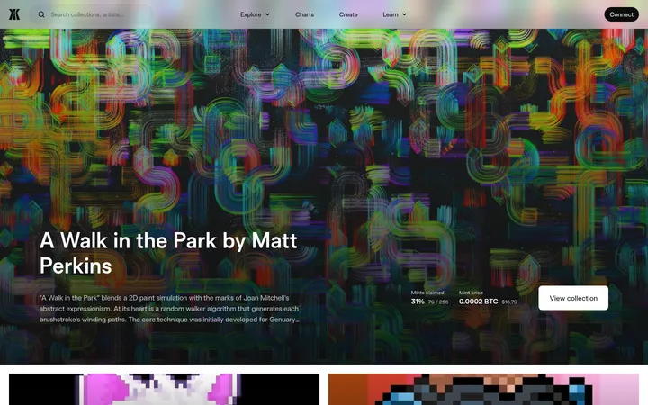
Rarible以近黑色画布衬托鲜明的NFT作品,并用克制的荧光色提示重点。等宽界面文字与密集的藏品数据,共同构成以视觉浏览为核心的市场体验。
North star · Let NFT artwork provide the spectacle while the near-black, monospaced interface stays quiet, legible, and consistent.
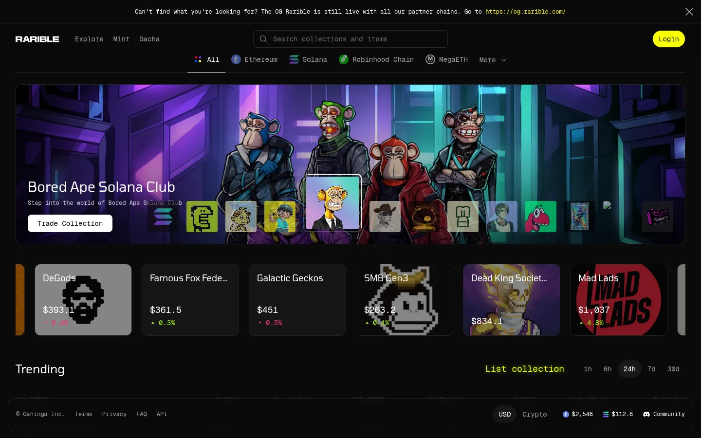
The page is built on a near-black canvas, with charcoal panels and fine dark borders defining controls, collection cards, and section edges without bright dividers. White carries primary interface text; softer grays recede into metadata, while acid yellow is reserved for a few standout actions and links. Tomorrow gives headings and larger editorial text a compact geometric character, while Geist Mono makes navigation, prices, filters, and utility labels feel systematic. The opening hero is a wide, rounded media panel: colorful NFT artwork supplies most of the visual energy, with text and a light CTA layered over it. Below, horizontally browsable collection cards lead into a restrained market table, then trusted-brand tiles and an image-led news feed. Sections retain ample dark negative space, but their cards and labels are information-dense. Keep decorative color inside the artwork; preserve the interface’s high-contrast, low-chrome frame.
配色 点色块复制色值。用途说明来自对页面的实测位置(背景、文字、描边、按钮)与截图判读。
强调色
Rarible Lime
#faff00
Rare high-attention accent for the Login button, selected links, and small highlighted labels.
表层色
Marketplace Black
#0a0a0a
Main page canvas and the continuous background behind navigation, collection browsing, market data, and editorial sections.
Charcoal Line
#222222
Subtle card and section surfaces; also the dominant hairline color separating interface elements.
Deep Fade
#040404
Gradient endpoint in media overlays; use to shade artwork edges rather than as a new interface band.
Media Graphite
#27272a
Minor media and interface edge detail; not a defining brand color.
Control Gray
#3a3a3a
Occasional button and utility-control surface detail against the black canvas.
中性色
Gallery White
#ffffff
Primary headings, interface labels, links, and the light-filled primary collection CTA.
Quiet Gray
#858585
Secondary and footer text, including subdued utility links and low-priority metadata.
Soft Silver
#cecece
Muted supporting copy and labels that need more contrast than footer gray.
Button Black
#000000
Text on white-filled primary buttons, notably the Explore Solana call to action.
Mid Gray
#9d9d9d
Occasional subdued text or button detail; keep secondary to white and Soft Silver.
Ash Gray
#6c6c6c
Low-emphasis text details within the dark interface.
文字 背景 对比度 WCAG #ffffff Gallery White#0a0a0a Marketplace Black19.8:1 AAA #ffffff Gallery White#222222 Charcoal Line15.91:1 AAA #858585 Quiet Gray#0a0a0a Marketplace Black5.37:1 AA #858585 Quiet Gray#222222 Charcoal Line4.31:1 AA-large #858585 Quiet Gray#ffffff Gallery White3.69:1 AA-large #cecece Soft Silver#0a0a0a Marketplace Black12.58:1 AAA
字体 字号阶梯:Major Third(比例约 1.247,正文 18px)。示例用免费替代字体渲染,数值为实测。
Aa 设计
Geist Mono 网络字体 · 字重 400 / 500 · 占比 64%
免费替代:IBM Plex Mono
Navigation, buttons, filters, prices, captions, utility links, and compact market data.
Aa 设计
Tomorrow 网络字体 · 字重 400 / 500 · 占比 36%
免费替代:Oxanium
Headings, hero copy, and larger descriptive text.
角色 示例 字号 字重 行高 字距 一级标题 Hero or primary page heading.
Rarible
28px 400 1.29 0 二级标题 Section headings such as Trending and News.
The quick brown fox 敏捷的狐狸
24px 400 1.17 0 正文 Collection descriptions and prominent supporting copy.
The quick brown fox 敏捷的狐狸
18px 400 1.33 0 辅助文字 Small metadata and supporting labels.
The quick brown fox 敏捷的狐狸
12px 400 1.33 0 按钮 CTA, login, and selectable time-range controls.
The quick brown fox 敏捷的狐狸
14px 500 1.43 0 链接 Compact navigation, utility, and inline links.
The quick brown fox 敏捷的狐狸
12px 400 1.33 0 代码 Monospaced data-like labels and values.
const style = 1;
12px 400 1.33 0
间距与布局 基准单位 8px · 密度:适中
48px 版块间距
8px 元素间距
— 卡片内边距
1392px 内容最大宽度
2px
4px
6px
8px
12px
16px
20px
24px
The marketplace content sits within a broad centered desktop frame, measured to a 1392px maximum width, with an observed 12-column structure in the opening collection area. Navigation and chain choices occupy compact horizontal bands above the hero. The page moves from a full-width media carousel to horizontally browsable collection cards, a single-column market table, a five-column trust grid, and a two-column news area. Preserve generous gaps between major dark sections while keeping controls and market data compact.
圆角与层次 hairline · input, button
sm · button
The interface is predominantly flat: near-black surfaces, thin charcoal borders, and rounded card edges establish hierarchy without pronounced shadows. Use modest shadows only for controls where separation helps. The hero and collection artwork create depth through their own lighting and color, not through raised UI panels.
组件 下面的预览按实测的按钮、输入框、徽标、卡片样式重建(字体用替代字体)。
Global announcement A narrow top notice uses compact Geist Mono copy, an inline lime link, and a dismiss control over the black canvas.
Marketplace navigation Brand, primary links, search, chain selectors, and a lime Login pill form compact horizontal navigation bands.
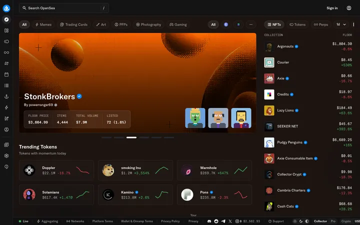
Featured collection hero A wide rounded media panel layers Tomorrow heading and supporting copy over NFT artwork, with a white CTA and collection thumbnails.
Collection carousel cards Dark, bordered cards present collection imagery, names, floor values, and colored change indicators in a horizontal strip.
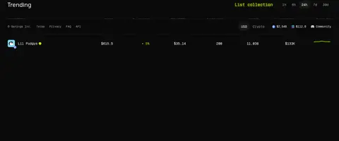
Trending market table A low-chrome data table pairs collection identity with floor, offer, sales, owners, and volume values; time filters sit beside its heading.
Trusted brand grid Repeated dark logo tiles provide a quiet visual break, with consistent card framing against the page canvas.
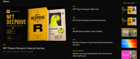
News feed A large editorial image anchors a two-column news area, balanced by compact linked stories and thumbnails.
Imagery · Artwork is the main source of color: NFT characters, collection graphics, and promotional media appear in wide carousel panels and cropped collection cards. Keep media prominent and edge-to-edge within its card, using dark overlays where text sits on top. Trusted-brand marks and editorial thumbnails remain contained in separate tiles; do not treat illustration colors as interface accents.
页面版块 共 6 个版块,按页面从上到下排列,每个都标了类型、布局和交互套路。
该做与不该做 ✓ 该做 Use Marketplace Black (#0a0a0a) as the dominant canvas. Keep borders and card framing close to Charcoal Line (#222222). Reserve Rarible Lime (#faff00) for sparse emphasis. Use Geist Mono for navigation, controls, and market data. Use Tomorrow for headings and larger descriptive text. Let NFT artwork carry the vivid colors. Keep market information aligned and easy to scan. ✕ 不该做 Do not introduce bright page-wide color bands. Do not use lime as a large background field. Do not add strong shadows to every card. Do not replace artwork-led panels with generic gradients. Do not style every text element in a monospaced face. Do not make secondary metadata as prominent as headings. Do not mistake colors sampled from NFT art for brand UI colors. 给 AI 的提示词 想快速出一个同风格的新页面,把这段话连同 DESIGN.md 一起发给 AI。
复制 Build a new Rarible-style marketplace page on Marketplace Black (#0a0a0a), using Charcoal Line (#222222) for restrained card boundaries and Gallery White (#ffffff) for primary text. Keep Rarible Lime (#faff00) sparse: use it for a single standout action or selected detail, not broad surfaces. Set headings in Tomorrow or a close geometric alternative and interface controls, labels, prices, and navigation in Geist Mono. Use a compact horizontal header, a wide artwork-led hero with legible overlay copy, and dense but clearly aligned collection or market data below. Let NFT media supply the palette; do not borrow its colors for interface chrome. Favor flat surfaces, fine borders, rounded cards, and deliberate dark negative space over strong shadows or decorative gradients.
DESIGN.md Tailwind v4 CSS 变量 Design Tokens
---
title: "Rarible — NFT Marketplace design system"
variant: extended
source: https://rarible.com/all
captured_at: 2026-10-12
theme: dark
industry: crypto
generator: Design DNA (https://four.wiralomi.com/style/rarible-com)
ai_generated: true
ai_label: "本文件由 AI 辅助生成:数值取自公开网页的实测样式,命名、用途说明与建议为模型解读。商标归原所有者。 / AI-assisted content"
---
# Rarible — NFT Marketplace · Design System
> Dark marketplace, vivid collections, precise data.
**Theme:** dark · **Industry:** crypto · **Source:** https://rarible.com/all · **Captured:** 2026-10-12 (1440×900 desktop)
_AI-assisted content: values are measured from the public page at capture time; names, roles and guidance are model-written interpretations. Trademarks belong to their owners._
Rarible pairs a near-black marketplace canvas with vivid NFT artwork and restrained neon accents. Monospaced interface labels and dense collection data frame an image-led browsing experience.
## North star
Let NFT artwork provide the spectacle while the near-black, monospaced interface stays quiet, legible, and consistent.
## Overview
The page is built on a near-black canvas, with charcoal panels and fine dark borders defining controls, collection cards, and section edges without bright dividers. White carries primary interface text; softer grays recede into metadata, while acid yellow is reserved for a few standout actions and links. Tomorrow gives headings and larger editorial text a compact geometric character, while Geist Mono makes navigation, prices, filters, and utility labels feel systematic. The opening hero is a wide, rounded media panel: colorful NFT artwork supplies most of the visual energy, with text and a light CTA layered over it. Below, horizontally browsable collection cards lead into a restrained market table, then trusted-brand tiles and an image-led news feed. Sections retain ample dark negative space, but their cards and labels are information-dense. Keep decorative color inside the artwork; preserve the interface’s high-contrast, low-chrome frame.
## Colors
| Name | Hex | Token | Group | Role |
|---|---|---|---|---|
| Marketplace Black | ` | `--color-marketplace-black` | surface | Main page canvas and the continuous background behind navigation, collection browsing, market data, and editorial sections. |
| Charcoal Line | ` | `--color-charcoal-line` | surface | Subtle card and section surfaces; also the dominant hairline color separating interface elements. |
| Gallery White | ` | `--color-gallery-white` | neutral | Primary headings, interface labels, links, and the light-filled primary collection CTA. |
| Deep Fade | ` | `--color-deep-fade` | surface | Gradient endpoint in media overlays; use to shade artwork edges rather than as a new interface band. |
| Quiet Gray | ` | `--color-quiet-gray` | neutral | Secondary and footer text, including subdued utility links and low-priority metadata. |
| Rarible Lime | ` | `--color-rarible-lime` | accent | Rare high-attention accent for the Login button, selected links, and small highlighted labels. |
| Soft Silver | ` | `--color-soft-silver` | neutral | Muted supporting copy and labels that need more contrast than footer gray. |
| Button Black | ` | `--color-button-black` | neutral | Text on white-filled primary buttons, notably the Explore Solana call to action. |
| Mid Gray | ` | `--color-mid-gray` | neutral | Occasional subdued text or button detail; keep secondary to white and Soft Silver. |
| Ash Gray | ` | `--color-ash-gray` | neutral | Low-emphasis text details within the dark interface. |
| Media Graphite | ` | `--color-media-graphite` | surface | Minor media and interface edge detail; not a defining brand color. |
| Control Gray | ` | `--color-control-gray` | surface | Occasional button and utility-control surface detail against the black canvas. |
### Semantic aliases
`--color-canvas` → ` (Marketplace Black) · `--color-surface` → ` (Charcoal Line) · `--color-surface-2` → ` (Gallery White) · `--color-text` → ` (Gallery White) · `--color-text-muted` → ` (Quiet Gray) · `--color-text-subtle` → ` (Soft Silver) · `--color-border` → ` (Charcoal Line)
### Contrast (WCAG 2.x)
| Text | Background | Ratio | Level |
|---|---|---|---|
| ` | ` | 19.8:1 | AAA |
| ` | ` | 15.91:1 | AAA |
| ` | ` | 5.37:1 | AA |
| ` | ` | 4.31:1 | AA-large |
| ` | ` | 3.69:1 | AA-large |
| ` | ` | 12.58:1 | AAA |
| ` | ` | 10.11:1 | AAA |
| ` | ` | 1.57:1 | fail |
### Gradients
- `linear-gradient(rgba(0, 0, 0, 0), rgba(0, 0, 0, 0.6))`
## Typography
| Family | Token | Source | Weights | Role | Free substitute |
|---|---|---|---|---|---|
| Geist Mono | `--font-mono` | webfont | 400, 500 | Navigation, buttons, filters, prices, captions, utility links, and compact market data. | IBM Plex Mono |
| Tomorrow | `--font-body` | webfont | 400, 500 | Headings, hero copy, and larger descriptive text. | Oxanium |
- **Geist Mono:** Use regular and medium weights; compact labels are predominantly mixed-case, with an engineered, data-forward feel.
- **Tomorrow:** Use regular weight for a clean geometric display voice; keep letter spacing neutral and avoid forced uppercase.
### Type scale — Major Third (ratio ≈ 1.247, base 18px)
| Role | Size | Weight | Line height | Letter spacing | Case | Family | Used for |
|---|---|---|---|---|---|---|---|
| h1 | 28px | 400 | 1.29 | 0 | — | Tomorrow | Hero or primary page heading. |
| h2 | 24px | 400 | 1.17 | 0 | — | Tomorrow | Section headings such as Trending and News. |
| body | 18px | 400 | 1.33 | 0 | — | Tomorrow | Collection descriptions and prominent supporting copy. |
| caption | 12px | 400 | 1.33 | 0 | — | Geist Mono | Small metadata and supporting labels. |
| button | 14px | 500 | 1.43 | 0 | — | Geist Mono | CTA, login, and selectable time-range controls. |
| link | 12px | 400 | 1.33 | 0 | — | Geist Mono | Compact navigation, utility, and inline links. |
| code | 12px | 400 | 1.33 | 0 | — | Geist Mono | Monospaced data-like labels and values. |
## Spacing & layout
- Base unit **8px**, density **comfortable**.
- Scale (most used values): 2, 4, 6, 8, 12, 16, 20, 24 px.
- Section rhythm 48px · element gap 8px · card padding — · max content width 1392px.
The marketplace content sits within a broad centered desktop frame, measured to a 1392px maximum width, with an observed 12-column structure in the opening collection area. Navigation and chain choices occupy compact horizontal bands above the hero. The page moves from a full-width media carousel to horizontally browsable collection cards, a single-column market table, a five-column trust grid, and a two-column news area. Preserve generous gaps between major dark sections while keeping controls and market data compact.
## Shape & elevation
- Radius: button `8px` · input `6px` · card `12px` · media `6px` · link `12px` · xs `4px` · sm `6px` · md `8px` · lg `12px` · pill `9999px`
- Shadow `hairline` (input, button): `rgba(0, 0, 0, 0) 0px 0px 0px 0px, rgba(0, 0, 0, 0) 0px 0px 0px 0px, rgba(0, 0, 0, 0.05) 0px 1px 2px 0px`
- Shadow `sm` (button): `rgba(0, 0, 0, 0) 0px 0px 0px 0px, rgba(0, 0, 0, 0) 0px 0px 0px 0px, rgba(0, 0, 0, 0.1) 0px 1px 3px 0px, rgba(0, 0, 0, 0.1) 0px 1px 2px -1px`
- Motion: standard transition `0.2s cubic-bezier(0.4, 0, 0.2, 1)` on interactive elements.
The interface is predominantly flat: near-black surfaces, thin charcoal borders, and rounded card edges establish hierarchy without pronounced shadows. Use modest shadows only for controls where separation helps. The hero and collection artwork create depth through their own lighting and color, not through raised UI panels.
## Imagery
Artwork is the main source of color: NFT characters, collection graphics, and promotional media appear in wide carousel panels and cropped collection cards. Keep media prominent and edge-to-edge within its card, using dark overlays where text sits on top. Trusted-brand marks and editorial thumbnails remain contained in separate tiles; do not treat illustration colors as interface accents.
## Components
### Global announcement
A narrow top notice uses compact Geist Mono copy, an inline lime link, and a dismiss control over the black canvas.
### Marketplace navigation
Brand, primary links, search, chain selectors, and a lime Login pill form compact horizontal navigation bands.
### Featured collection hero
A wide rounded media panel layers Tomorrow heading and supporting copy over NFT artwork, with a white CTA and collection thumbnails.
### Collection carousel cards
Dark, bordered cards present collection imagery, names, floor values, and colored change indicators in a horizontal strip.
### Trending market table
A low-chrome data table pairs collection identity with floor, offer, sales, owners, and volume values; time filters sit beside its heading.
### Trusted brand grid
Repeated dark logo tiles provide a quiet visual break, with consistent card framing against the page canvas.
### News feed
A large editorial image anchors a two-column news area, balanced by compact linked stories and thumbnails.
### Measured component styles
- **Primary button** (“Explore Solana”): background ## Do
- Use Marketplace Black (## Don't
- Do not introduce bright page-wide color bands.
- Do not use lime as a large background field.
- Do not add strong shadows to every card.
- Do not replace artwork-led panels with generic gradients.
- Do not style every text element in a monospaced face.
- Do not make secondary metadata as prominent as headings.
- Do not mistake colors sampled from NFT art for brand UI colors.
## Agent prompt
Build a new Rarible-style marketplace page on Marketplace Black (## Page sections (top to bottom)
| # | Type | Layout | UX patterns | UI patterns |
|---|---|---|---|---|
| 1 | hero | Wide, rounded artwork carousel below two compact navigation bands; overlay title, supporting copy, CTA, and collection thumbnails. | Browse featured collections, Trade collection CTA, Chain navigation | Full-bleed media, Text overlay, White CTA, Dark rounded frame |
| 2 | category-nav | Horizontal strip of collection links and small media tiles beneath the hero. | Quick collection discovery, Horizontal browsing | Compact image tiles, Dark canvas, Linked labels |
| 3 | stats | Single-column market table with collection rows and time-range controls beside the title. | Filter by time range, Compare collection metrics | Monospaced data labels, Low-chrome table, Subtle row boundaries |
| 4 | logo-cloud | Five-column grid of bordered logo tiles on the dark canvas. | Scan trusted brands | Repeated dark tiles, Consistent image framing |
| 5 | content-feed | Two-column editorial area with a large lead image and a stack of linked stories with thumbnails. | Open featured article, Browse related posts | Image-led feature, Compact story links, Small category labels |
| 6 | footer | Dark closing area with oversized Rarible wordmark and compact utility information beneath. | Access footer links, Review utility details | Large brand wordmark, Subdued legal text, Minimal divider |
## Source CSS custom properties (selected)
```css
--background: white;
--foreground: black;
--foreground-invert: 0 0% 100%;
--card-foreground: 0 0% 100%;
--popover-foreground: 0 0% 100%;
--primary: 240 5.9% 10%;
--primary-foreground: 0 0% 98%;
--secondary: 240 4.8% 95.9%;
--secondary-foreground: 240 5.9% 10%;
--muted-foreground: 240 3.8% 46.1%;
--accent: 240 4.8% 95.9%;
--accent-foreground: 240 5.9% 10%;
--destructive-foreground: 0 0% 98%;
--border: 240 5.9% 90%;
--radius: .5rem;
--sidebar-background: 0 0% 98%;
--sidebar-foreground: 240 5.3% 26.1%;
--sidebar-primary: 240 5.9% 10%;
--sidebar-primary-foreground: 0 0% 98%;
--sidebar-accent: 240 4.8% 95.9%;
--sidebar-accent-foreground: 240 5.9% 10%;
--sidebar-border: 220 13% 91%;
--brand: 61.18 100% 50%;
--scrollbar-radius: 10px;
--tw-border-opacity: 1;
--tw-bg-opacity: 1;
--tw-text-opacity: 1;
--privy-color-background: