North star · Keep the interface nearly monochrome and information-dense, then use small hand-drawn details to add warmth without competing with product evidence.
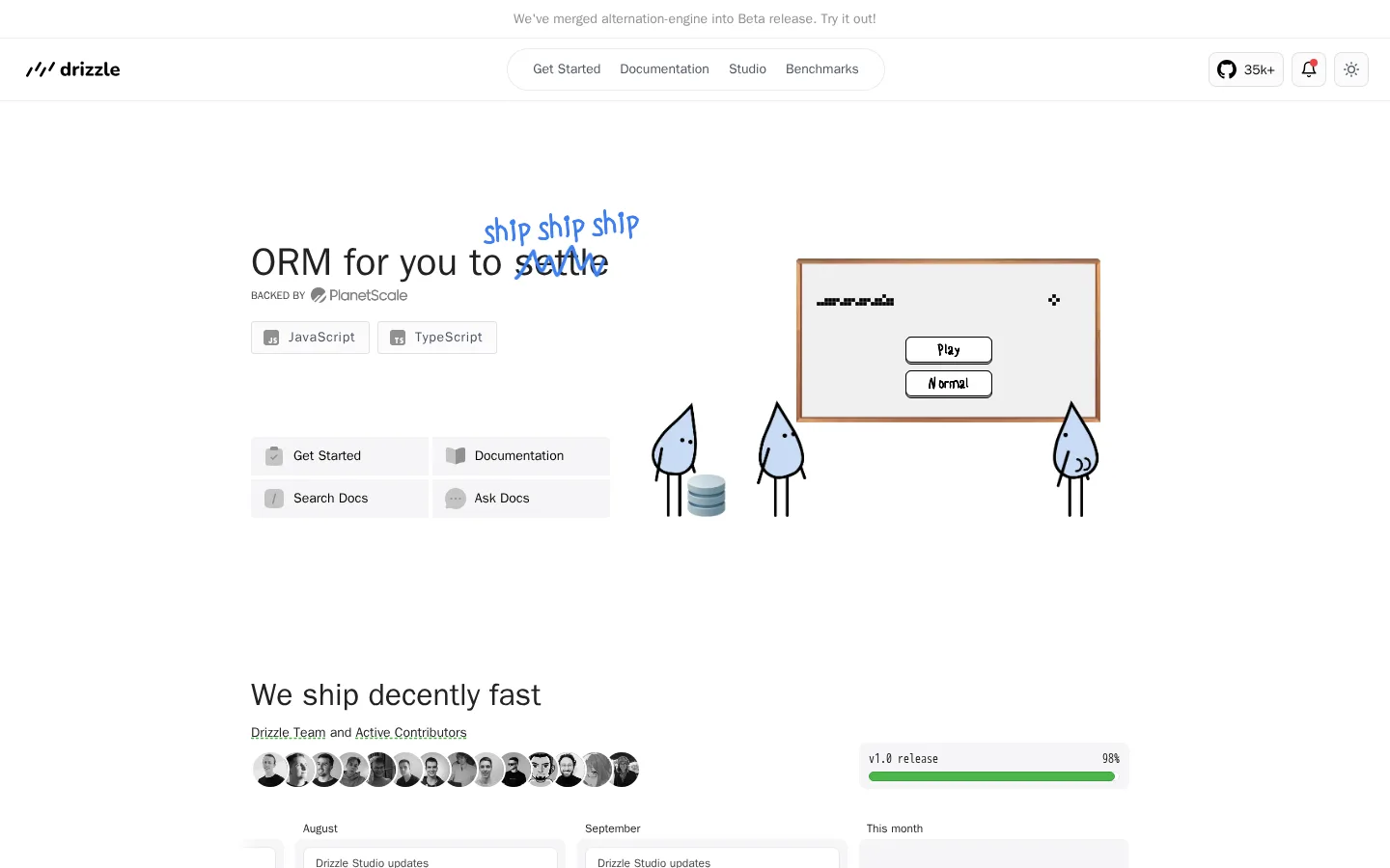
The visual strategy is intentionally quiet: pure white (#ffffff) dominates the canvas, while pale gray (#f6f6f7) distinguishes soft panels and cards. Medium charcoal (#444444) carries most text; the darker blue-gray (#282b3b) and near-black tones (#222222, #0a0a0a) are reserved for selective labels, code-like details, and emphasis. Hairline borders (#e8e8e8) define cards without making the interface feel heavy. System sans-serif typography supplies a familiar developer-tool tone, with compact labels and monospace reserved for small code or data tokens. The layout centers content in a relatively narrow column, alternating feature explanations with product evidence, integrations, and community material. Hand-drawn droplet mascots and small illustrations provide warmth against otherwise functional UI captures and tables. Generous vertical pauses separate sections, while internal card layouts remain dense and information-led.
Headings, body copy, navigation, links, buttons, and interface labels.
Aa 设计
Menlo
网络字体 · 字重 500 / 700 · 占比 2%
免费替代:Roboto Mono
Small code-like labels and data tokens within technical interface details.
角色
示例
字号
字重
行高
字距
一级标题
Hero headline introducing the ORM in a concise, prominent line.
Drizzle ORM
32px
600
1.5
0
二级标题
Section headings for features, performance, pricing, and community.
The quick brown fox 敏捷的狐狸
20px
500
1.5
0
正文
Explanatory copy, supporting descriptions, and general page text.
The quick brown fox 敏捷的狐狸
16px
400
1.5
0
辅助文字
Small supporting notes, contributor labels, and compact metadata.
The quick brown fox 敏捷的狐狸
12px
500
1.42
0
按钮
Primary and secondary action labels.
The quick brown fox 敏捷的狐狸
14px
500
1
0
链接
Compact bold links within navigation and supporting content.
The quick brown fox 敏捷的狐狸
12px
700
1.42
0
代码
Small monospace tokens in technical previews and data labels.
const style = 1;
10px
500
normal
0
间距与布局
基准单位 4px · 密度:紧凑
36px版块间距
6px元素间距
10px卡片内边距
—内容最大宽度
1px
2px
3px
4px
6px
8px
9px
10px
12px
16px
20px
Use a centered, restrained content column with a compact top navigation and announcement strip. The hero pairs a short headline and quick links with a playful product illustration. Continue through vertically separated feature sections, alternating text with tables, charts, integration grids, and Studio imagery. Align most content to a shared center, but let product previews span wider than accompanying copy. Maintain a compact rhythm inside cards and a generous rhythm between major sections; avoid inventing a fixed maximum width not present in the measurements.
圆角与层次
按钮 · 3px
输入框 · 4px
卡片 · 8px
图片 · 50%
徽标 · 2px
链接 · 9999px
sm · card, input, other
inset · other, text
sm · other
The page is mostly flat, with white space doing more work than shadow. Use pale surfaces and fine gray borders to separate cards and controls; measured cards use rounded corners. Apply only a restrained soft shadow to selected controls or previews, and keep layered effects subtle so interface evidence remains legible.
组件
下面的预览按实测的按钮、输入框、徽标、卡片样式重建(字体用替代字体)。
Top navigation
A slim header with brand mark, centered pill-like navigation, and compact utility controls on the right; separate it with a faint hairline.
Hero quick links
Short headline and language badges sit beside four compact shortcut tiles on soft gray surfaces.
Feature card
White card with a fine #e8e8e8 outline, softly rounded corners, and concise technical content.
Benchmark preview
A tidy grid of charts and runtime controls, presented as a product capture with restrained panel borders.
Integration list
Compact rows of provider names and small logos arranged in a simple two-column surface.
Dark action button
Use a compact dark slate fill for prominent actions, with short, legible white labeling and minimal decoration.
Community feed
A multi-column stream of testimonial cards with small avatars, short text, and occasional embedded media.
Imagery · Use hand-drawn droplet mascots and small playful sketches as distinctive accents, especially near hero and feature content. Pair them with realistic product captures: benchmark charts, database tables, integration logos, and community posts. Keep illustrations lightly colored and outlined; avoid polished 3D or large photographic backgrounds. Screenshots should remain crisp, rectangular, and information-rich.
Use pale gray panels to group practical interface content.
Favor concise headings and compact, readable labels.
Use hand-drawn mascots as small supporting accents.
Show real-looking technical evidence in charts and tables.
Separate major sections with generous vertical pauses.
✕ 不该做
Do not introduce large saturated brand-color blocks.
Do not turn every card into a heavily elevated panel.
Do not replace the simple sans-serif system with display typography.
Do not use decorative gradients as a dominant page treatment.
Do not let mascot art obscure product details or text.
Do not compress major sections into one dense dashboard.
给 AI 的提示词
想快速出一个同风格的新页面,把这段话连同 DESIGN.md 一起发给 AI。
Build a new developer-tool page in the Drizzle visual style. Use Gallery White (#ffffff) as the canvas, Cloud Panel (#f6f6f7) for quiet grouping, Soft Graphite (#444444) for primary reading text, and Fine Divider (#e8e8e8) for subtle outlines. Reserve Midnight Slate (#282b3b), Near Ink (#222222), and Carbon Black (#0a0a0a) for selective emphasis and tiny technical details. Use a clean system sans-serif with neutral tracking and a small monospace accent for code. Center the content in a restrained column, make the header compact, and alternate concise feature copy with crisp charts, tables, and integration previews. Add a few hand-drawn mascot accents, not large decorative scenes. Keep card elevation subtle, internal data compact, and section transitions spacious.