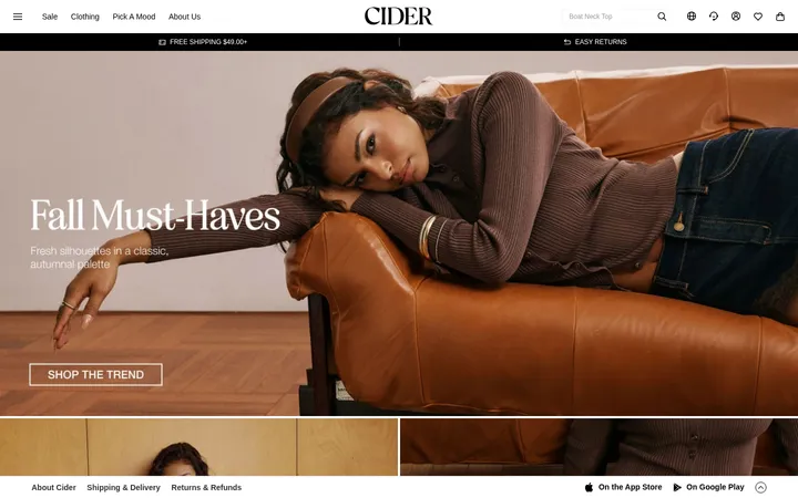
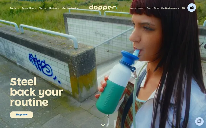
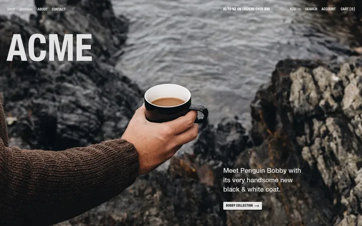
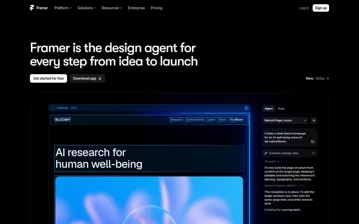
North star · Keep the interface quiet and spacious so the dinnerware’s shape, glaze, and texture provide the page’s color and drama.
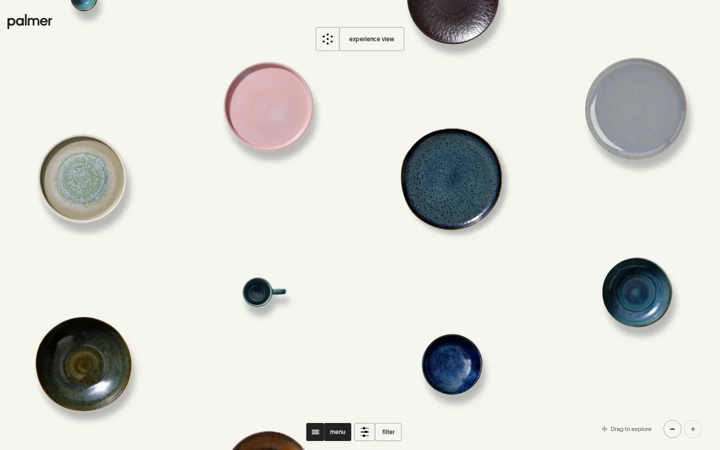
The page is built around a near-white, slightly warm canvas (#f5f6ee) that fills the viewport and keeps the ceramics visually prominent. Ink (#222222) is reserved for the Palmer wordmark, controls, and other high-contrast text; muted gray (#a1a19c) appears in subtle outlines and secondary link details. Large, lightweight TWK Lausanne display lettering introduces the collections with a closely tracked editorial feel, while compact body and control text stays quiet and functional. The first view behaves like an open tabletop gallery: individual plates and bowls float at varied positions and scales against generous negative space, with their glaze colors and irregular textures supplying most of the visual variety. Navigation and exploration controls are small and unobtrusive rather than framed as conventional promotional banners. Below, collection cards continue the product-first approach, with minimal decoration, restrained borders, and clear explore links. Spacious section rhythm and a broad desktop canvas keep the experience calm and tactile.
配色
点色块复制色值。用途说明来自对页面的实测位置(背景、文字、描边、按钮)与截图判读。
品牌色
中性色
功能色
页面底色 · Gallery Ivory表层 · Soft Ink主文字 · Soft Ink次要文字 · Gallery Ivory描边 · Stone Line
Display headline, body copy, navigation, captions, and compact controls.
角色
示例
字号
字重
行高
字距
特大标题
Oversized collection introduction and editorial headline.
Palmer
120px
300
0.9
-0.04em
正文
Short explanatory copy beneath the main collection heading.
The quick brown fox 敏捷的狐狸
13.5px
400
1.4
-0.02em
辅助文字
Compact collection labels and secondary product information.
The quick brown fox 敏捷的狐狸
12px
500
1.4
0
按钮
Small, understated experience and filtering controls.
The quick brown fox 敏捷的狐狸
12px
500
1.4
0
导航
Large menu treatment alongside compact navigation labels.
Palmer
120px
300
0.9
-0.04em
间距与布局
基准单位 4px · 密度:宽松
96px版块间距
80px元素间距
—卡片内边距
1410px内容最大宽度
3px
4px
5px
6px
7px
9px
10px
12px
15px
16px
18px
24px
66px
80px
96px
144px
A broad desktop canvas is used as a single open composition rather than a conventional boxed grid. The measured page max width is 1410px; content aligns simply, while product imagery is dispersed across the hero with generous negative space. The introduction gives way to a collection gallery with a spacious section rhythm and low visual density. Controls sit close to the viewport edges or product group, preserving a clear view of the dinnerware.
圆角与层次
卡片 · 9px
链接 · 50%
没有测到阴影:页面是扁平的,层次靠底色和描边区分。
The interface is largely flat, with no measured shadow system or gradients. Product photographs carry natural tonal depth and subtle grounding, while fine gray outlines distinguish a few controls and card edges. Keep interface layering restrained; do not add heavy shadows or prominent filled panels.
组件
下面的预览按实测的按钮、输入框、徽标、卡片样式重建(字体用替代字体)。
Wordmark
Small dark Palmer mark sits at the upper-left edge of the open canvas.
Experience view control
Compact outlined control near the top, pairing a dot-like icon with an experience-view label.
Gallery navigation
Minimal menu and filter controls sit near the bottom of the product canvas, with dark and outlined treatments.
Collection gallery
Dinnerware pieces are spaced across the canvas as a free-form, exploratory product arrangement.
Collection cards
Three measured cards use a 9px radius, minimal borders, and small explore links alongside collection names and product counts.
Explore controls
Small text links and drag guidance invite browsing without introducing prominent CTA blocks.
Imagery · Product photography is the defining visual element: plates, bowls, and smaller serving pieces are isolated against the light canvas and shown from above. Pieces vary in scale and position, exposing glaze, rim, and surface texture. Their pink, blue, gray, and earthy hues belong to the merchandise imagery, not the measured interface palette. The treatment is clean and softly grounded, without decorative frames competing with the products.
Use Gallery Ivory (#f5f6ee) as the dominant canvas.
Let product imagery provide the strongest color and texture.
Keep controls compact and visually secondary.
Use Soft Ink (#222222) for readable text and key controls.
Preserve generous negative space around products.
Use fine outlines sparingly for interactive boundaries.
✕ 不该做
Do not introduce loud interface accent colors.
Do not arrange the hero as a dense conventional product grid.
Do not add large promotional buttons or banners.
Do not treat ceramic glaze colors as brand palette colors.
Do not add heavy shadows, gradients, or decorative panels.
Do not use oversized body copy or dense navigation.
给 AI 的提示词
想快速出一个同风格的新页面,把这段话连同 DESIGN.md 一起发给 AI。
Build a new page in Palmer’s quiet, product-led style. Use Gallery Ivory (#f5f6ee) as the full-page canvas, Soft Ink (#222222) for the wordmark, text, and primary controls, and Stone Line (#a1a19c) only for subtle borders or secondary details. Set type in TWK Lausanne or a close Inter substitute: lightweight, tightly tracked display text paired with compact, calm body and control labels. Give the layout a broad, spacious composition with abundant negative space and clear editorial hierarchy. Make product imagery the visual focus; isolate pieces against the canvas and allow their real glaze colors and textures to add richness. Keep controls small, use borders sparingly, and avoid heavy shadows, gradients, dense grids, or loud promotional treatments.