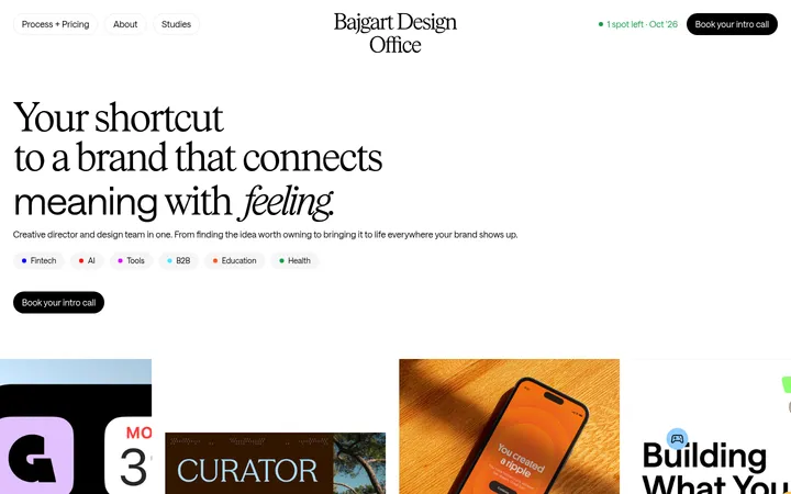
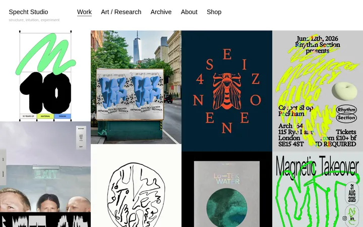
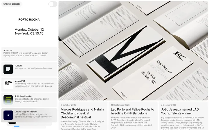
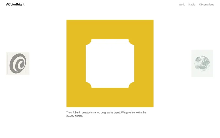
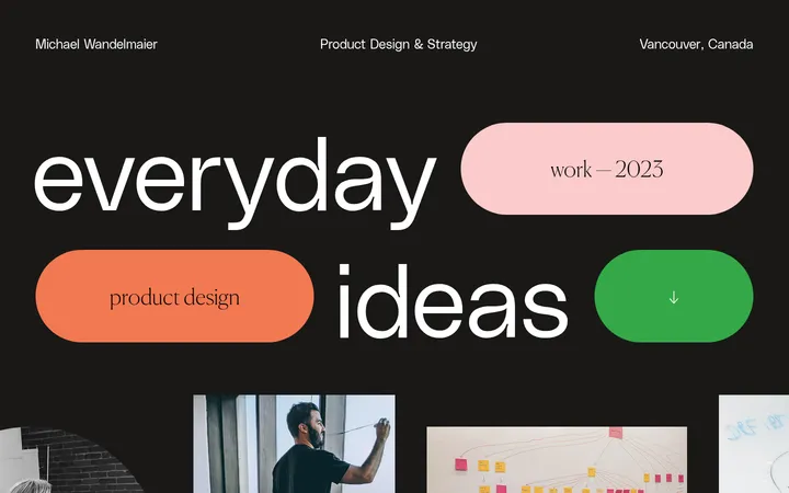
North star · Keep the interface neutral and editorial so each project’s own visual identity remains the loudest element.
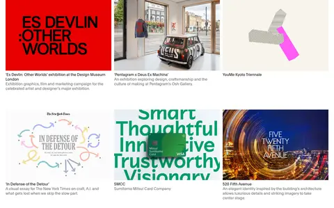
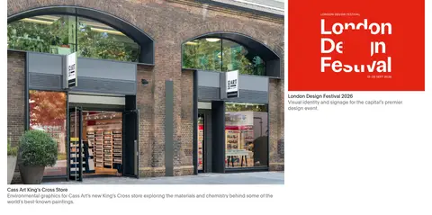
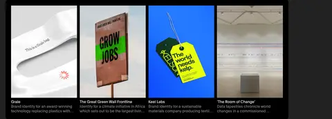
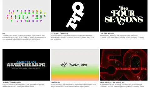
Pentagram’s homepage treats its portfolio as an editorial sequence rather than a conventional agency pitch. White canvas dominates the project feed, alternating with expansive charcoal bands that introduce themed collections and give pale text strong contrast. The palette stays deliberately restrained: near-black typography, muted gray supporting copy, and occasional pale-gray surfaces; saturated colours belong chiefly to the featured client work, not the site chrome. Plain is used consistently, with regular-weight headings and compact, quiet captions. A compact horizontal navigation anchors the top, while the content shifts between a full-bleed featured image, asymmetric project arrangements, multi-column image grids, and dark retrospective galleries. Section changes provide the main rhythm, with generous breathing room around project groups and tighter captions beneath images. Controls remain understated, using simple text and small rounded buttons rather than prominent branded decoration.
配色
点色块复制色值。用途说明来自对页面的实测位置(背景、文字、描边、按钮)与截图判读。
表层色
中性色
功能色
页面底色 · Gallery White表层 · Studio Charcoal表层 2 · Deep Black表层 3 · Paper Mist主文字 · Print Ink次要文字 · Soft Graphite弱文字 · Quiet Slate
文字
背景
对比度
WCAG
#1a1a1a Print Ink
#ffffff Gallery White
17.4:1
AAA
#1a1a1a Print Ink
#222222 Studio Charcoal
1.09:1
不达标
#1a1a1a Print Ink
#000000 Deep Black
1.21:1
不达标
#1a1a1a Print Ink
#e3e4e5 Paper Mist
13.67:1
AAA
#9e9e9e Soft Graphite
#ffffff Gallery White
2.68:1
不达标
#9e9e9e Soft Graphite
#222222 Studio Charcoal
5.94:1
AA
字体
字号阶梯:Custom(比例约 1.803,正文 16px)。示例用免费替代字体渲染,数值为实测。
Aa 设计
Plain
网络字体 · 字重 400 / 500 · 占比 100%
免费替代:Inter
Site-wide navigation, project titles, editorial headings, descriptions, and captions.
角色
示例
字号
字重
行高
字距
一级标题
Large editorial statements and primary page headings.
Pentagram
52px
400
1.05
-0.02em
二级标题
Project feature and collection headings.
Pentagram
32px
400
1.2
-0.01em
正文
Project descriptions and explanatory editorial copy.
The quick brown fox 敏捷的狐狸
16px
400
1.25
0
辅助文字
Compact image captions, categories, and metadata.
The quick brown fox 敏捷的狐狸
13px
400
1.25
0
导航
Top-level site navigation and header links.
The quick brown fox 敏捷的狐狸
16px
400
1.25
0
间距与布局
基准单位 8px · 密度:适中
48px版块间距
8px元素间距
—卡片内边距
1392px内容最大宽度
4px
6px
8px
12px
24px
48px
64px
96px
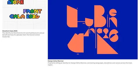
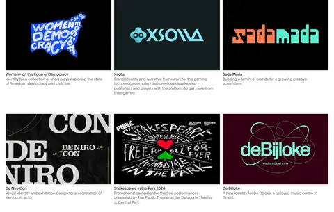
A broad, twelve-column portfolio canvas supports a full-bleed lead image and flexible project groupings. Later sections move between two- and three-column project grids, compact four-item showcases, and single-column editorial bands. Content aligns to the left, with image edges establishing the grid more strongly than borders. The page alternates white and charcoal sections to create rhythm, leaving generous breathing room around transitions and tighter spacing within image-caption pairs. Keep the header compact and the overall density comfortable.
圆角与层次
按钮 · 50%
没有测到阴影:页面是扁平的,层次靠底色和描边区分。
The page is predominantly flat: white and charcoal are uninterrupted section fields, and projects are separated by whitespace rather than card borders or shadows. Images supply their own contrast and visual depth. Small controls may use a subtle rounded treatment, but avoid floating panels, ornamental outlines, or heavy elevation.
组件
下面的预览按实测的按钮、输入框、徽标、卡片样式重建(字体用替代字体)。
Compact header navigation
White horizontal header with the Pentagram wordmark on the left and plain dark navigation links aligned to the right.
Featured project carousel
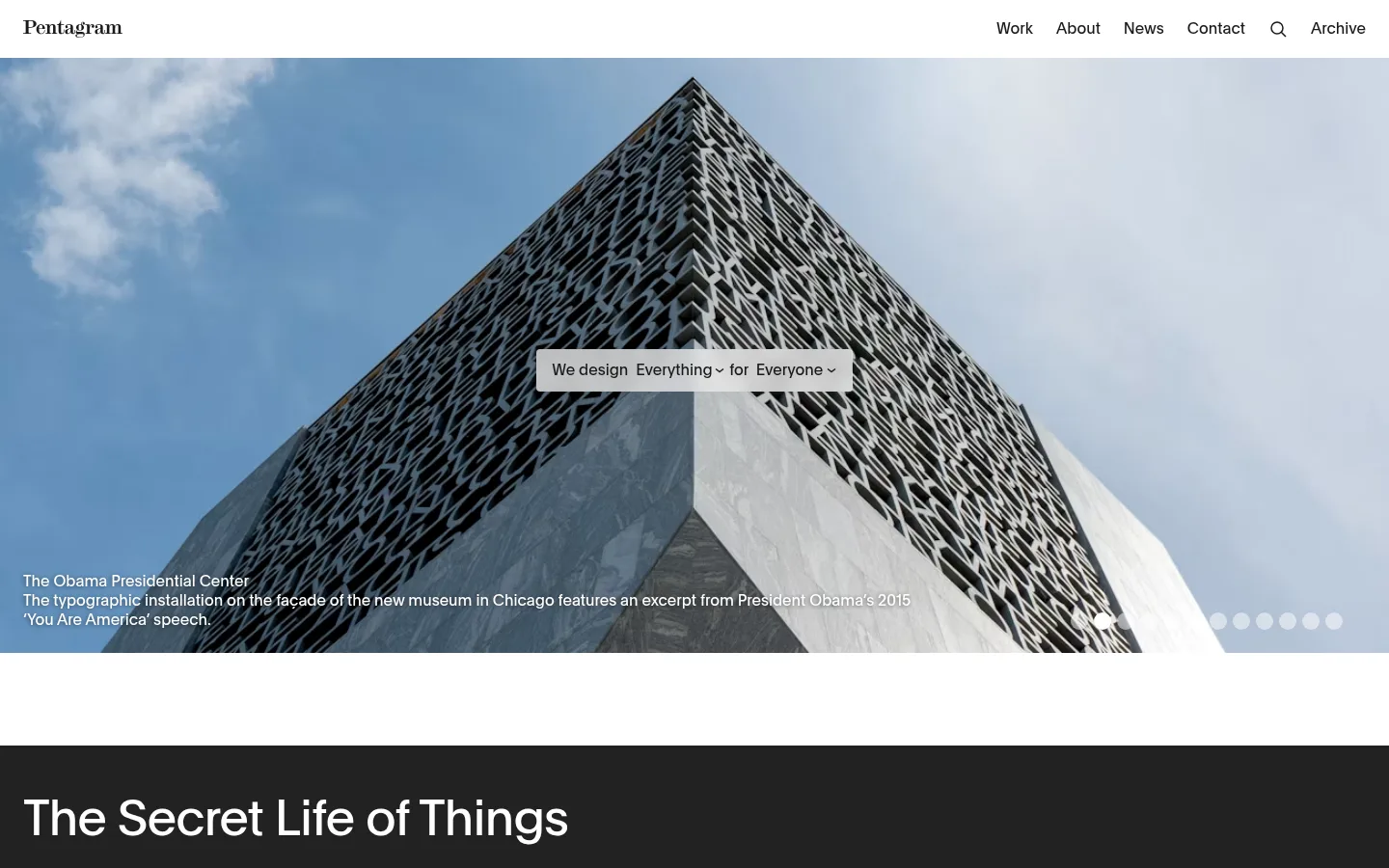
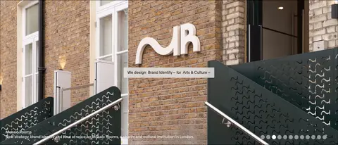
Full-bleed project image with low-positioned white title and description, centered selector treatment, and small pagination dots.
Project feed tile
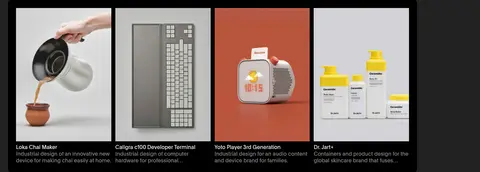
Artwork or photography with a plain title, muted descriptive copy, and a small category label below.
Dark editorial feature
Charcoal section with a large light heading, restrained copy, and a compact row of project images.
Retrospective gallery
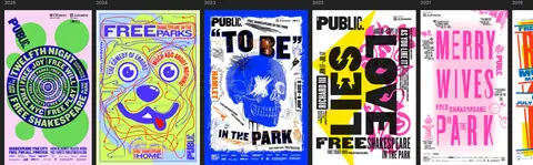
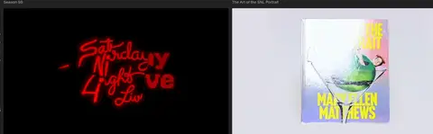
Dark archive band combining explanatory text, date or project labels, a horizontal artwork gallery, and a small show-more control.
Project filter
Small centered latest/category/project selector placed between portfolio sections without a prominent container.
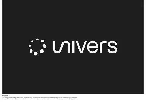
Imagery · Project imagery is the visual identity: architectural photography, product shots, campaign graphics, brand marks, and occasional motion work appear in their original client palettes. The lead project uses a wide, edge-to-edge photographic frame with overlaid copy and carousel markers. Grid tiles preserve varied aspect ratios and artwork; captions sit directly below rather than inside decorative cards. Dark retrospective sections use artwork thumbnails as a compact archive.
Use white and charcoal as the primary section fields.
Let client artwork supply most vivid colour.
Keep navigation and project links typographically simple.
Place concise captions directly beneath project imagery.
Alternate light portfolio feeds with dark editorial features.
Vary project grids while preserving clear left alignment.
✕ 不该做
Do not add a bright brand accent absent from the measured UI palette.
Do not put every project inside a bordered card.
Do not impose a uniform crop on diverse client artwork.
Do not turn captions into oversized promotional copy.
Do not use gradients or heavy shadows as interface decoration.
Do not mistake colours inside portfolio artwork for site chrome.
给 AI 的提示词
想快速出一个同风格的新页面,把这段话连同 DESIGN.md 一起发给 AI。
Build a new editorial portfolio page in Pentagram’s restrained visual style. Use Gallery White (#ffffff) for open project-feed areas, Studio Charcoal (#222222) for selected feature bands, and Print Ink (#1a1a1a) for navigation, titles, and links. Use Soft Graphite (#9e9e9e) or Quiet Slate (#767676) sparingly for supporting copy. Set everything in a Plain-like neutral sans-serif, with regular-weight headings and concise captions. Create a compact top navigation, a prominent image-led feature, and varied two- or three-column project groupings separated by generous whitespace. Preserve each project’s own image treatment and colour; do not impose decorative cards, bright interface accents, gradients, or heavy shadows. Make section transitions—not borders—the primary source of rhythm.