North star · Keep the interface nearly invisible: use a quiet gray canvas and editorial grid so each carefully framed 3D project owns the attention.
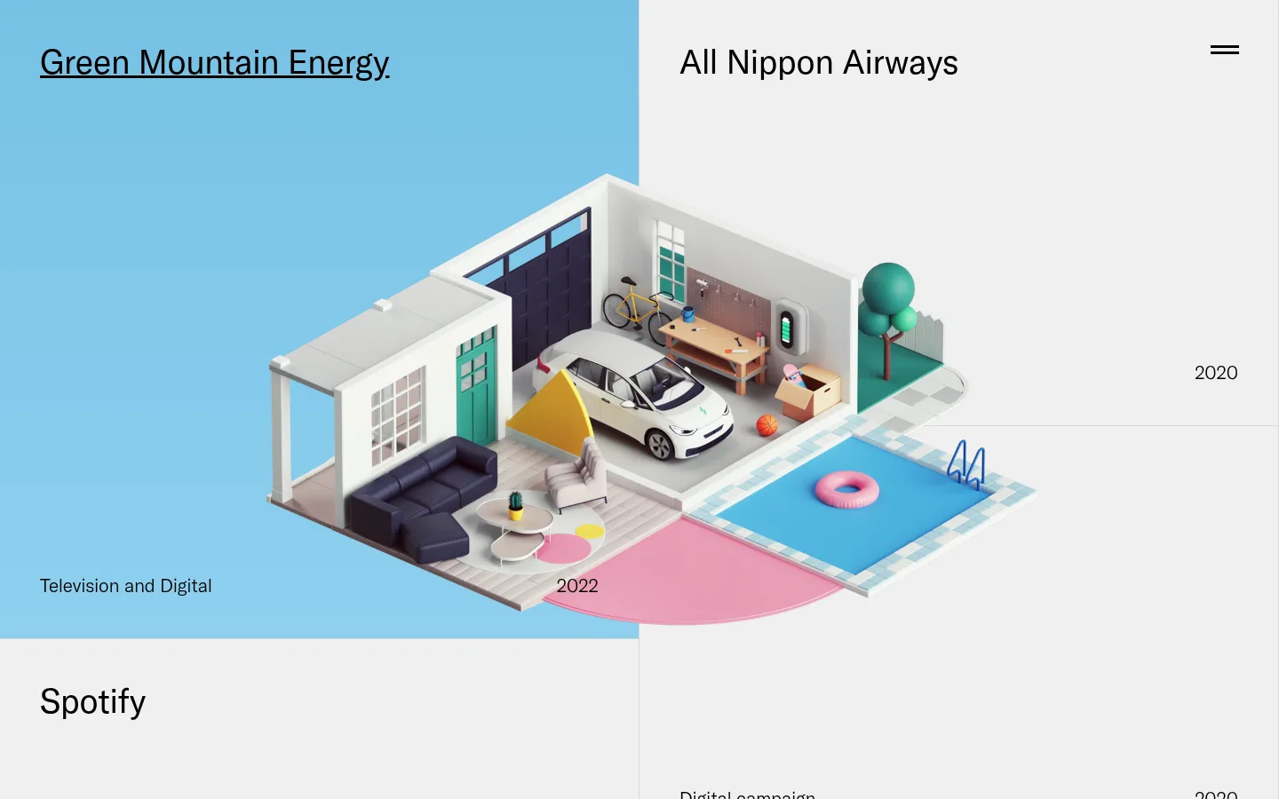
The page pairs a near-white gray canvas (#f0f0f0) with black typography and restrained light-gray hairlines, keeping the project index quiet and letting each artwork become the focal point. The first project introduces a broad sky-blue field, while most other color comes from the commissioned 3D scenes rather than the site chrome; the measured pale blues should not be promoted into a general UI palette. GT America supplies a consistent, clean sans-serif voice. Project names are large and regular, while captions and years are much smaller, with no decorative tracking or all-caps treatment. The portfolio uses an asymmetrical, two-column sequence of generous project blocks. Names sit near the top, metadata anchors the lower edge, and thin dividers mark transitions without enclosing cards. The featured isometric scene overlaps its blue field and neighboring pale space, creating depth through composition rather than interface shadows. Ample open space and flat surfaces preserve an art-directed, gallery-like presentation.
Project titles, navigation, captions, years, and links throughout the portfolio.
角色
示例
字号
字重
行高
字距
一级标题
Large project title and primary portfolio heading treatment.
Peter Tarka
38px
400
1.31
0
正文
Project descriptors and supporting copy.
The quick brown fox 敏捷的狐狸
21px
300
1.31
0
导航
Prominent navigation labels and section links.
Peter Tarka
38px
400
1.31
0
链接
Light-weight project links and footer-style links.
The quick brown fox 敏捷的狐狸
21px
200
1
0
间距与布局
基准单位 1px · 密度:适中
—版块间距
—元素间距
—卡片内边距
—内容最大宽度
10px
15px
20px
45px
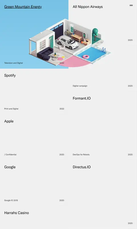
Use a broad, edge-to-edge canvas organized as an asymmetric two-column project grid. The first viewport gives the featured project a large visual field spanning the left side, while the adjacent project occupies a pale block on the right. Continue with alternating project blocks and generous open areas rather than forcing every item into identical cards. Align titles toward the top and compact descriptors and years near block edges. Preserve comfortable breathing room; no measured maximum width or section gap is specified.
圆角与层次
没有测到阴影:页面是扁平的,层次靠底色和描边区分。
The page is predominantly flat, with no measured shadow system or rounded card treatment. Use thin gray dividers to separate project regions. Let the 3D artwork create its own depth through lighting, perspective, and overlap rather than adding interface shadows or raised containers.
组件
下面的预览按实测的按钮、输入框、徽标、卡片样式重建(字体用替代字体)。
Project title
Set a prominent regular-weight GT America title near the top edge of its project block; use black on the pale canvas.
Project metadata
Place a compact project descriptor and year near the lower edge of the block, separated spatially from the title.
Project grid
Arrange projects in alternating left and right columns with varied block heights and subtle gray boundary lines.
Featured artwork
Let a large 3D scene sit over a sky-blue project field and extend into adjacent canvas space.
Menu toggle
Use a minimal black two-line menu mark at the top-right of the opening project area.
Project link
Style linked project names as plain text; the first visible project title is underlined rather than presented as a button.
Imagery · Large, polished 3D campaign illustrations are the defining imagery, with an isometric miniature environment in the opening project. Frame visuals as immersive project-specific scenes that can overlap their colored background fields and neighboring whitespace. Keep the art crisp and richly rendered; the saturated blues, pinks, and object colors belong to the artwork rather than the global interface.
Build a portfolio page that follows Peter Tarka’s quiet editorial style. Use Gallery Gray (#f0f0f0) as the main canvas, Carbon Ink (#000000) for titles and navigation, and Pencil Line (#d8d8d8) for restrained project dividers. Set clean sans-serif type resembling GT America, with large regular project titles and much smaller, lighter descriptors and dates. Organize projects in an asymmetric two-column grid with varied block proportions and generous whitespace. Give a featured 3D artwork room to overlap its project field; reserve Sky Field (#77c1e5) and Pale Sky (#8ed0ef) for artwork-specific backgrounds, not generic interface controls. Keep the UI flat, omit rounded cards and heavy shadows, and let carefully composed imagery provide depth and color.