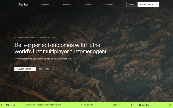
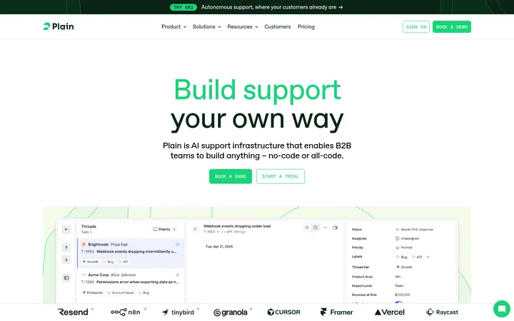
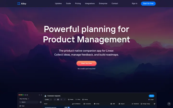
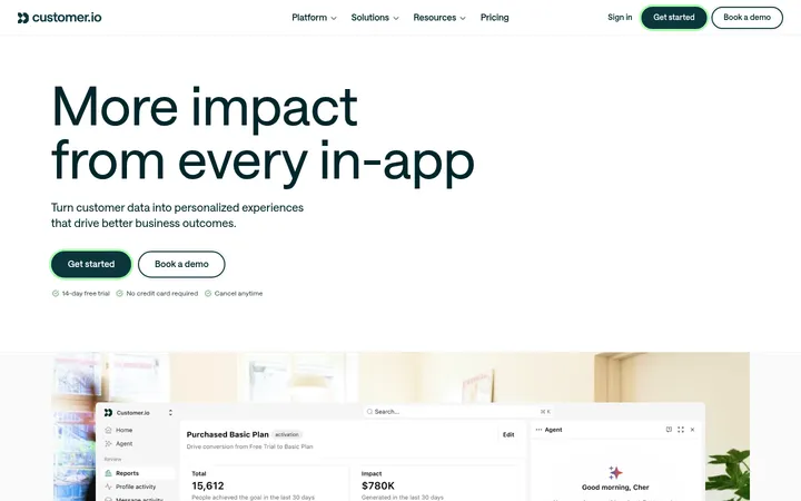
North star · Use deep navy as the anchor, electric blue as a precise highlight, and generous pale feature bands to let product interfaces breathe.
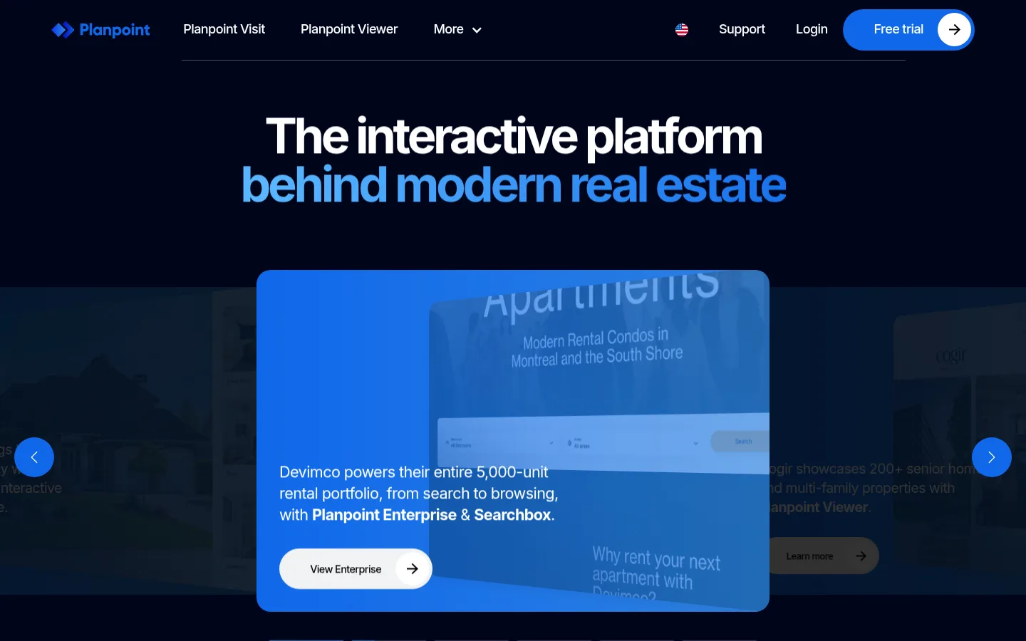
The page opens with a near-black navy hero, white navigation and headline, and blue emphasis on the second line; the carousel gives the product story a bright-blue focal panel. A white logo area transitions into repeated #f0f2f4 feature bands, where dark Inter headings and restrained copy sit beside clean interface mockups. These spacious, rounded sections establish a calm product-demo rhythm rather than a dense marketing grid. Bright blue returns as a full-bleed innovation block, while lower calls to action alternate navy and blue panels against white space. Inter is used throughout: heavy, tightly tracked display and heading styles contrast with relaxed body copy. Rounded pill buttons and large-radius cards soften the technical interface. Shadows are modest and mainly support media or card separation; pale borders and backgrounds do most of the structural work. Treat vivid blues inside screenshots as product imagery, not as additional site-brand colours.
All page typography, from navigation and body copy to display headings, links, and CTA labels.
角色
示例
字号
字重
行高
字距
特大标题
Large hero display headline and prominent page-level statements.
Planpoint
144px
700
1.1
-0.066em
一级标题
Primary hero heading and highest-level page headline.
Planpoint
68.5px
700
1
-0.063em
二级标题
Major section headings, including innovation and world coverage.
Planpoint
50.5px
700
1
-0.071em
三级标题
Feature-panel and secondary section headlines.
Planpoint
43px
700
1.1
-0.067em
四级标题
Subheads and nested feature titles within content bands.
Planpoint
32.5px
700
1.3
-0.044em
正文
Supporting descriptions, product explanations, and testimonial copy.
The quick brown fox 敏捷的狐狸
16px
400
1.6
-0.027em
辅助文字
Small labels, helper copy, and details accompanying product visuals.
The quick brown fox 敏捷的狐狸
14.5px
500
1.6
-0.04em
导航
Primary navigation labels and menu items.
The quick brown fox 敏捷的狐狸
18px
500
1.6
-0.032em
链接
Prominent inline links and action-oriented text links.
The quick brown fox 敏捷的狐狸
18px
600
1.6
-0.032em
间距与布局
基准单位 2px · 密度:适中
72px版块间距
14px元素间距
86px卡片内边距
1296px内容最大宽度
7px
11px
14px
20px
22px
25px
29px
32px
40px
43px
64px
72px
86px
108px
A centered, wide desktop composition uses a measured 1296px maximum page width and comfortable density. The hero and innovation block span broad dark or blue fields; the logo cloud and world section return to white. Feature content repeats in large pale bands, with text and interface media arranged as a split composition. Centered headings establish the hero and major brand moments, while feature copy is left-aligned. Section spacing is generous, with measured 72px section gaps and a 14px element gap; keep content uncluttered rather than compressing panels.
圆角与层次
按钮 · 9999px
卡片 · 9999px
图片 · 16px
导航 · 50%
链接 · 20px
md · media
lg · card
md · media
The overall treatment is mostly flat: colour bands, whitespace, and rounded surfaces provide hierarchy instead of heavy outlines. Measured shadows are reserved for media and cards, including a light media shadow and a broader card shadow. Avoid pervasive borders; pale gray hairlines and surfaces separate content quietly, while layered hero media creates the strongest depth.
组件
下面的预览按实测的按钮、输入框、徽标、卡片样式重建(字体用替代字体)。
Navigation bar
Dark navy header with white logo and links, a thin divider, and a bright-blue pill-shaped Free trial action.
Hero carousel
Centered white-and-blue headline above a rounded bright-blue story card; dimmed background media, circular blue arrows, and compact slide indicators support browsing.
Logo cloud
Centered dark heading over a spacious white field of customer logos arranged in a loose multi-column grid.
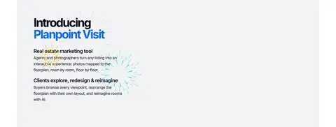
Feature bands
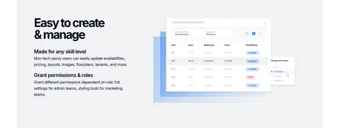
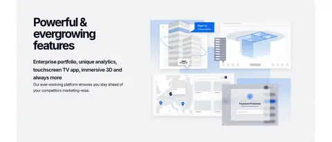
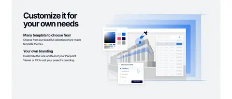
Repeated #f0f2f4 panels pair left-aligned Inter headings and explanatory copy with product UI media; rounded imagery and broad whitespace keep each feature distinct.
Innovation CTA
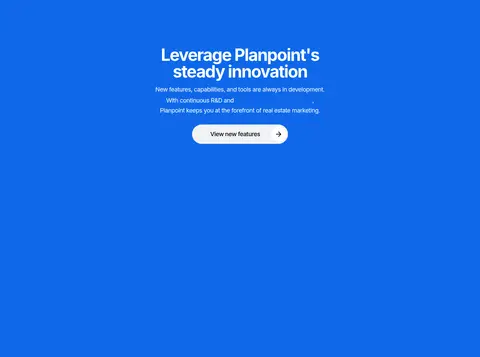
Full-bleed #0f68ea section with centered white heading and copy, followed by a pale pill button.
Contact panel
Pale-gray rounded panel centers a project-discussion heading and places dark pill actions for a virtual call and email beneath it.
Demo cards
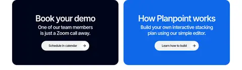
Two side-by-side rounded cards contrast a #00051a demo invitation with a #0f68ea how-it-works invitation, each using white copy and a light action pill.
Footer
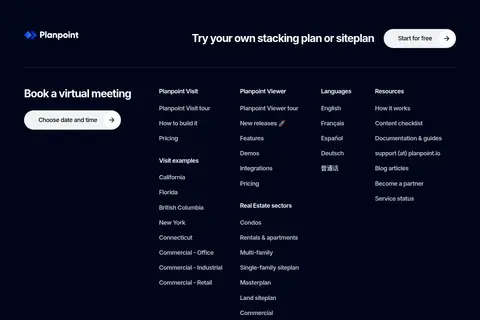
Deep navy footer combines a brand mark, a free-start prompt, a meeting action, and multiple columns of compact white links.
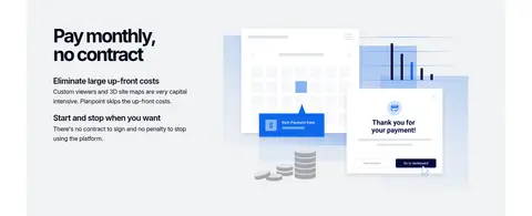
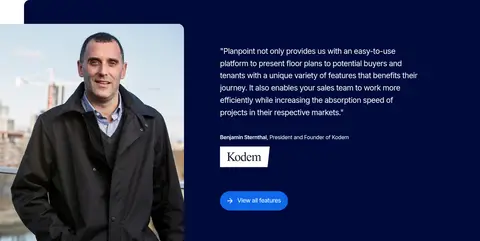
Imagery · The page prioritizes product UI mockups and interface-led media: floorplans, property-viewing tools, dashboards, and platform screens appear within pale feature bands. The hero uses a carousel panel layered over a dimmed background image, with a vivid blue overlay and rounded framing. Lower down, customer photography anchors a testimonial panel. Keep screenshots crisp and lightly framed; imagery is evidence of the product, while logos and photography remain supporting content.
Reserve Signal Blue (#0f68ea) for key actions and featured moments.
Use Cloud Gray (#f0f2f4) for broad product-feature bands.
Set headings in bold Inter with tight tracking.
Give UI mockups generous breathing room inside feature panels.
Use rounded pill actions and softly rounded media framing.
✕ 不该做
Don't introduce unmeasured brand colours.
Don't make every section a saturated colour block.
Don't crowd product screenshots with copy or decoration.
Don't use heavy borders as the main way to separate sections.
Don't replace the spacious band rhythm with a dense grid.
Don't treat vivid colours inside product mockups as page-brand colours.
给 AI 的提示词
想快速出一个同风格的新页面,把这段话连同 DESIGN.md 一起发给 AI。
Build a new Planpoint-style real-estate SaaS page using Inter throughout. Anchor the navigation and footer in Midnight Ink (#00051a), with white type and a Signal Blue (#0f68ea) pill CTA. Keep the canvas Gallery White (#ffffff); group product explanations into spacious Cloud Gray (#f0f2f4) bands, pairing concise left-aligned copy with crisp interface mockups. Use Skyline Blue (#2e82e2) only as a restrained accent or gradient partner. Make the hero bold and centered, with tightly tracked heavy headings, a blue-highlighted phrase, and a layered carousel or product visual. Alternate calm light sections with a single full-width blue innovation moment. Prefer rounded media and cards, soft shadows only where useful, and generous whitespace. Keep content hierarchy clear, interactions obvious, and decorative detail subordinate to the product.