North star · Let the handheld and the page’s bold color bands do the talking, with clear Roobert hierarchy and compact supporting content.
The page uses color as its primary organizing device: a muted slate-gray hero sets off the yellow handheld, followed by a large yellow feature band, a pale catalog section, more yellow maker content, a teal education block, a violet purchase section, and a charcoal specs footer. Roobert carries nearly all of the interface, from heavy display headlines to approachable body copy; the bold weights make short headings readable against saturated fields. The centered hero gives the product room to lead, while later content uses a constrained reading column, occasional three-column game imagery, and alternating text-and-image compositions. Product photos, exploded hardware views, game screenshots, and interface captures supply texture without changing the underlying graphic system. Spacing feels comfortable and section-led rather than dense. Rounded pill buttons and small, crisp cards soften the strong blocks of color; borders and shadows are used sparingly, mostly for card definition and tactile product controls.
Primary interface type for headlines, body copy, navigation, links, and buttons.
角色
示例
字号
字重
行高
字距
特大标题
Oversized Playdate wordmark-style hero display.
Playdate
68.5px
800
1
0
一级标题
Main hero statement and primary page headline.
Playdate
57px
700
1.1
0
二级标题
Major section headings, including features and catalog.
Playdate
51.5px
800
normal
0
三级标题
Feature subsection titles and secondary content headings.
Playdate
34px
700
normal
0
四级标题
Smaller subsection or product-content headings.
Playdate
33.5px
700
normal
0
正文
Feature explanations, product details, and supporting paragraphs.
The quick brown fox 敏捷的狐狸
18.5px
400
normal
0
辅助文字
Small utility labels and media captions.
The quick brown fox 敏捷的狐狸
13.5px
400
normal
0
按钮
Large shop CTA and prominent action labels.
Playdate
28.5px
400
normal
0
导航
Top-level header navigation links.
The quick brown fox 敏捷的狐狸
22px
700
normal
-0.007em
链接
Prominent inline links and game-discovery calls to action.
Playdate
34px
700
normal
0
间距与布局
基准单位 1px · 密度:适中
57px版块间距
3px元素间距
15px卡片内边距
800px内容最大宽度
3px
5px
9px
10px
11px
12px
13px
15px
19px
20px
24px
29px
30px
40px
50px
60px
The first viewport centers the handheld within a full-width slate stage, with a compact header aligned across the top. Below, full-width color bands create a clear vertical rhythm. Main copy is held to a measured 800px page maximum, while the feature section uses a three-column structure and game art can spread more broadly. Most text is left-aligned; the hero and selected promotional moments are centered. Comfortable section gaps give each color block a distinct pause, while cards and explanatory content remain relatively compact.
圆角与层次
按钮 · 9999px
输入框 · 9999px
卡片 · 2px
导航 · 9999px
inset · button
Most sections are flat, uninterrupted color fields rather than layered panels. Game cards use a thin dark outline and restrained corner rounding. The shop CTA has a tactile inset shadow, while product photos create their own depth; avoid adding broad ambient shadows or unnecessary borders.
组件
下面的预览按实测的按钮、输入框、徽标、卡片样式重建(字体用替代字体)。
Header navigation
White Playdate wordmark and compact white icon-and-label links sit over the slate hero; the Shop action is a violet pill.
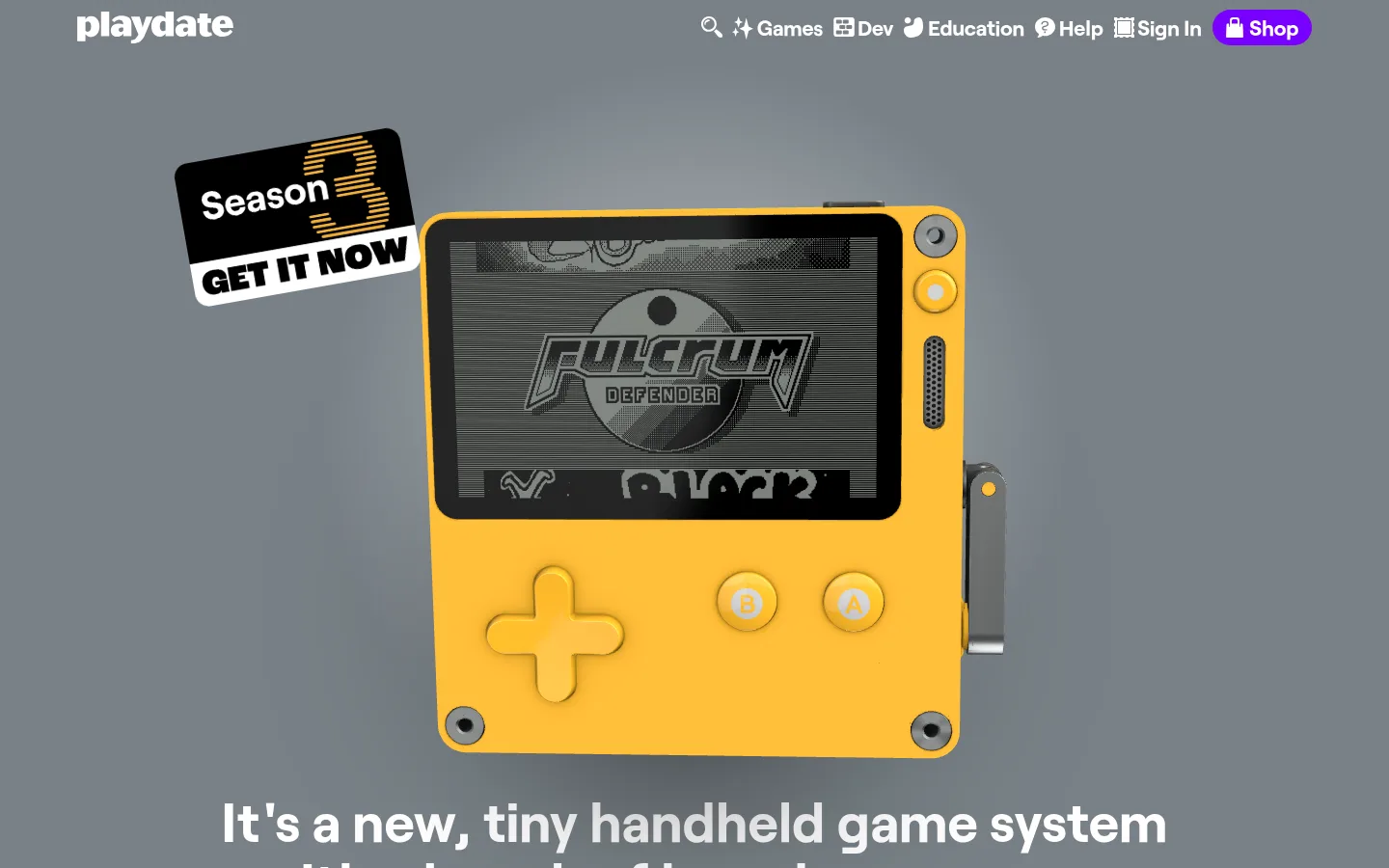
Hero product stage
Large yellow console imagery sits centered on the slate canvas, followed by bold white product copy and the oversized yellow brand wordmark.
Shop CTA
A prominent white-label violet pill with a measured violet gradient and inset tactile shadow.
Feature and game cards
Yellow feature content mixes copy with product visuals; the game listings use warm pale cards, dark text, fine outlines, and compact artwork.
Catalog band
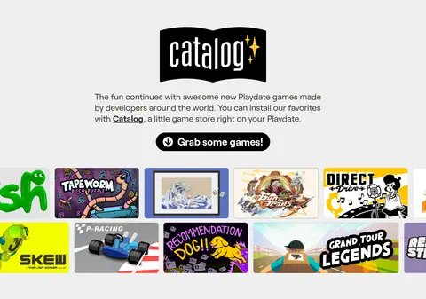
Pale gray section centers a black Catalog mark, short explanatory copy, a dark pill link, and a horizontal strip of game imagery.
Purchase band
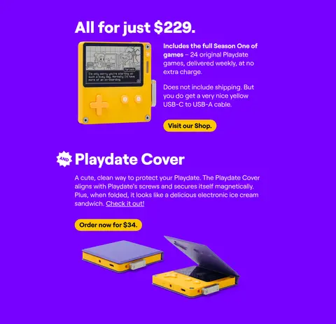
Violet background groups the price, console and cover imagery, white supporting copy, and contrasting yellow purchase buttons.
Specs footer
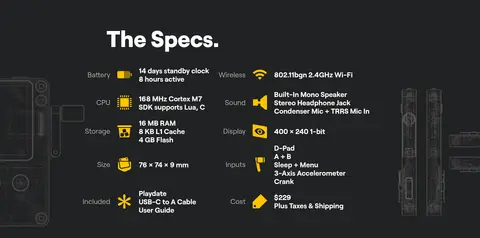
Charcoal technical section organizes hardware labels and values into columns, with white text, yellow icons, and product diagrams.
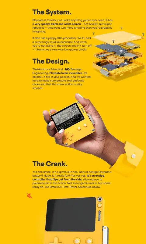
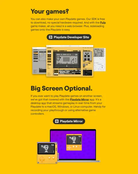
Imagery · The console is the central visual anchor, shown in crisp product photography against a plain slate hero. The page mixes close product views, exploded hardware imagery, in-hand photography, game-screen captures, and developer interface screenshots. Game artwork appears as a grid of small, varied black-and-white thumbnails. Imagery stays tightly cropped and product-focused; illustrations and screens add personality within the system rather than defining its palette.
Use the slate hero to make the yellow console the first focal point.
Give each major content block one strong measured background color.
Use Roobert-like bold typography for short section headings.
Keep supporting copy compact and readable beside relevant imagery.
Use pill-shaped treatments for prominent actions and navigation.
Let game and product imagery provide detail within the simple color system.
✕ 不该做
Do not add unmeasured brand colors or invent hex values.
Do not put every section on a white card.
Do not let decoration overwhelm the console photography.
Do not use dense, uniform grids for all content.
Do not add heavy drop shadows to otherwise flat sections.
Do not turn product artwork colors into the site-wide palette.
给 AI 的提示词
想快速出一个同风格的新页面,把这段话连同 DESIGN.md 一起发给 AI。
Build a new Playdate-style page with color-led storytelling and a clear hardware focal point. Start with a Slate Stage (#788086) hero, white navigation, and prominent yellow product imagery; use Playdate Yellow (#ffc500) for the main product and feature bands. Separate content with Catalog Mist (#efefef), Education Teal (#21c6a9), Electric Violet (#7700ff), and Spec Charcoal (#212223), using these only where the page needs a deliberate section change. Use Roobert or a close sans-serif substitute such as Inter, with heavy, compact headings and regular short-form copy. Favor centered product photography, alternating text and imagery, and concise card grids. Keep buttons pill-shaped, reserve strong shadows for tactile controls, and use Warm Charcoal (#312f27) for restrained outlines and muted text. Do not introduce colors outside the measured palette.