North star · Keep the warm editorial canvas quiet so bold type, real app mockups, and pink actions tell the personal-product story.
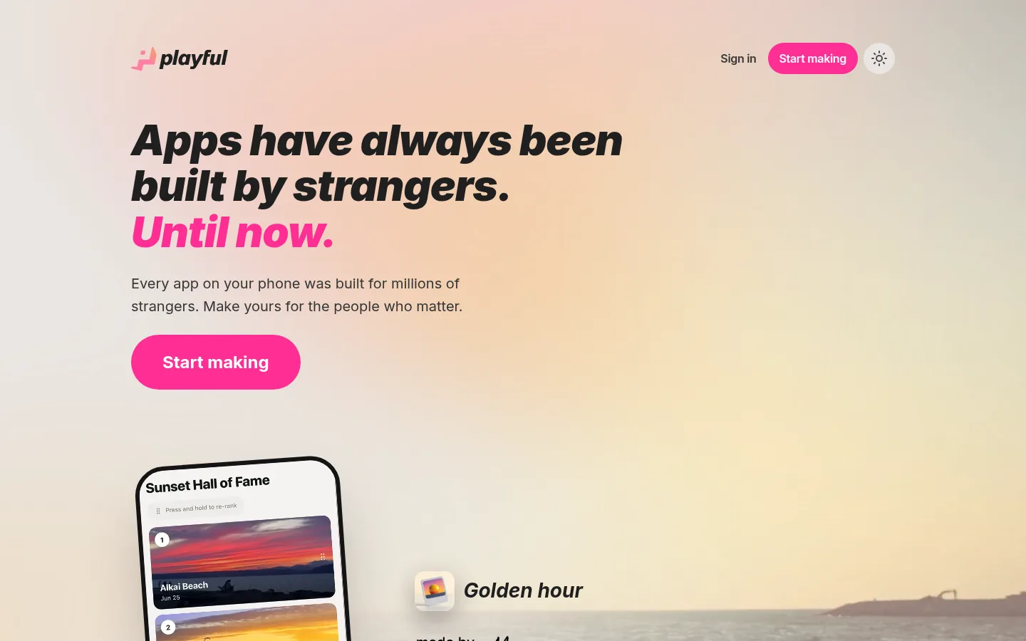
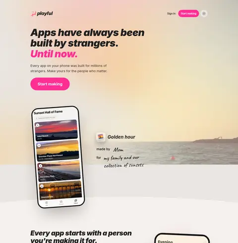
The page builds its identity from a restrained warm-neutral foundation: #f6f1ed carries most content, while #eae5e1 distinguishes the opening band and #141414 anchors the final CTA. Bright #ff2e95 is reserved for primary actions and selective headline emphasis, so it remains a clear focal point. Inter supplies the compact navigation, readable body copy, and very heavy, tight-tracked display headlines; Caveat appears sparingly for handwritten personal notes in the app-story moments. The hero combines a large editorial message with a sunset-and-sea image and a floating phone mockup. Below, product screens and short explanatory blocks alternate across spacious, mostly single-column sections, with thin dividers organizing the FAQ. The page uses generous vertical breathing room and rounded pill buttons, but keeps cards largely flat; device frames, soft shadows, and layered mockups provide depth where product detail needs it. A dark closing band creates a decisive final contrast.
Navigation, body copy, buttons, headings, and most interface text.
Aa 设计
Caveat
网络字体 · 字重 700 / 400 · 占比 4%
免费替代:Kalam
Handwritten-style notes and personal annotations around app examples.
角色
示例
字号
字重
行高
字距
特大标题
Large hero or closing statement headlines.
Playful
60px
900
1.08
-0.02em
一级标题
Primary hero headline with selective pink emphasis.
Playful
52px
900
1.1
-0.02em
二级标题
Major section headings introducing product benefits.
Playful
41.5px
900
1.12
-0.02em
三级标题
Handwritten-style app annotations and personal notes.
Playful
34.5px
700
1.15
0
四级标题
Smaller feature or product-story headings.
The quick brown fox 敏捷的狐狸
25.5px
900
1.5
-0.01em
正文
Explanatory paragraphs and supporting section copy.
The quick brown fox 敏捷的狐狸
16px
400
1.6
0
辅助文字
Small labels and details inside product examples.
The quick brown fox 敏捷的狐狸
14px
400
normal
0
按钮
Primary Start making and closing CTA labels.
The quick brown fox 敏捷的狐狸
20px
700
normal
0
导航
Header sign-in and primary navigation actions.
The quick brown fox 敏捷的狐狸
16px
600
normal
-0.02em
链接
Inline links, support, and policy text.
The quick brown fox 敏捷的狐狸
16px
400
1.6
0
间距与布局
基准单位 4px · 密度:适中
80px版块间距
8px元素间距
—卡片内边距
1072px内容最大宽度
4px
6px
7px
8px
10px
11px
12px
16px
20px
24px
26px
28px
32px
33px
40px
56px
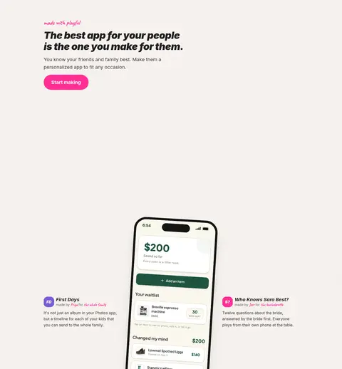
The measured content max width is 1072px, with a comfortable, spacious rhythm and a measured 80px section gap. The page opens with a wide, image-led hero, then moves through mostly single-column story bands, a two-column product example, a four-part sharing section, and a single-column FAQ. Headings align to the start of their content blocks; the closing CTA centers its content. The large vertical gaps give the mockups room to read without crowding the copy.
圆角与层次
按钮 · 9999px
卡片 · 9999px
导航 · 9999px
链接 · 9999px
xl · card
xl · card
xl · card
xl · card
Most content sits flat on the canvas, with thin #ded9d5 dividers structuring FAQ rows and occasional outlined surfaces. Depth is concentrated in the product imagery: phone frames, layered cards, and soft, broad shadows lift mockups from the background. Avoid adding shadows to every content block; retain the contrast of the dark final band.
组件
下面的预览按实测的按钮、输入框、徽标、卡片样式重建(字体用替代字体)。
Header navigation
Compact brand mark at left; sign-in text, pill-shaped pink Start making action, and a small theme control at right.
Primary CTA
Bright #ff2e95 pill button with white Inter label; repeated across the hero, feature stories, and closing band.
Hero story
Large heavy italic headline with a pink final line, short supporting copy, and an atmospheric sunset image behind a phone mockup.
Phone mockup
Dark, rounded device frame containing a realistic personal mini-app screen; use gentle shadow and overlap with surrounding content.
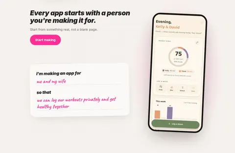
Feature story
Short bold heading and concise explanatory copy paired with a product screenshot or handwritten app-use example.
FAQ list
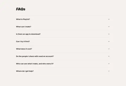
Single-column questions with fine #ded9d5 hairlines, small right-aligned chevrons, and compact text.
Closing CTA and footer
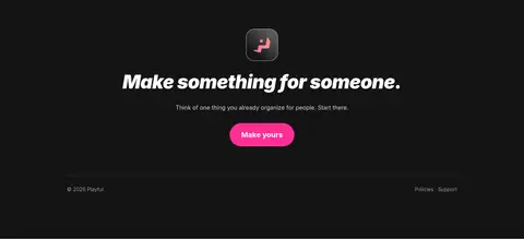
Centered white headline and pink action on a #141414 band, followed by understated policy and support links.
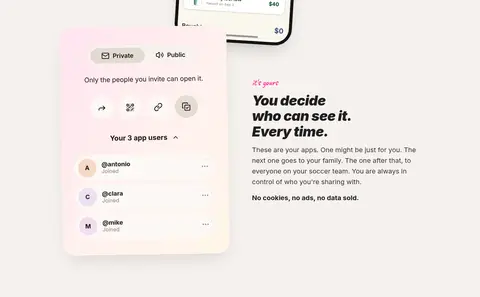
Imagery · The opening uses a wide sunset-and-sea scene as atmospheric photography, with a phone interface overlapping its lower edge. Further down, framed phone screens show personal mini-app examples, supported by small interface cards and handwritten annotations. Treat app screens as product evidence: preserve readable device framing, soft shadows, and clean screen surfaces. Keep decorative gradients subtle and avoid letting mockup colors redefine the warm neutral brand palette.
Reserve #ff2e95 for primary actions and selective emphasis.
Set display headlines in heavy, tightly tracked Inter.
Use Caveat only for personal handwritten annotations.
Let phone mockups overlap spacious editorial sections.
Use thin neutral dividers to organize FAQ rows.
✕ 不该做
Do not make pink the general page background.
Do not crowd the hero with extra cards or controls.
Do not apply handwritten type to navigation or body copy.
Do not turn every section into a raised card.
Do not treat mockup gradient colors as core brand colors.
Do not use dense grids that compete with the product screens.
给 AI 的提示词
想快速出一个同风格的新页面,把这段话连同 DESIGN.md 一起发给 AI。
Build a new Playful-style SaaS page with a warm editorial feel. Use Soft Parchment (#f6f1ed) as the main canvas, Oat Section (#eae5e1) for a restrained band, Warm Charcoal (#353535) for navigation and copy, and Headline Ink (#1f1f1f) for strong headings. Make Playful Pink (#ff2e95) the clear primary CTA color with white labels. Use Inter for interface and headline typography, with heavy, tightly tracked display text; reserve Caveat for occasional handwritten annotations. Organize content in spacious story-led sections with realistic rounded phone mockups, subtle dividers, and soft shadows concentrated on product imagery. Finish with a centered CTA on Night Frame (#141414). Keep decorative pink and lilac gradients secondary to the real product screens.