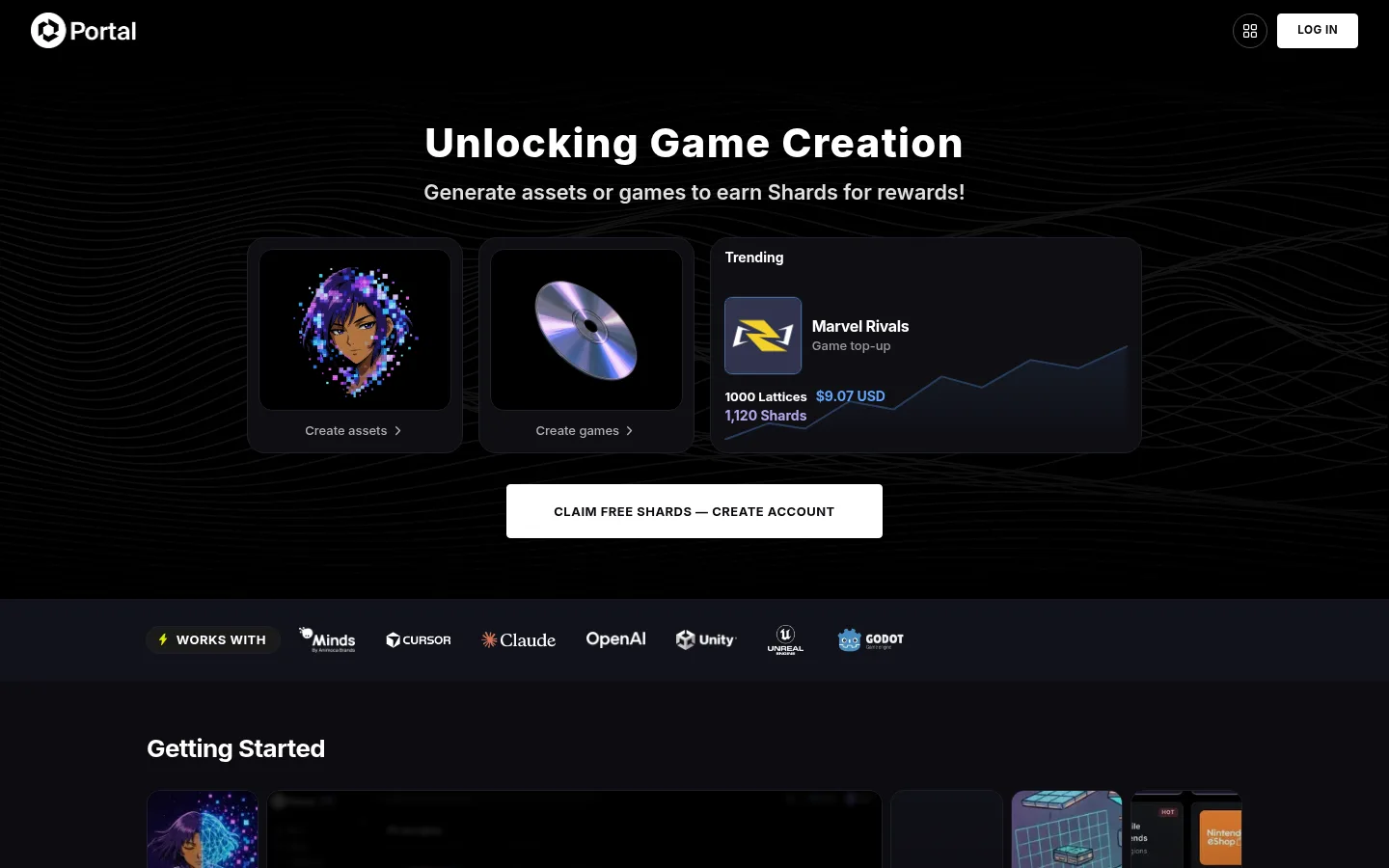
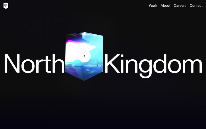
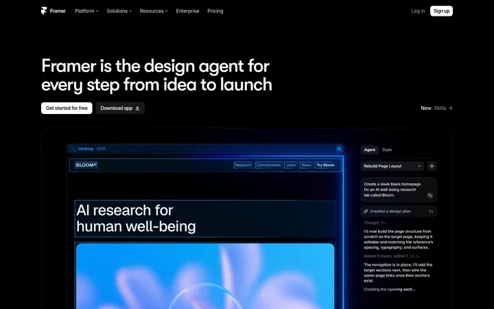
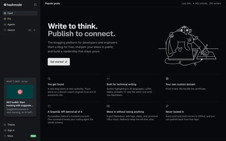
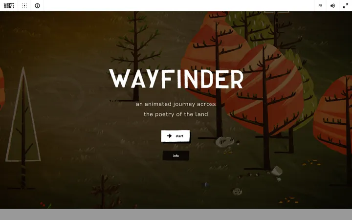
North star · Keep the interface almost black and structurally quiet so white actions and vivid game media carry the attention.
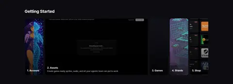
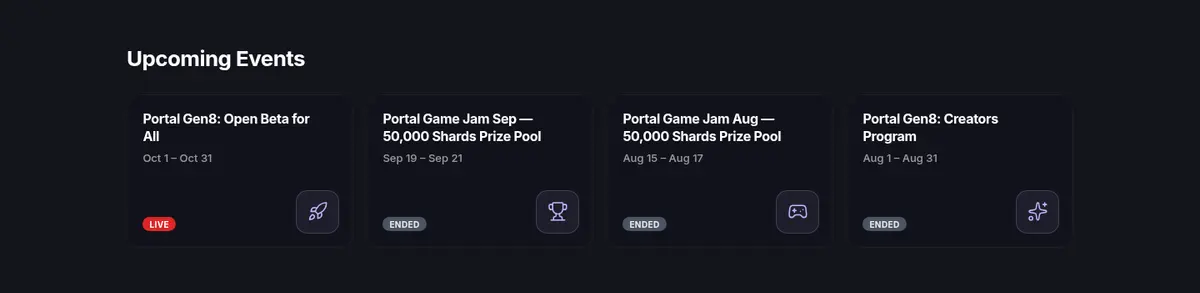
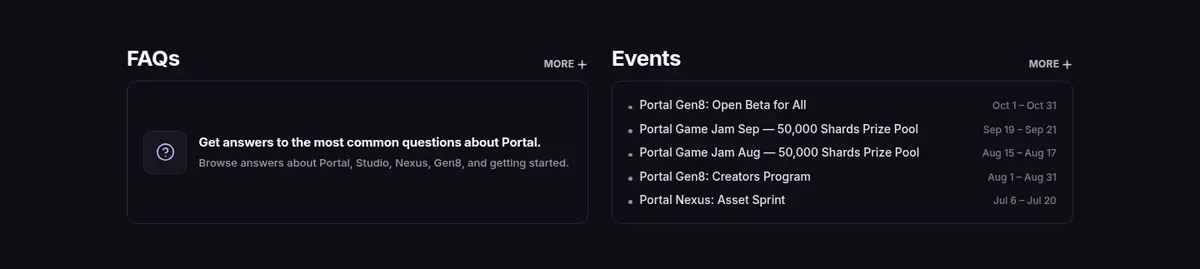
The page is built around a near-black canvas, with subtle charcoal section bands separating the hero, onboarding content, events, and FAQs. White headings and controls provide the strongest contrast; muted grays carry secondary copy, while pale lavender appears sparingly in links and selected interface details. Inter supplies a consistent geometric sans-serif voice, with heavy, tightly tracked display headings and compact uppercase button labels. The hero centers its headline above a row of dark, rounded media cards and a prominent white account CTA. Below it, the layout shifts into left-aligned, modular content: a partner logo strip, a broad Getting Started showcase, four event cards, then a two-column FAQ and events area. Game artwork, promotional thumbnails, and embedded media introduce saturated color inside otherwise subdued frames. Fine borders and modest radii define panels; the overall effect stays flat and controlled rather than glossy.
All interface typography, from hero headings and navigation to cards, buttons, and footer copy.
角色
示例
字号
字重
行高
字距
一级标题
Hero headline announcing the game-creation proposition.
Portal
42px
800
1
0.031em
二级标题
Section titles such as Getting Started and Upcoming Events.
The quick brown fox 敏捷的狐狸
26px
700
1.2
-0.02em
三级标题
Card or subsection headings within content modules.
The quick brown fox 敏捷的狐狸
21.5px
600
1.35
0
正文
Emphasized explanatory copy and primary card descriptions.
The quick brown fox 敏捷的狐狸
16px
700
1.3
-0.02em
辅助文字
Compact metadata, event dates, and secondary labels.
The quick brown fox 敏捷的狐狸
14px
500
1.4
0
按钮
Uppercase labels on primary and account actions.
The quick brown fox 敏捷的狐狸
13px
700
1
0.04em
导航
Header links and footer navigation items.
The quick brown fox 敏捷的狐狸
14px
600
1.43
0
链接
Inline and card-based links to tools and resources.
The quick brown fox 敏捷的狐狸
16px
400
1.5
0
眉题
Small uppercase labels used to introduce interface content.
The quick brown fox 敏捷的狐狸
13px
700
1
0.04em
间距与布局
基准单位 2px · 密度:适中
54px版块间距
3px元素间距
19px卡片内边距
1136px内容最大宽度
2px
3px
4px
6px
7px
8px
9px
10px
11px
12px
14px
16px
18px
19px
20px
27px
Use a centered content frame capped at the measured 1136px maximum, with the hero centered and subsequent section headings aligned left. The page moves from a full-width cinematic hero into a slim partner strip, then broad media-led onboarding, a four-column event row, and a two-column FAQ/events band. Section backgrounds alternate between black and subtly lighter charcoal rather than using strong color blocks. Keep spacing comfortable and content modular, with the measured 54px section gap as the rhythm reference.
圆角与层次
按钮 · 8px
卡片 · 14px
图片 · 8px
徽标 · 9999px
链接 · 14px
hairline · media
md · button
hairline · other
The interface is mostly flat, relying on charcoal surface shifts and fine borders instead of strong shadows. Cards use measured dark outlines and rounded corners; the primary CTA has a restrained shadow for separation. Media may receive a subtle hairline edge. Use overlap and gradients only to layer hero imagery without making the page feel glossy.
组件
下面的预览按实测的按钮、输入框、徽标、卡片样式重建(字体用替代字体)。
Header
Minimal black top bar with Portal identity, a compact app-grid control, and a white uppercase LOG IN button.
Hero CTA
Centered white account button with uppercase Inter label, dark text, rounded corners, and a soft measured shadow.
Creation previews
Dark rounded media cards for asset and game creation, paired with short captions and vivid preview artwork.
Partner strip
Narrow charcoal band carrying a horizontally aligned row of partner and tool logos.
Event cards
Four compact event links on a dark section, with title, date, small icon tile, and rounded LIVE or ENDED badge.
FAQ panel
Dark FAQ preview card with a subtle #2a2a38 border, concise explanatory copy, and a supporting icon.
Footer
Black two-column footer with Portal identity, subdued utility links, social icons, and copyright text.
Imagery · Use vivid game art, tool previews, and promotional media as focal points inside dark rounded frames. The hero combines small creation previews with a wider trending panel, while onboarding uses a large media showcase and narrow step cards. Preserve the page’s restrained treatment around imagery: black surroundings, soft dark overlays, and gradients that fade media into the canvas. Logos remain compact and monochrome where possible; saturated color belongs mainly to artwork and event icons.
Separate content with subtle charcoal section bands.
Reserve bright white for headings and primary actions.
Keep lavender accents sparse and functional.
Frame colorful game media inside dark panels.
Use Inter consistently across interface elements.
✕ 不该做
Do not turn the interface into a bright, colorful dashboard.
Do not use vivid accents as large background fields.
Do not compete with artwork using decorative gradients.
Do not add heavy shadows to every card.
Do not center all lower-page content; align sections left.
Do not make secondary copy as bright as primary headings.
给 AI 的提示词
想快速出一个同风格的新页面,把这段话连同 DESIGN.md 一起发给 AI。
Build a new Portal-style page with a cinematic, nearly black canvas. Use Void Black (#000000) for the main background, Coal Panel (#0c0c10) and Midnight Slate (#12121a) for alternating content surfaces, and Panel Edge (#1e1e2a) for restrained outlines. Set all text in Inter; use bold white headings, muted gray supporting copy, and uppercase button labels. Keep the hero centered with a clear headline, media previews, and a prominent white CTA. Organize lower content into left-aligned modular sections, with compact cards and generous separation. Use vivid artwork only inside dark media frames; apply lavender accents sparingly. Favor subtle borders and modest corner rounding over pronounced shadows, and preserve a clear hierarchy between actions, headings, and secondary information.