North star · Keep the interface calm and editorial, letting expressive product artwork carry the color and personality.
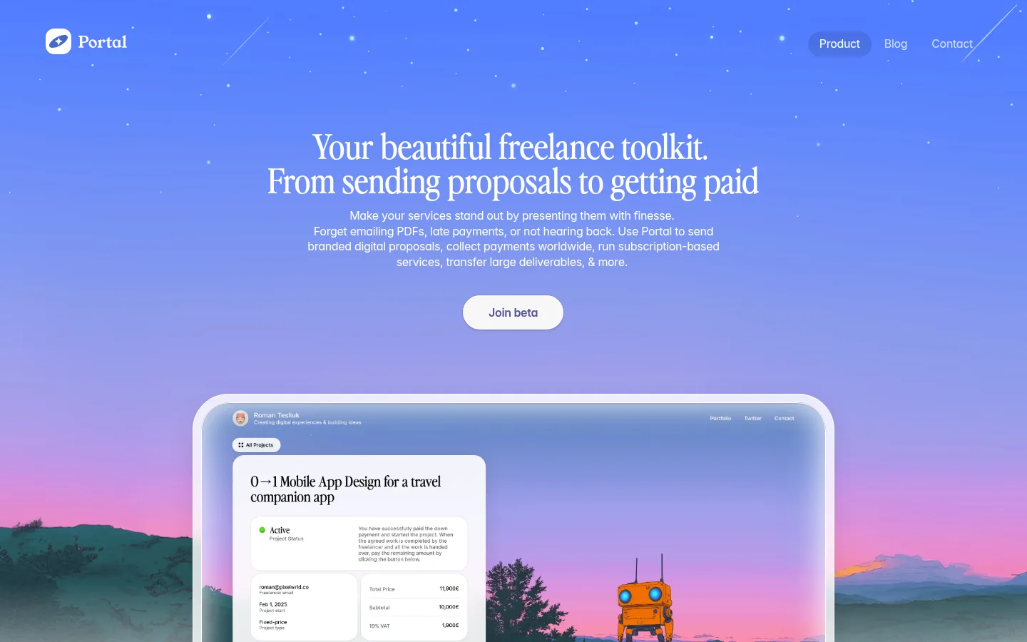
The page uses a soft off-white canvas (#f7f7f7) throughout, creating a quiet backdrop for black headings, muted charcoal copy, and compact interface details. The first screen makes the strongest visual statement: a blue-to-lilac twilight scene with stars, a pink horizon, and a large framed product preview. Treat that gradient as hero artwork rather than a site-wide interface colour; the measured interface palette remains restrained. Perfectly Nineties Regular gives headings a literary, editorial character, while Inter handles navigation, body copy, and utility text. A narrow centered content column alternates with two-column feature explanations, small interface mockups, and generous gaps between sections. Rounded cards and screens provide soft framing without turning the page into a dense dashboard. Bright blue is reserved for beta actions and small functional highlights, while vivid colors inside mockups and illustrations remain supporting product imagery.
Editorial headings introducing major feature and content sections.
Portal
36px
400
1
0
正文
Explanatory paragraphs and supporting descriptions.
The quick brown fox 敏捷的狐狸
16px
400
1.35
-0.02em
辅助文字
Compact labels and secondary interface details.
The quick brown fox 敏捷的狐狸
12px
400
1.3
-0.02em
导航
Header navigation links.
The quick brown fox 敏捷的狐狸
16px
400
1.35
-0.02em
链接
Inline and footer links.
The quick brown fox 敏捷的狐狸
16px
400
1.35
-0.02em
间距与布局
基准单位 2px · 密度:适中
80px版块间距
10px元素间距
20px卡片内边距
600px内容最大宽度
2px
4px
6px
8px
10px
12px
14px
16px
20px
24px
36px
40px
60px
80px
A narrow centered content column organizes most sections, with measured page maximum width of 600px and comfortable density. The hero centers its headline, copy, and CTA above a large framed product preview. Below, editorial sections are left-aligned; feature groups alternate between two-column text and image arrangements, while some content remains a single column. Section rhythm is spacious, with a measured section gap of 80px and 20px card padding. The consistent light canvas makes changes in composition and imagery—not section background bands—the primary way to distinguish blocks.
圆角与层次
按钮 · 9999px
卡片 · 24px
图片 · 22px
导航 · 9999px
链接 · 7px
hairline · card
inset · other
inset · other
hairline · card
The page is mostly flat, relying on whitespace and composition rather than borders or heavy shadows. Rounded white cards and framed media create gentle separation; measured card corners are 24px. Use subtle inset highlights and faint shadowing on selected mockups, not as a repeated dashboard treatment.
组件
下面的预览按实测的按钮、输入框、徽标、卡片样式重建(字体用替代字体)。
Top navigation
Small brand mark at left and compact Product, Blog, and Contact links at right, over the hero artwork.
Hero CTA
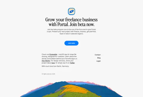
A centered pill-shaped Join beta action; the measured accent is #007aff, with a subtle inset highlight.
Framed product preview
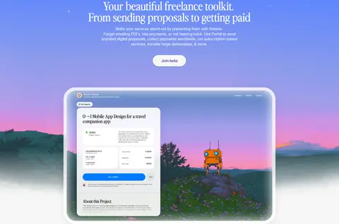
Large rounded media frame containing a digital project portal, set against the illustrated sunset landscape.
Feature rows
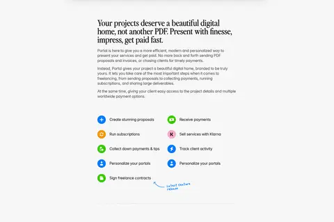
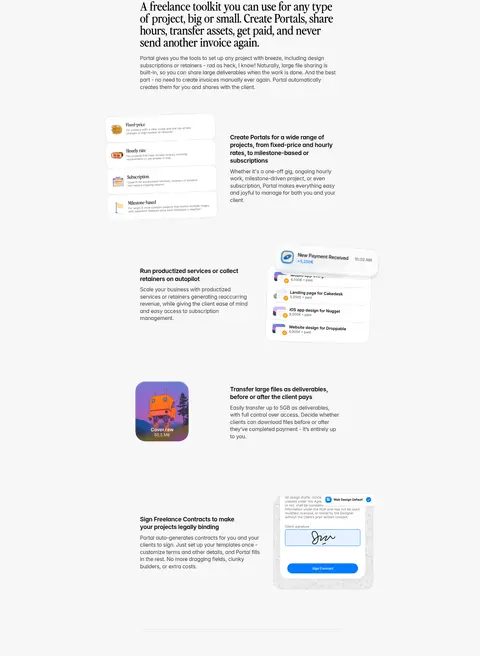
Alternating two-column text and product mockups explain proposals, subscriptions, payments, file transfer, and contracts.
How-it-works list
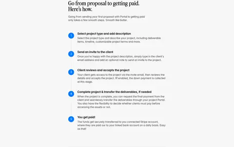
Five sequential steps use blue numbered markers and concise descriptions to explain the path from project setup to payment.
Pricing note
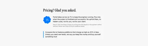
A compact editorial pricing section pairs a small blue percentage graphic with short explanatory copy.
Founder memo
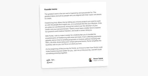
A white rounded letter-like card uses long-form text and a founder signature and portrait detail.
Closing beta CTA
Centered closing headline and copy, product mark, and a blue pill action above the footer.
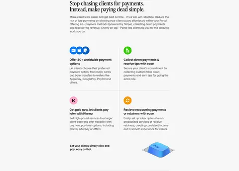
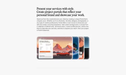
Imagery · The hero uses a cinematic illustrated landscape with a starry blue-lilac sky, pink sunset, and a product portal framed over the scene. Further down, small product UI previews, payment cards, service examples, and a layered portfolio showcase demonstrate the toolkit. The imagery mixes interface mockups with colorful illustration; keep vivid mockup colors contained within media rather than spreading them across the page chrome.
Reserve the serif display face for prominent headings.
Keep body text in Inter with clear visual hierarchy.
Center the hero and final beta invitation.
Alternate editorial copy with relevant product previews.
Let colorful artwork stay inside media frames.
Use rounded cards and soft, restrained elevation.
✕ 不该做
Do not turn the whole interface into a blue gradient.
Do not use vivid mockup colors as general UI colors.
Do not make every section a card.
Do not compress the generous section rhythm.
Do not use the display serif for dense paragraphs.
Do not add heavy borders or deep shadows.
Do not center-align every lower-page feature.
给 AI 的提示词
想快速出一个同风格的新页面,把这段话连同 DESIGN.md 一起发给 AI。
Build a new Portal-style page as a calm editorial canvas, not a conventional SaaS dashboard. Use Quiet Canvas (#f7f7f7) as the continuous background, Ink (#000000) for prominent text, and Soft Graphite (#3e3e3e) for supporting copy. Use a literary serif display face for section headlines and Inter for navigation, body, and utility text. Keep the content in a narrow centered column, with generous vertical separation and selected two-column feature rows. Use Gallery White (#ffffff) for product panels and Portal Blue (#007aff) sparingly for primary actions and functional accents. Place colorful illustrations and interface mockups inside rounded media frames; let imagery carry the visual drama. Keep elevation subtle, prioritize whitespace, and vary alignment by section rather than adding colored bands.