North star · Let the illustrated landscape dominate, and make the centered start invitation the clearest point of focus.
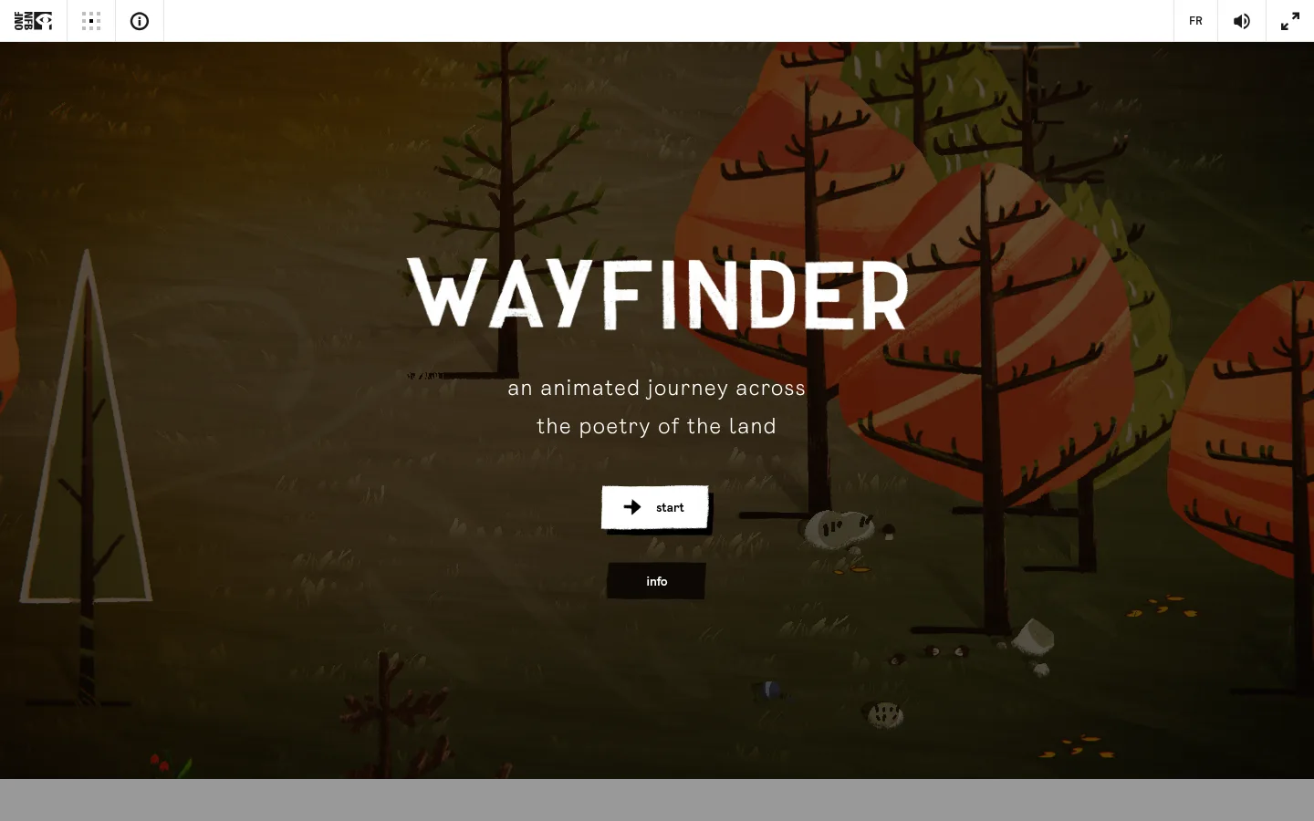
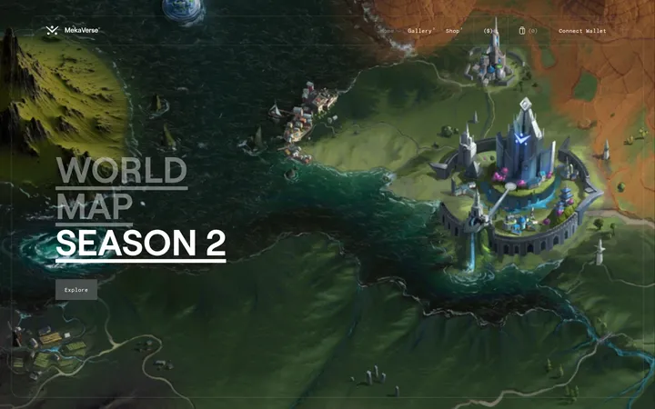
The page is built around an immersive, full-bleed illustrated landscape rather than a conventional content grid. The measured canvas is near-black brown (#0b0502), while a slightly warmer dark brown (#130904) underpins the main section; the screenshot’s olive ground and rust-red trees belong to the scene artwork, not the core interface palette. A narrow white navigation strip sits above the artwork, with compact black utility icons and fine pale dividers. In the hero, a large uppercase white wordmark anchors the center, followed by two short lines of softly lit supporting copy and a small white start button. A dark secondary info button recedes beneath it. Typography mixes airy, widely tracked Enreal display text with compact Ciutadella-Medium navigation. Generous open landscape around the centered copy preserves the cinematic composition, while the restrained controls make the page feel like a calm threshold into an interactive story.
配色
点色块复制色值。用途说明来自对页面的实测位置(背景、文字、描边、按钮)与截图判读。
表层色
中性色
功能色
页面底色 · Night Soil表层 · Warm Umber表层 2 · Paper Light主文字 · Paper Light次要文字 · Charcoal Ink弱文字 · Pure Ink描边 · Soft Divider
文字
背景
对比度
WCAG
#ffffff Paper Light
#0b0502 Night Soil
20.25:1
AAA
#ffffff Paper Light
#130904 Warm Umber
19.65:1
AAA
#1a1a1a Charcoal Ink
#0b0502 Night Soil
1.16:1
不达标
#1a1a1a Charcoal Ink
#130904 Warm Umber
1.13:1
不达标
#1a1a1a Charcoal Ink
#ffffff Paper Light
17.4:1
AAA
#000000 Pure Ink
#0b0502 Night Soil
1.04:1
不达标
字体
字号阶梯:Custom(比例约 1.714,正文 14px)。示例用免费替代字体渲染,数值为实测。
Aa 设计
Enreal
网络字体 · 字重 300 / 700 · 占比 67%
免费替代:Inter
Hero wordmark and primary page text.
Aa 设计
Ciutadella-Medium
网络字体 · 字重 300 · 占比 33%
免费替代:Montserrat
Compact navigation labels and utility-bar text.
角色
示例
字号
字重
行高
字距
一级标题
Hero wordmark, centered above the short journey description.
The quick brown fox 敏捷的狐狸
24px
300
1.75
0.042em
正文
Supporting hero copy and compact explanatory text.
The quick brown fox 敏捷的狐狸
14px
700
normal
0
导航
Top utility controls and language label.
The quick brown fox 敏捷的狐狸
14px
300
1
0
间距与布局
基准单位 8px · 密度:适中
—版块间距
4px元素间距
—卡片内边距
—内容最大宽度
4px
8px
10px
16px
20px
30px
40px
A thin, full-width utility bar spans the top, followed by one full-bleed hero scene. The hero content is centered horizontally and grouped in a narrow stack: wordmark, two-line description, primary start control, then secondary info control. Keep the landscape open around this stack and avoid adding conventional cards or columns. Measurements report a comfortable density and an 8-pixel base spacing unit; no page max-width or section-gap value is measured, so preserve proportions visually rather than imposing one.
圆角与层次
没有测到阴影:页面是扁平的,层次靠底色和描边区分。
The interface is mostly flat, with no measured shadows or radius scale. Separate the white utility strip from the illustration using fine pale hairlines. The start control is a compact white rectangle with dark lettering and a strong dark offset visible in the screenshot; the info control is a simple dark rectangle that blends into the scene.
组件
下面的预览按实测的按钮、输入框、徽标、卡片样式重建(字体用替代字体)。
Utility bar
White, full-width strip above the hero; compact black icons and language control sit in separated cells with fine pale dividers.
Hero wordmark
Large centered uppercase white title over the landscape, visually dominant and widely spaced.
Journey introduction
Two centered lines of light-colored supporting copy beneath the title, with restrained scale and generous breathing room.
Start button
Small white rectangular primary control with dark arrow and label; preserve its sharp corners and high contrast.
Info button
Compact dark rectangular secondary control beneath the primary action, with a short light label.
Landscape backdrop
Full-bleed illustrated environment that fills the hero and carries the page’s warm, natural visual character.
Imagery · Use a full-bleed, hand-painted animated landscape as the defining visual: a dusky olive field, sparse dark trees, and stylized rust and green foliage. Frame it as a wide cinematic environment, with the central area dark and legible behind the title and controls. These scene colors are artwork, not additions to the measured interface palette.
Keep the landscape full-bleed and visually dominant.
Center the hero copy and actions over a legible part of the scene.
Use white type for the main title and primary invitation.
Reserve the measured white strip for compact utility navigation.
Keep primary and secondary actions rectangular and simple.
Treat illustration colors as scene art rather than UI tokens.
✕ 不该做
Do not add card grids to the single-scene hero.
Do not place busy artwork directly behind small text.
Do not introduce gradients or shadows as unmeasured brand effects.
Do not round the measured sharp-cornered controls.
Do not let utility navigation compete with the title.
Do not promote illustration hues into interface accents.
给 AI 的提示词
想快速出一个同风格的新页面,把这段话连同 DESIGN.md 一起发给 AI。
Build a new landing page in Wayfinder’s immersive illustrated style. Use a full-bleed, hand-painted landscape as the main canvas, framed by Night Soil (#0b0502) and Warm Umber (#130904). Keep the utility navigation as a narrow white strip with compact dark controls and Soft Divider (#e3e3e2) hairlines. Center the hero title and short supporting copy over a quiet area of the illustration; use Paper Light (#ffffff) for the title and primary copy. Make the primary action a small, sharp-cornered white rectangle with dark text, and let a darker secondary action recede below it. Use Enreal-like display typography with open tracking and a clean geometric sans for navigation. Preserve generous negative space; avoid cards, decorative gradients, and unnecessary interface chrome.