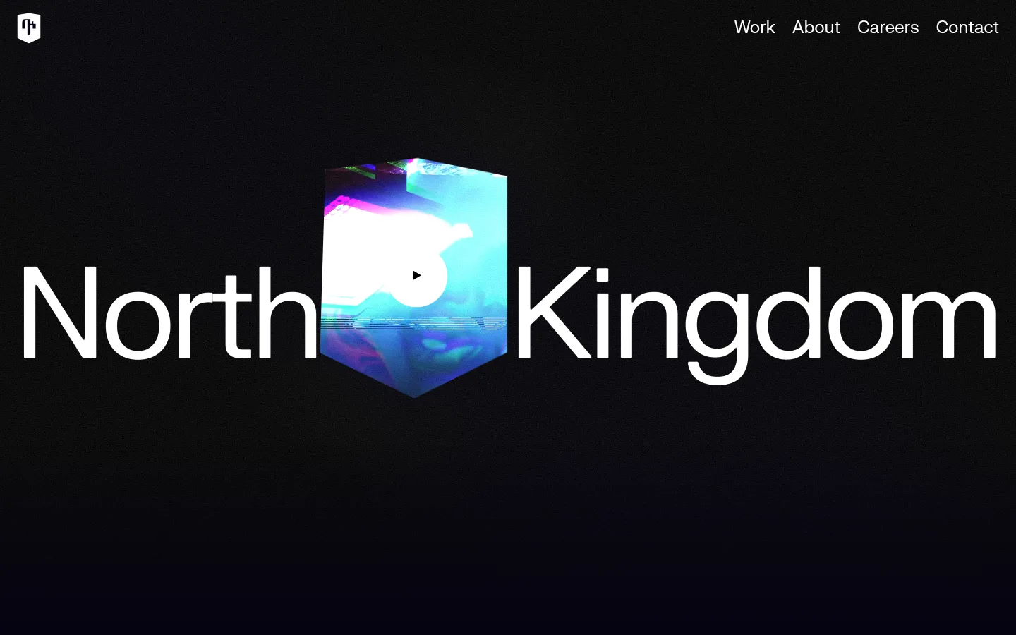
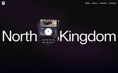
North Kingdom 首页以近黑色背景搭配超大白色字体和沉浸式动态主视觉。界面克制简洁,让专注游戏领域的创意作品成为焦点。
North star · Keep the interface nearly black and typographically bold, letting immersive project media provide the color and motion.
The visual strategy starts with an almost-black canvas, measured as #050311, that occupies nearly the entire page and lets full-bleed media carry the atmosphere. White is reserved for high-contrast navigation and the enormous North Kingdom wordmark; muted gray appears sparingly in footer text. The first screen is intentionally spare: a compact mark at the upper left and a right-aligned navigation row frame a centered typographic statement, interrupted by a vivid video tile. That tile’s cyan, magenta and blue tones belong to the featured media, not the core brand palette. Typography uses a single regular sans-serif family, with slightly tight tracking and a clean, unembellished character. Large open areas create a cinematic pause around the logo and moving imagery. The result feels immersive without relying on decorative UI: the dark field, crisp type and changing media do the expressive work.
配色
点色块复制色值。用途说明来自对页面的实测位置(背景、文字、描边、按钮)与截图判读。
品牌色
中性色
页面底色 · Midnight Canvas主文字 · Studio White次要文字 · Quiet Gray
Navigation and body copy, with the same sans-serif voice supporting the page’s oversized wordmark.
角色
示例
字号
字重
行高
字距
正文
Agency introduction and supporting page copy.
The quick brown fox 敏捷的狐狸
24.5px
400
1.15
-0.01em
导航
Top-level links: Work, About, Careers and Contact.
The quick brown fox 敏捷的狐狸
24.5px
400
1.15
-0.01em
间距与布局
基准单位 4px · 密度:宽松
160px版块间距
—元素间距
—卡片内边距
1400px内容最大宽度
1px
6px
20px
24px
52px
160px
Use a spacious, full-bleed composition rather than enclosing the page in cards. The measured page maximum width is 1400px, with a seven-column structure and a 160px section gap in the spacing system. At the opening viewport, place the compact brand mark at the upper left and navigation at the upper right, then center the hero identity across the canvas. Keep alignment crisp and the density low; large areas of dark negative space are an intentional part of the layout.
圆角与层次
按钮 · 50%
图片 · 8px
没有测到阴影:页面是扁平的,层次靠底色和描边区分。
The interface reads as flat: the measured system has no shadows, gradients or border color. Keep navigation and typography directly on the dark canvas rather than placing them in raised panels. Layer the hero media visually over the wordmark, but avoid adding ornamental borders or card chrome.
组件
下面的预览按实测的按钮、输入框、徽标、卡片样式重建(字体用替代字体)。
Header navigation
Compact brand mark at the upper left; white Work, About, Careers and Contact links align along the upper right.
Hero wordmark
Oversized white North Kingdom lettering spans the central hero and is visually interrupted by project media.
Featured media tile
A prominent video-led visual sits over the wordmark, with a simple play affordance and vivid colors confined to its content.
Back link
A plain white text link with an upward arrow; keep it flat and consistent with the site’s typographic navigation.
Footer text
Use muted gray for secondary footer copy, preserving the contrast hierarchy of white primary text on the dark canvas.
Imagery · Use full-bleed video or rich project media as the page’s expressive counterpoint to the quiet interface. In the hero, a vivid rectangular moving image interrupts the oversized wordmark. Cyan, magenta and blue appear within that media and should not be promoted to core interface colors. Favor immersive, high-contrast framing over decorative illustration.
Set primary navigation and hero lettering in white.
Keep the header visually light and direct.
Give the hero wordmark substantial room to span the composition.
Let project media supply vivid color and movement.
Preserve generous dark negative space.
✕ 不该做
Do not turn media colors into interface accents.
Do not add card-heavy layouts or decorative borders.
Do not use shadows to manufacture depth.
Do not crowd the hero with supporting copy.
Do not introduce multiple competing typefaces.
Do not use muted gray for primary navigation.
给 AI 的提示词
想快速出一个同风格的新页面,把这段话连同 DESIGN.md 一起发给 AI。
Build a new North Kingdom-style page as a cinematic, dark creative-agency experience. Use Midnight Canvas (#050311) for the dominant background and Studio White (#ffffff) for primary text and navigation; reserve Quiet Gray (#9b9aa0) for secondary footer copy. Use a clean regular sans-serif similar to FKGroteskNeue-Regular, with subtly tight tracking and no decorative treatments. Keep the header compact, with the brand mark left and navigation right. Make the main content spacious and typographically bold, pairing oversized identity text with full-bleed project video or imagery. Let colors inside that media remain content-specific, not UI accents. Keep surfaces flat, avoid shadows and card chrome, and preserve large areas of negative space so the work supplies the energy.