North star · Keep the interface warm, quiet, and editorial; let the scale and detail of grid imagery provide the visual drama.
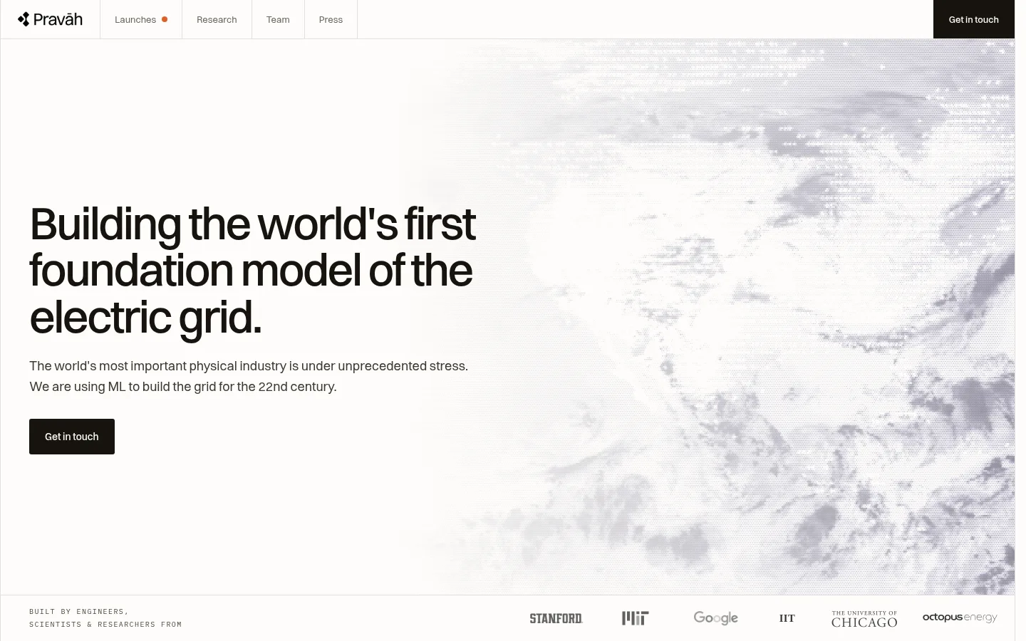
The page is built on a warm near-white canvas (#fdfcf9), with near-black text (#17140f) carrying the main headline and primary contact button. Muted gray-brown copy keeps supporting information readable without competing for attention; thin pale borders divide the navigation and content bands. Switzer provides a contemporary sans-serif voice, using large, tightly tracked headline styles against relaxed body copy. The opening hero aligns a concise text block on the left with a pale, expansive grid image on the right, creating contrast through composition rather than saturated color. Below, research and product sections alternate text with maps, charts, and interface imagery; soft lilac and stone surfaces distinguish selected content cards. Green tones appear mainly in data graphics and gradient details, not as a dominant interface color. Spacing feels open and deliberate, with restrained controls and clear section separation supporting an editorial, engineering-focused presentation.
Display and interface type throughout, from hero headlines to navigation and buttons.
Aa 设计
IBM Plex Mono
网络字体 · 字重 400 · 占比 7%
免费替代:IBM Plex Mono
Compact technical labels, captions, and code-like details.
Aa 设计
JetBrains Mono
网络字体 · 字重 400 · 占比 2%
免费替代:IBM Plex Mono
Minor monospace details in technical and data-oriented content.
角色
示例
字号
字重
行高
字距
特大标题
Large editorial display headings for prominent page statements.
Pravāh
64px
500
1.02
-0.04em
一级标题
Hero headline and primary page-level heading.
Pravāh
52px
500
0.92
-0.04em
二级标题
Section titles introducing research and product areas.
Pravāh
42px
500
1.04
-0.034em
三级标题
Feature and product-card headings.
Pravāh
34px
500
1.12
-0.03em
四级标题
Smaller nested feature headings.
Pravāh
28px
500
1.12
-0.03em
正文
Main explanatory copy and descriptive paragraphs.
The quick brown fox 敏捷的狐狸
15px
400
1.62
0
辅助文字
Compact supporting descriptions and image captions.
The quick brown fox 敏捷的狐狸
14.5px
400
1.4
-0.01em
按钮
Contact and product action labels.
The quick brown fox 敏捷的狐狸
14px
500
1.6
0
链接
Navigation, text links, and understated secondary actions.
The quick brown fox 敏捷的狐狸
13px
400
1.6
0
代码
Technical labels and code-like metadata.
const style = 1;
10.5px
400
1.6
0.12em
间距与布局
基准单位 4px · 密度:适中
48px版块间距
16px元素间距
25px卡片内边距
1359px内容最大宽度
3px
4px
6px
7px
8px
9px
10px
12px
13px
14px
16px
20px
22px
24px
28px
32px
A wide, editorial canvas uses a centered page frame capped at the measured 1359px maximum width. The top navigation spans the page with fine vertical separators, then the hero places a left-aligned text block beside full-bleed grid imagery. Subsequent sections alternate text-and-image layouts and card groupings, with generous section rhythm and comfortable content density. Keep alignment crisp, use open negative space around headings, and let imagery occupy large uninterrupted areas rather than crowding the copy.
圆角与层次
按钮 · 3px
卡片 · 20px
lg · other, card
lg · other
xl · card
xl · card
The interface is mostly flat, with pale hairline borders doing the structural work. Keep navigation and section divisions crisp; reserve soft, deep shadows for layered interface mockups or selected cards shown within imagery. Avoid floating the entire page or applying heavy shadows to ordinary content blocks.
组件
下面的预览按实测的按钮、输入框、徽标、卡片样式重建(字体用替代字体)。
Top navigation
A light horizontal navigation bar with brand mark, restrained text links, fine dividers, and a dark contact action aligned at the far edge.
Hero statement
Large left-aligned Switzer headline, concise supporting copy, and a dark contact button beside atmospheric grid imagery.
Primary action
Near-black (#17140f) button with light text, measured Switzer medium styling, and restrained corner treatment.
Research feature
Alternating text and large visualization panels, using open spacing and limited warm-neutral or lilac surfaces.
Product card
A concise descriptive lead above a large product visual; measured card surfaces include stone (#e8e4dc) and lilac (#cfc7ef).
Technical visual
Charts, maps, and network graphics layered with restrained labels; green tones function as data marks rather than broad interface fills.
Section divider
Use subtle pale-gray hairlines (#e1dfdd) to distinguish navigation and content bands without adding heavy containers.
Imagery · Use expansive, pale-toned imagery of power infrastructure, maps, weather, and network systems. Mix research-style visualizations with product-interface mockups, including charts and map overlays. Keep the hero image atmospheric and softly contrasted so the headline remains dominant; use product graphics as legible evidence, not decoration. Green data marks and lilac or stone panels can appear within visuals and cards without recoloring the overall interface.
Set key headlines in Grid Ink with a tight editorial feel.
Keep supporting copy muted and clearly subordinate.
Use fine dividers to separate content bands.
Let infrastructure imagery carry the visual impact.
Keep green accents mainly within data graphics.
✕ 不该做
Do not introduce bright, saturated interface backgrounds.
Do not make every section a boxed card.
Do not let mockup colors define the site-wide palette.
Do not crowd the hero with extra copy or controls.
Do not use heavy shadows on ordinary page sections.
Do not turn technical labels into prominent display text.
给 AI 的提示词
想快速出一个同风格的新页面,把这段话连同 DESIGN.md 一起发给 AI。
Build a new page in Pravāh’s quiet, engineering-led visual style. Use Gallery White (#fdfcf9) as the main canvas, Grid Ink (#17140f) for headlines and primary actions, Quiet Taupe (#6b665e) for supporting copy, and Soft Divider (#e1dfdd) for fine structural lines. Set typography in Switzer or a close sans-serif substitute, with large tightly tracked headings and relaxed body copy. Create a clear left-aligned text hierarchy and generous breathing room. Pair content with expansive, pale imagery of energy infrastructure, maps, charts, or grid models. Use Stone Surface (#e8e4dc) and Lilac Field (#cfc7ef) selectively for cards; reserve Grid Green (#5f9e82) for data marks and gradients. Keep sections mostly flat, with borders and imagery doing more work than shadows.