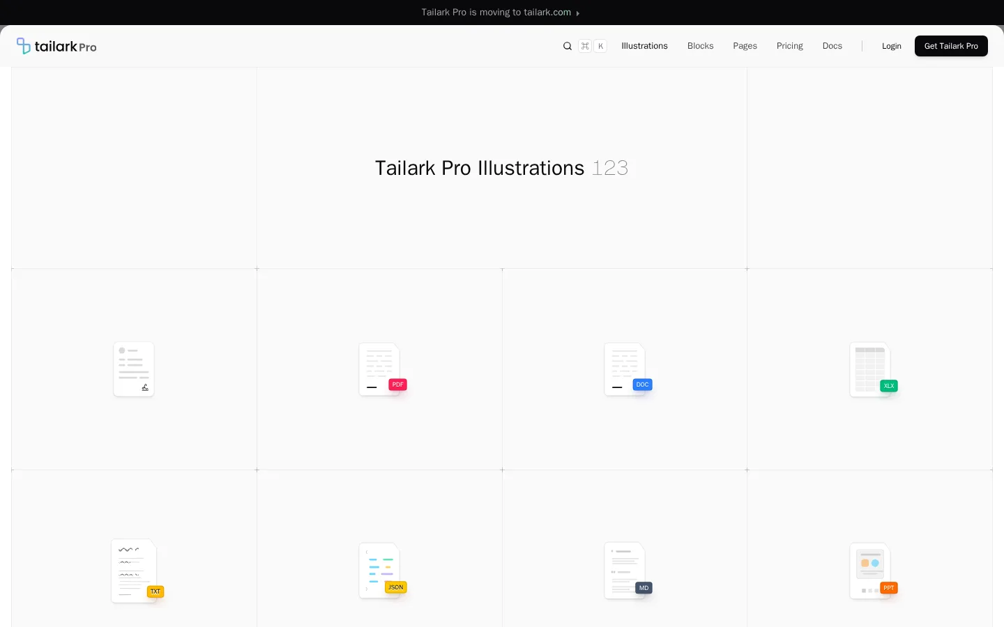
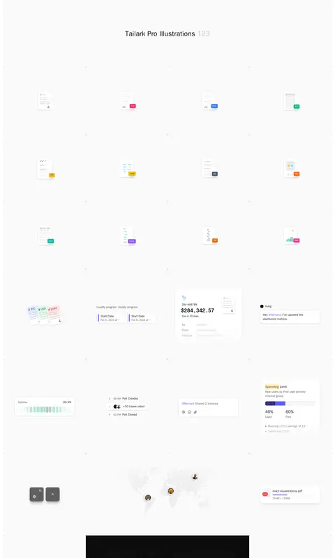
Tailark Pro 以浅色、长页面画廊展示产品与界面插画。细网格线和充足留白让各类小型视觉素材成为焦点。
North star · Keep the page itself nearly colourless and let carefully spaced, individually framed illustrations provide the visual variety.
The page uses a near-white canvas and a disciplined hairline grid to make a very long illustration catalogue feel quiet and navigable. Deep ink anchors the compact navigation, headline, and purchase CTA; pale gray marks the broad content band and separates cells without heavy framing. Most colour is intentionally confined to the illustrations: small file badges, interface accents, charts, and occasional dark media panels. The system sans-serif carries navigation and ordinary interface copy, while Geist Mono introduces a technical note in the heading hierarchy. Typography stays measured rather than expressive, with medium-weight text and no conspicuous tracking or uppercase treatment. A centered title sits above a three-column gallery whose cells vary in content but retain consistent boundaries and alignment. Ample breathing room around each miniature makes the page read as an archive of reusable assets, not a dense dashboard. Cards are largely flat, with subtle outlines and restrained shadows reserved for floating interface mock-ups.
配色
点色块复制色值。用途说明来自对页面的实测位置(背景、文字、描边、按钮)与截图判读。
强调色
表层色
中性色
功能色
页面底色 · Gallery White表层 · Grid Mist表层 2 · Deep Ink主文字 · Deep Ink次要文字 · Slate Copy弱文字 · Quiet Gray描边 · Grid Mist强调 · Signal Indigo强调 2 · Bright Aqua强调 3 · Electric Leaf
Navigation, body copy, labels, buttons, and primary display heading.
Aa 设计
Geist Mono
网络字体 · 字重 400 / 600 / 100 · 占比 2%
免费替代:IBM Plex Mono
Technical secondary headings and code-like text roles.
角色
示例
字号
字重
行高
字距
一级标题
Centered gallery title and top-level page heading.
Tailark Pro
30px
500
1.2
0
二级标题
Technical-style secondary section headings where present.
The quick brown fox 敏捷的狐狸
24px
600
1.33
0
三级标题
Illustration group and feature headings.
The quick brown fox 敏捷的狐狸
20px
500
1.4
0
四级标题
Compact card and interface sample headings.
The quick brown fox 敏捷的狐狸
18px
600
1.56
0
正文
Supporting copy and labels within mock-up illustrations.
The quick brown fox 敏捷的狐狸
14px
500
1.43
0
辅助文字
Small metadata and secondary asset labels.
The quick brown fox 敏捷的狐狸
12px
400
1.33
0
按钮
Compact purchase and interface action labels.
The quick brown fox 敏捷的狐狸
12px
500
1.33
0
导航
Header navigation links and active page label.
The quick brown fox 敏捷的狐狸
13px
500
1.5
0
链接
Inline links and linked interface text.
The quick brown fox 敏捷的狐狸
14px
500
1.43
0
代码
Monospaced technical labels or code-like sample content.
const style = 1;
24px
600
1.33
0
间距与布局
基准单位 4px · 密度:适中
48px版块间距
8px元素间距
40px卡片内边距
703px内容最大宽度
2px
4px
6px
8px
10px
12px
16px
20px
24px
32px
48px
A compact navigation bar sits above a long, single content band. The gallery begins with a wide centered title area, then resolves into a measured three-column grid with fine boundaries and illustration samples centered within cells. The measured content width is 703px, while the screenshot shows the grid spanning much of the viewport; preserve the screenshot's broad, edge-to-edge grid character rather than squeezing every cell into a narrow text column. Cells have generous internal breathing room and a comfortable, repeated rhythm, with varied mock-up sizes balanced by consistent alignment.
圆角与层次
按钮 · 6px
卡片 · 16px
图片 · 50%
徽标 · 4px
导航 · 6px
hairline · button
hairline · button
md · other, card
sm · other
The gallery is mostly flat: fine gray grid lines define the structure, while mock-ups may use discreet outlines or light shadows to read as floating UI. Avoid heavy card shadows or layered page panels. Reserve stronger depth for details inside the illustrations, not the surrounding layout.
组件
下面的预览按实测的按钮、输入框、徽标、卡片样式重建(字体用替代字体)。
Top navigation
Light header with Tailark Pro identity, compact navigation links, command-menu affordance, and a deep-ink “Get Tailark Pro” CTA.
Gallery title cell
Wide, open top grid region with a centered medium-weight title and a light, understated numeric suffix.
Illustration grid cell
Repeated cell with a fine #ececec boundary and ample empty space around a centered miniature asset.
File badge
Small coloured format label attached to a document illustration; badges are artwork details, not page-wide accent buttons.
Interface mock-up
Compact cards, forms, calendars, charts, and workflow diagrams rendered as individual assets with restrained borders and subtle depth.
Dark media panel
Occasional large near-black illustration panel that provides contrast within the otherwise bright, pale gallery.
Imagery · The page is an illustration catalogue rather than a photography-led landing page. It contains many small interface and product mock-ups—file formats, cards, charts, calendars, workflows, and occasional dark media panels—set individually into spacious grid cells. Keep artwork crisp and isolated on pale backgrounds; preserve each asset's own colour accents instead of tinting the gallery around it.
Use white and pale gray as the dominant page colours.
Keep the gallery structure visible with fine gray dividers.
Center each illustration within its spacious cell.
Use deep ink for primary text and the main CTA.
Keep bright colours mostly inside the artwork.
Use the system sans for interface text and mono sparingly.
✕ 不该做
Do not turn the page into a dark theme.
Do not apply illustration badge colours to large section backgrounds.
Do not crowd the assets or remove their surrounding whitespace.
Do not rely on heavy shadows to separate every cell.
Do not make the title oversized or overly decorative.
Do not treat mock-up colours as the core brand palette.
给 AI 的提示词
想快速出一个同风格的新页面,把这段话连同 DESIGN.md 一起发给 AI。
Build a new Tailark Pro-style page as a quiet, light illustration gallery. Use Gallery White (#ffffff) as the canvas, Grid Mist (#ececec) for the broad gallery surface and fine cell dividers, and Deep Ink (#09090b) for navigation, headings, and the primary CTA. Keep Slate Copy (#52525c) secondary. Use a compact system-sans navigation and restrained typography; reserve Geist Mono for technical labels or a secondary heading. Lay out content as a spacious, repeated grid with a centered title region and illustrations centered within their cells. Keep artwork colours such as Badge Rose (#ff2056), Badge Blue (#2b7fff), Signal Indigo (#615fff), Bright Aqua (#00e0d9), and Electric Leaf (#63f655) inside the assets rather than spreading them across the page. Prefer flat surfaces, hairline borders, and only subtle mock-up shadows.