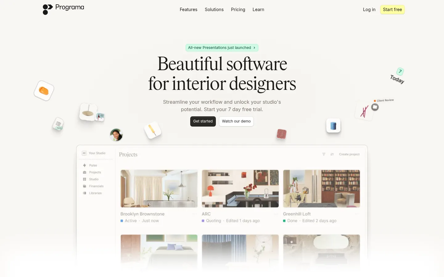
North star · Keep the interface quiet and editorial, letting refined typography and authentic design-work imagery carry the page.
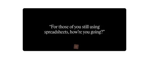
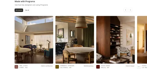
The page uses white as its dominant canvas, softened in the screenshot by warm off-white imagery and subtle neutral section treatments. Near-black headings and body copy provide clear contrast, while muted taupe handles supporting text and fine pale borders quietly separate cards and controls. A small lemon-yellow CTA and occasional green announcement details act as restrained highlights rather than a broad color system. Rhymes Display gives the main headlines a light, elegant editorial character; Inter keeps navigation, body copy, labels, and buttons practical and legible. The centered hero gives way to spacious feature cards and alternating product-image splits, followed by a dark testimonial panel, a studio gallery, support stories, and press cards. Product UI captures and interior photography provide the visual richness, framed by generous whitespace and mostly subtle elevation.
Navigation, body copy, buttons, captions, labels, and card content.
Aa 设计
Roboto Mono
系统字体 · 字重 400 / 500 / 600 · 占比 13%
免费替代:IBM Plex Mono
Small metadata and uppercase code-like labels.
Aa 设计
Rhymes Display
网络字体 · 字重 300 · 占比 8%
免费替代:Cormorant Garamond
Large hero and section headings.
角色
示例
字号
字重
行高
字距
特大标题
Largest editorial statements and prominent promotional headings.
Programa
60px
300
1.07
-0.025em
一级标题
Primary hero headline.
Programa
44px
300
1.14
-0.005em
二级标题
Major section headings, including feature and CTA introductions.
Programa
36px
300
0.94
-0.006em
三级标题
Feature titles and prominent card headings.
The quick brown fox 敏捷的狐狸
24px
500
1.25
0
四级标题
Secondary card and content headings.
The quick brown fox 敏捷的狐狸
20px
500
1.4
0
正文
Descriptions, paragraphs, and general interface copy.
The quick brown fox 敏捷的狐狸
16px
400
1.5
0
辅助文字
Image metadata, testimonials, and compact supporting details.
The quick brown fox 敏捷的狐狸
12px
400
1.33
0
按钮
Short CTA labels and compact control text.
The quick brown fox 敏捷的狐狸
12px
400
1.4
0
导航
Header navigation labels.
The quick brown fox 敏捷的狐狸
14px
400
1.43
0
链接
Small inline or secondary action links.
The quick brown fox 敏捷的狐狸
12px
400
1.4
0
代码
Occasional uppercase utility or metadata labels.
const style = 1;
12px
400
1.67
0
间距与布局
基准单位 4px · 密度:适中
60px版块间距
12px元素间距
—卡片内边距
720px内容最大宽度
1px
2px
4px
6px
8px
10px
12px
16px
20px
24px
58px
60px
80px
The page favors a centered desktop composition with a measured 720px content max-width, broad whitespace, and comfortable content density. A centered hero and product preview establish the rhythm; feature content shifts into card grids and alternating image/text splits. Gallery and press areas use horizontal visual groupings, while testimonials and conversion sections return to centered alignment. Sections have a clear vertical separation without relying on strong background bands. Keep navigation light and unobtrusive, with content aligned to a consistent central frame.
圆角与层次
按钮 · 6px
卡片 · 8px
图片 · 6px
徽标 · 6px
导航 · 6px
链接 · 6px
hairline · card, button, media
md · card, media, button
hairline · button
inset · button
The page is mostly flat, with pale hairline borders defining cards, badges, and media frames. Use restrained shadows to separate interface previews or floating controls from the canvas, not as a persistent card effect. Rounded corners remain subtle and consistent across buttons, cards, badges, and media. Preserve the stronger contrast of the black testimonial panel as a deliberate exception.
组件
下面的预览按实测的按钮、输入框、徽标、卡片样式重建(字体用替代字体)。
Header navigation
Minimal logo-and-link row with regular Inter labels, ample whitespace, and a small lemon-yellow trial action.
Hero CTA pair
Centered dark Get started button alongside a light Watch our demo control; compact Inter labels and softly rounded corners.
Feature cards
Six product-feature panels arranged in a grid, pairing short titles and muted descriptions with detailed interface imagery.
Product feature split
Alternating copy and large software screenshot sections; concise headings and small supporting actions keep the imagery prominent.
Designer gallery
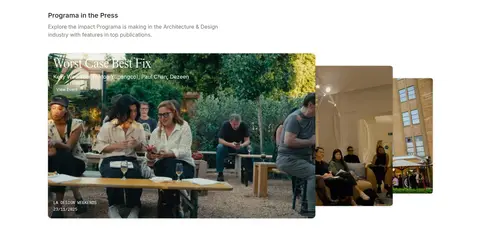
Horizontal studio-project cards led by interior photography, with compact studio names and muted location or category metadata.
Testimonial cards
Light neutral review cards with client attribution, short quotes, and subtle outlines; a separate dark quote panel provides contrast.
Footer
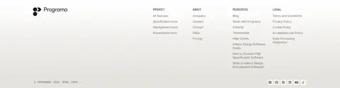
White-to-warm-neutral closing area with brand mark, compact multi-column link lists, and low-emphasis dividers.
Imagery · Use crisp product-interface captures as the main proof of utility, paired with interior photography that feels lived-in, warm, and professionally composed. Float small interface or material details around the hero as supporting accents, not as decorative clutter. Feature imagery belongs in softly rounded frames and clean card layouts. Keep photo colors natural and muted; dark media panels are occasional contrast moments. Avoid generic stock-tech visuals.
Use the white and warm-paper surfaces as the dominant canvas.
Set major headlines in a light editorial serif.
Keep body copy and interface labels practical and compact.
Use charcoal for the primary CTA and lemon only for selective emphasis.
Show authentic software screens and interior-design photography.
Separate content with whitespace, pale borders, and restrained shadows.
✕ 不该做
Do not introduce saturated accent colors beyond the measured palette.
Do not make every section a boxed card.
Do not use heavy shadows or thick borders.
Do not crowd the hero with competing copy or controls.
Do not replace editorial photography with generic technology stock images.
Do not use display serif for dense navigation or long paragraphs.
给 AI 的提示词
想快速出一个同风格的新页面,把这段话连同 DESIGN.md 一起发给 AI。
Build a new page in Programa’s calm, editorial SaaS style. Use Gallery White (#ffffff) as the primary canvas, Warm Paper (#f8f6f3) for subtle surface shifts, Soft Ink (#1a1916) for headings and navigation, and Studio Taupe (#7b736c) for supporting text. Reserve Citrus Signal (#fdffa2) for a small, high-intent CTA; use Charcoal Button (#2b2926) for the main action. Set major headlines in a light serif display face and use Inter for practical interface text. Compose a generous centered hero, then alternate product-interface showcases with interior photography and concise copy. Keep cards lightly outlined in Limestone Line (#eeece6), with minimal shadow and softly rounded corners. Maintain whitespace, clear hierarchy, and restrained color throughout.