North star · Keep the black canvas calm and spacious, then use violet gradients, candid youth photography, and clear white type to give each mission moment its energy.
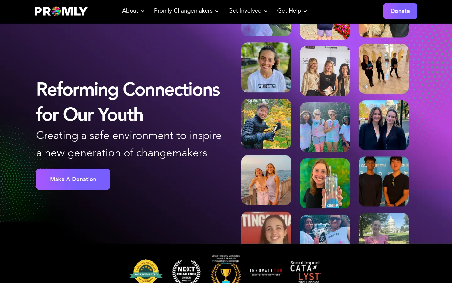
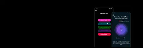
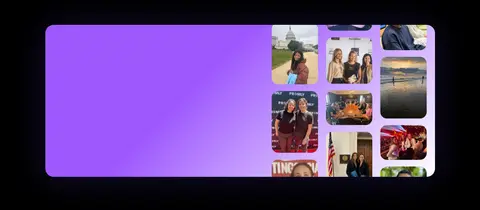
The page is built on a near-black canvas, with white headings and copy providing strong contrast across its long, mostly dark sections. Purple and violet gradients are the main expressive device: they energize the hero and selected promotional bands without turning every section into a coloured panel. Avenir carries the identity throughout, from oversized, tightly tracked bold headings to lighter supporting text and clear navigation. The hero combines a left-aligned mission statement and donation action with a dense mosaic of rounded candid photos on the right. Further down, app imagery, press cards, event photography, and a contact form create variety while preserving the dark ground. Content is organized into broad, generously separated bands; compact grids and rounded image crops add structure. Blue donation buttons and violet outlined join buttons stand out as distinct actions. Thin dark hairlines and restrained shadows define surfaces without competing with photography.
Site-wide identity across headings, body copy, navigation, and most buttons.
角色
示例
字号
字重
行高
字距
特大标题
Large hero and prominent mission headlines.
Promly
64px
700
1.25
-0.047em
一级标题
Primary page and section titles.
Promly
60px
700
1.17
-0.05em
二级标题
Major section headings, including impact and contact content.
Promly
59px
700
1.36
-0.051em
三级标题
Secondary headings for featured content blocks.
Promly
45px
700
1.11
-0.067em
四级标题
Light-weight supporting headline or subheading.
Promly
35px
300
1.57
0
正文
Paragraphs, card copy, and supporting descriptions.
The quick brown fox 敏捷的狐狸
16px
400
1.69
0
按钮
Donation, join, and form submission actions.
The quick brown fox 敏捷的狐狸
18px
700
1.5
0
导航
Main navigation links across the header.
The quick brown fox 敏捷的狐狸
18px
400
1.39
0.014em
间距与布局
基准单位 2px · 密度:适中
60px版块间距
20px元素间距
14px卡片内边距
1220px内容最大宽度
5px
6px
8px
10px
11px
12px
15px
20px
24px
27px
30px
100px
A long, single-page sequence sits on a full-width black canvas, with content arranged within a measured 1220px maximum page width. The hero uses a left text column and a multi-column photo mosaic on the right; later sections alternate between single-column storytelling, card grids, a photo strip, and centered contact content. Section spacing is generous, while card and form internals remain compact. Most text is left-aligned, with contact headings and form content centered.
圆角与层次
按钮 · 12px
输入框 · 12px
卡片 · 25px
图片 · 20px
md · media
xl · card
The overall treatment is mostly flat: black section bands and dark surfaces do the structural work. A measured deep blue-black card uses a restrained violet-tinted shadow, while media can carry a faint neutral shadow. Thin charcoal borders separate the footer and cards; rounded crops and gradients create depth without stacking many panels.
组件
下面的预览按实测的按钮、输入框、徽标、卡片样式重建(字体用替代字体)。
Main navigation
Black horizontal header with white Avenir links, dropdown indicators, Promly logo, and a prominent blue Donate button.
Hero mission block
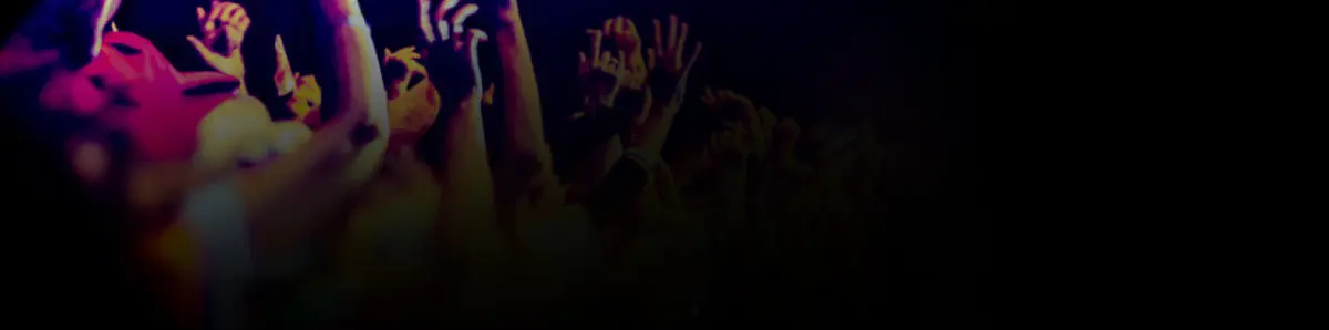
Large left-aligned white headline and light supporting copy beside a rounded, multi-column collage of youth photographs over a violet gradient.
Primary action
Filled #3898ec button with white bold Avenir text and a rounded 12px radius; used for donation and form submission.
Outlined join action
Transparent button with #755eff text and a matching 1px border, rounded 12px.
Featured content card
Deep #040723 surface with white copy, generous left inset, rounded 25px corners, and a subtle violet-tinted shadow.
Press cards
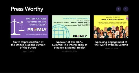
Three-column editorial presentation with prominent image thumbnails, white linked headlines, and subdued dates.
Contact form
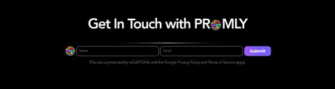
Centered contact heading and compact fields on black; measured inputs use a #cccccc border and rounded corners.
Footer
Minimal black closing band with white copyright text and a subtle #1a1a1a top border.
Imagery · Candid photographs of teens and young changemakers are the defining imagery, cropped into rounded rectangles and mosaics. The hero's portrait grid sits against a purple gradient, while later event, press, and community photos provide documentary context. App screens and award marks appear as supporting assets; imagery stays photographic and grounded rather than relying on illustration or 3D.
Reserve violet gradients for hero and selected feature bands.
Keep major headings large, white, and left-aligned where content-led.
Use real, candid youth photography in rounded collage crops.
Make donation actions clearly visible with blue fills.
Separate long-form content into spacious dark section bands.
✕ 不该做
Do not replace the dark canvas with a light page theme.
Do not apply gradients to every section or card.
Do not make the photo collage feel like generic stock imagery.
Do not introduce unmeasured colors as brand palette values.
Do not rely on heavy borders or stacked shadows for hierarchy.
Do not compress the long-page sections into a dense dashboard.
给 AI 的提示词
想快速出一个同风格的新页面,把这段话连同 DESIGN.md 一起发给 AI。
Build a new Promly-style nonprofit page on a near-black #000000 canvas, using Bright White #ffffff for clear headings and copy. Apply Avenir throughout, or use Nunito Sans as a free substitute; keep display headings bold with tight tracking and supporting copy lighter. Use Electric Orchid #a957fe and Violet Signal #755eff in selective gradients, not as full-page fills. Set primary actions in Action Blue #3898ec with white text; reserve outlined Violet Signal #755eff buttons for secondary participation actions. Structure content in broad, well-separated bands within the measured 1220px maximum width. Pair mission copy with candid youth photo mosaics, rounded crops, and occasional documentary event imagery. Use Midnight Card #040723 for featured surfaces, subtle charcoal hairlines, and restrained shadows. Preserve generous section breathing room and simple navigation.