North star · Keep the warm ivory canvas and generous breathing room dominant, then use forest green and rounded, high-contrast booking accents sparingly.
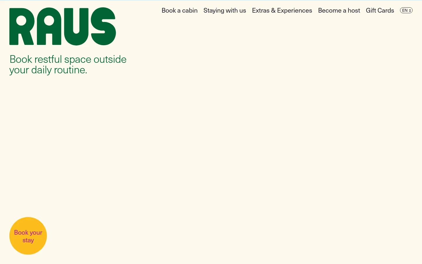
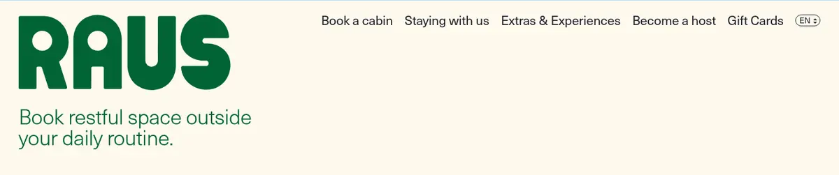
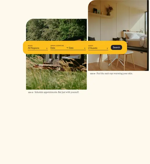
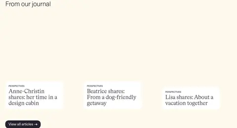
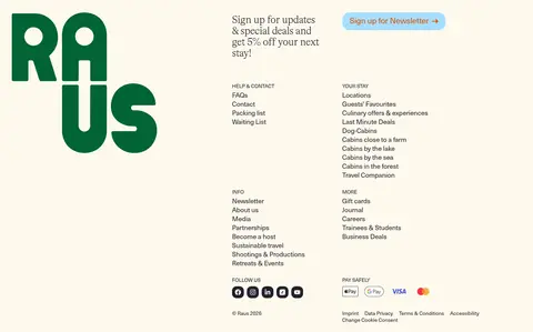
The page is anchored by a warm ivory canvas (#fdf9ed), which remains continuous across the long scroll instead of dividing content with strong background bands. A deep green identity appears in the oversized Raus wordmark and introductory line; ink-dark text carries navigation and body copy, while orange, pale blue, and yellow are reserved for booking, newsletter, and search accents. The typography contrasts light, close-set serif display headings with a clean sans-serif for navigation, controls, and supporting copy. Layout is intentionally spacious: the header and short hero sit above offset cabin photographs and a floating search bar, followed by a broad white feature panel, a three-column journal feed, and a dense multi-column footer. Photography supplies the natural color and sense of place. Rounded controls and cards soften the otherwise flat, quiet composition.
Sans-serif for navigation, body copy, labels, and interface controls.
Aa 设计
fonts
网络字体 · 字重 300 · 占比 29%
免费替代:Cormorant Garamond
Light serif display face for the main hero and large section headings.
角色
示例
字号
字重
行高
字距
一级标题
Main hero statement beneath the Raus wordmark.
Raus
40px
300
0.95
-0.02em
二级标题
Large section headings, including cabin discovery and journal.
Raus
36px
300
1
-0.015em
三级标题
Editorial card titles and smaller feature headings.
Raus
28px
300
1.07
-0.015em
四级标题
Supporting section titles and prominent interface copy.
The quick brown fox 敏捷的狐狸
22px
400
1.18
-0.01em
正文
Introductory copy, descriptions, and general supporting text.
The quick brown fox 敏捷的狐狸
18px
400
1.22
-0.01em
辅助文字
Uppercase labels, category markers, and small metadata.
The quick brown fox 敏捷的狐狸
14px
400
1.29
-0.01em
导航
Primary header navigation links.
The quick brown fox 敏捷的狐狸
22px
400
1.18
-0.01em
间距与布局
基准单位 4px · 密度:宽松
96px版块间距
4px元素间距
20px卡片内边距
1428px内容最大宽度
2px
4px
5px
6px
8px
12px
16px
20px
24px
26px
40px
48px
192px
Use a spacious, single-column page flow with a measured maximum content width of 1428px. Keep the header and introductory statement aligned to the left, then let the hero photography overlap and offset around a floating booking bar. The cabin feature has a broad white surface; the journal becomes a three-column feed, and the footer organizes links in two columns. The measured section gap is 96px, with generous open canvas between the image-led hero and later content.
圆角与层次
按钮 · 12px
卡片 · 20px
导航 · 20px
没有测到阴影:页面是扁平的,层次靠底色和描边区分。
The interface is mostly flat: no measured shadows or gradients establish hierarchy. Separate content with whitespace and occasional white surfaces rather than borders. Rounded cards and controls provide the main dimensional cues; layer the booking/search bar over the hero photographs, while keeping outlines and other decoration restrained.
组件
下面的预览按实测的按钮、输入框、徽标、卡片样式重建(字体用替代字体)。
Primary booking CTA
Use Campfire Orange (#dd5000), white text, a 12px radius, and Neue Haas Unica at 18px; label example: “Book now!”
Cabin discovery CTA
Use Quiet Ink (#23212c) with white 22px sans-serif text, a 20px radius, and 20px horizontal padding.
Newsletter CTA
Use Sky Wash (#a6dfff) with Campfire Orange (#dd5000) text, 22px sans-serif type, and a 20px radius.
Journal card
White (#ffffff) surface with Quiet Ink (#23212c) text, 20px radius and padding; pair an uppercase category label with a light editorial title.
Booking search bar
Place a wide Marigold Search (#fcbd1c) rounded bar across the hero imagery, with region, arrival/departure, guests, and a dark search action.
Header navigation
Quiet Ink (#23212c) sans-serif links in a single horizontal row, with a compact uppercase language selector at the end.
Imagery · Use natural, documentary-style cabin and landscape photography rather than decorative illustration. In the hero, offset two rectangular photographs with rounded corners and let the wide search bar cross in front. The imagery is richly green and warm, providing the page’s environmental color variation against ivory. Journal cards use smaller photographs and concise editorial titles; retain clear image crops and avoid heavy overlays.
Keep Cabin Ivory (#fdf9ed) as the dominant canvas.
Use Forest Emblem (#006434) for the wordmark and nature-led introduction.
Set large statements in the light editorial serif.
Use photography to carry the sense of place.
Give sections generous breathing room.
Keep functional accents rounded and easy to scan.
✕ 不该做
Do not introduce unmeasured colors into the interface palette.
Do not split the page into many high-contrast color bands.
Do not crowd the hero with extra copy or controls.
Do not add heavy shadows or decorative gradients.
Do not make every element a pill or rounded card.
Do not let the journal cards overpower their photography and titles.
给 AI 的提示词
想快速出一个同风格的新页面,把这段话连同 DESIGN.md 一起发给 AI。
Build a new travel page in Raus’s quiet, nature-led editorial style. Use Cabin Ivory (#fdf9ed) as the continuous canvas and Quiet Ink (#23212c) for navigation and body copy. Make the wordmark and select introductory text Forest Emblem (#006434). Pair a light editorial serif for major headings with a clean sans-serif for controls, labels, and navigation. Use offset cabin or landscape photography as the visual anchor, with a Marigold Search (#fcbd1c) booking bar layered across it. Reserve Campfire Orange (#dd5000) for the primary booking action and Sky Wash (#a6dfff) for a secondary CTA. Keep content spacious, section transitions subtle, and surfaces mostly flat; use measured rounded cards and buttons without adding shadows or invented palette colors.