North star · Keep the interface quiet and legible so expressive, varied project work and unmistakable orange actions take center stage.
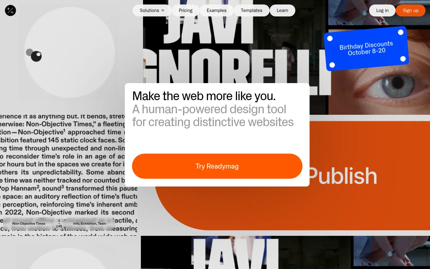
The page uses a mostly white canvas and black text to keep its product story legible against a lively stream of portfolio work. Bright orange appears sparingly in the primary actions and in project imagery; the pinks, blues, and varied photographic tones belong chiefly to the showcased work, not the core interface palette. A centered white hero panel sits over a full-bleed collage, creating a clear reading zone without muting the examples behind it. Typography is compact and confidently weighted, with tightly tracked display headings and quieter gray supporting text. The page alternates broad white content sections with a stark black product demonstration band, then returns to a white CTA and dark footer. Image grids use contrasting projects rather than a uniform art direction, making the product feel versatile. Rounded pill navigation and oversized orange CTA shapes soften the otherwise sharp editorial layout.
Most-used webfont for compact navigation, links, captions, and controls.
Aa 设计
custom_157067
网络字体 · 字重 400 · 占比 22%
免费替代:DM Sans
Regular-weight display and section heading styles, including measured h2 and h4 roles.
Aa 设计
-apple-system
系统字体 · 字重 400 · 占比 4%
免费替代:Inter
System sans-serif used in measured interface buttons.
Aa 设计
custom_189785
网络字体 · 字重 500 · 占比 4%
免费替代:Inter
Medium-weight headline and body styles, including measured h1, h3, and body roles.
角色
示例
字号
字重
行高
字距
一级标题
Hero headline introducing the product’s creative promise.
Readymag
42px
500
1.05
-0.04em
二级标题
Prominent section headings across the homepage.
Readymag
40px
400
0.95
-0.045em
三级标题
Subsection headings for feature and editorial content.
Readymag
38px
500
1.05
-0.055em
四级标题
Smaller supporting feature headings.
Readymag
30px
400
1.03
-0.053em
正文
Supporting statements and explanatory copy.
The quick brown fox 敏捷的狐狸
18px
500
1.11
-0.033em
辅助文字
Compact labels and image or project captions.
The quick brown fox 敏捷的狐狸
10px
500
1.2
0
链接
Navigation, footer links, and short text actions.
The quick brown fox 敏捷的狐狸
12px
500
1.5
0
间距与布局
基准单位 4px · 密度:适中
—版块间距
—元素间距
—卡片内边距
—内容最大宽度
1px
4px
11px
15px
16px
20px
24px
45px
A full-bleed, image-rich hero opens the page, with a centered panel and floating pill navigation layered above it. Below, wide content sections align headings to the left and arrange examples in compact multi-column grids. A black product-demo band interrupts the white sections before the page returns to capability tiles, editorial content, and a prominent CTA. Keep section widths generous and align content consistently, but do not impose a measured max-width: none was recorded. Rhythm comes from alternating dense galleries and open white space rather than decorative separators.
圆角与层次
按钮 · 9999px
卡片 · 102px
inset · other, button
The design relies on flat color fields and image-led layering rather than pronounced shadows or outlined cards. A white hero panel sits visibly above its busy collage, and pill-shaped navigation controls float over the hero. Use clean edges and restrained separation; the measured shadow is effectively zero, and no consistent border color was recorded.
组件
下面的预览按实测的按钮、输入框、徽标、卡片样式重建(字体用替代字体)。
Floating pill navigation
Place compact rounded light controls over the hero collage, with navigation centered and account actions aligned to the right.
Hero statement panel
Use a prominent white panel over the full-bleed montage, with a black headline, gray supporting copy, and a wide orange pill CTA.
Project gallery
Present contrasting website examples in a tight multi-column image grid with small captions.
Product demo band
Set a centered product-editor preview and short white explanatory copy against a solid black section.
Capability mosaic
Combine differently sized feature tiles with colorful interface details and dark panels instead of uniform text-only cards.
Large CTA
Use a broad, highly rounded orange action surface with centered white text, followed by a restrained customer-logo row.
Dark footer
Group compact, low-contrast link columns on a black background and keep legal links visually subordinate.
Imagery · Use a varied collage of website projects, interface captures, editorial artwork, photography, and colorful graphic compositions. Keep images in rectangular tiles and combine contrasting visual styles to communicate creative range. The hero’s layered project montage is the dominant visual, while later grids provide smaller examples. Product UI imagery should remain crisp and legible; the measured bright colors in project thumbnails are examples, not extra brand colors.
该做与不该做
✓ 该做
Use white and black as the primary interface foundation.
Reserve orange for high-priority actions and selected accents.
Let the hero collage show a range of visual styles.
Keep headings tight, clear, and left-aligned in content sections.
Alternate bright content areas with occasional black sections.
Use rounded pill forms for navigation and major actions.
✕ 不该做
Do not make project-thumbnail colors the site-wide palette.
Do not add prominent shadows or decorative outlines.
Do not force every gallery image into one art direction.
Do not crowd the hero statement with competing copy.
Do not turn every section into a dark surface.
Do not use orange for long passages of text.
给 AI 的提示词
想快速出一个同风格的新页面,把这段话连同 DESIGN.md 一起发给 AI。
Build a new Readymag-style page with a clean white canvas (#ffffff), crisp black typography (#000000), and muted gray supporting copy (#999999). Use orange (#ff5900) for the main action, with #ec520b reserved for a secondary sign-up treatment. Start with a full-bleed, varied portfolio collage and layer a centered white hero panel over it; place compact pill navigation above the imagery. Follow with spacious white sections containing tightly arranged project galleries, then use a black (#000000) band for a product demonstration. Keep imagery expressive and varied, but treat vivid project colors as artwork rather than interface tokens. Use compact, tightly tracked sans-serif headings, subdued borders, minimal elevation, and rounded pills for key controls. Finish with a prominent orange CTA and a restrained dark footer.