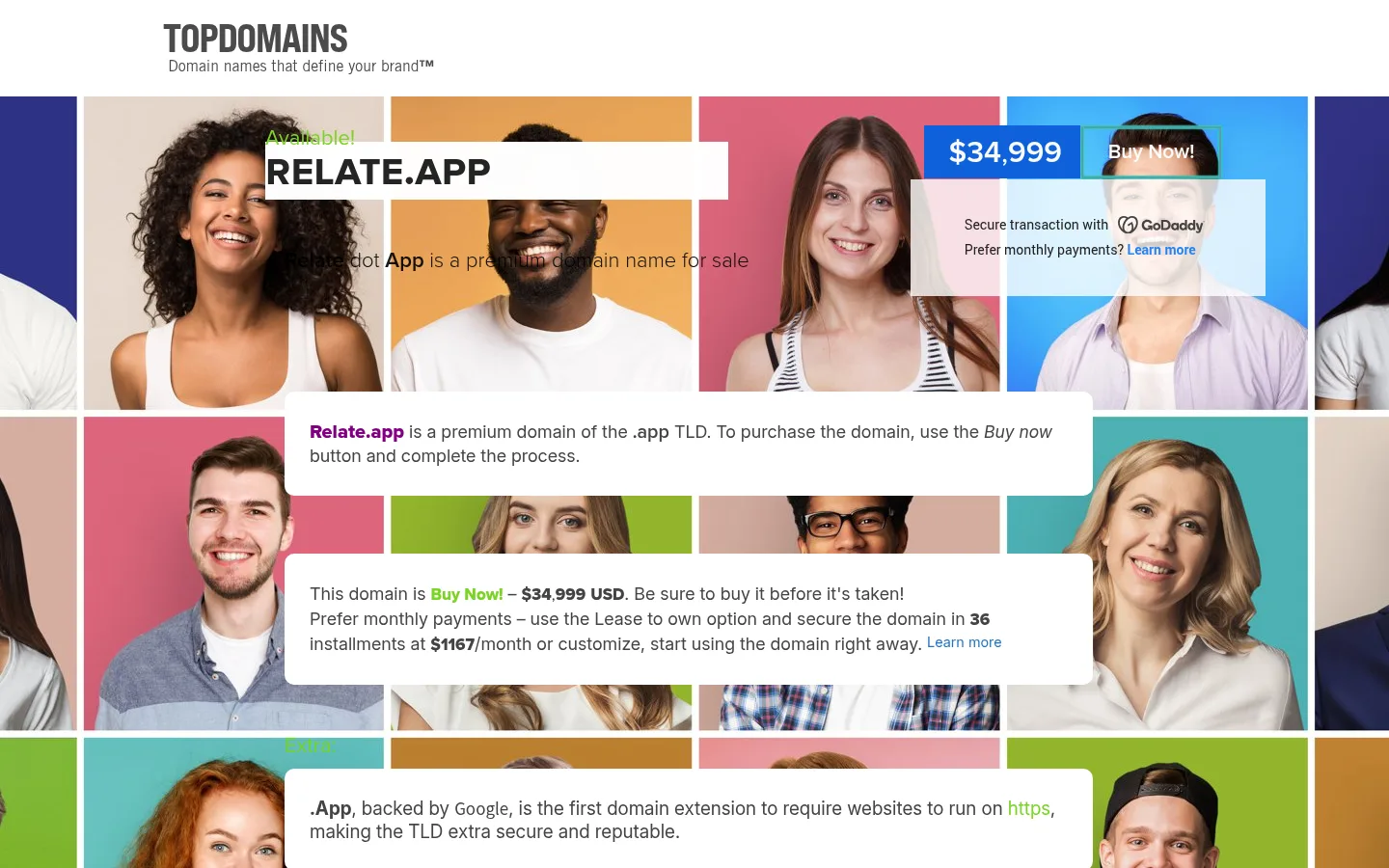
North star · Let the colourful portrait mosaic attract attention, but keep the domain, price, and transaction details legible on uncluttered white overlays.
The page pairs a clean white TopDomains masthead with a full-width mosaic of brightly coloured portrait photographs. The mosaic supplies most of the visual energy; the deep indigo canvas is visible at the outer edges and in the measured section styling, rather than defining a uniformly dark interface. A bold, black relate.app headline sits on a white strip near the top of the imagery, while the price and purchase action form a compact blue-and-dark control. Several broad white cards float over the portraits, using dark grey body copy, selective blue links, and green emphasis for offer-related words. Typography is functional and mixed: a condensed caps display face marks the brand, with Proxima, Inter, and Roboto supporting headings, explanatory copy, and links. Content aligns to a centered single-column composition, with generous breaks between cards and little decorative framing. The result feels like a straightforward domain-sale landing page, not a conventional dark-mode product site.
Purchase action and compact transaction or navigation details.
Aa 设计
proxima
网络字体 · 字重 300 / 800 / 500 / 400 · 占比 12%
免费替代:Montserrat
Secondary headings and domain-sale display text.
Aa 设计
proximacapsbold
网络字体 · 字重 400 · 占比 1%
免费替代:Oswald
Prominent relate.app display headline.
角色
示例
字号
字重
行高
字距
一级标题
Large uppercase relate.app domain headline on a white strip.
TopDomains
46px
400
normal
0
二级标题
Secondary page heading describing the domain sale.
TopDomains
31px
500
normal
0
正文
Explanatory copy within the floating white information cards.
The quick brown fox 敏捷的狐狸
19px
400
normal
0
辅助文字
Smaller supporting details and transaction explanations.
The quick brown fox 敏捷的狐狸
18px
400
1.39
0
链接
Compact bold purchase-related and Learn more links.
The quick brown fox 敏捷的狐狸
14px
700
normal
0
间距与布局
基准单位 2px · 密度:适中
50px版块间距
—元素间距
28px卡片内边距
1090px内容最大宽度
1px
2px
6px
7px
8px
19px
20px
25px
26px
28px
29px
30px
39px
50px
60px
90px
A single centered content column sits over a full-width, tightly tiled portrait mosaic. The measured page max width is 1090px; the masthead occupies a separate white band above the imagery. The headline and compact purchase controls overlay the upper image area, followed by wide white copy cards stacked down the page. Cards have measured padding around 28px and a 10px radius. Comfortable section spacing separates the content, while the dense image grid remains visible between cards and at the outer edges.
圆角与层次
卡片 · 10px
inset · other
The design relies on flat white cards layered directly over the busy photograph, rather than pronounced drop shadows. Rounded card corners are measured at 10px; other blocks and controls are mostly square-edged. A thin inset teal shadow is measured elsewhere, but it is not a defining visible elevation treatment. The image grid's white dividers provide most of the separation.
组件
下面的预览按实测的按钮、输入框、徽标、卡片样式重建(字体用替代字体)。
TopDomains masthead
A compact brand mark and tagline sit in a clean white band above the portrait grid.
Domain headline strip
A bold black uppercase relate.app title sits on a white horizontal panel over the upper mosaic.
Price and purchase control
A bright blue price block pairs with a dark Buy Now action near the headline.
Sale explanation card
A broad white card with a 10px radius contains dark grey copy and a bold purple domain link.
Transaction details card
A second white rounded card presents the sale price, monthly payment information, and a blue Learn more link.
Supporting content cards
Additional wide white panels explain the .app extension and domain context over the continuing photo grid.
Imagery · The dominant imagery is a full-bleed grid of smiling people, cropped into rectangular tiles with narrow white dividers. Each portrait sits against a different saturated colour, creating a lively patchwork behind the sales content. Photography is natural and people-focused; no product render or decorative illustration defines the page. White overlays deliberately cover parts of the mosaic to preserve text legibility.
Keep the portrait mosaic as the page's main visual backdrop.
Place long explanations on clean white cards.
Make relate.app and its price immediately easy to find.
Use blue for purchase emphasis and links.
Reserve green for brief offer-related highlights.
Keep the masthead distinct on a white band.
✕ 不该做
Do not turn the whole page into a dark interface.
Do not place long copy directly on busy portrait tiles.
Do not add gradients that are absent from the measured design.
Do not replace the human-photo mosaic with product renders.
Do not overuse green beyond short highlights.
Do not add heavy shadows or decorative card borders.
给 AI 的提示词
想快速出一个同风格的新页面,把这段话连同 DESIGN.md 一起发给 AI。
Build a new premium domain-sale page in the TopDomains visual style. Put a compact logo and tagline in a white masthead, then use a full-width grid of colourful, cropped portrait photography as the main backdrop. Overlay a strong black domain headline on an Offer White (#ffffff) strip, with a compact Action Blue (#2484f2) price treatment and dark purchase action nearby. Stack broad, rounded white information cards over the mosaic; use Copy Charcoal (#444444) for readable body copy, Card Ink (#222222) for secondary transaction details, and Link Blue (#2374c4) for supporting links. Keep Domain Indigo (#2d3284) restrained to the canvas or outer edges. Apply green (#7bd428) only to short offer highlights. Use a centered single-column layout, generous separation between cards, crisp typography, and minimal elevation.