North star · Keep the interface nearly black and spacious; reserve bright contrast for readable type, white actions, and cyan-lit product evidence.
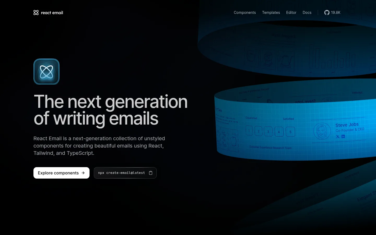
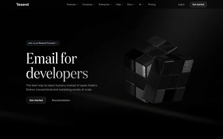
The page is anchored by a nearly continuous black canvas, with white and pale-gray typography establishing contrast rather than large colored section bands. Muted gray supports navigation and explanatory copy, while cyan appears sparingly in product marks, interface details, and the blue-lit hero artwork; those brighter blues belong mainly to media, not a general background system. Inter handles headlines, navigation, and controls with moderate weights and subtly tight tracking. CommitMono gives code and technical snippets a distinct working-console voice. A broad centered content frame alternates centered introductions with split product demonstrations and compact grids. Sections breathe with generous vertical separation, while cards and preview panels stay dark, outlined, and visually quiet. White buttons provide the clearest action contrast. Product imagery is treated as atmospheric evidence: darkened, cropped, and selectively illuminated so it supports the message without displacing readable interface content.
Display and interface typography, including headings, navigation, captions, and buttons
Aa 设计
-apple-system
系统字体 · 字重 400 / 700 / 600 · 占比 4%
免费替代:Inter
System-font fallback for small portions of interface text
角色
示例
字号
字重
行高
字距
特大标题
Large hero headline; compact line breaks and tight display tracking.
React Email
68px
500
0.94
-0.05em
一级标题
Primary section headline and major content heading.
React Email
35px
500
1.2
-0.025em
二级标题
Section headings introducing features and product capabilities.
The quick brown fox 敏捷的狐狸
24px
500
1.4
-0.01em
三级标题
Subsection titles and prominent card headings.
The quick brown fox 敏捷的狐狸
20px
400
1.4
-0.008em
四级标题
Smaller editorial or feature-panel headings.
The quick brown fox 敏捷的狐狸
18px
400
1.56
0
正文
Technical descriptions, code, and developer-facing explanatory text.
The quick brown fox 敏捷的狐狸
13px
400
1.33
0
辅助文字
Small supporting labels and metadata around previews.
The quick brown fox 敏捷的狐狸
12px
400
1.33
0
按钮
Primary and secondary CTA labels.
The quick brown fox 敏捷的狐狸
16px
500
1.5
0
导航
Header links and compact navigation items.
The quick brown fox 敏捷的狐狸
14px
400
1.43
0
代码
Syntax-oriented snippets and command-line examples.
const style = 1;
13px
400
1.33
0
间距与布局
基准单位 4px · 密度:宽松
96px版块间距
8px元素间距
—卡片内边距
1248px内容最大宽度
1px
4px
6px
8px
10px
12px
16px
20px
24px
32px
40px
64px
80px
96px
Use a centered content frame with a measured maximum width of 1248px and a spacious vertical rhythm; the measured section gap is 96px. The hero aligns its text on the left and lets large atmospheric media occupy the right, while feature introductions often center above demos. Alternate split showcases, logo rows, and compact component grids to vary the long page without changing the dark canvas. Keep text blocks narrow relative to previews, align section content consistently, and use restrained internal gaps. Overall density is low, with substantial negative space between demonstrations.
圆角与层次
按钮 · 12px
卡片 · 24px
图片 · 50%
徽标 · 4px
导航 · 6px
链接 · 8px
xl · other, button
hairline · other, card
md · other
lg · other
The visual system is mostly flat: dark surfaces sit close to the black canvas, with thin outlines doing more work than shadows. Use measured dark borders such as Graphite Edge or Dot Grid to define cards and editor frames. Reserve stronger layering for the hero glow and overlapping product previews; avoid broad, bright drop shadows.
组件
下面的预览按实测的按钮、输入框、徽标、卡片样式重建(字体用替代字体)。
Primary CTA
White, rounded button with dark text and a thin pale border; use for the clearest action such as exploring components.
Secondary command control
Dark outlined inline control paired with a command or copy affordance; set its text in CommitMono.
Navigation
Compact Inter links on the black canvas with subdued gray text and restrained separators.
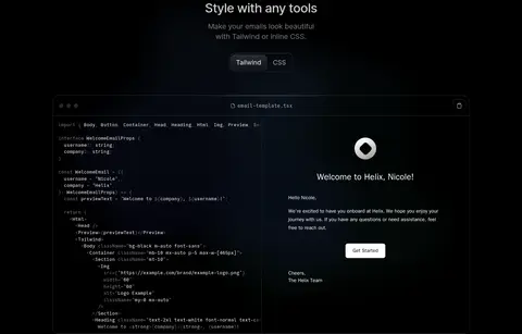
Code preview
Dark, thin-bordered panel with monospace syntax and a small header or copy control.
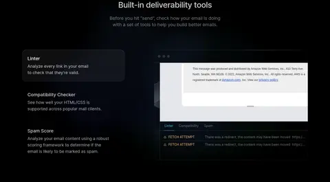
Product preview
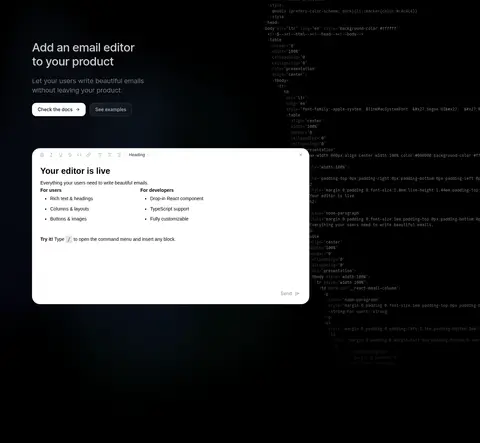
Large framed email or editor UI; dark interface areas may be contrasted by a white preview surface.
Feature card
Quiet dark card with a thin Graphite Edge or Dot Grid outline and ample surrounding negative space.
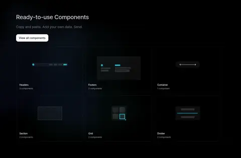
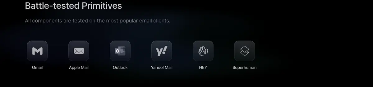
Logo row
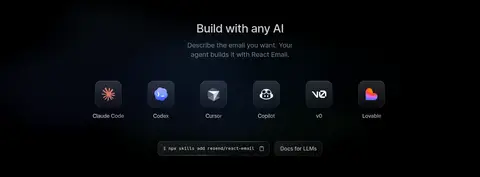
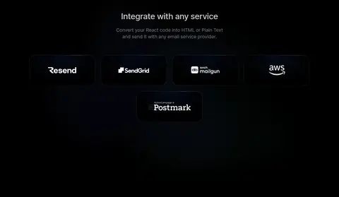
Compact sequence of tool or email-client marks with small captions, arranged without colored section backing.
Imagery · Use product UI, code previews, and brand marks rather than lifestyle photography. The hero uses oversized, cropped, blue-cyan illuminated email-interface media against black; treat it as atmospheric product evidence, not a flat background color. Keep screenshots dark and framed, with readable interface details. Small logos and tool icons sit in compact rows, while a white editor preview creates a deliberate contrast point.
Reserve cyan-blue glow for product media and small accents.
Pair Inter interface text with CommitMono code.
Give demonstrations generous space between sections.
Define dark cards with thin, subtle borders.
✕ 不该做
Do not turn the page into alternating bright section bands.
Do not use cyan as a large flat background.
Do not add decorative photography unrelated to the product.
Do not make card shadows stronger than their borders.
Do not use oversized navigation or dense text blocks.
Do not treat illustration-only blues as the core interface palette.
给 AI 的提示词
想快速出一个同风格的新页面,把这段话连同 DESIGN.md 一起发给 AI。
Build a new developer-tools page in the React Email visual language. Use Deep Canvas (#000000) across the page, Soft Chalk (#ededef) for primary text, and Cool Ash (#abafb4) for secondary copy. Keep Signal Cyan (#4acae4) restrained, chiefly in product details or a blue-lit media treatment. Use Inter for headings and controls and CommitMono for code and command snippets. Establish a centered frame no wider than the measured 1248px maximum, with generous vertical section rhythm and alternating centered introductions, split product demos, and compact grids. Use thin Graphite Edge (#181b1c) outlines rather than prominent shadows. Make primary actions white with dark text. Product previews should look like real interface evidence, with occasional white editor surfaces against the otherwise dark composition.