North star · Keep the warm canvas and fine black framing quiet so the product imagery and expressive serif lettering remain the focus.
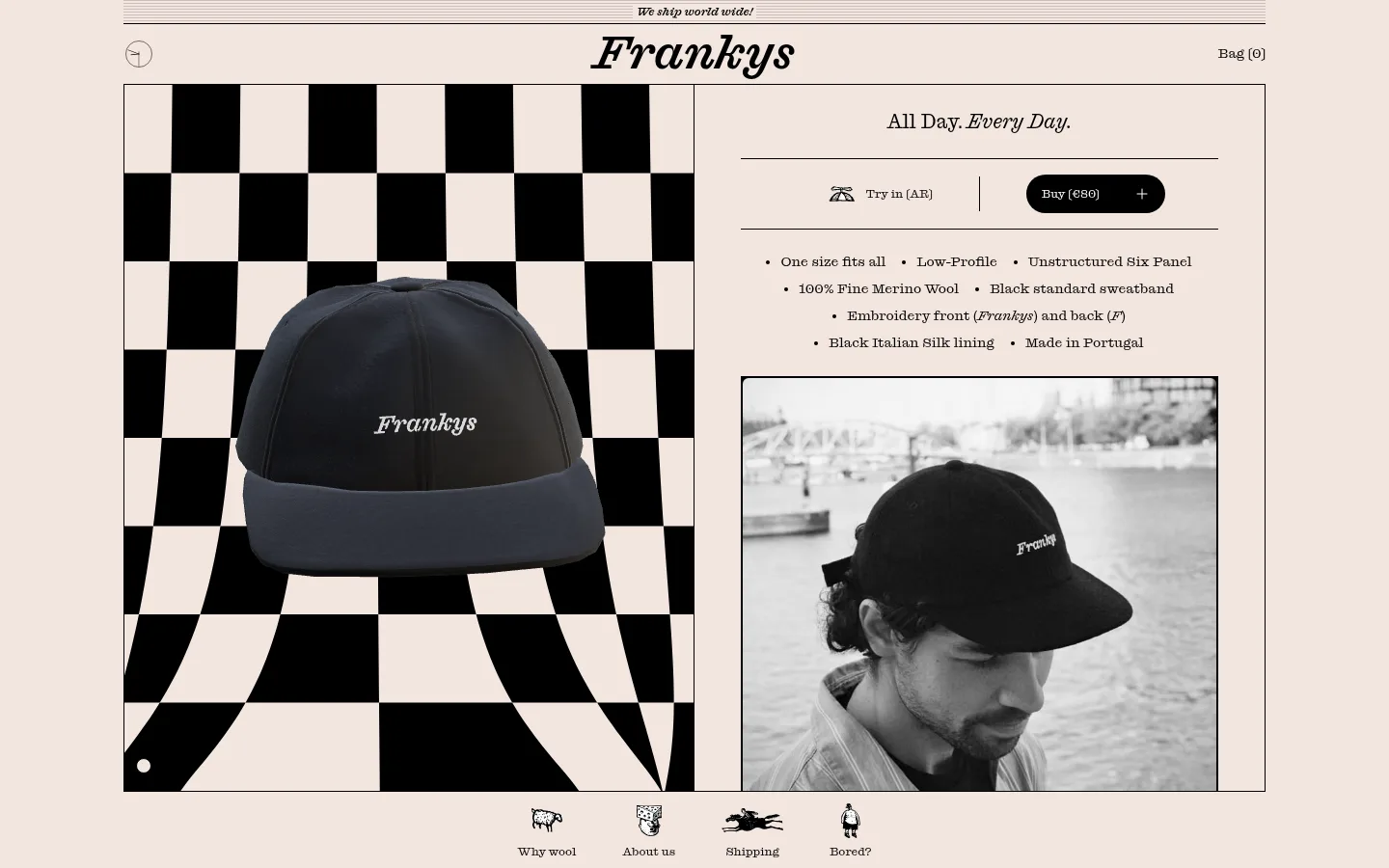
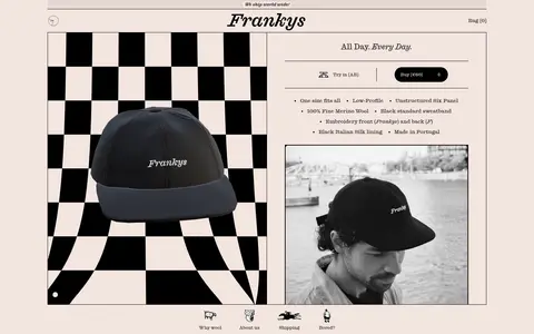
The page is built from a warm blush canvas (#f3e5df) and near-absolute black (#000000), with white (#ffffff) reserved for small text details such as the purchase button label. The restrained palette lets the checkerboard product backdrop and monochrome lifestyle photograph carry visual contrast without introducing competing brand colours. A single custom slab-serif family gives the wordmark, product headline, specifications, and small navigation a consistent, slightly playful editorial voice. The desktop hero is a thinly outlined frame split between a large product image and a narrower information column; fine rules divide the announcement, purchase controls, and product details. The composition is spacious around the frame but information-dense within it, with compact type, short feature bullets, and rounded pill controls. Small illustrated navigation marks below the frame add a hand-drawn counterpoint to the otherwise disciplined grid.
Custom slab-serif used throughout the wordmark, headings, product copy, navigation, and controls.
角色
示例
字号
字重
行高
字距
一级标题
Large product headline and primary page title.
Frankys
48px
500
1
0
二级标题
Secondary product and section headings.
The quick brown fox 敏捷的狐狸
20px
400
1.4
0
正文
Product details, feature bullets, and supporting copy.
The quick brown fox 敏捷的狐狸
14px
400
1.43
0
辅助文字
Small supporting labels and fine print.
The quick brown fox 敏捷的狐狸
12px
400
1.33
0
按钮
Compact purchase and action labels.
The quick brown fox 敏捷的狐狸
12px
400
1.33
0
导航
Announcement, bag, and navigation links.
The quick brown fox 敏捷的狐狸
12px
400
1.33
0
间距与布局
基准单位 8px · 密度:适中
48px版块间距
4px元素间距
8px卡片内边距
1184px内容最大宽度
2px
4px
6px
8px
12px
14px
16px
24px
32px
48px
A centered content frame sits within a generous blush canvas, with a slim announcement strip and centered wordmark above it. The hero uses a two-column split: image-led product presentation on the left and product title, purchase controls, specifications, and a second photograph on the right. Thin borders define the main frame and horizontal separators organize the details. Small illustrated navigation links sit just below the hero, while the newsletter and legal links continue the right-column alignment. The measured maximum page width is 1184px.
圆角与层次
按钮 · 9999px
输入框 · 9999px
图片 · 6px
没有测到阴影:页面是扁平的,层次靠底色和描边区分。
The interface is predominantly flat, with no measured shadows. Thin black outlines frame the hero, image, and information dividers, giving structure without raised cards. The purchase action is differentiated by a solid black pill and reversed white label; image layers provide the strongest depth.
组件
下面的预览按实测的按钮、输入框、徽标、卡片样式重建(字体用替代字体)。
Announcement strip
A narrow, ruled band above the centered wordmark carries a compact shipping message.
Header
Centered brand wordmark with a small back control on the left and bag count on the right.
Framed product hero
A thin black rectangular frame holds a two-column product presentation, with imagery left and product information right.
Purchase controls
A horizontal row pairs the try-on option with a black rounded purchase button and white compact label.
Product specifications
Short centered bullet points list fit, construction, wool, trim, embroidery, lining, and origin.
Illustrated link navigation
Small hand-drawn icons and concise labels link to wool, about, shipping, and help content below the hero.
Newsletter signup
A slim rounded email field with a fine black outline and a dark circular submit control.
Imagery · Lead with crisp product photography of the dark hat against a bold black-and-blush checkerboard image, then pair it with a framed monochrome lifestyle photograph. Keep both images rectangular and prominent; the graphic backdrop belongs to the product imagery, not the core brand palette. Small hand-drawn icons support the secondary navigation.
Use the measured blush canvas as the main background.
Frame major content with fine black rules.
Keep product photography monochrome or high contrast.
Use the slab-serif consistently across interface text.
Make purchase actions black pills with white labels.
Keep supporting navigation compact and lightly illustrated.
✕ 不该做
Do not introduce unmeasured brand colours.
Do not add gradients, heavy shadows, or raised cards.
Do not replace the split hero with a generic centered banner.
Do not let labels compete with the product imagery.
Do not use oversized rounded cards or thick borders.
Do not mistake colours inside the checkerboard artwork for interface palette.
给 AI 的提示词
想快速出一个同风格的新页面,把这段话连同 DESIGN.md 一起发给 AI。
Build a new Frankys page with the same restrained visual language: use Blush Canvas (#f3e5df) as the page ground, Soft Ink (#000000) for text, outlines, and primary actions, and Paper White (#ffffff) only for reversed button details. Use a slab-serif throughout, substituting Roboto Slab if the custom face is unavailable. Compose content inside a centered, thinly outlined frame with a clear editorial split between prominent imagery and concise product information. Favor monochrome product photography, compact specifications, and fine horizontal separators. Keep controls simple: pill-shaped black actions, unfilled text links, and outlined rounded fields. Maintain generous breathing room around the frame, but keep internal copy concise and structured. Add small illustrated link icons only where they support navigation; avoid extra palette colours, shadows, gradients, or decorative card effects.