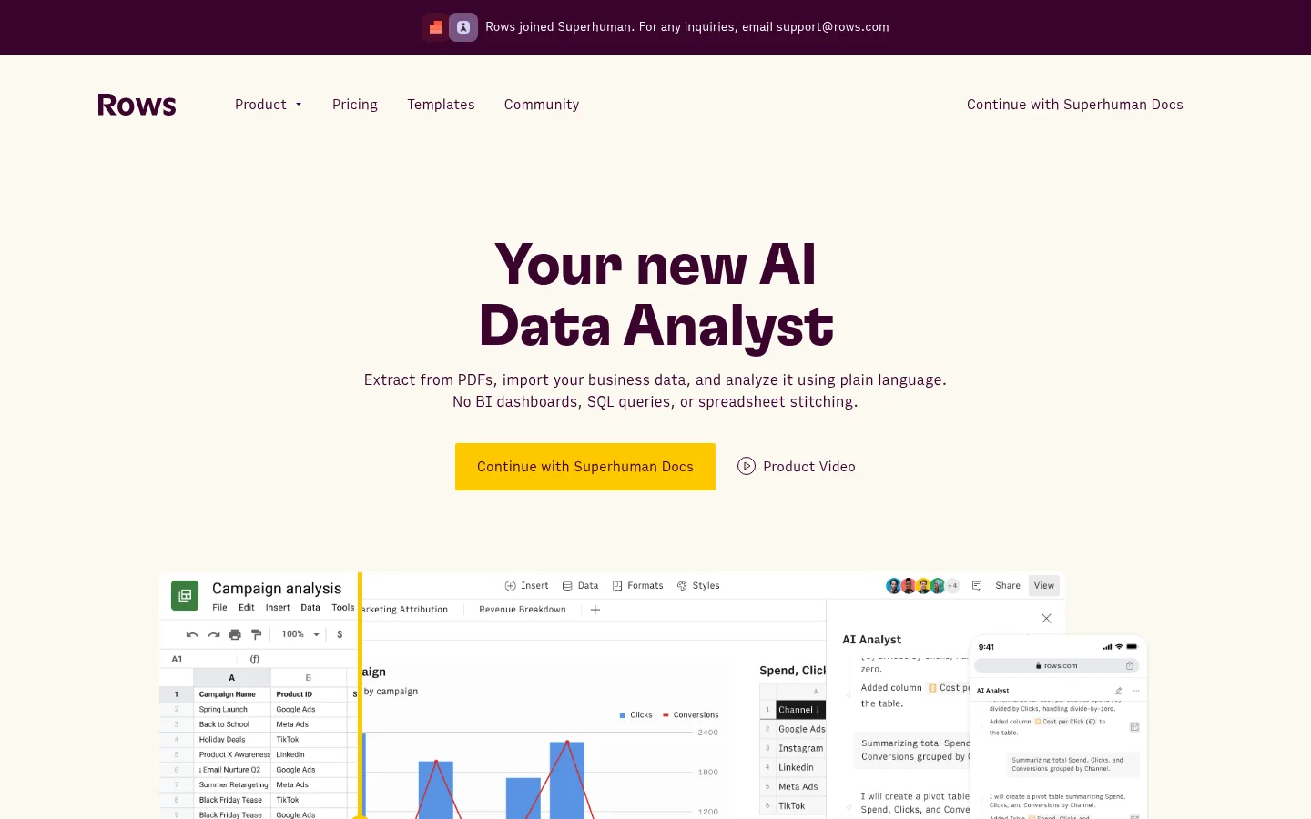
Rows 以奶油色底、深梅紫文字和明亮黄色按钮,呈现 AI 数据分析产品。真实产品界面与分明的彩色功能区块,让复杂的 SaaS 工具更直观、更易理解。
North star · Use warm cream and deep plum as the quiet foundation, then let yellow bands, crisp headings, and real product UI explain the product.
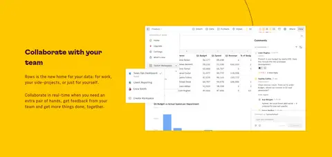
The page builds its identity around a warm cream canvas (#fbf9f0) and deep plum (#3a032d), replacing the cool white-and-blue convention common to data software. Yellow (#ffc800) serves as a high-visibility action color and also defines a full-width collaboration band; pale butter (#fff4cc) gives the AI feature section its own visual chapter. GT Flexa supplies bold, tightly tracked display headings, while Output Sans keeps navigation, descriptions, and controls readable and unshowy. The layout alternates centered hero content with left-aligned feature blocks, using generous vertical breathing room and a broad content frame. Spreadsheet and assistant-interface screenshots do much of the explanatory work, arranged as overlapping product compositions rather than decorative photography. Cards stay restrained: fine warm-gray borders and soft off-white surfaces provide separation without competing with the product. A dark plum integrations section adds contrast and resets the scrolling rhythm.
配色
点色块复制色值。用途说明来自对页面的实测位置(背景、文字、描边、按钮)与截图判读。
品牌色
强调色
表层色
中性色
功能色
页面底色 · Warm Canvas表层 · Deep Plum表层 2 · Buttercream Band表层 3 · Paper White表层 4 · Footer Stone主文字 · Deep Plum描边 · Warm Hairline强调 · Signal Yellow
Navigation, body copy, captions, buttons, and links.
Aa 设计
GT Flexa
网络字体 · 字重 700 / 600 · 占比 13%
免费替代:Space Grotesk
Display and section headings.
角色
示例
字号
字重
行高
字距
特大标题
Large hero display headline introducing the AI data analyst.
Rows
64px
600
1.05
-0.02em
一级标题
Primary page headline and prominent footer callout.
Rows
48px
700
1.35
-0.02em
二级标题
Main feature-section headings.
Rows
36px
600
0.95
-0.02em
三级标题
Feature subheads and key supporting product statements.
Rows
32px
700
1.4
-0.02em
四级标题
Card headings and smaller section titles.
The quick brown fox 敏捷的狐狸
24px
700
1.2
-0.01em
正文
Emphasized explanatory copy and introductory descriptions.
The quick brown fox 敏捷的狐狸
18px
700
1.39
0
辅助文字
Small supporting notes and compact interface descriptions.
The quick brown fox 敏捷的狐狸
16px
400
1.3
0
按钮
Primary CTA and secondary action labels.
The quick brown fox 敏捷的狐狸
18px
400
1.4
0
导航
Top navigation links and footer navigation labels.
The quick brown fox 敏捷的狐狸
18px
400
1.4
0
链接
Text links to product details, templates, and support.
The quick brown fox 敏捷的狐狸
18px
400
1.4
0
间距与布局
基准单位 4px · 密度:宽松
108px版块间距
20px元素间距
16px卡片内边距
1224px内容最大宽度
3px
8px
10px
12px
13px
16px
20px
21px
22px
24px
32px
40px
Use a broad centered content frame capped at the measured 1224px, with spacious vertical section pacing and a 4px-based spacing system. The hero is centered and text-led; most feature sections switch to left-aligned headings beside product imagery in two-column compositions. Alternate cream, butter-yellow, plum, and vivid yellow bands to mark topic changes. Keep card groups structured but airy, and let the template showcase spread into a multi-column horizontal gallery. The footer becomes denser and more grid-like than the rest of the page.
圆角与层次
按钮 · 2px
卡片 · 6px
图片 · 12px
链接 · 6px
sm · link
sm · card, other
Favor flat color fields and restrained surfaces over pronounced shadows. Separate cards with the measured warm-gray hairline, using pale cream fills where needed. Interface screenshots may overlap or sit in layered compositions, but keep shadows subtle and reserve visual depth for product framing rather than page-wide decoration.
组件
下面的预览按实测的按钮、输入框、徽标、卡片样式重建(字体用替代字体)。
Announcement strip
A narrow deep-plum strip above the main navigation, with small centered notice text and compact icons.
Primary CTA
Signal Yellow (#ffc800) fill, Deep Plum (#3a032d) label, and a crisp near-square 2px corner radius.
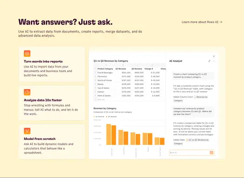
AI feature cards
Repeated pale Vanilla Card (#fffae5) panels with warm-gray borders, plum text, and compact orange-toned product icons.
Product UI composition
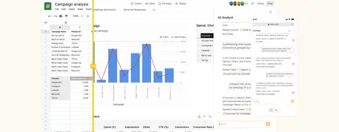
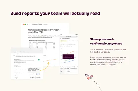
Layered spreadsheet and AI assistant screenshots, arranged side-by-side or overlapping to demonstrate real workflows.
Integrations band
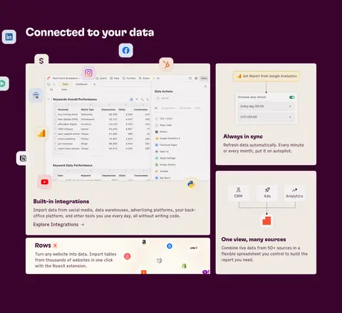
Full-width Deep Plum (#3a032d) section with white or light interface cards and integration logos breaking across the composition.
Template gallery
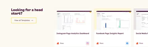
Horizontally presented report-preview cards on the warm canvas, paired with a yellow-outlined templates action.
Footer link grid
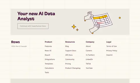
Warm, restrained footer with a brand callout, compact grouped navigation, and a small illustrative accent.
Imagery · Use product screenshots as the primary imagery: spreadsheets, charts, AI assistant panels, dashboards, and responsive report views. Keep interfaces bright and legible, often layered together to show how the product works across contexts. Small customer logos and interface icons support credibility and comprehension. Illustration is secondary and appears as a playful footer accent; avoid substituting lifestyle photography or glossy 3D imagery for the product UI.
Use Warm Canvas (#fbf9f0) as the main page ground.
Set major headings in bold GT Flexa-style display typography.
Use Deep Plum (#3a032d) for core text and dark section contrast.
Reserve Signal Yellow (#ffc800) for primary actions and distinct section emphasis.
Show real dashboard and assistant UI as the main explanatory imagery.
Give each feature chapter a clear background band and generous breathing room.
✕ 不该做
Do not make the page feel like a generic blue enterprise dashboard.
Do not use gradients as a substitute for the measured flat color bands.
Do not crowd the hero with competing text or interface elements.
Do not add heavy shadows or thick decorative borders to ordinary cards.
Do not let supporting illustration colors redefine the brand palette.
Do not replace product screenshots with unrelated lifestyle photography.
给 AI 的提示词
想快速出一个同风格的新页面,把这段话连同 DESIGN.md 一起发给 AI。
Build a new SaaS page in the Rows visual style. Use Warm Canvas (#fbf9f0) for the main ground and Deep Plum (#3a032d) for headings, navigation, and dark contrast sections. Use Signal Yellow (#ffc800) for the primary CTA and occasional full-width emphasis, and Buttercream Band (#fff4cc) for a feature chapter. Pair bold, slightly tight display headings with clean, neutral sans-serif body copy. Keep the hero centered and spacious, then use left-aligned two-column feature sections with real dashboard or assistant UI imagery. Create a clear scroll rhythm through alternating flat color bands, restrained warm-gray borders, and mostly flat cards. Keep the page content broad but controlled, use product visuals to explain functionality, and avoid gradients, heavy shadows, or generic blue SaaS styling.