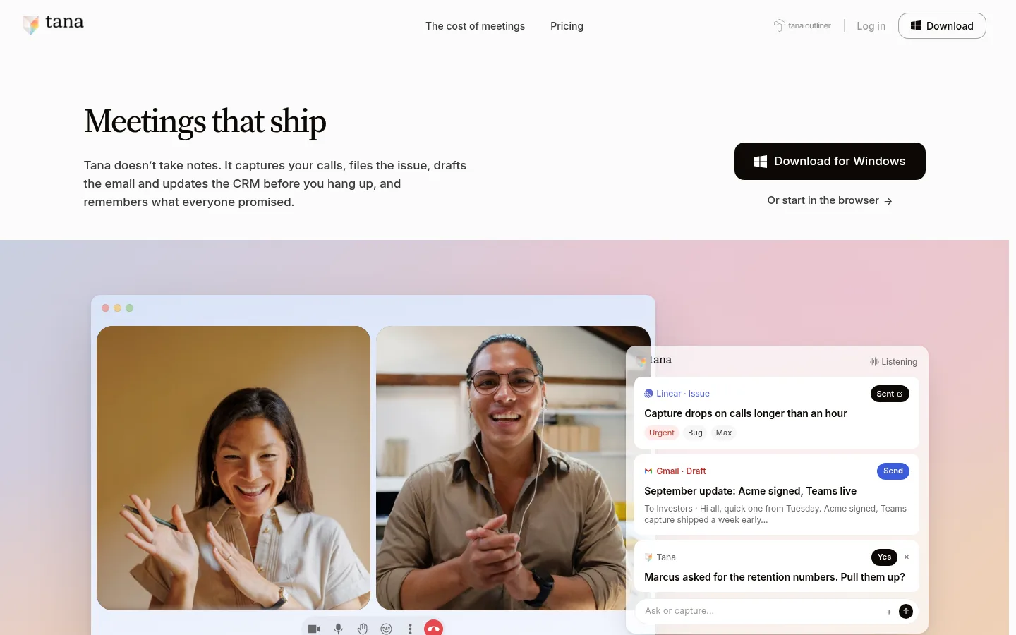
Tana 以克制的编辑式版面展示 AI 会议平台,用衬线标题搭配清晰的无衬线界面文字。柔和渐变与叠层产品画面带来色彩和动感,同时保持整体页面以近白色为主。
North star · Keep the page editorial and mostly near-white; let product imagery and interface details carry the vivid color.
The page uses a near-white canvas (#fbfbfb) across nearly every section, giving the long homepage a continuous, quiet foundation. Near-black (#0c0805) anchors headlines, body copy, dark CTAs, and selected product panels; secondary text steps back in gray. Source Serif 4 supplies the expressive, tightly tracked headlines, while Inter keeps navigation, descriptions, labels, and interface mockups practical and legible. The hero places copy on the left and a dark download action on the right, then gives way to a wide call-interface scene framed by a soft pastel gradient. Later sections alternate concise editorial text with product UI, comparison-like visuals, and photography. Most content is left-aligned or split across columns, with centered statements used as pauses. Generous vertical gaps create a spacious rhythm. Fine gray rules and subtle shadows distinguish cards and floating UI, while the brighter reds and blues remain restrained accents or product-interface details.
配色 点色块复制色值。用途说明来自对页面的实测位置(背景、文字、描边、按钮)与截图判读。
品牌色
Warm Ink
#0c0805
Primary text, headings, dark download CTA, badges, and the inverse knowledge-graph panel.
强调色
Signal Coral
#e5484d
Small prominent accent button inside the interface; use sparingly.
Interface Blue
#2b8fe6
Blue interface accent and product UI detail; keep it contextual rather than global.
表层色
Gallery White
#fbfbfb
Dominant page canvas and the continuous background behind nearly all sections.
Muted Stone
#9f9d9d
Limited subdued surface or card detail, not the primary canvas.
中性色
Quiet Gray
#6a6a6a
Muted supporting copy and footer text, secondary to near-black headings.
Graphite Text
#3a3a3a
Secondary navigation, inline links, and subdued labels.
Rule Gray
#eeeeee
Subtle borders, card edges, and fine separators.
Soft Divider
#e5e5e5
Occasional section or card border detail, secondary to the near-white canvas.
Gradient Gray
#a3a3a3
Gradient or visual transition detail measured in section artwork.
Shadow Gray
#717171
Muted gradient or visual treatment detail, not a core text color.
功能色
Brick Red
#c0392b
Rare badge detail in measured UI; not a defining page-wide brand color.
Cobalt Badge
#3b5bdb
Rare badge or interface detail; appears within product UI rather than the page chrome.
Periwinkle Badge
#5a6ac4
Badge color found in product-interface details, not a core site color.
Clay Badge
#b9835f
Small badge detail in mock UI; avoid using as a broad section color.
Sage Badge
#6a9a7c
Small badge detail in mock UI; not a page-level color.
文字 背景 对比度 WCAG #0c0805 Warm Ink#fbfbfb Gallery White19.28:1 AAA #0c0805 Warm Ink#9f9d9d Muted Stone7.4:1 AAA #fbfbfb Gallery White#9f9d9d Muted Stone2.61:1 不达标 #fbfbfb Gallery White#0c0805 Warm Ink19.28:1 AAA #6a6a6a Quiet Gray#fbfbfb Gallery White5.23:1 AA #6a6a6a Quiet Gray#9f9d9d Muted Stone2:1 不达标
字体 字号阶梯:Perfect Fourth(比例约 1.337,正文 15px)。示例用免费替代字体渲染,数值为实测。
Aa 设计
Inter 网络字体 · 字重 400 / 500 / 600 · 占比 80%
免费替代:Roboto
Navigation, body copy, links, captions, labels, and product-interface text.
Aa 设计
Source Serif 4 网络字体 · 字重 500 / 400 · 占比 20%
免费替代:Lora
Editorial page headlines and section titles.
角色 示例 字号 字重 行高 字距 一级标题 Primary hero statement, large editorial serif headline.
Tana
48px 500 1.1 -0.045em 二级标题 Major section headlines and centered narrative statements.
Tana
32px 500 1.15 -0.045em 三级标题 Subsection titles and feature-card headlines.
The quick brown fox 敏捷的狐狸
26px 500 1.2 -0.045em 四级标题 Smaller editorial headings within feature or supporting content.
The quick brown fox 敏捷的狐狸
22px 400 1.3 -0.045em 正文 Paragraphs explaining product behavior, benefits, and security.
The quick brown fox 敏捷的狐狸
15px 400 1.5 0 辅助文字 Compact interface labels and supporting card metadata.
The quick brown fox 敏捷的狐狸
13px 600 1.3 0 链接 Inline navigation and secondary browser-start actions.
The quick brown fox 敏捷的狐狸
15px 400 1.5 0 眉题 Small uppercase category labels above feature content.
The quick brown fox 敏捷的狐狸
11px 400 1.5 0.08em
间距与布局 基准单位 2px · 密度:宽松
96px 版块间距
8px 元素间距
13px 卡片内边距
— 内容最大宽度
1px
2px
3px
4px
5px
6px
7px
8px
9px
10px
11px
12px
14px
16px
18px
24px
A long, spacious homepage sits on a consistent near-white canvas, with content arranged in one-, two-, and multi-column section patterns. The hero is left-copy/right-action, followed by a wide visual product demonstration. Feature sections alternate text and interface artwork; centered headings punctuate the flow. Some sections use horizontal card rows or comparison panels. The measured data provides no fixed page maximum width, so preserve broad margins and responsive columns rather than assuming a numeric container. Large vertical pauses separate major narratives; denser interface details stay within cards.
圆角与层次 inset · other
lg · other
inset · nav
xl · card
Most sections are flat against the canvas, with light hairlines defining occasional card boundaries. Product cards and floating interface panels gain separation through soft, broad shadows and layered overlap rather than heavy outlines. Rounded white UI surfaces sit above gradient fields; dark panels provide contrast without requiring elaborate elevation.
组件 下面的预览按实测的按钮、输入框、徽标、卡片样式重建(字体用替代字体)。
Top navigation Minimal horizontal header with the Tana mark, centered text links, account actions, and a compact outlined Download pill.
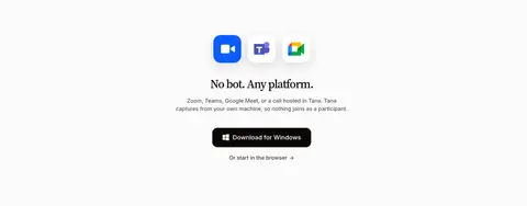
Hero download action Near-black rounded download button with white platform icon and label; a smaller graphite browser-start link sits beneath.
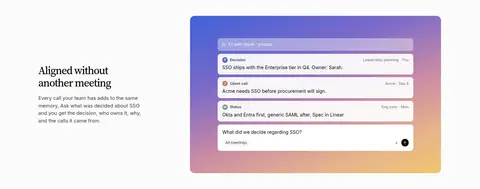
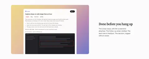
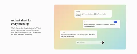
Product interface cards White rounded UI cards with compact Inter labels, status badges, message content, and subtle shadow over colorful gradient artwork.
Feature split Editorial serif heading and short sans-serif copy paired with a product screenshot or interface visual in an opposing column.
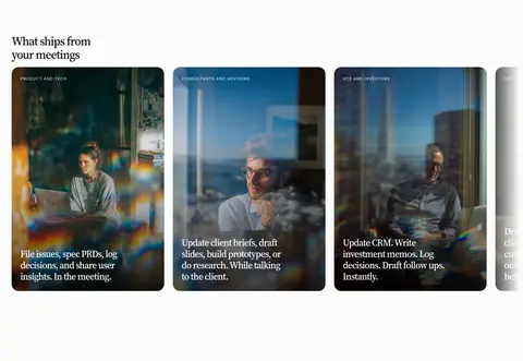
Use-case card row Horizontal image-led cards with dark photographic treatment, small category eyebrow, and white serif copy over the image.
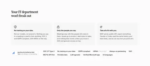
Security feature cards Light, restrained columns with small line icons, concise bold lead-ins, and muted explanatory text.
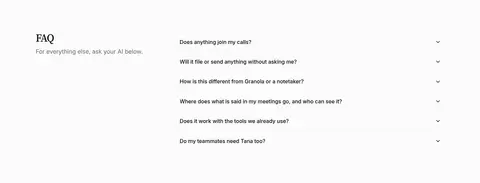
FAQ accordion Two-column FAQ area with a section title and short introduction at left; individual questions align with compact disclosure indicators.
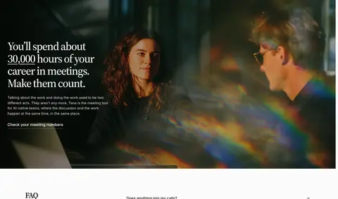
Imagery · Use realistic video-call photography in the opening product scene and selected use-case cards, with interface mockups layered over or beside it. Product visuals include crisp white cards, tiny status labels, and dark text. Pastel gradients frame several mockups, while the meeting-hours section uses cinematic, darkened photography and a text overlay. Keep photography framed as product context, not decorative stock imagery.
页面版块 共 16 个版块,按页面从上到下排列,每个都标了类型、布局和交互套路。
该做与不该做 ✓ 该做 Use near-white as the page-wide foundation. Set major headlines in Source Serif 4. Keep interface and body text in Inter. Use Warm Ink for primary copy and download actions. Pair concise text with concrete product visuals. Reserve gradients for mockup framing and visual transitions. ✕ 不该做 Do not turn the page into a dark theme. Do not apply accent colors to large text areas. Do not make every section a card grid. Do not use oversized, heavy sans-serif headlines. Do not add strong borders around every panel. Do not treat mockup badge colors as the site palette. 给 AI 的提示词 想快速出一个同风格的新页面,把这段话连同 DESIGN.md 一起发给 AI。
复制 Build a new Tana-style page on a continuous Gallery White (#fbfbfb) canvas. Use Warm Ink (#0c0805) for primary text and dark calls to action, Graphite Text (#3a3a3a) for secondary links, and Quiet Gray (#6a6a6a) for muted explanations. Set editorial headings in Source Serif 4 with tight tracking; use Inter for navigation, paragraphs, labels, and interface details. Structure the page as spacious editorial sections, alternating concise copy with realistic product UI or contextual photography. Use subtle Rule Gray (#eeeeee) dividers, rounded white interface cards, and soft shadows only where panels overlap. Pastel gradients may frame product mockups; Signal Coral (#e5484d) and Interface Blue (#2b8fe6) should remain small interface accents. Preserve responsive columns and generous breathing room without inventing fixed container measurements.
DESIGN.md Tailwind v4 CSS 变量 Design Tokens
---
title: "Tana design system"
variant: extended
source: https://tana.inc/
captured_at: 2026-10-12
theme: light
industry: ai
generator: Design DNA (https://four.wiralomi.com/style/tana-inc)
ai_generated: true
ai_label: "本文件由 AI 辅助生成:数值取自公开网页的实测样式,命名、用途说明与建议为模型解读。商标归原所有者。 / AI-assisted content"
---
# Tana · Design System
> Quiet editorial clarity, energized by vivid product color
**Theme:** light · **Industry:** ai · **Source:** https://tana.inc/ · **Captured:** 2026-10-12 (1440×900 desktop)
_AI-assisted content: values are measured from the public page at capture time; names, roles and guidance are model-written interpretations. Trademarks belong to their owners._
Tana presents an AI meeting platform through a calm, editorial layout with serif headlines and crisp sans-serif interface text. Pastel gradient fields and layered product imagery add color and motion without disrupting the predominantly near-white canvas.
## North star
Keep the page editorial and mostly near-white; let product imagery and interface details carry the vivid color.
## Overview
The page uses a near-white canvas (## Colors
| Name | Hex | Token | Group | Role |
|---|---|---|---|---|
| Gallery White | ` | `--color-gallery-white` | surface | Dominant page canvas and the continuous background behind nearly all sections. |
| Quiet Gray | ` | `--color-quiet-gray` | neutral | Muted supporting copy and footer text, secondary to near-black headings. |
| Warm Ink | ` | `--color-warm-ink` | brand | Primary text, headings, dark download CTA, badges, and the inverse knowledge-graph panel. |
| Graphite Text | ` | `--color-graphite-text` | neutral | Secondary navigation, inline links, and subdued labels. |
| Rule Gray | ` | `--color-rule-gray` | neutral | Subtle borders, card edges, and fine separators. |
| Brick Red | ` | `--color-brick-red` | semantic | Rare badge detail in measured UI; not a defining page-wide brand color. |
| Cobalt Badge | ` | `--color-cobalt-badge` | semantic | Rare badge or interface detail; appears within product UI rather than the page chrome. |
| Soft Divider | ` | `--color-soft-divider` | neutral | Occasional section or card border detail, secondary to the near-white canvas. |
| Signal Coral | ` | `--color-signal-coral` | accent | Small prominent accent button inside the interface; use sparingly. |
| Periwinkle Badge | ` | `--color-periwinkle-badge` | semantic | Badge color found in product-interface details, not a core site color. |
| Clay Badge | ` | `--color-clay-badge` | semantic | Small badge detail in mock UI; avoid using as a broad section color. |
| Sage Badge | ` | `--color-sage-badge` | semantic | Small badge detail in mock UI; not a page-level color. |
| Muted Stone | ` | `--color-muted-stone` | surface | Limited subdued surface or card detail, not the primary canvas. |
| Gradient Gray | ` | `--color-gradient-gray` | neutral | Gradient or visual transition detail measured in section artwork. |
| Interface Blue | ` | `--color-interface-blue` | accent | Blue interface accent and product UI detail; keep it contextual rather than global. |
| Shadow Gray | ` | `--color-shadow-gray` | neutral | Muted gradient or visual treatment detail, not a core text color. |
### Semantic aliases
`--color-canvas` → ` (Gallery White) · `--color-surface` → ` (Muted Stone) · `--color-surface-2` → ` (Warm Ink) · `--color-text` → ` (Warm Ink) · `--color-text-muted` → ` (Gallery White) · `--color-text-subtle` → ` (Quiet Gray) · `--color-border` → ` (Rule Gray) · `--color-accent` → ` (Signal Coral) · `--color-accent-2` → ` (Interface Blue)
### Contrast (WCAG 2.x)
| Text | Background | Ratio | Level |
|---|---|---|---|
| ` | ` | 19.28:1 | AAA |
| ` | ` | 7.4:1 | AAA |
| ` | ` | 2.61:1 | fail |
| ` | ` | 19.28:1 | AAA |
| ` | ` | 5.23:1 | AA |
| ` | ` | 2:1 | fail |
| ` | ` | 3.69:1 | AA-large |
| ` | ` | 3.78:1 | AA-large |
| ` | ` | 1.45:1 | fail |
| ` | ` | 5.1:1 | AA |
### Gradients
- `linear-gradient(rgba(0, 0, 0, 0.18), rgba(0, 0, 0, 0.08) 30%, rgba(0, 0, 0, 0.2) 55%, rgba(0, 0, 0, 0.7))`
- `linear-gradient(rgba(0, 0, 0, 0.35), rgba(0, 0, 0, 0.55))`
- `linear-gradient(90deg, rgb(251, 251, 251), rgb(227, 234, 246) 22%, rgb(211, 222, 241) 50%, rgb(227, 234, 246) 78%, rgb(251, 251, 251))`
- `linear-gradient(90deg, rgba(0, 0, 0, 0.6), rgba(0, 0, 0, 0.35) 40%, rgba(0, 0, 0, 0.1))`
## Typography
| Family | Token | Source | Weights | Role | Free substitute |
|---|---|---|---|---|---|
| Inter | `--font-body` | webfont | 400, 500, 600 | Navigation, body copy, links, captions, labels, and product-interface text. | Roboto |
| Source Serif 4 | `--font-display` | webfont | 500, 400 | Editorial page headlines and section titles. | Lora |
- **Inter:** Use practical sans-serif text with regular body weight and stronger compact captions; eyebrow labels are uppercase with lightly expanded tracking.
- **Source Serif 4:** Medium, restrained serif headlines with tight negative tracking; sentence case rather than all caps.
### Type scale — Perfect Fourth (ratio ≈ 1.337, base 15px)
| Role | Size | Weight | Line height | Letter spacing | Case | Family | Used for |
|---|---|---|---|---|---|---|---|
| h1 | 48px | 500 | 1.1 | -0.045em | — | Source Serif 4 | Primary hero statement, large editorial serif headline. |
| h2 | 32px | 500 | 1.15 | -0.045em | — | Source Serif 4 | Major section headlines and centered narrative statements. |
| h3 | 26px | 500 | 1.2 | -0.045em | — | Source Serif 4 | Subsection titles and feature-card headlines. |
| h4 | 22px | 400 | 1.3 | -0.045em | — | Source Serif 4 | Smaller editorial headings within feature or supporting content. |
| body | 15px | 400 | 1.5 | 0 | — | Inter | Paragraphs explaining product behavior, benefits, and security. |
| caption | 13px | 600 | 1.3 | 0 | — | Inter | Compact interface labels and supporting card metadata. |
| link | 15px | 400 | 1.5 | 0 | — | Inter | Inline navigation and secondary browser-start actions. |
| eyebrow | 11px | 400 | 1.5 | 0.08em | uppercase | Inter | Small uppercase category labels above feature content. |
## Spacing & layout
- Base unit **2px**, density **spacious**.
- Scale (most used values): 1, 2, 3, 4, 5, 6, 7, 8, 9, 10, 11, 12, 14, 16, 18, 24 px.
- Section rhythm 96px · element gap 8px · card padding 13px · max content width —.
A long, spacious homepage sits on a consistent near-white canvas, with content arranged in one-, two-, and multi-column section patterns. The hero is left-copy/right-action, followed by a wide visual product demonstration. Feature sections alternate text and interface artwork; centered headings punctuate the flow. Some sections use horizontal card rows or comparison panels. The measured data provides no fixed page maximum width, so preserve broad margins and responsive columns rather than assuming a numeric container. Large vertical pauses separate major narratives; denser interface details stay within cards.
## Shape & elevation
- Radius: button `9999px` · card `14px` · badge `9999px` · nav `14px` · link `8px` · xs `6px` · sm `8px` · md `11px` · lg `14px` · xl `20px` · 2xl `23px` · pill `9999px`
- Shadow `inset` (other): `rgba(0, 0, 0, 0.12) 0px 0px 0px 0.5px inset`
- Shadow `lg` (other): `rgba(28, 32, 36, 0.14) 0px 10px 30px 0px, rgba(28, 32, 36, 0.06) 0px 1px 2px 0px`
- Shadow `inset-2` (nav): `color(srgb 0.0470588 0.0313726 0.0196078 / 0.35) 0px 0px 0px 1px inset`
- Shadow `xl` (card): `rgba(12, 8, 5, 0.08) 0px 4px 10px 0px, rgba(12, 8, 5, 0.17) 0px 44px 92px 0px`
- Shadow `xl-2` (card): `rgba(20, 22, 36, 0.12) 0px 2px 6px -2px, rgba(20, 22, 36, 0.3) 0px 24px 48px -20px`
- Shadow `inset-3` (other): `rgba(255, 255, 255, 0.6) 0px 1px 0px 0px inset`
- Motion: standard transition `0.12s ease` on interactive elements.
Most sections are flat against the canvas, with light hairlines defining occasional card boundaries. Product cards and floating interface panels gain separation through soft, broad shadows and layered overlap rather than heavy outlines. Rounded white UI surfaces sit above gradient fields; dark panels provide contrast without requiring elaborate elevation.
## Imagery
Use realistic video-call photography in the opening product scene and selected use-case cards, with interface mockups layered over or beside it. Product visuals include crisp white cards, tiny status labels, and dark text. Pastel gradients frame several mockups, while the meeting-hours section uses cinematic, darkened photography and a text overlay. Keep photography framed as product context, not decorative stock imagery.
## Components
### Top navigation
Minimal horizontal header with the Tana mark, centered text links, account actions, and a compact outlined Download pill.
### Hero download action
Near-black rounded download button with white platform icon and label; a smaller graphite browser-start link sits beneath.
### Product interface cards
White rounded UI cards with compact Inter labels, status badges, message content, and subtle shadow over colorful gradient artwork.
### Feature split
Editorial serif heading and short sans-serif copy paired with a product screenshot or interface visual in an opposing column.
### Use-case card row
Horizontal image-led cards with dark photographic treatment, small category eyebrow, and white serif copy over the image.
### Security feature cards
Light, restrained columns with small line icons, concise bold lead-ins, and muted explanatory text.
### FAQ accordion
Two-column FAQ area with a section title and short introduction at left; individual questions align with compact disclosure indicators.
### Measured component styles
- **Primary button** (“Download for Windows”): background ## Do
- Use near-white as the page-wide foundation.
- Set major headlines in Source Serif 4.
- Keep interface and body text in Inter.
- Use Warm Ink for primary copy and download actions.
- Pair concise text with concrete product visuals.
- Reserve gradients for mockup framing and visual transitions.
## Don't
- Do not turn the page into a dark theme.
- Do not apply accent colors to large text areas.
- Do not make every section a card grid.
- Do not use oversized, heavy sans-serif headlines.
- Do not add strong borders around every panel.
- Do not treat mockup badge colors as the site palette.
## Agent prompt
Build a new Tana-style page on a continuous Gallery White (## Page sections (top to bottom)
| # | Type | Layout | UX patterns | UI patterns |
|---|---|---|---|---|
| 1 | hero | Left-aligned headline and supporting copy, with a right-side download action. | Primary platform download, Secondary browser-start link | Editorial serif headline, Near-black CTA |
| 2 | product-showcase | Wide meeting-call visual with layered action and message cards. | Show outcomes in context, Surface generated actions | Video-call imagery, Floating white interface cards, Pastel gradient backdrop |
| 3 | integrations | Dense horizontal collection of partner and tool marks. | Show supported services, Scan familiar integrations | Repeated logo row, Compact labels |
| 4 | other | Single centered statement with substantial surrounding whitespace. | Audience positioning | Centered serif heading |
| 5 | feature-split | Text block paired with a product knowledge or meeting-memory visual. | Explain persistent context, Illustrate retrieval | Serif section title, Product interface visual |
| 6 | feature-split | Two-column copy and product output visual, alternating image and text placement. | Show completed deliverables, Connect meeting to action | Compact feature list, Layered interface screenshot |
| 7 | feature-split | Editorial text alongside a conversational assistant interface visual. | Answer live questions, Recall previous context | Serif title, Gradient-framed mockup |
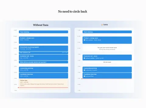
| 8 | comparison | Centered heading above side-by-side schedule comparison panels. | Contrast before and after, Make time savings legible | Two-column schedule boards, Blue event blocks |
| 9 | feature-grid | Centered copy and platform marks with download and browser actions. | Reassure about compatibility, Offer download choice | Platform icons, Centered CTA stack |
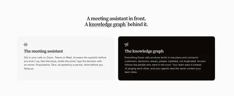
| 10 | feature-split | Centered title above two contrasting explanatory panels. | Explain two product layers, Contrast assistant and graph | Light feature panel, Dark inverse panel |
| 11 | gallery | Multi-column, image-led use-case cards in a horizontal gallery. | Browse by work context, Show practical outputs | Photographic cards, Overlay copy, Category eyebrows |
| 12 | feature-grid | Three restrained feature columns followed by a row of compliance and capability labels. | Address security concerns, Summarize controls | Line icons, Compact proof points, Light cards |
| 13 | video | Full-width cinematic image with white text overlaid at the left. | Make the problem relatable, Link to meeting-cost information | Darkened photo treatment, Large serif overlay copy |
| 14 | faq | Two-column section with an introduction at left and stacked questions at right. | Answer purchase concerns, Expand questions on demand | Simple accordion rows, Disclosure indicators |
| 15 | cta | Large product mark or visual paired with a text-and-action column. | Offer self-serve product details, Prompt an agent-based follow-up | Serif headline, Compact description action |
| 16 | footer | Multi-column link groups with brand, company, legal, and social details. | Navigate product areas, Access company and legal links | Small muted link lists, Compact social row |
## Source CSS custom properties (selected)
```css
--gray-surface: #ffffffcc;
--mauve-surface: #ffffffcc;
--slate-surface: #ffffffcc;
--sage-surface: #ffffffcc;
--olive-surface: #ffffffcc;
--sand-surface: #ffffffcc;
--amber-surface: #fefae4cc;
--blue-surface: #f1f9ffcc;
--bronze-surface: #fdf5f3cc;
--brown-surface: #fbf8f4cc;
--crimson-surface: #fef5f8cc;
--cyan-surface: #eff9facc;
--gold-surface: #f9f8efcc;
--grass-surface: #f3faf3cc;
--green-surface: #f1faf4cc;
--indigo-surface: #f5f8ffcc;
--iris-surface: #f6f6ffcc;
--jade-surface: #f1faf5cc;
--lime-surface: #f6f9f0cc;
--mint-surface: #effaf8cc;
--orange-surface: #fff5e9cc;
--pink-surface: #fef5facc;
--plum-surface: #fdf5fdcc;
--purple-surface: #faf5fecc;
--red-surface: #fff5f5cc;
--ruby-surface: #fff5f6cc;
--sky-surface: #eef9fdcc;
--teal-surface: #f0faf8cc;
--tomato-surface: #fff6f5cc;
--violet-surface: #f9f6ffcc;
--yellow-surface: #fefbe4cc;
```
---
本文件由 AI 辅助生成:数值取自公开网页的实测样式,命名、用途说明与建议为模型解读。商标归原所有者。
Generated by Design DNA · https://four.wiralomi.com/style/tana-inc