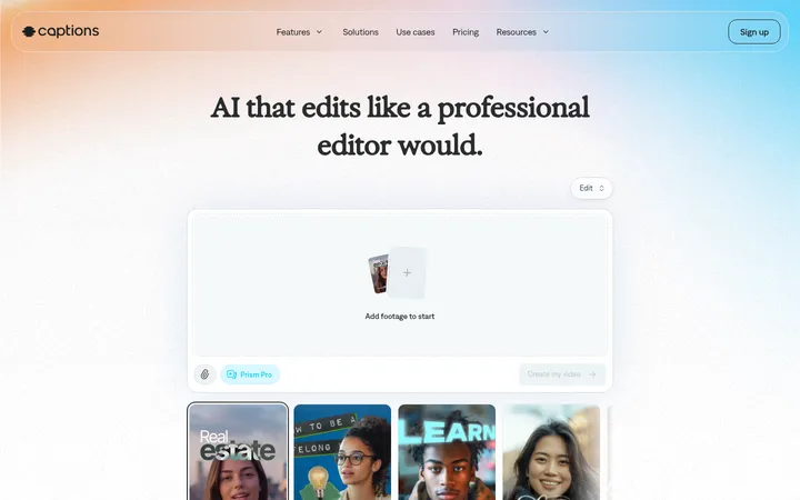
VEED以明亮留白的页面、醒目的荧光绿操作色和利落的黑色字体,呈现轻快直接的品牌气质。产品演示与人物视频承担主要叙事,深色功能区则带来鲜明的节奏变化。
North star · Keep the page mostly white and spacious, using Signal Lime (#96ff1a) as a precise action cue and real video imagery as the proof.
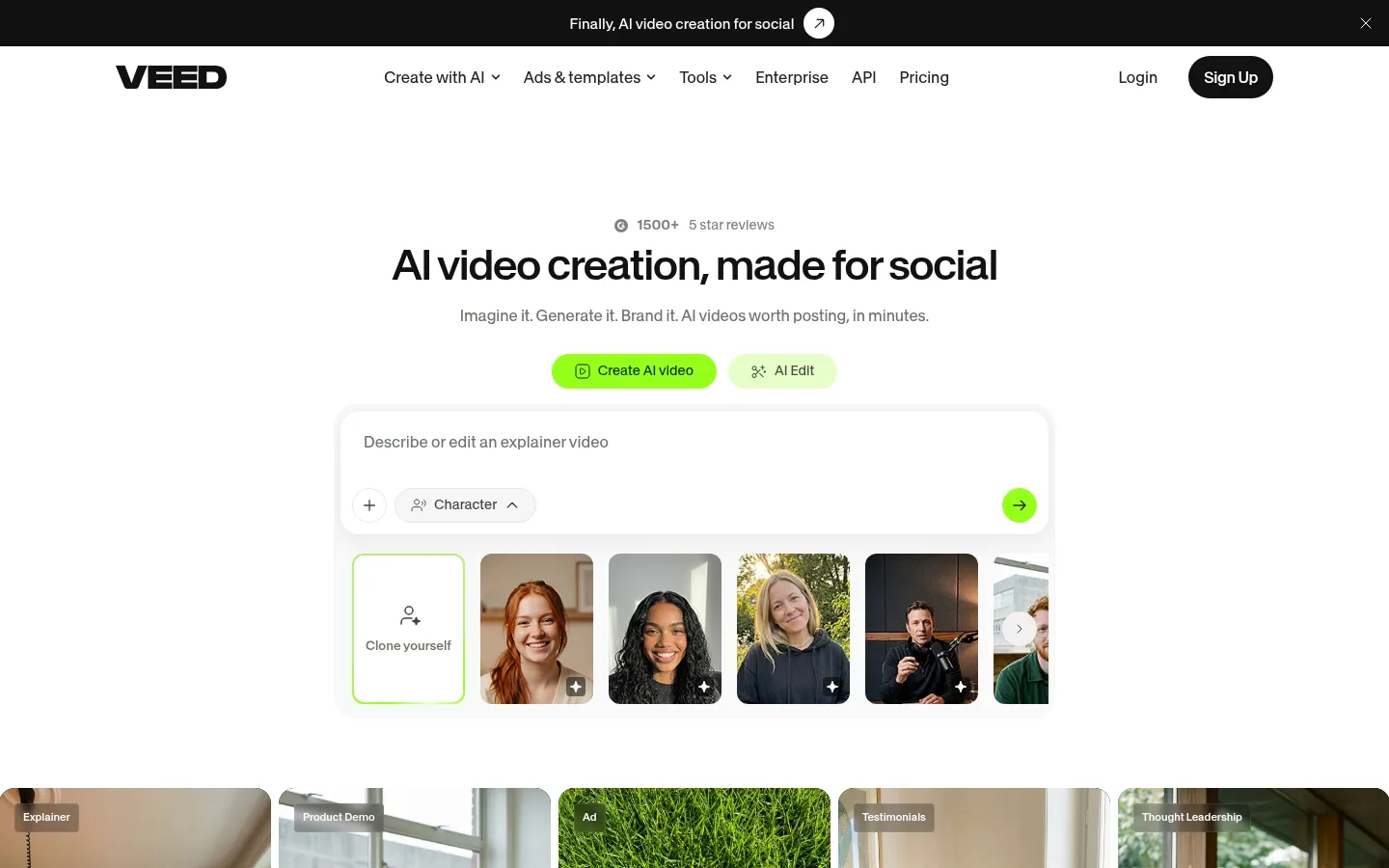
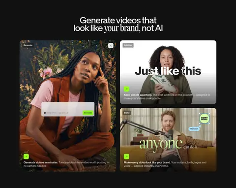
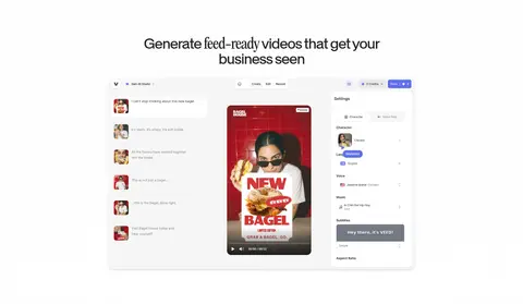
The homepage is built on Gallery White (#ffffff), with near-black text and generous open space around its centered hero. Signal Lime (#96ff1a) is reserved for primary actions and small interface highlights, so it reads as a deliberate cue rather than a broad wash of brand colour. SwissNow’s compact, tightly tracked headings give the page a crisp, contemporary voice; body copy stays restrained and muted. The hero pairs concise copy and pill-shaped actions with a large, realistic creation interface, then transitions into a strip of human-led video examples. A near-black feature section breaks the predominantly light canvas and gives its media cards more contrast. Product screenshots and people in video remain central; testimonial cards use soft green rather than competing with the primary CTA. Across the page, rounded controls, quiet hairlines and broad section spacing keep a complex toolset approachable.
配色 点色块复制色值。用途说明来自对页面的实测位置(背景、文字、描边、按钮)与截图判读。
强调色
Signal Lime
#96ff1a
Primary creation CTA and small high-visibility interface accents.
Lime Mist
#e6ffc8
Pale secondary-action fill that softens the primary lime.
表层色
Gallery White
#ffffff
Primary page canvas, light section backgrounds, and white interface and testimonial cards.
Pistachio Wash
#d6ffa6
Soft green testimonial-card backgrounds; a supporting tint rather than a page-wide brand field.
Night Ink
#121212
Dark feature-section band, dark CTA, and inverse text or labels.
Cloud Line
#f5f5f6
Subtle card and control surfaces, plus fine borders on light sections.
Graphite Control
#292a2e
Dark button or control surface in inverse UI.
中性色
Soft Ink
#0c0a09
Primary dark text and strong foreground contrast on the white canvas.
Quiet Grey
#797676
Muted supporting copy and footer text against light backgrounds.
Charcoal Link
#1a1a1a
Dark link and interactive surface treatment.
Slate Copy
#4d4d51
Secondary muted text for quieter supporting information.
Navigation Ink
#262527
Header navigation and selected dark text on the light canvas.
Pale Caption
#bababa
Low-emphasis text detail; not a dominant brand colour.
功能色
Moss Edge
#bee57f
Measured button edge colour; keep to subtle control detailing.
Graphite Edge
#3a3b3e
Subtle measured border detail on dark controls or interface elements.
Silver Hairline
#e6e6e7
Quiet interface and button border detail.
文字 背景 对比度 WCAG #0c0a09 Soft Ink#ffffff Gallery White19.76:1 AAA #0c0a09 Soft Ink#121212 Night Ink1.05:1 不达标 #0c0a09 Soft Ink#1a1a1a Charcoal Link1.14:1 不达标 #0c0a09 Soft Ink#292a2e Graphite Control1.38:1 不达标 #797676 Quiet Grey#ffffff Gallery White4.5:1 AA #797676 Quiet Grey#121212 Night Ink4.16:1 AA-large
字体 字号阶梯:Perfect Fifth(比例约 1.5,正文 16px)。示例用免费替代字体渲染,数值为实测。
Aa 设计
SwissNow 网络字体 · 字重 500 / 400 / 600 / 700 · 占比 99%
免费替代:Inter
Primary interface, navigation, headings, body copy, and buttons
Aa 设计
PPEditorialNew 网络字体 · 字重 400 · 占比 1%
免费替代:Instrument Serif
Rare editorial serif accent
角色 示例 字号 字重 行高 字距 一级标题 Centered hero headline; large, compact, tightly tracked display text.
VEED
54px 400 0.88 -0.05em 二级标题 Major feature and section headings.
VEED
44px 500 0.88 -0.04em 三级标题 Subsection headings and product-feature titles.
VEED
40px 400 1 -0.05em 正文 Primary descriptions, card copy, and supporting interface text.
The quick brown fox 敏捷的狐狸
16px 500 1.36 -0.005em 辅助文字 Small labels, review details, and metadata.
The quick brown fox 敏捷的狐狸
14px 400 1.43 0 按钮 CTA labels and action controls.
The quick brown fox 敏捷的狐狸
16px 400 1.5 0 导航 Header navigation links.
The quick brown fox 敏捷的狐狸
16px 400 1.5 0
间距与布局 基准单位 4px · 密度:宽松
100px 版块间距
8px 元素间距
24px 卡片内边距
1200px 内容最大宽度
4px
6px
8px
9px
10px
12px
14px
16px
24px
32px
Use a spacious, mostly centered composition with a measured page max width of 1200px. The hero stacks social proof, headline, short supporting copy, lime actions, and the creation interface; a full-width video strip follows. Subsequent content alternates broad white sections with a dark feature band, then returns to testimonials and discovery links. A measured 100px section gap and 24px card padding establish the rhythm. Keep grids aligned and media prominent, with denser link collections reserved for the lower page.
圆角与层次 hairline · button, input
lg · card
sm · button
md · button
The page is largely flat, with separation coming from whitespace, alternating light and dark section backgrounds, and restrained borders. Cards use measured rounded corners and occasional soft shadows, while the creation interface can sit on a subtly elevated white panel. Keep shadows quiet; avoid heavy floating layers.
组件 下面的预览按实测的按钮、输入框、徽标、卡片样式重建(字体用替代字体)。
Primary CTA Signal Lime (#96ff1a) pill-shaped action with dark-green text; measured label styling is SwissNow at 14px.
Secondary action Pale lime (#e6ffc8) pill button beside the primary hero action.
Header Wordmark at left, centered navigation links, and a dark rounded Sign Up button at right.
Creation interface Large white prompt panel with a text-entry area, compact controls, lime submit action, and a row of creator thumbnails.
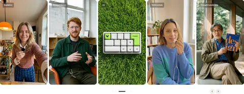
Media cards Rounded video previews with small overlay labels and concise descriptions, arranged in asymmetric feature grids.
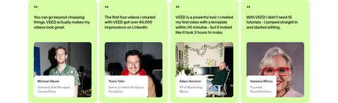
Testimonial cards Soft green quote cards with compact copy, a person image, and attribution details.
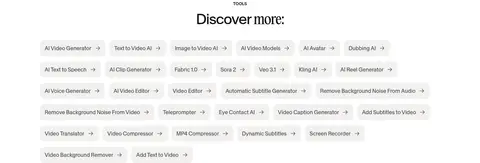
Discovery links Dense set of small, light-neutral rounded tool links, distinct from the spacious hero and feature areas.
Imagery · Use realistic video stills and product-interface imagery as the main visual proof: creators speaking to camera, varied environments, and clear previews of editing or generation tools. Present media in rounded rectangular cards, sometimes in a compact multi-column grid and sometimes as a wide horizontal strip. Preserve natural photography and product screenshots; avoid decorative illustration or 3D as the dominant visual language.
页面版块 共 7 个版块,按页面从上到下排列,每个都标了类型、布局和交互套路。
该做与不该做 ✓ 该做 Keep the main canvas white and visibly spacious. Use Signal Lime (#96ff1a) for primary actions and restrained interface cues. Make the hero headline centered and visually compact. Use real video stills and product previews as the core imagery. Break up the light page with a decisive near-black feature band. Use rounded controls and cards with understated borders. Keep secondary text muted and lower in visual priority. ✕ 不该做 Do not turn the lime accent into a large background wash. Do not crowd the hero with extra copy or competing actions. Do not use decorative illustrations in place of product and video imagery. Do not add heavy shadows or layered glass effects. Do not make every section dark; preserve the predominantly light canvas. Do not use oversized, high-contrast serif typography for the interface. Do not apply saturated colours to every card or control. 给 AI 的提示词 想快速出一个同风格的新页面,把这段话连同 DESIGN.md 一起发给 AI。
复制 Build a new VEED-style page with a spacious white canvas (#ffffff), dark primary text (#0c0a09), and SwissNow-like sans-serif typography (Inter is a suitable free substitute). Use compact, tightly tracked headings and short supporting copy. Reserve Signal Lime (#96ff1a) for the primary CTA and small interaction cues; use Lime Mist (#e6ffc8) for secondary actions and Pistachio Wash (#d6ffa6) sparingly on testimonial surfaces. Structure the page with a centered hero, clear product interface or video preview, and broad, orderly sections. Add one Night Ink (#121212) feature band to create contrast. Favor authentic people-in-video and editing-interface imagery in rounded cards. Use restrained hairlines, subtle elevation, and generous section spacing; keep navigation and lower-page link collections tidy and secondary.
DESIGN.md Tailwind v4 CSS 变量 Design Tokens
---
title: "VEED design system"
variant: extended
source: https://www.veed.io/
captured_at: 2026-10-12
theme: light
industry: ai
generator: Design DNA (https://four.wiralomi.com/style/veed-io)
ai_generated: true
ai_label: "本文件由 AI 辅助生成:数值取自公开网页的实测样式,命名、用途说明与建议为模型解读。商标归原所有者。 / AI-assisted content"
---
# VEED · Design System
> Bright, spacious video creation with a sharp lime signal.
**Theme:** light · **Industry:** ai · **Source:** https://www.veed.io/ · **Captured:** 2026-10-12 (1440×900 desktop)
_AI-assisted content: values are measured from the public page at capture time; names, roles and guidance are model-written interpretations. Trademarks belong to their owners._
VEED pairs a bright, open canvas with a focused lime-green action colour and confident black typography. Product demonstrations and creator-led video imagery carry the story, while a dark feature band creates a clear shift in pace.
## North star
Keep the page mostly white and spacious, using Signal Lime (## Overview
The homepage is built on Gallery White (## Colors
| Name | Hex | Token | Group | Role |
|---|---|---|---|---|
| Gallery White | ` | `--color-gallery-white` | surface | Primary page canvas, light section backgrounds, and white interface and testimonial cards. |
| Soft Ink | ` | `--color-soft-ink` | neutral | Primary dark text and strong foreground contrast on the white canvas. |
| Pistachio Wash | ` | `--color-pistachio-wash` | surface | Soft green testimonial-card backgrounds; a supporting tint rather than a page-wide brand field. |
| Signal Lime | ` | `--color-signal-lime` | accent | Primary creation CTA and small high-visibility interface accents. |
| Moss Edge | ` | `--color-moss-edge` | semantic | Measured button edge colour; keep to subtle control detailing. |
| Night Ink | ` | `--color-night-ink` | surface | Dark feature-section band, dark CTA, and inverse text or labels. |
| Quiet Grey | ` | `--color-quiet-grey` | neutral | Muted supporting copy and footer text against light backgrounds. |
| Cloud Line | ` | `--color-cloud-line` | surface | Subtle card and control surfaces, plus fine borders on light sections. |
| Charcoal Link | ` | `--color-charcoal-link` | neutral | Dark link and interactive surface treatment. |
| Slate Copy | ` | `--color-slate-copy` | neutral | Secondary muted text for quieter supporting information. |
| Graphite Control | ` | `--color-graphite-control` | surface | Dark button or control surface in inverse UI. |
| Graphite Edge | ` | `--color-graphite-edge` | semantic | Subtle measured border detail on dark controls or interface elements. |
| Lime Mist | ` | `--color-lime-mist` | accent | Pale secondary-action fill that softens the primary lime. |
| Silver Hairline | ` | `--color-silver-hairline` | semantic | Quiet interface and button border detail. |
| Navigation Ink | ` | `--color-navigation-ink` | neutral | Header navigation and selected dark text on the light canvas. |
| Pale Caption | ` | `--color-pale-caption` | neutral | Low-emphasis text detail; not a dominant brand colour. |
### Semantic aliases
`--color-canvas` → ` (Gallery White) · `--color-surface` → ` (Night Ink) · `--color-surface-2` → ` (Charcoal Link) · `--color-surface-3` → ` (Graphite Control) · `--color-surface-4` → ` (Cloud Line) · `--color-text` → ` (Soft Ink) · `--color-text-muted` → ` (Quiet Grey) · `--color-text-subtle` → ` (Slate Copy) · `--color-border` → ` (Cloud Line) · `--color-accent` → ` (Signal Lime) · `--color-on-accent` → `
### Contrast (WCAG 2.x)
| Text | Background | Ratio | Level |
|---|---|---|---|
| ` | ` | 19.76:1 | AAA |
| ` | ` | 1.05:1 | fail |
| ` | ` | 1.14:1 | fail |
| ` | ` | 1.38:1 | fail |
| ` | ` | 4.5:1 | AA |
| ` | ` | 4.16:1 | AA-large |
| ` | ` | 3.87:1 | AA-large |
| ` | ` | 3.19:1 | AA-large |
| ` | ` | 8.41:1 | AAA |
| ` | ` | 2.23:1 | fail |
### Gradients
- `radial-gradient(100% 70% at 50% 100%, rgb(255, 255, 255) 0%, rgba(255, 255, 255, 0.7) 40%, rgba(255, 255, 255, 0.3) 65%, rgba(0, 0, 0, 0) 100%)`
- `linear-gradient(to top, oklab(0 0 0 / 0.6) 0px, rgba(0, 0, 0, 0) 50%, rgba(0, 0, 0, 0) 100%)`
- `linear-gradient(to right in oklab, rgb(255, 255, 255) 0px, rgba(0, 0, 0, 0) 100%)`
- `linear-gradient(to left in oklab, rgb(255, 255, 255) 0px, rgba(0, 0, 0, 0) 100%)`
## Typography
| Family | Token | Source | Weights | Role | Free substitute |
|---|---|---|---|---|---|
| SwissNow | `--font-body` | webfont | 500, 400, 600, 700 | Primary interface, navigation, headings, body copy, and buttons | Inter |
| PPEditorialNew | `--font-ppeditorialnew` | webfont | 400 | Rare editorial serif accent | Instrument Serif |
- **SwissNow:** Use a clean sans-serif voice with compact, tightly tracked display headings; weights range from regular to bold, with sentence case.
- **PPEditorialNew:** Measured at very low page share; use sparingly for occasional editorial contrast, not core interface text.
### Type scale — Perfect Fifth (ratio ≈ 1.5, base 16px)
| Role | Size | Weight | Line height | Letter spacing | Case | Family | Used for |
|---|---|---|---|---|---|---|---|
| h1 | 54px | 400 | 0.88 | -0.05em | — | SwissNow | Centered hero headline; large, compact, tightly tracked display text. |
| h2 | 44px | 500 | 0.88 | -0.04em | — | SwissNow | Major feature and section headings. |
| h3 | 40px | 400 | 1 | -0.05em | — | SwissNow | Subsection headings and product-feature titles. |
| body | 16px | 500 | 1.36 | -0.005em | — | SwissNow | Primary descriptions, card copy, and supporting interface text. |
| caption | 14px | 400 | 1.43 | 0 | — | SwissNow | Small labels, review details, and metadata. |
| button | 16px | 400 | 1.5 | 0 | — | SwissNow | CTA labels and action controls. |
| nav | 16px | 400 | 1.5 | 0 | — | SwissNow | Header navigation links. |
## Spacing & layout
- Base unit **4px**, density **spacious**.
- Scale (most used values): 4, 6, 8, 9, 10, 12, 14, 16, 24, 32 px.
- Section rhythm 100px · element gap 8px · card padding 24px · max content width 1200px.
Use a spacious, mostly centered composition with a measured page max width of 1200px. The hero stacks social proof, headline, short supporting copy, lime actions, and the creation interface; a full-width video strip follows. Subsequent content alternates broad white sections with a dark feature band, then returns to testimonials and discovery links. A measured 100px section gap and 24px card padding establish the rhythm. Keep grids aligned and media prominent, with denser link collections reserved for the lower page.
## Shape & elevation
- Radius: button `12px` · card `16px` · media `12px` · badge `4px` · nav `9999px` · link `16px` · xs `4px` · sm `8px` · md `10px` · lg `12px` · xl `16px` · pill `9999px`
- Shadow `hairline` (button, input): `rgba(0, 0, 0, 0) 0px 0px 0px 0px, rgba(0, 0, 0, 0) 0px 0px 0px 0px, rgba(0, 0, 0, 0) 0px 0px 0px 0px, oklch(0.3171 0 0) 0px 0px 0px 0px, rgba(0, 0, 0, 0) 0px 0px 0px 0px`
- Shadow `lg` (card): `rgba(0, 0, 0, 0) 0px 0px 0px 0px, rgba(0, 0, 0, 0) 0px 0px 0px 0px, rgba(0, 0, 0, 0) 0px 0px 0px 0px, rgba(0, 0, 0, 0) 0px 0px 0px 0px, rgba(0, 0, 0, 0.04) 0px 8px 20px 8px, rgba(0, 0, 0, 0.04) 0px 0p`
- Shadow `sm` (button): `rgba(0, 0, 0, 0) 0px 0px 0px 0px, rgba(0, 0, 0, 0) 0px 0px 0px 0px, rgba(0, 0, 0, 0) 0px 0px 0px 0px, rgba(0, 0, 0, 0) 0px 0px 0px 0px, rgba(68, 68, 70, 0.05) 0px 2px 5px 0px, rgba(68, 68, 70, 0.15) 0`
- Shadow `md` (button): `rgba(0, 0, 0, 0) 0px 0px 0px 0px, rgba(0, 0, 0, 0) 0px 0px 0px 0px, rgba(0, 0, 0, 0) 0px 0px 0px 0px, rgba(0, 0, 0, 0) 0px 0px 0px 0px, rgba(81, 244, 97, 0.1) 0px 0px 16px 0px`
- Shadow `sm-2` (button): `rgba(0, 0, 0, 0) 0px 0px 0px 0px, rgba(0, 0, 0, 0) 0px 0px 0px 0px, rgba(0, 0, 0, 0) 0px 0px 0px 0px, rgba(0, 0, 0, 0) 0px 0px 0px 0px, rgba(68, 68, 70, 0.15) 0px 1px 2px -1px, rgba(68, 68, 70, 0.05) `
- Shadow `md-2` (media): `rgba(0, 0, 0, 0) 0px 0px 0px 0px, rgba(0, 0, 0, 0) 0px 0px 0px 0px, rgba(0, 0, 0, 0) 0px 0px 0px 0px, rgba(0, 0, 0, 0) 0px 0px 0px 0px, rgba(0, 0, 0, 0.1) 0px 4px 6px -1px, rgba(0, 0, 0, 0.1) 0px 2px `
- Motion: standard transition `0.15s cubic-bezier(0.4, 0, 0.2, 1)` on interactive elements.
The page is largely flat, with separation coming from whitespace, alternating light and dark section backgrounds, and restrained borders. Cards use measured rounded corners and occasional soft shadows, while the creation interface can sit on a subtly elevated white panel. Keep shadows quiet; avoid heavy floating layers.
## Imagery
Use realistic video stills and product-interface imagery as the main visual proof: creators speaking to camera, varied environments, and clear previews of editing or generation tools. Present media in rounded rectangular cards, sometimes in a compact multi-column grid and sometimes as a wide horizontal strip. Preserve natural photography and product screenshots; avoid decorative illustration or 3D as the dominant visual language.
## Components
### Primary CTA
Signal Lime (### Secondary action
Pale lime (### Header
Wordmark at left, centered navigation links, and a dark rounded Sign Up button at right.
### Creation interface
Large white prompt panel with a text-entry area, compact controls, lime submit action, and a row of creator thumbnails.
### Media cards
Rounded video previews with small overlay labels and concise descriptions, arranged in asymmetric feature grids.
### Testimonial cards
Soft green quote cards with compact copy, a person image, and attribution details.
### Discovery links
Dense set of small, light-neutral rounded tool links, distinct from the spacious hero and feature areas.
### Measured component styles
- **Primary button** (“Create AI video”): background ## Do
- Keep the main canvas white and visibly spacious.
- Use Signal Lime (## Don't
- Do not turn the lime accent into a large background wash.
- Do not crowd the hero with extra copy or competing actions.
- Do not use decorative illustrations in place of product and video imagery.
- Do not add heavy shadows or layered glass effects.
- Do not make every section dark; preserve the predominantly light canvas.
- Do not use oversized, high-contrast serif typography for the interface.
- Do not apply saturated colours to every card or control.
## Agent prompt
Build a new VEED-style page with a spacious white canvas (## Page sections (top to bottom)
| # | Type | Layout | UX patterns | UI patterns |
|---|---|---|---|---|
| 1 | navigation | Slim dark announcement strip above a white header with centered links. | Announcement link, Primary sign-up action, Dropdown navigation | Black announcement band, Wordmark, Dark pill button, Minimal link row |
| 2 | hero | Centered headline and actions above a creation interface and horizontal video gallery. | Social proof, Prompt entry, Creator selection, Video examples | Centered typography, Lime CTA, Rounded prompt panel, Thumbnail strip |
| 3 | logo-cloud | Centered heading above a horizontal row of customer logos. | Social proof | White canvas, Monochrome logo row |
| 4 | feature-grid | Full-width dark section with a centered title and asymmetrical media-card grid. | Feature discovery, Video demonstrations | Night Ink background, Rounded media cards, Overlay labels, Lime detail |
| 5 | product-showcase | Light section with centered heading and a large editor screenshot. | Product demonstration | White canvas, Centered product screenshot, Quiet framing |
| 6 | testimonials | Horizontal row of soft-green quote cards, followed by a dark award panel. | Customer testimonials, Credibility proof | Pale green cards, Portrait imagery, Compact attribution, Dark award panel |
| 7 | footer | Centered discovery heading, dense tool-link grid, then multi-column footer navigation. | Tool discovery, Related-link navigation, Footer navigation | Small rounded links, Multiple text columns, Muted metadata |
---
本文件由 AI 辅助生成:数值取自公开网页的实测样式,命名、用途说明与建议为模型解读。商标归原所有者。
Generated by Design DNA · https://four.wiralomi.com/style/veed-io