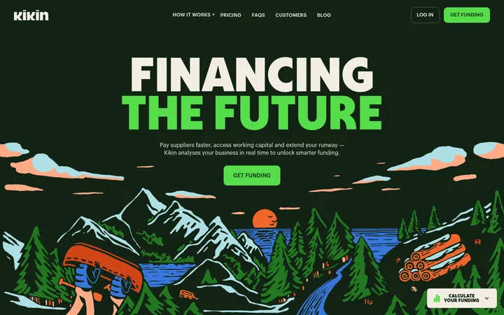
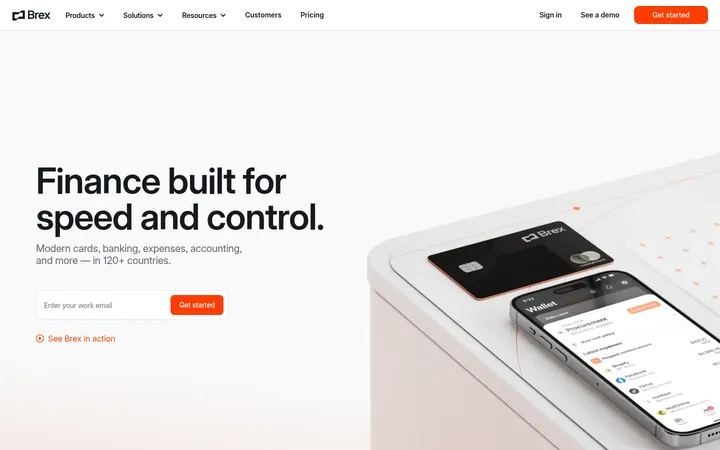
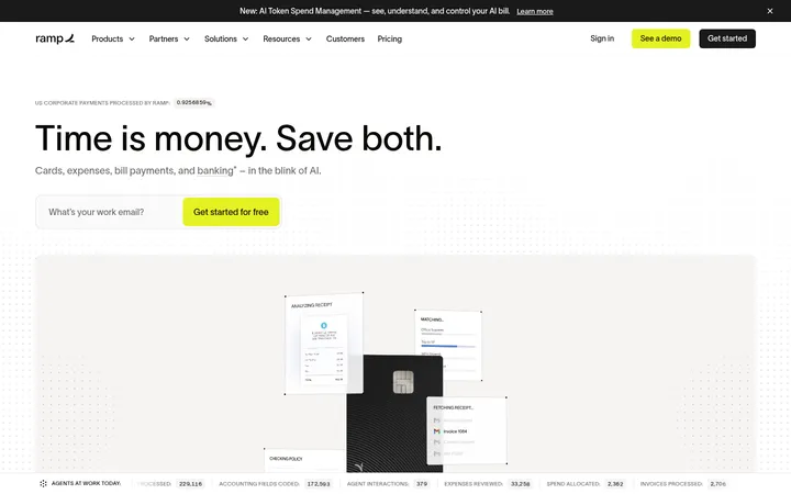
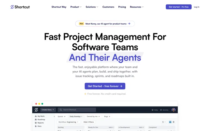
Quicken 将易懂的财务指引与精致的产品预览结合,用鲜明紫色突出行动按钮和品牌重点。明亮底色、圆润卡片与交替铺陈的内容区,让长页面依然清晰易读。
North star · Use confident purple accents and generous, pale surfaces to make complex financial tools feel clear, approachable, and easy to act on.
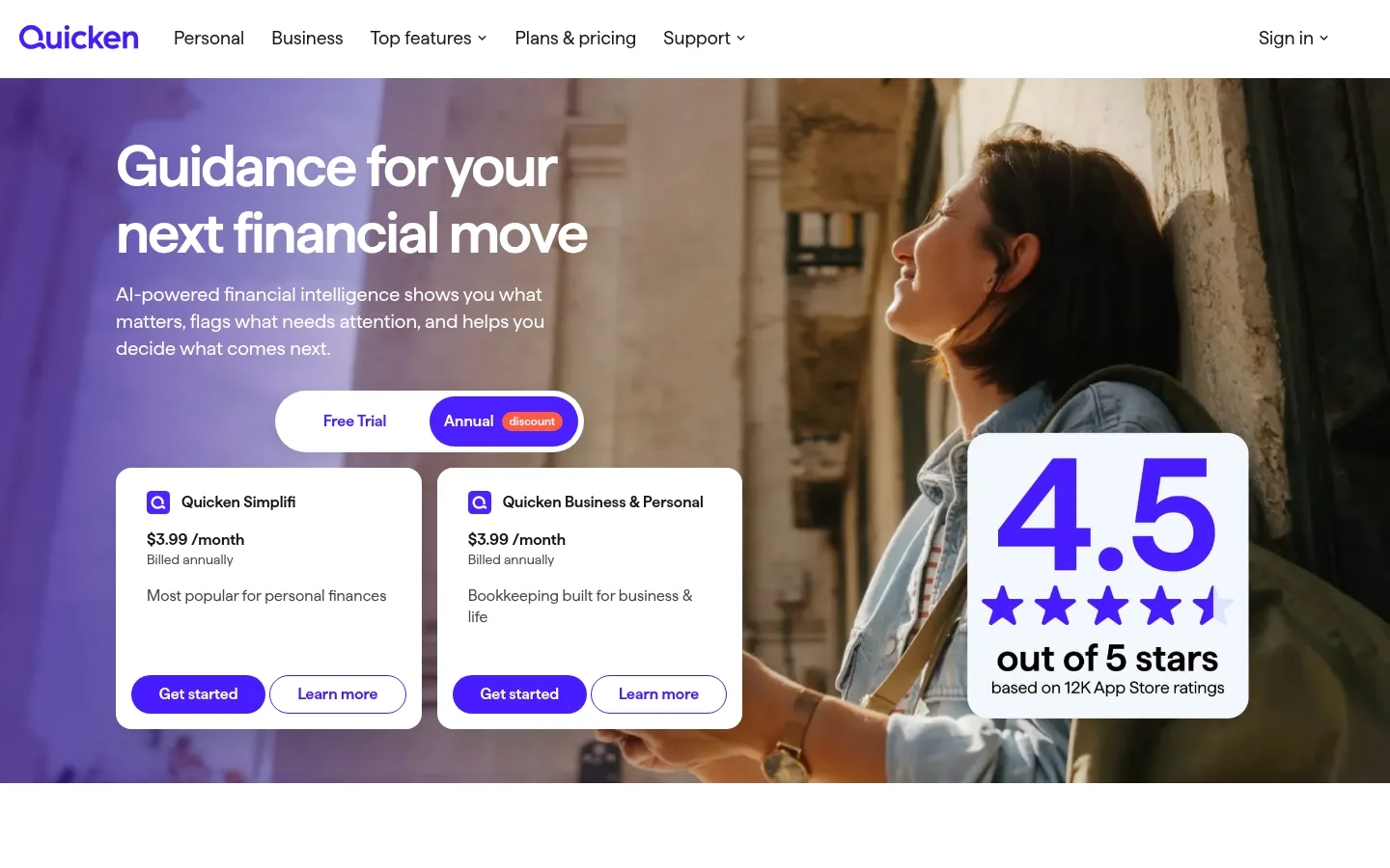
The page builds its identity around vivid purple set against white and cool, pale-blue surfaces. In the opening hero, purple overlays a full-bleed lifestyle photograph and supports large white headline text; elsewhere, purple marks primary actions, small emphasis details, and the deep footer band. Haffer supplies a consistent, geometric sans-serif voice, with strongly weighted, tightly tracked headlines and more open, readable body copy. The layout alternates white and pale-blue sections to organize product stories, data-led features, and pricing without heavy dividers. Most content sits in paired columns or compact card groups, while product imagery shows finance dashboards in device frames. Rounded buttons and cards soften the otherwise crisp interface. Shadows are reserved for floating product and pricing cards, allowing surfaces to lift subtly while the larger section bands remain mostly flat.
配色 点色块复制色值。用途说明来自对页面的实测位置(背景、文字、描边、按钮)与截图判读。
品牌色
Quicken Violet
#471cff
Primary CTA fill, brand marks, emphasized links, and key graphic accents.
Guidance Purple
#3f1cd4
Hero background and high-impact purple section treatment.
Footer Indigo
#3317aa
Deep purple footer background and dense footer navigation.
强调色
Coral Badge
#ff5a43
Small discount badge in the hero pricing control.
Illustration Plum
#261180
Deep purple within product-card artwork; treat as illustration detail, not a broad UI color.
表层色
Cloud Blue
#f3f8fd
Alternating section bands, including product discovery and desktop-product callout areas.
Lavender Line
#dbd3ff
Pale lavender hairline border, most visible around footer elements.
Mist Edge
#eaecf7
Minor pale border detail; not a defining page-wide surface.
Periwinkle Mist
#dee5ff
Tinted personal-finance card surface.
中性色
Gallery White
#ffffff
Main canvas, cards, hero controls, and reversed text on purple.
Soft Ink
#18181f
Main heading and body text, navigation, and dark card copy.
Graphite Gray
#494949
Secondary navigation and supporting copy.
True Black
#000000
Navigation and occasional high-contrast text.
Slate Ink
#292832
Supporting text and copy where a softened near-black is used.
功能色
Alert Red
#eb0130
Rare red emphasis in a button or text detail; secondary to the purple system.
文字 背景 对比度 WCAG #000000 True Black#ffffff Gallery White21:1 AAA #000000 True Black#f3f8fd Cloud Blue19.66:1 AAA #000000 True Black#dee5ff Periwinkle Mist16.76:1 AAA #18181f Soft Ink#ffffff Gallery White17.66:1 AAA #18181f Soft Ink#f3f8fd Cloud Blue16.53:1 AAA #18181f Soft Ink#dee5ff Periwinkle Mist14.09:1 AAA
字体 字号阶梯:Perfect Fourth(比例约 1.358,正文 13px)。示例用免费替代字体渲染,数值为实测。
Aa 设计
Haffer 网络字体 · 字重 400 / 600 / 700 · 占比 100%
免费替代:Inter
All page typography, from headlines and navigation to body copy, buttons, and cards.
角色 示例 字号 字重 行高 字距 特大标题 Large hero or campaign headline.
Quicken
60px 600 1.15 -0.033em 一级标题 Primary page and major section headings.
Quicken
48px 600 1.15 -0.042em 二级标题 Prominent section headlines, often bold and compact.
Quicken
42px 700 1.06 -0.035em 三级标题 Feature and product-story headings.
Quicken
36px 600 1.2 -0.028em 四级标题 Card and smaller subsection headings.
The quick brown fox 敏捷的狐狸
26px 600 1.2 -0.038em 正文 Supporting descriptions, pricing details, and footer copy.
The quick brown fox 敏捷的狐狸
13px 400 1.4 0 按钮 Action labels, set in a clear semibold style.
The quick brown fox 敏捷的狐狸
14px 600 1.4 0 导航 Top-level navigation labels.
The quick brown fox 敏捷的狐狸
17px 400 1.24 0
间距与布局 基准单位 8px · 密度:适中
40px 版块间距
16px 元素间距
— 卡片内边距
1200px 内容最大宽度
4px
8px
9px
10px
12px
16px
20px
24px
32px
40px
56px
80px
The desktop page uses a centered content area capped at the measured 1200px width, with a horizontal navigation above a full-bleed hero. Sections alternate between white and Cloud Blue backgrounds, usually arranging copy and product imagery in two columns; product and trust areas use four-column groupings. Section changes are distinct but the rhythm stays comfortable, with ample open space around headlines and compact card interiors. The footer switches to a dense multi-column link layout.
圆角与层次 Most sections are flat color bands with little or no visible border. Rounded product and pricing cards gain separation through restrained shadows, especially where they float over the hero or pale backgrounds. Use hairlines sparingly; layering comes mainly from device mockups, overlapping cards, and the hero image rather than stacked panel chrome.
组件 下面的预览按实测的按钮、输入框、徽标、卡片样式重建(字体用替代字体)。
Primary CTA Quicken Violet (#471cff) pill button with white semibold Haffer text; the measured primary example uses a full-radius shape.
Hero pricing switch White pill-shaped selector pairing a light Free Trial option with a vivid purple Annual option and a small Coral Badge discount label.
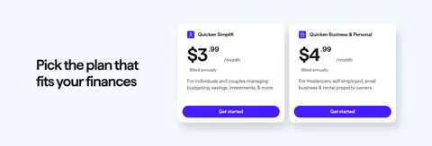
Pricing cards White, rounded cards with Soft Ink text, concise plan details, and paired filled and outlined actions; cards lift subtly with shadow.
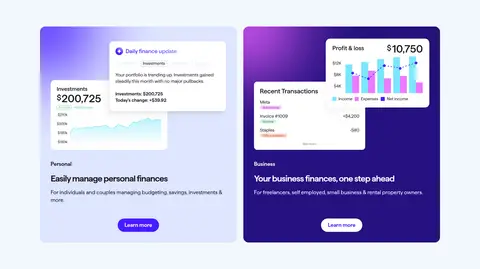
Product category cards Two side-by-side cards for Personal and Business, using pale blue or purple-toned imagery, a product preview, brief copy, and a Learn more action.
Rating panel A prominent white rounded panel overlays hero photography, using a large purple score, star marks, and compact explanatory text.
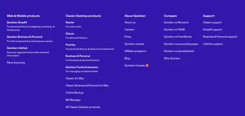
Footer link columns A deep Footer Indigo band organizes dense product, company, comparison, and support links into columns.
Imagery · A lifestyle photograph dominates the hero, with a purple wash behind the headline and the subject framed on the right. The rest of the page favors crisp finance-dashboard and device mockups, including charts, balances, and transaction views. Product cards and rating graphics sit cleanly against pale surfaces; the visual emphasis is on legible UI previews rather than decorative illustration. Screenshot-derived warm tones belong to photography, not the core brand palette.
页面版块 共 12 个版块,按页面从上到下排列,每个都标了类型、布局和交互套路。
首页
首屏 财务指引
Full-bleed lifestyle hero with left-aligned copy and pricing cards over the image; rating panel floats on the right.
用户评价 用户口碑
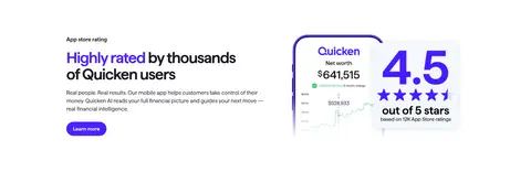
White section with copy on the left and a financial app/rating visual on the right.
功能网格 产品方案
Pale-blue band with a centered intro heading above two side-by-side product cards.
图文交替 规划下一步
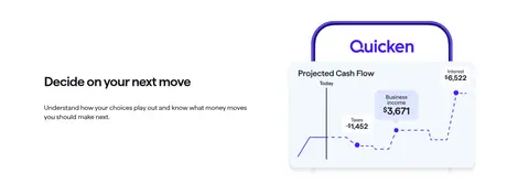
White section with a product-story heading above copy on the left and a dashboard mockup on the right.
图文交替 财务全景
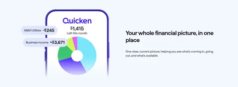
Pale-blue band with product visualization on the left and heading plus description on the right.
图文交替 持续进步
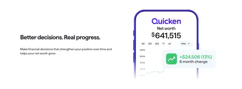
White band with feature copy on the left and a net-worth dashboard visual on the right.
数据亮点 成效数据
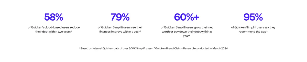
White section with a centered heading and four evenly distributed metric columns.
价格方案 选择方案
Two-column pricing area with a left-side heading and product plan cards to the right.
其他 安全保障
White trust strip with a centered heading and four benefit items in a row.
行动号召 经典版入口
Centered callout inside a pale-blue section, with heading, supporting line, and action link.
页脚 产品导航
Deep purple footer band with multiple dense columns of product, company, comparison, and support links.
页脚 页脚信息
White lower footer with brand mark, app-store badges, legal notes, policy links, and social icons.
该做与不该做 ✓ 该做 Use Haffer or a close geometric sans-serif throughout. Reserve Quicken Violet (#471cff) for primary actions and key emphasis. Alternate white and Cloud Blue (#f3f8fd) content bands. Keep product previews crisp, legible, and connected to their feature copy. Use rounded pills for actions and softly rounded cards for content. Let imagery and product mockups create the visual interest. ✕ 不该做 Do not turn every section into a purple background. Do not use heavy borders or dense boxed layouts. Do not use Coral Badge (#ff5a43) as a large surface color. Do not mistake photographic colors for the brand palette. Do not crowd headlines or product previews with decorative elements. Do not make secondary body copy compete with the main CTA. 给 AI 的提示词 想快速出一个同风格的新页面,把这段话连同 DESIGN.md 一起发给 AI。
复制 Build a new Quicken-style fintech page with a clean, approachable product-led feel. Use Gallery White (#ffffff) as the main canvas, Cloud Blue (#f3f8fd) for alternating section bands, and Quicken Violet (#471cff) for primary CTAs, emphasis, and brand details; reserve Guidance Purple (#3f1cd4) and Footer Indigo (#3317aa) for focused large-area moments. Set all type in Haffer or Inter, with large, tightly tracked semibold headlines and clear regular-weight supporting copy. Organize content in a centered desktop-width layout, using paired copy-and-product-preview sections, compact rounded cards, and generous breathing room. Favor crisp finance dashboards and device mockups; use photography selectively for a hero. Keep most sections flat, with restrained card shadows, pill buttons, and a dense multi-column footer.
DESIGN.md Tailwind v4 CSS 变量 Design Tokens
---
title: "Quicken design system"
variant: extended
source: https://www.quicken.com/
captured_at: 2026-10-12
theme: light
industry: fintech
generator: Design DNA (https://four.wiralomi.com/style/quicken-com)
ai_generated: true
ai_label: "本文件由 AI 辅助生成:数值取自公开网页的实测样式,命名、用途说明与建议为模型解读。商标归原所有者。 / AI-assisted content"
---
# Quicken · Design System
> Clear financial guidance in a bright, confident interface
**Theme:** light · **Industry:** fintech · **Source:** https://www.quicken.com/ · **Captured:** 2026-10-12 (1440×900 desktop)
_AI-assisted content: values are measured from the public page at capture time; names, roles and guidance are model-written interpretations. Trademarks belong to their owners._
Quicken pairs approachable financial guidance with polished product previews, using vivid purple to distinguish calls to action and brand-led moments. Bright surfaces, compact rounded cards, and alternating content bands keep a long homepage easy to scan.
## North star
Use confident purple accents and generous, pale surfaces to make complex financial tools feel clear, approachable, and easy to act on.
## Overview
The page builds its identity around vivid purple set against white and cool, pale-blue surfaces. In the opening hero, purple overlays a full-bleed lifestyle photograph and supports large white headline text; elsewhere, purple marks primary actions, small emphasis details, and the deep footer band. Haffer supplies a consistent, geometric sans-serif voice, with strongly weighted, tightly tracked headlines and more open, readable body copy. The layout alternates white and pale-blue sections to organize product stories, data-led features, and pricing without heavy dividers. Most content sits in paired columns or compact card groups, while product imagery shows finance dashboards in device frames. Rounded buttons and cards soften the otherwise crisp interface. Shadows are reserved for floating product and pricing cards, allowing surfaces to lift subtly while the larger section bands remain mostly flat.
## Colors
| Name | Hex | Token | Group | Role |
|---|---|---|---|---|
| Gallery White | ` | `--color-gallery-white` | neutral | Main canvas, cards, hero controls, and reversed text on purple. |
| Quicken Violet | ` | `--color-quicken-violet` | brand | Primary CTA fill, brand marks, emphasized links, and key graphic accents. |
| Soft Ink | ` | `--color-soft-ink` | neutral | Main heading and body text, navigation, and dark card copy. |
| Cloud Blue | ` | `--color-cloud-blue` | surface | Alternating section bands, including product discovery and desktop-product callout areas. |
| Lavender Line | ` | `--color-lavender-line` | surface | Pale lavender hairline border, most visible around footer elements. |
| Guidance Purple | ` | `--color-guidance-purple` | brand | Hero background and high-impact purple section treatment. |
| Footer Indigo | ` | `--color-footer-indigo` | brand | Deep purple footer background and dense footer navigation. |
| Graphite Gray | ` | `--color-graphite-gray` | neutral | Secondary navigation and supporting copy. |
| True Black | ` | `--color-true-black` | neutral | Navigation and occasional high-contrast text. |
| Mist Edge | ` | `--color-mist-edge` | surface | Minor pale border detail; not a defining page-wide surface. |
| Alert Red | ` | `--color-alert-red` | semantic | Rare red emphasis in a button or text detail; secondary to the purple system. |
| Coral Badge | ` | `--color-coral-badge` | accent | Small discount badge in the hero pricing control. |
| Slate Ink | ` | `--color-slate-ink` | neutral | Supporting text and copy where a softened near-black is used. |
| Periwinkle Mist | ` | `--color-periwinkle-mist` | surface | Tinted personal-finance card surface. |
| Illustration Plum | ` | `--color-illustration-plum` | accent | Deep purple within product-card artwork; treat as illustration detail, not a broad UI color. |
### Semantic aliases
`--color-canvas` → ` (Gallery White) · `--color-surface` → ` (Cloud Blue) · `--color-surface-2` → ` (Periwinkle Mist) · `--color-text` → ` (True Black) · `--color-text-muted` → ` (Soft Ink) · `--color-text-subtle` → ` (Gallery White) · `--color-border` → ` (Lavender Line) · `--color-accent` → ` (Quicken Violet) · `--color-accent-2` → ` (Guidance Purple) · `--color-accent-3` → ` (Footer Indigo) · `--color-on-accent` → ` (Gallery White)
### Contrast (WCAG 2.x)
| Text | Background | Ratio | Level |
|---|---|---|---|
| ` | ` | 21:1 | AAA |
| ` | ` | 19.66:1 | AAA |
| ` | ` | 16.76:1 | AAA |
| ` | ` | 17.66:1 | AAA |
| ` | ` | 16.53:1 | AAA |
| ` | ` | 14.09:1 | AAA |
| ` | ` | 1.07:1 | fail |
| ` | ` | 1.25:1 | fail |
| ` | ` | 7.3:1 | AAA |
| ` | ` | 6.83:1 | AA |
### Gradients
- `linear-gradient(to right, rgba(0, 0, 0, 0), rgba(0, 0, 0, 0)), linear-gradient(to right, rgb(255, 255, 255), rgb(255, 255, 255))`
## Typography
| Family | Token | Source | Weights | Role | Free substitute |
|---|---|---|---|---|---|
| Haffer | `--font-body` | webfont | 400, 600, 700 | All page typography, from headlines and navigation to body copy, buttons, and cards. | Inter |
- **Haffer:** Use a single sans-serif family; headlines are semibold or bold with tight negative tracking, while navigation and body copy stay regular.
### Type scale — Perfect Fourth (ratio ≈ 1.358, base 13px)
| Role | Size | Weight | Line height | Letter spacing | Case | Family | Used for |
|---|---|---|---|---|---|---|---|
| display | 60px | 600 | 1.15 | -0.033em | — | Haffer | Large hero or campaign headline. |
| h1 | 48px | 600 | 1.15 | -0.042em | — | Haffer | Primary page and major section headings. |
| h2 | 42px | 700 | 1.06 | -0.035em | — | Haffer | Prominent section headlines, often bold and compact. |
| h3 | 36px | 600 | 1.2 | -0.028em | — | Haffer | Feature and product-story headings. |
| h4 | 26px | 600 | 1.2 | -0.038em | — | Haffer | Card and smaller subsection headings. |
| body | 13px | 400 | 1.4 | 0 | — | Haffer | Supporting descriptions, pricing details, and footer copy. |
| button | 14px | 600 | 1.4 | 0 | — | Haffer | Action labels, set in a clear semibold style. |
| nav | 17px | 400 | 1.24 | 0 | — | Haffer | Top-level navigation labels. |
## Spacing & layout
- Base unit **8px**, density **comfortable**.
- Scale (most used values): 4, 8, 9, 10, 12, 16, 20, 24, 32, 40, 56, 80 px.
- Section rhythm 40px · element gap 16px · card padding — · max content width 1200px.
The desktop page uses a centered content area capped at the measured 1200px width, with a horizontal navigation above a full-bleed hero. Sections alternate between white and Cloud Blue backgrounds, usually arranging copy and product imagery in two columns; product and trust areas use four-column groupings. Section changes are distinct but the rhythm stays comfortable, with ample open space around headlines and compact card interiors. The footer switches to a dense multi-column link layout.
## Shape & elevation
- Radius: button `9999px` · card `16px` · media `16px` · badge `9999px` · nav `16px` · xs `16px` · pill `9999px`
- Shadow `lg` (card): `rgba(0, 0, 0, 0.15) 10px 20px 30px 0px`
- Shadow `md` (other): `rgba(0, 0, 0, 0.08) 0px 4px 20px 0px`
- Motion: standard transition `0.2s ease` on interactive elements.
Most sections are flat color bands with little or no visible border. Rounded product and pricing cards gain separation through restrained shadows, especially where they float over the hero or pale backgrounds. Use hairlines sparingly; layering comes mainly from device mockups, overlapping cards, and the hero image rather than stacked panel chrome.
## Imagery
A lifestyle photograph dominates the hero, with a purple wash behind the headline and the subject framed on the right. The rest of the page favors crisp finance-dashboard and device mockups, including charts, balances, and transaction views. Product cards and rating graphics sit cleanly against pale surfaces; the visual emphasis is on legible UI previews rather than decorative illustration. Screenshot-derived warm tones belong to photography, not the core brand palette.
## Components
### Primary CTA
Quicken Violet (### Hero pricing switch
White pill-shaped selector pairing a light Free Trial option with a vivid purple Annual option and a small Coral Badge discount label.
### Pricing cards
White, rounded cards with Soft Ink text, concise plan details, and paired filled and outlined actions; cards lift subtly with shadow.
### Product category cards
Two side-by-side cards for Personal and Business, using pale blue or purple-toned imagery, a product preview, brief copy, and a Learn more action.
### Rating panel
A prominent white rounded panel overlays hero photography, using a large purple score, star marks, and compact explanatory text.
### Footer link columns
A deep Footer Indigo band organizes dense product, company, comparison, and support links into columns.
### Measured component styles
- **Primary button** (“Get started”): background ## Do
- Use Haffer or a close geometric sans-serif throughout.
- Reserve Quicken Violet (## Don't
- Do not turn every section into a purple background.
- Do not use heavy borders or dense boxed layouts.
- Do not use Coral Badge (## Agent prompt
Build a new Quicken-style fintech page with a clean, approachable product-led feel. Use Gallery White (## Page sections (top to bottom)
| # | Type | Layout | UX patterns | UI patterns |
|---|---|---|---|---|
| 1 | hero | Full-bleed lifestyle hero with left-aligned copy and pricing cards over the image; rating panel floats on the right. | Free Trial and Annual choice, plan actions, rating proof | purple image wash, white headline, rounded white cards, pill controls |
| 2 | testimonials | White section with copy on the left and a financial app/rating visual on the right. | app rating proof, Learn more link | white canvas, large heading, product graphic |
| 3 | feature-grid | Pale-blue band with a centered intro heading above two side-by-side product cards. | Personal and Business paths, Learn more actions | two rounded cards, finance UI previews, contrasting card treatments |
| 4 | feature-split | White section with a product-story heading above copy on the left and a dashboard mockup on the right. | explain a benefit, show projected outcomes | white band, two-column feature, device-framed chart |
| 5 | feature-split | Pale-blue band with product visualization on the left and heading plus description on the right. | show a unified view, supporting explanation | alternating image placement, device mockup, cool surface |
| 6 | feature-split | White band with feature copy on the left and a net-worth dashboard visual on the right. | explain long-term value, show progress | two-column split, device mockup, growth indicator |
| 7 | stats | White section with a centered heading and four evenly distributed metric columns. | four proof points, footnote context | large purple figures, small explanatory labels, minimal chrome |
| 8 | pricing | Two-column pricing area with a left-side heading and product plan cards to the right. | compare plans, annual billing context, Get started actions | white cards, price-first hierarchy, rounded purple buttons |
| 9 | other | White trust strip with a centered heading and four benefit items in a row. | reassure before conversion, scan trust points | small purple icons, compact labels, open spacing |
| 10 | cta | Centered callout inside a pale-blue section, with heading, supporting line, and action link. | direct to desktop products, single next step | centered text, white inner panel, red emphasis |
| 11 | footer | Deep purple footer band with multiple dense columns of product, company, comparison, and support links. | browse product families, navigate support and company | Footer Indigo background, small white links, multi-column lists |
| 12 | footer | White lower footer with brand mark, app-store badges, legal notes, policy links, and social icons. | download app, review legal information, social links | white background, compact text, small badges and icons |
## Source CSS custom properties (selected)
```css
--qkn-red-background: