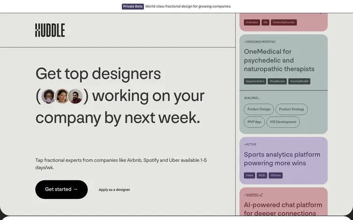
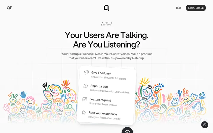
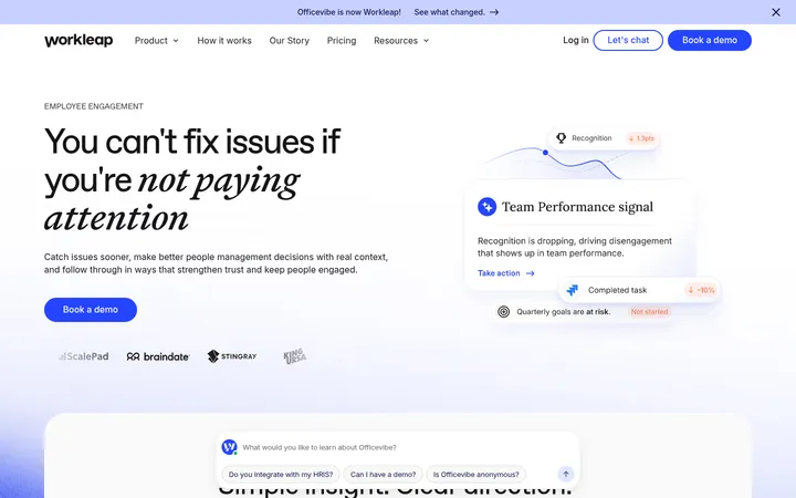
North star · Keep the page quiet and spacious; let real-looking product interfaces carry the visual detail and use blue only to signal action.
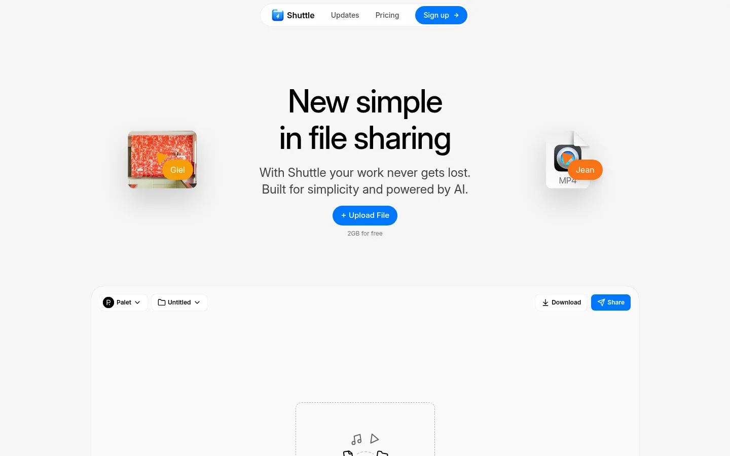
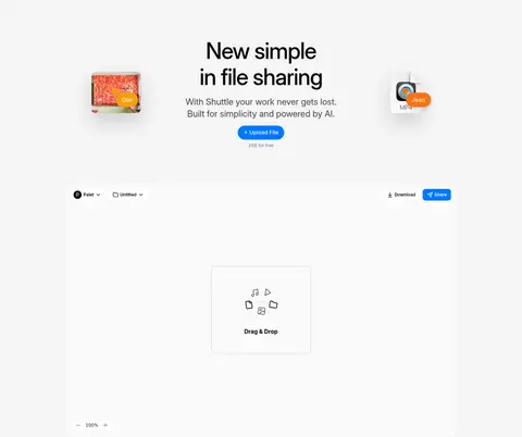
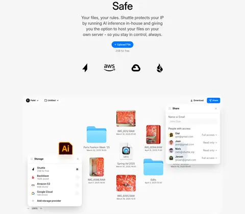
The page uses a near-white #f5f5f5 canvas throughout, letting generous open areas and dark typography establish its quiet visual character. Bright #0077ff is reserved for high-intent actions such as Upload File, Share, and Sign up, rather than broad decorative fills. InterVariable provides a consistent voice: a large, medium-weight display headline anchors the hero, while centered section headings and compact body copy keep the product story direct. A narrow floating pill navigation sits above the hero. The content then alternates centered feature introductions with broad workspace mockups, keeping a steady vertical rhythm and a comfortable, constrained page width. Interface previews, file tiles, and collaborator markers supply the visual variety; photographic and colorful file imagery belongs to those product examples, not the core brand palette. Rounded cards, subtle hairlines, and barely-there shadows give mockups separation without making the page feel heavy.
配色
点色块复制色值。用途说明来自对页面的实测位置(背景、文字、描边、按钮)与截图判读。
品牌色
强调色
表层色
中性色
功能色
页面底色 · Soft Canvas表层 · Paper Surface主文字 · Deep Ink次要文字 · Quiet Graphite弱文字 · Nav Charcoal描边 · Fine Divider强调 · Shuttle Blue
文字
背景
对比度
WCAG
#000000 Deep Ink
#f5f5f5 Soft Canvas
19.26:1
AAA
#000000 Deep Ink
#fefefe Paper Surface
20.82:1
AAA
#525252 Quiet Graphite
#f5f5f5 Soft Canvas
7.17:1
AAA
#525252 Quiet Graphite
#fefefe Paper Surface
7.75:1
AAA
#404040 Nav Charcoal
#f5f5f5 Soft Canvas
9.51:1
AAA
#404040 Nav Charcoal
#fefefe Paper Surface
10.28:1
AAA
字体
字号阶梯:Custom(比例约 2.104,正文 14px)。示例用免费替代字体渲染,数值为实测。
Aa 设计
InterVariable
网络字体 · 字重 400 / 500 / 600 / 700 · 占比 100%
免费替代:Inter
All page typography, from display headlines and centered feature copy to navigation, buttons, and interface labels.
角色
示例
字号
字重
行高
字距
特大标题
Large centered hero headline introducing Shuttle’s file-sharing proposition.
Shuttle
62px
500
1.16
-0.025em
一级标题
Section-level feature headings and closing call-to-action heading.
The quick brown fox 敏捷的狐狸
24px
400
1.38
0
正文
Short explanatory paragraphs below feature headings.
The quick brown fox 敏捷的狐狸
14px
400
1.43
0
辅助文字
Small upload allowance notes and compact secondary annotations.
The quick brown fox 敏捷的狐狸
11px
400
1.4
0
按钮
Upload File and prominent account actions.
The quick brown fox 敏捷的狐狸
15px
500
1.5
0
导航
Floating pill navigation links and signup label.
The quick brown fox 敏捷的狐狸
14px
500
1.43
0
间距与布局
基准单位 8px · 密度:适中
48px版块间距
8px元素间距
—卡片内边距
1180px内容最大宽度
4px
6px
8px
12px
16px
32px
48px
128px
A centered page sits within a measured 1180px maximum width, with a comfortable density and broad, uncluttered section bands. The floating pill navigation precedes a centered hero with small peripheral file visuals and a wide workspace preview. Subsequent feature blocks repeat a centered heading-and-copy introduction followed by large product imagery, sometimes arranged as two-column content. Sections follow a measured 48px rhythm; the closing CTA returns to a single centered column.
圆角与层次
按钮 · 8px
输入框 · 6px
卡片 · 24px
图片 · 16px
导航 · 9999px
hairline · button
hairline · card, nav
md · text
xl · card
Most of the page remains flat and open. Rounded white or near-white interface panels gain separation from hairline edging and very subtle shadows; larger previews may layer over the surrounding workspace to suggest depth. Avoid heavy outlines or dramatic page-wide elevation.
组件
下面的预览按实测的按钮、输入框、徽标、卡片样式重建(字体用替代字体)。
Floating pill navigation
Compact centered white navigation capsule with Shuttle identity, Updates, Pricing, and a blue Sign up action; use fully rounded ends and a restrained hairline shadow.
Hero introduction
Centered oversized headline, concise supporting copy, blue Upload File button, and a small free-capacity caption, with file visuals flanking the copy.
Upload action
Prominent blue pill button with white medium-weight Inter text; a small muted allowance note sits directly beneath.
Workspace showcase
Wide pale product canvas with compact workspace controls, file drop area or preview, and discreet edging; keep product UI more detailed than the surrounding page.
Feature introduction
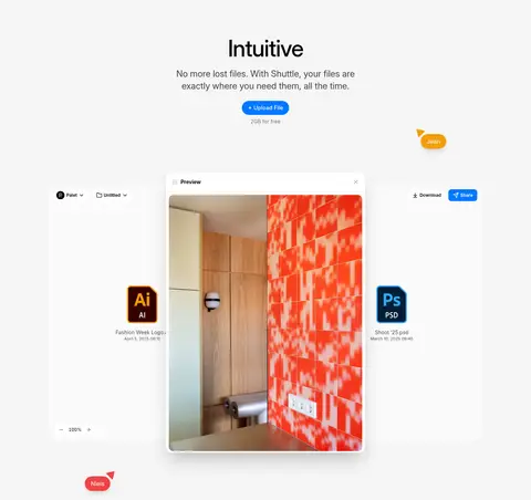
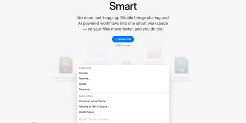
Centered short heading and explanatory paragraph paired with a large workspace mockup; repeat for Intuitive, Smart, and Safe.
Closing CTA
Minimal centered brand mark and two-line headline, followed by a blue Create account action and small social and policy links.
Imagery · Product-interface mockups are the main visual asset: workspace canvases, file previews, menus, storage panels, and sharing controls. They appear large and light against the pale page, with small floating file tiles and collaborator labels adding context. Colorful photos, file icons, and document thumbnails appear inside these interface demonstrations, so treat them as product content rather than brand decoration.
Center feature headings and keep supporting copy concise.
Show product workflows in large, pale interface mockups.
Use InterVariable or a close Inter substitute throughout.
Keep navigation capsule-shaped and visually lightweight.
Use colorful imagery inside product demonstrations, not as broad page decoration.
✕ 不该做
Do not introduce broad saturated color bands.
Do not fill empty space with unnecessary decoration.
Do not make shadows or borders visually heavy.
Do not use multiple competing display typefaces.
Do not crowd the feature introductions with long paragraphs.
Do not treat mockup file imagery as the site’s base palette.
给 AI 的提示词
想快速出一个同风格的新页面,把这段话连同 DESIGN.md 一起发给 AI。
Build a new page in Shuttle’s understated product-story style. Use Soft Canvas (#f5f5f5) as the continuous background, Deep Ink (#000000) for headings, and Shuttle Blue (#0077ff) only for primary actions. Set all typography in Inter or InterVariable, with a prominent centered headline, regular concise supporting copy, and compact navigation text. Constrain the main content to the measured 1180px maximum width and preserve generous vertical breathing room. Start with a floating Paper Surface (#fefefe) pill navigation, then use centered introductions paired with broad, realistic product-interface mockups. Keep UI panels rounded and lightly separated with Fine Divider (#e5e7eb) or subtle shadows. Any vivid photos, file icons, or collaborator labels should live inside the mockups. Finish with a quiet, centered account CTA and small secondary links.