浅色主题设计机构brand and digital agency homepage编辑感极简留白充足字体主导作品集原网页 smilingwolf.co.uk ↗ · 2026-10-12 采集 · 1440×900 桌面端
Smiling Wolf 以暖调浅底色和深色文字,搭配宽松的编辑式留白。克制的页面框架让鲜明的客户作品与摄影项目成为主要视觉焦点。
North star · Keep the interface quiet and paper-like so large, carefully chosen project imagery and confident typography carry the story.
The page is built around a warm off-white canvas (#f7f3f0) and deep near-black green (#131713), with muted grey text creating a softer hierarchy. Colour is deliberately sparse in the interface; saturated blues, greens and ochres mostly belong to client artwork and photography, not reusable brand accents. Bagoss Standard provides rounded, contemporary display and body typography, while a tightly tracked monospace face handles small uppercase navigation and labels. The layout feels like an editorial portfolio: broad quiet stretches separate compact project labels, image-led work, client marks and service content. Images are allowed to carry their own palettes and compositions, often appearing as large, clean rectangles rather than decorative cards. Fine rules and understated labels organize the content without adding visual weight. The overall strategy is calm, spacious and highly art-directed, balancing an almost paper-like background against bold project imagery and concise typographic signposts.
Default body copy and caption text across the editorial portfolio.
Aa 设计
General Grotesque Mono Regular
网络字体 · 字重 400 · 占比 32%
免费替代:Space Mono
Small navigation, eyebrow labels and compact uppercase metadata.
Aa 设计
Bagoss Standard Medium
网络字体 · 字重 520 / 400 · 占比 24%
免费替代:Manrope
Display statements and main headings.
角色
示例
字号
字重
行高
字距
特大标题
Large editorial statements and prominent introductory messaging.
Smiling Wolf
63px
400
0.98
-0.02em
一级标题
Primary page headline or major section heading.
Smiling Wolf
59px
520
1
-0.02em
正文
Explanatory agency, project and service copy.
The quick brown fox 敏捷的狐狸
19.5px
385
1.15
0
辅助文字
Project descriptions and secondary supporting text.
The quick brown fox 敏捷的狐狸
14px
385
1.4
0.01em
眉题
Small uppercase section labels and metadata.
The quick brown fox 敏捷的狐狸
10.5px
400
1.6
0.1em
代码
Monospaced uppercase micro-labels and compact navigation details.
const style = 1;
10.5px
400
1.6
0.1em
间距与布局
基准单位 2px · 密度:宽松
120px版块间距
10px元素间距
—卡片内边距
1400px内容最大宽度
4px
6px
8px
10px
14px
20px
60px
The measured content uses a spacious, wide editorial canvas, with a maximum width of 1400px and a two-column section structure. Major content aligns left, while project imagery and text blocks vary in scale to avoid a rigid catalogue feel. Section transitions use generous vertical breathing room; element-level gaps are comparatively compact. Small labels sit close to the content they identify, and thin rules separate occasional full-width link rows. The visual density stays low, allowing photography and case-study artwork to dominate.
圆角与层次
图片 · 4px
链接 · 4px
没有测到阴影:页面是扁平的,层次靠底色和描边区分。
The page reads as flat and editorial, with no measured shadow system. Separate content through whitespace, image scale and occasional fine hairlines rather than raised cards. Media and links have a subtle 4px radius in the measurements; keep other surfaces visually flush and avoid unnecessary borders or layered panels.
组件
下面的预览按实测的按钮、输入框、徽标、卡片样式重建(字体用替代字体)。
Editorial navigation
A slim horizontal row on the light canvas, using tiny uppercase monospaced labels for the studio name, agency descriptor and page links.
Project feature
Large photographic or designed project imagery paired with a compact category label, title and muted supporting description.
Section eyebrow
Small uppercase mono text with wide tracking, used as a restrained marker above content.
Text link row
Concise link aligned to a fine horizontal rule, with a small directional arrow at the far edge.
Client mark strip
A spacious horizontal arrangement of client logos, kept monochrome and visually subordinate to project imagery.
Service list
A prominent typographic list beside short introductory copy, with muted entries and a dark active or leading item.
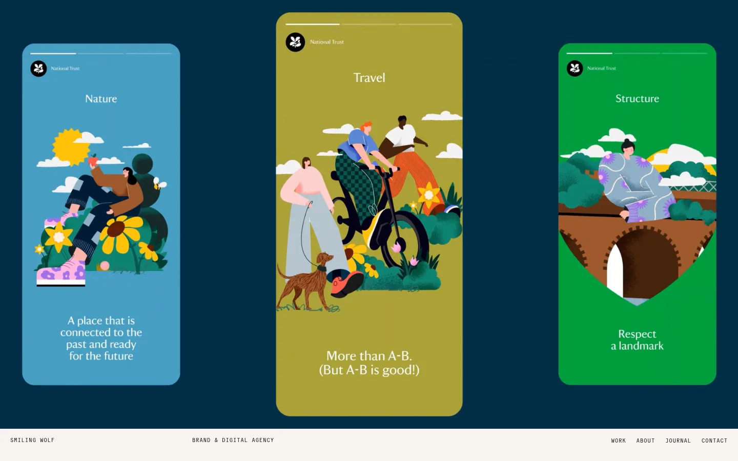
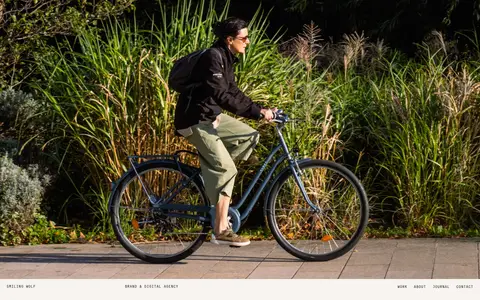
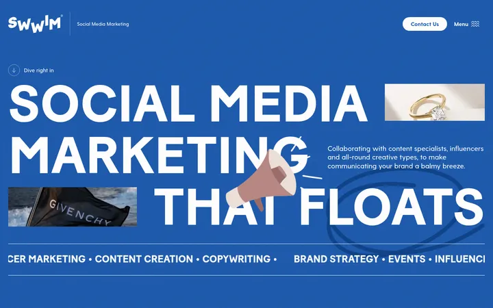
Imagery · Photography and client project visuals are the main colour source. Use large, cleanly framed photographs or graphic case-study images, retaining their original rich colour rather than applying a brand tint. The supplied first viewport includes illustrated campaign cards against a deep blue field; later portfolio imagery includes real-world photography and designed environments. Avoid decorative overlays that compete with the work.
Use Warm Paper (#f7f3f0) as the primary page canvas.
Set primary type in Forest Ink (#131713).
Reserve saturated colour for project imagery and client work.
Use the monospaced face for small uppercase labels.
Let broad whitespace separate major editorial sections.
Keep image framing clean and visually unobtrusive.
✕ 不该做
Do not add unmeasured brand accent colours to interface controls.
Do not turn every project into a raised or bordered card.
Do not compress the generous vertical rhythm.
Do not use oversized, heavy navigation labels.
Do not apply filters that dull or recolour client artwork.
Do not add shadows or gradients as decoration.
给 AI 的提示词
想快速出一个同风格的新页面,把这段话连同 DESIGN.md 一起发给 AI。
Build a new agency page in Smiling Wolf’s quiet editorial style. Use Warm Paper (#f7f3f0) for the primary canvas, Forest Ink (#131713) for main text and dark sections, and Soft Graphite (#858582) for supporting copy. Do not introduce extra interface colours; let project photography and artwork provide vivid colour. Use a rounded contemporary sans-serif for headlines and body copy, with a tracked uppercase monospace for navigation and eyebrow labels. Lay out content on a wide, spacious canvas with a flexible two-column editorial grid, generous gaps between sections, and compact labels near their content. Favor large, clean image frames, concise project metadata, fine rules and simple arrow links. Keep surfaces flat, avoid shadows, and use only subtle media rounding.