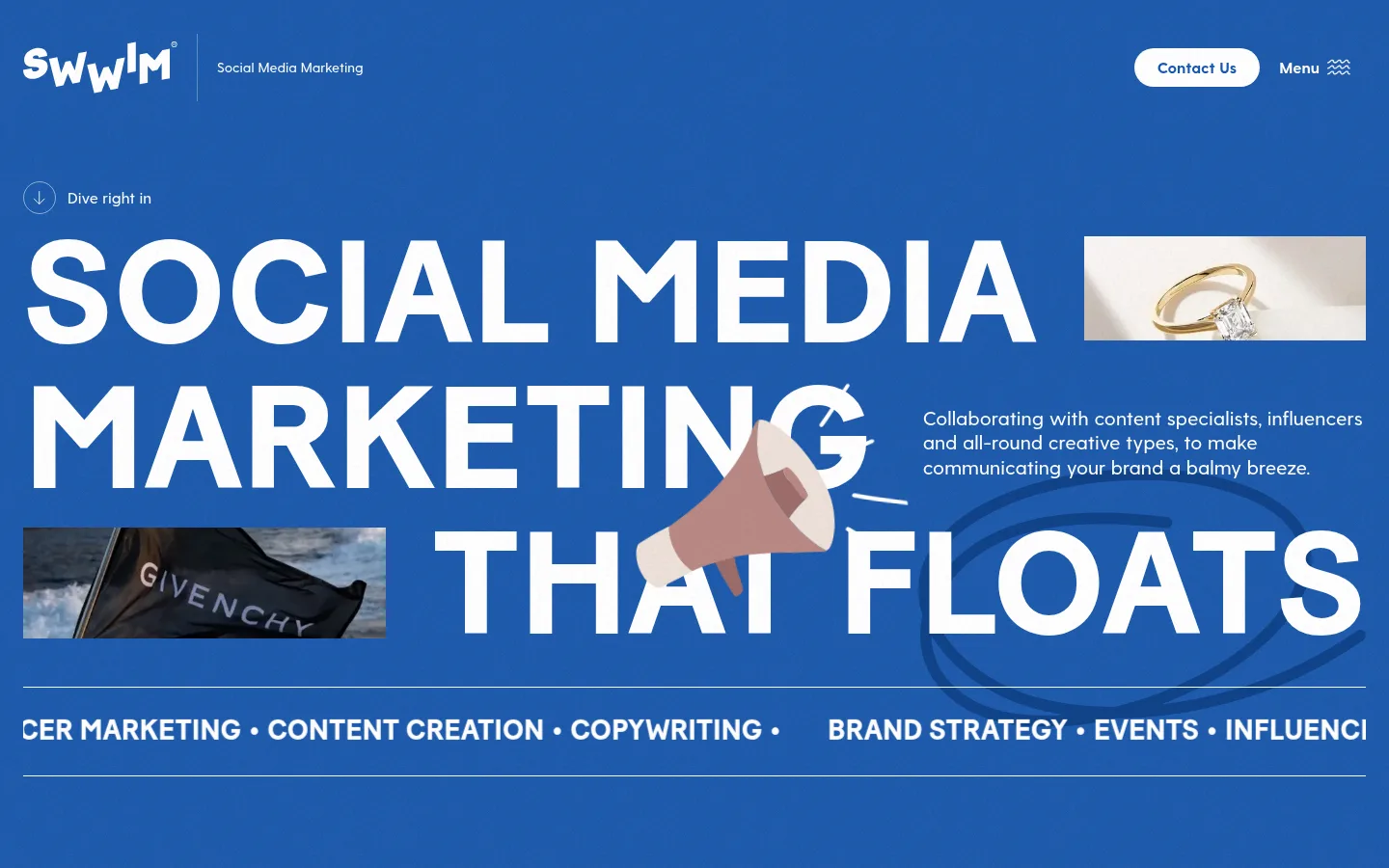
North star · Let oversized white editorial typography lead across vivid blue fields, using cropped imagery as playful interruptions rather than decoration.
The homepage is built around a vivid blue canvas, using #1658b3 as the defining field and #ffffff for high-contrast type, navigation, and pill-shaped contact buttons. Large uppercase display lettering sets an assertive editorial tone: the hero headline spreads across the viewport and shares space with compact copy and cropped photographs. Greycliff provides a more conversational counterpoint for body copy, navigation, and article details. Deep blue #0d3c88 appears in darker section treatments and card-like areas; the brighter #015fee is a limited footer accent, while #8bacd9 belongs to fine border details rather than the main color story. The layout alternates expansive, image-led blue brand sections with a restrained white news feed. Photography and flat illustrations are layered into the composition, sometimes overlapping the typography. Hairlines and generous section breaks organize content without relying on shadows or elaborate card chrome.
Body copy, navigation, article details, and supporting interface text.
Aa 设计
Baton Turbo
网络字体 · 字重 400 · 占比 39%
免费替代:Oswald
Oversized display headlines and uppercase section titles.
角色
示例
字号
字重
行高
字距
特大标题
Oversized uppercase hero message, spanning the blue opening canvas.
Swwim
151px
400
1
0
一级标题
Uppercase primary hero and major page headline.
Swwim
48px
400
1
0
二级标题
Section headings and supporting editorial statements.
Swwim
36px
400
1.11
0
三级标题
Bold article titles and prominent supporting headings.
Swwim
30px
700
1.2
0
四级标题
Uppercase small section labels and editorial eyebrows.
Swwim
29px
400
1.5
0
正文
Agency descriptions, article copy, and supporting paragraphs.
The quick brown fox 敏捷的狐狸
18px
400
1.56
0
辅助文字
Compact article metadata and secondary details.
The quick brown fox 敏捷的狐狸
16px
400
1.5
0
导航
Header navigation and footer browse links.
The quick brown fox 敏捷的狐狸
16px
500
1.5
0
间距与布局
基准单位 8px · 密度:适中
64px版块间距
—元素间距
—卡片内边距
1392px内容最大宽度
1px
4px
8px
10px
12px
16px
20px
24px
36px
40px
48px
64px
128px
The page uses a wide, responsive canvas, with measured maximum content width of 1392px. The hero is deliberately loose: an oversized headline occupies most of the width while short copy and cropped images fill gaps in the composition. Blue storytelling sections follow, including a single-column feature statement and an image-led split layout. A white editorial feed then resets the visual density with stacked, image-and-text rows separated by fine rules. The footer shifts to a three-column information layout. Section spacing is generous and the overall density remains comfortable.
圆角与层次
按钮 · 9999px
图片 · 50%
没有测到阴影:页面是扁平的,层次靠底色和描边区分。
The design is primarily flat: no measured shadows or gradients define its hierarchy. Contrast comes from blue and white section fields, dark-blue overlays, and thin horizontal rules. The hero’s photos, illustration, and decorative marks layer visually over the canvas, while the news list is divided by hairlines rather than card elevation.
组件
下面的预览按实测的按钮、输入框、徽标、卡片样式重建(字体用替代字体)。
Header
White wordmark and service label sit at the left; a white pill Contact Us button and compact Menu control align to the right.
Hero headline
Oversized uppercase white display type spans the blue canvas, interrupted by cropped photos, a megaphone illustration, and short supporting copy.
Contact button
White 9999px-radius pill with blue text, bold 16px Greycliff, and measured 8px 24px padding.
Editorial feature
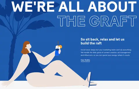
Blue feature area pairs large uppercase messaging and a lifestyle illustration with a compact bold heading and supporting copy.
News row
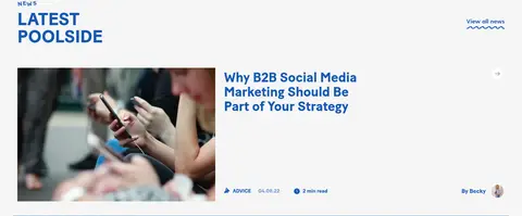
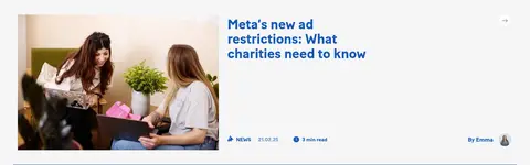
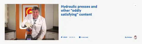
White-background editorial entry combines a rectangular image, blue title, small metadata, author detail, and a thin separator.
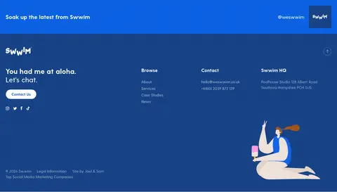
Footer
Deep-blue field groups a contact message and pill CTA with browse links, contact details, social links, and a small illustration.
Imagery · Photography appears as small, sharply cropped windows within the hero and as larger editorial thumbnails in the news feed. The blue feature section mixes a flat lifestyle illustration with decorative botanical imagery. Images sit directly in the layout rather than inside raised cards; playful overlap with headline lettering helps the opening feel assembled and energetic. Preserve image crops and aspect variation instead of forcing a uniform tile system.
Set major display headlines in uppercase Baton Turbo or a close condensed alternative.
Keep primary text and navigation white on blue.
Use cropped photography as intentional interruptions in the hero.
Separate editorial rows with thin rules rather than elevated cards.
Reserve rounded pills for prominent contact actions.
✕ 不该做
Do not replace the blue-and-white identity with a neutral-first palette.
Do not shrink the hero headline into conventional page-title scale.
Do not enclose every content block in a shadowed card.
Do not make #015fee or #8bacd9 dominant surface colors.
Do not treat the playful illustration as a substitute for editorial photography.
Do not crowd the news feed with decorative elements.
给 AI 的提示词
想快速出一个同风格的新页面,把这段话连同 DESIGN.md 一起发给 AI。
Build a new agency page in Swwim’s bold editorial style. Use Swwim Blue (#1658b3) as the main brand field and Gallery White (#ffffff) for high-contrast typography and key controls. Use Deep Current (#0d3c88) sparingly for darker section or footer areas, with Electric Tide (#015fee) and Mist Blue (#8bacd9) limited to subtle accents and rules. Set display headlines in a Baton Turbo-like condensed sans, uppercase and oversized; use a friendly Greycliff-like sans for body copy, navigation, and metadata. Compose photography as cropped, varied windows and allow occasional flat illustration to overlap the visual field. Alternate expansive blue storytelling areas with a clean white editorial feed. Keep surfaces mostly flat, use hairlines to structure rows, and reserve rounded white pills for contact actions. Preserve generous section breaks and an energetic, uncluttered hierarchy.