North star · Use literary serif headlines and restrained dark-and-white contrast to frame practical legal-product content with calm editorial clarity.
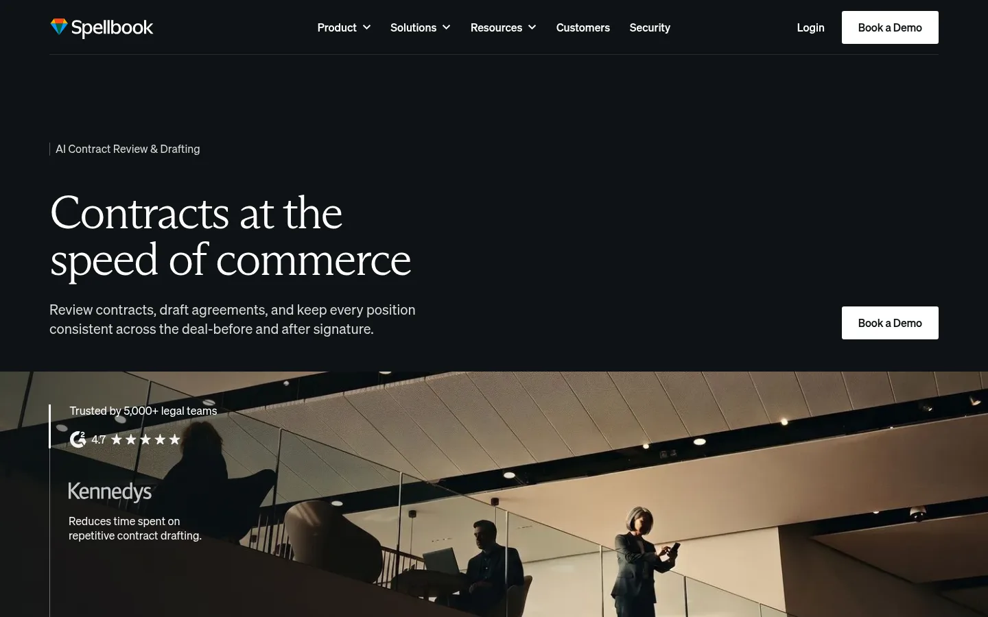
The page uses a restrained, high-contrast palette: near-black #0e1315 establishes the hero and footer, white carries most product and solution content, and soft gray #f5f5f5 marks selected editorial bands. The orange #f94d1e is an occasional functional spark rather than a broad brand wash. Arizona Mix gives large headlines a literary, editorial character; Soehne keeps navigation, body copy, controls, and captions direct and contemporary. The opening is deliberately spacious, with left-aligned copy and an expansive dark field before a full-width photographic proof section. Subsequent sections alternate between open white layouts, light-gray testimonial and newsletter bands, logo grids, and image-led cards. Photography is prominent and cinematic, while product content remains uncluttered. Hairline borders and subtle surface contrast separate elements; the overall system avoids ornamental shadows, heavy rounding, and dense decoration.
配色
点色块复制色值。用途说明来自对页面的实测位置(背景、文字、描边、按钮)与截图判读。
品牌色
强调色
表层色
中性色
功能色
页面底色 · Paper White表层 · Midnight Ink表层 2 · Cloud Gray表层 3 · Media Black表层 4 · Graphite Panel主文字 · Midnight Ink次要文字 · Paper White弱文字 · Slate Copy描边 · Quiet Divider强调 · Signal Orange
Navigation, body copy, buttons, links, captions, and interface text
Aa 设计
Arizona Mix
网络字体 · 字重 300 · 占比 8%
免费替代:Cormorant Garamond
Display and prominent section headlines
Aa 设计
Arial
系统字体 · 字重 400 · 占比 2%
免费替代:Arial
System fallback for body/interface text
角色
示例
字号
字重
行高
字距
特大标题
Large editorial headline emphasis in the opening and major statements.
Spellbook
68px
300
1
-0.04em
一级标题
Primary hero headline and highest-priority page title.
Spellbook
51px
300
1.1
-0.03em
二级标题
Section headings introducing product, customer, and solution content.
The quick brown fox 敏捷的狐狸
24px
400
1.4
0
正文
Supporting explanations and introductory product copy.
The quick brown fox 敏捷的狐狸
20px
400
1.4
0
辅助文字
Customer details, media labels, and compact supporting text.
The quick brown fox 敏捷的狐狸
16px
400
1.3
0
按钮
Demo, product, and form action labels.
The quick brown fox 敏捷的狐狸
16px
500
1.5
-0.01em
导航
Header navigation and footer link group labels.
The quick brown fox 敏捷的狐狸
16px
500
1.3
0
链接
Inline actions such as customer stories and product details.
The quick brown fox 敏捷的狐狸
16px
500
1.5
-0.01em
间距与布局
基准单位 4px · 密度:宽松
128px版块间距
8px元素间距
—卡片内边距
1296px内容最大宽度
4px
5px
6px
8px
11px
12px
13px
16px
19px
20px
24px
28px
32px
48px
128px
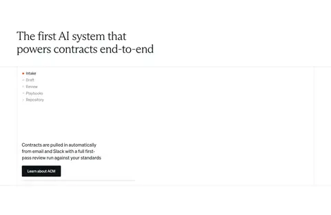
The measured content width reaches 1296px, with a spacious overall density and pronounced section breathing room. The desktop hero is left-aligned beneath a compact horizontal navigation, while the proof image spans the viewport. Content then moves through varied grids: four-column customer marks, a broad product demonstration, testimonial cards, integrations and stats, and multi-column footer content. Backgrounds alternate between white, #f5f5f5, and #0e1315 to distinguish chapters. Keep alignment predominantly left; center only the closing conversion block.
圆角与层次
按钮 · 3px
输入框 · 4px
卡片 · 4px
图片 · 2px
导航 · 4px
链接 · 3px
没有测到阴影:页面是扁平的,层次靠底色和描边区分。
The page is largely flat: white and pale-gray bands, hairline separators, and changes in background tone do the structural work. Cards have understated edges and small corner radii rather than pronounced shadows. Layer photography with subtle dark gradients when text sits on top; keep controls and surfaces crisp and legible.
组件
下面的预览按实测的按钮、输入框、徽标、卡片样式重建(字体用替代字体)。
Top navigation
Compact dark header with logo, horizontally arranged Soehne navigation, subtle divider, login link, and white Book a Demo button.
Hero
Near-black full-width field with a small product descriptor, large light serif headline, concise supporting copy, and white demo CTA.
Customer proof
Full-bleed photographic testimonial/proof panel with overlaid trust statement, rating, customer mark, and short result.
Logo grid
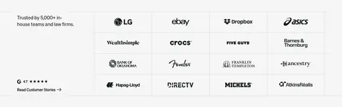
Pale-gray trust section combining a short heading and customer-story link with a structured grid of customer marks.
Testimonial cards
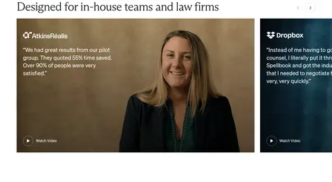
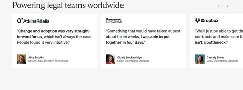
Horizontal customer cards pair brand marks and concise quotes with portrait or video imagery and compact attribution.
Lead form
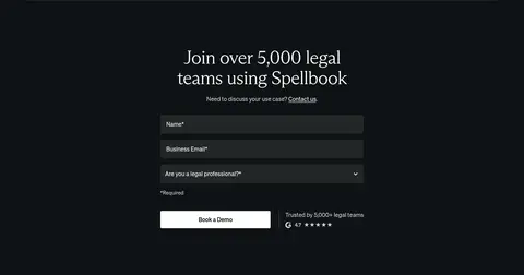
Dark conversion area with centered serif heading, stacked dark inputs, small supporting proof, and a high-contrast action button.
Newsletter signup
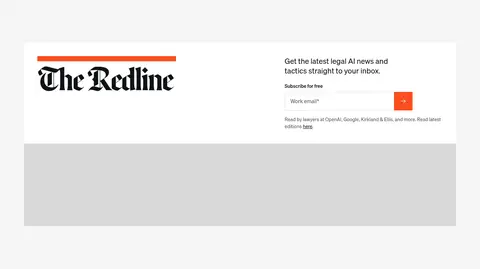
Newsletter block on a soft-gray band with editorial identity, short invitation, email field, and orange submit control.
Footer
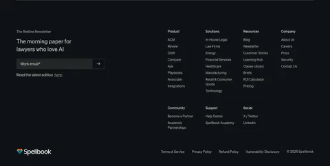
Dark multi-column navigation and newsletter area, separated by a fine horizontal rule and finished with legal links.
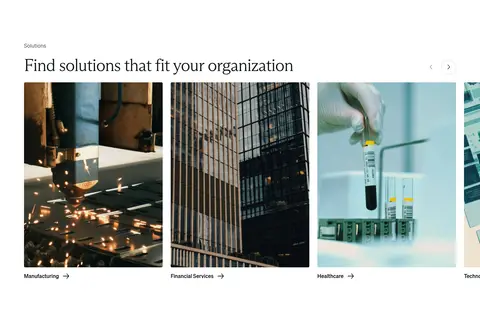
Imagery · Use real, cinematic workplace and industry photography: legal-team testimonials, a container port, manufacturing, office buildings, and healthcare settings. Frame images broadly, often edge-to-edge or as horizontal cards, with dark overlays only when needed for readable copy. Product/interface areas remain restrained and mostly white. Avoid decorative illustration or glossy 3D as the main visual language.
Use #0e1315 for major dark bands and white inverse text.
Set prominent headings in a light editorial serif.
Keep navigation, body copy, and controls in a clean sans-serif.
Alternate white content with measured #f5f5f5 section bands.
Use real photography for customer proof and solution categories.
Reserve orange for small functional accents.
Separate sections with whitespace and fine rules.
✕ 不该做
Do not turn orange into a large background wash.
Do not add heavy shadows or strongly rounded cards.
Do not fill every section with dark backgrounds.
Do not crowd the hero with extra copy or controls.
Do not use decorative graphics in place of customer photography.
Do not center-align all content; preserve the left-led editorial layout.
给 AI 的提示词
想快速出一个同风格的新页面,把这段话连同 DESIGN.md 一起发给 AI。
Build a new legal-AI SaaS page in Spellbook's calm editorial style. Use Midnight Ink (#0e1315) for a dramatic hero and conversion/footer bands, Paper White (#ffffff) for the main canvas, and Cloud Gray (#f5f5f5) for occasional proof or editorial sections. Keep Signal Orange (#f94d1e) to small action details. Use a light, tightly tracked serif display face for large headlines and a clear sans-serif for navigation, body, and controls. Favor a compact horizontal header, left-aligned copy, spacious section transitions, broad real-world photography, customer marks, and uncluttered cards. Use thin dividers and subtle surface contrast instead of shadows. Vary layouts across proof, product, testimonial, and solution content; keep the final CTA more centered and high contrast.