North star · Let oversized black type and candid employee imagery lead, using bright colour blocks as punctuation within generous white space.
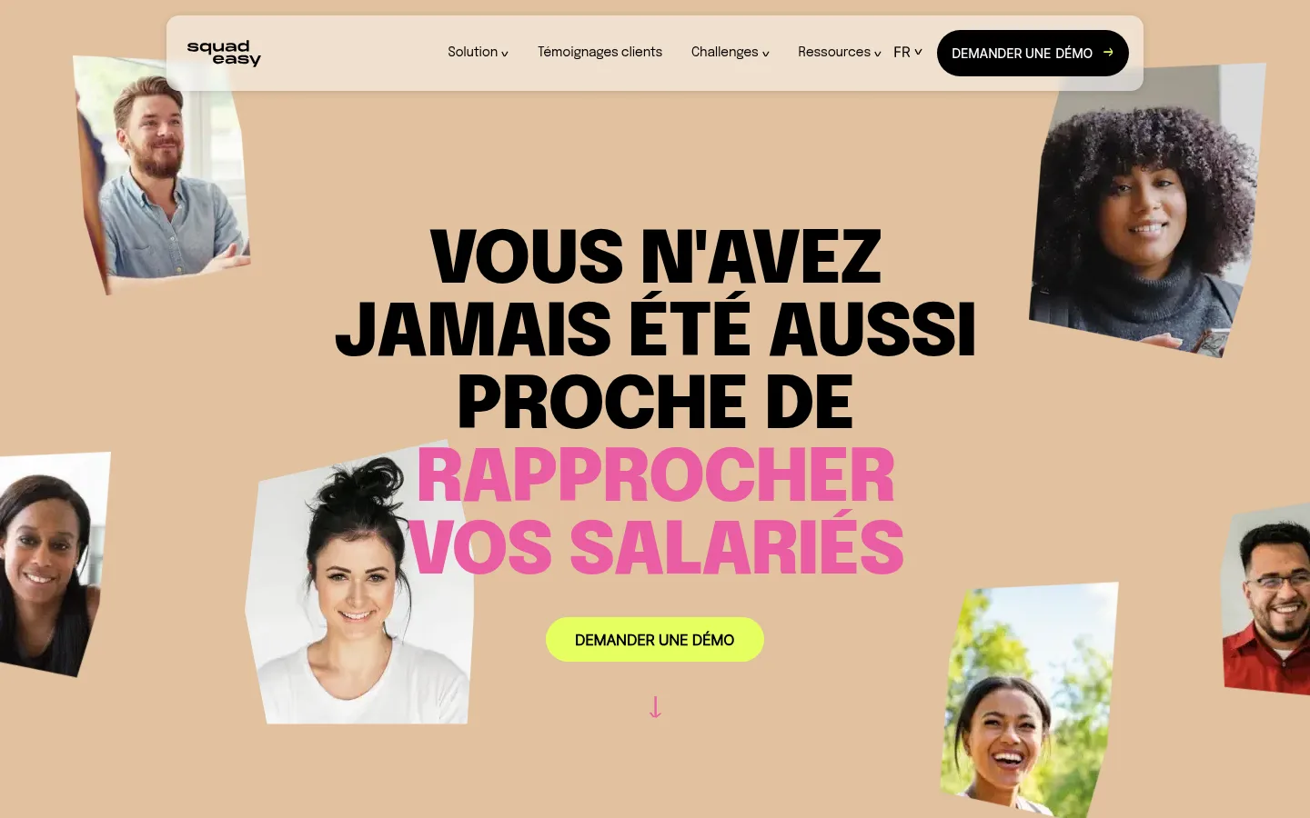
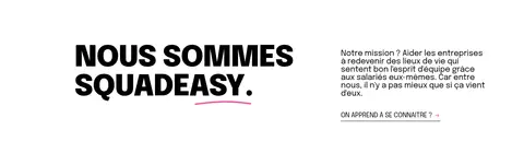
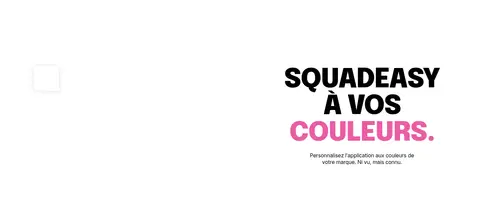
The page balances a mostly white canvas with a warm sand-coloured hero, vivid lime CTAs, lavender testimonial cards and occasional blue or purple section panels. Black is the anchor: it carries navigation, body copy and the oversized uppercase headings, while hot pink appears selectively in headline emphasis and branding imagery. Typography is deliberately emphatic and compact at display scale, then small and plain for supporting copy and navigation. The opening hero places a centered message amid loose, tilted portraits, giving the people imagery a scrapbook-like feel. Below it, unusually generous white intervals separate product, proof and story sections instead of relying on repeated coloured bands. Content alternates between centered panels, split layouts and horizontally browsable cards. Flat colour surfaces and minimal borders keep the geometry clear; restrained navigation shadow and rounded pill CTAs provide the principal depth and interaction cues.
配色
点色块复制色值。用途说明来自对页面的实测位置(背景、文字、描边、按钮)与截图判读。
品牌色
强调色
表层色
中性色
页面底色 · Gallery White表层 · Playful Lilac表层 2 · Warm Sand表层 3 · Open Sky表层 4 · Soft Mist主文字 · Team Ink次要文字 · Gallery White描边 · Team Ink强调 · Playful Lilac强调 2 · Open Sky
文字
背景
对比度
WCAG
#000000 Team Ink
#ffffff Gallery White
21:1
AAA
#000000 Team Ink
#adabff Playful Lilac
10.05:1
AAA
#000000 Team Ink
#e1c19e Warm Sand
12.32:1
AAA
#000000 Team Ink
#7fb6e6 Open Sky
9.74:1
AAA
#ffffff Gallery White
#adabff Playful Lilac
2.09:1
不达标
#ffffff Gallery White
#e1c19e Warm Sand
1.7:1
不达标
字体
字号阶梯:Custom(比例约 1.71,正文 16px)。示例用免费替代字体渲染,数值为实测。
Aa 设计
Body
网络字体 · 字重 400 / 700 · 占比 87%
免费替代:Inter
Main copy, links, testimonial text, buttons, and body-scale headings.
Aa 设计
Black
网络字体 · 字重 700 / 400 · 占比 6%
免费替代:Archivo Black
Display and main headings, including the hero and oversized section statements.
Aa 设计
Regular
网络字体 · 字重 400 · 占比 4%
免费替代:Inter
CTA button text and selected uppercase secondary links.
Aa 设计
Medium
网络字体 · 字重 400 · 占比 3%
免费替代:Inter
Compact dark demo CTA labels, especially in navigation and repeated calls to action.
角色
示例
字号
字重
行高
字距
特大标题
Oversized uppercase campaign headlines and prominent statements.
SquadEasy
80px
700
1
-0.025em
一级标题
Main page and section headlines, set in heavy uppercase.
SquadEasy
56px
700
normal
-0.036em
二级标题
Supporting section headings and secondary statements.
The quick brown fox 敏捷的狐狸
22px
400
normal
-0.011em
正文
Paragraphs, testimonial text, and explanatory copy.
The quick brown fox 敏捷的狐狸
16px
400
normal
-0.016em
辅助文字
Small supporting labels and compact metadata.
The quick brown fox 敏捷的狐狸
14px
400
normal
-0.018em
按钮
CTA labels, generally uppercase.
The quick brown fox 敏捷的狐狸
16px
400
normal
0
导航
Header navigation labels.
The quick brown fox 敏捷的狐狸
14px
400
1.21
-0.018em
链接
Uppercase text links such as learn-more actions.
The quick brown fox 敏捷的狐狸
16px
400
normal
-0.016em
间距与布局
基准单位 2px · 密度:宽松
100px版块间距
15px元素间距
57px卡片内边距
1240px内容最大宽度
4px
8px
10px
14px
15px
16px
20px
22px
24px
30px
32px
40px
50px
100px
140px
Use a centered content frame capped at the measured 1240px, with a spacious rhythm and section gaps around the measured 100px. The page mixes a full-width hero, centered colour panels, split text-and-image features, and horizontally browsable testimonial cards. Keep alignment deliberate within each block: center prominent proof and CTA sections, but left-align editorial feature copy. The measured base spacing unit is 2px and the scale ranges from 4px to 140px; keep element spacing airy rather than dense. Most content sits on white, so reserve coloured bands for emphasis.
圆角与层次
按钮 · 9999px
导航 · 14px
sm · nav
Surfaces are predominantly flat, with no heavy card shadows. Use black borders sparingly for controls and selected proof buttons; the measured customer-case card is square-cornered. The header is the key layered element, with a subtle measured shadow and rounded navigation container. Pill-shaped dark CTAs provide a compact contrast against the flat page.
组件
下面的预览按实测的按钮、输入框、徽标、卡片样式重建(字体用替代字体)。
Floating navigation
A light, rounded navigation container layered over the hero with a subtle shadow, compact labels and a dark pill demo CTA.
Hero
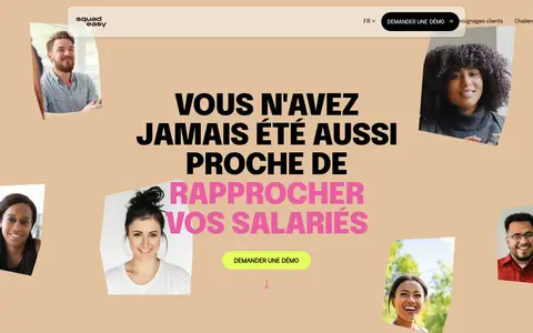
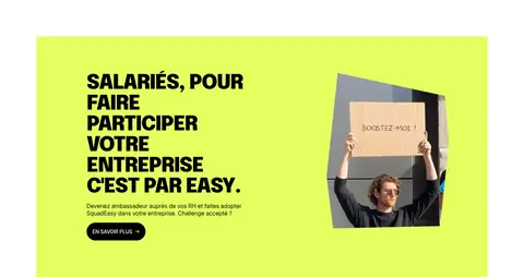
Warm sand field, huge centered uppercase headline, selective pink emphasis, scattered tilted employee portraits and a lime pill CTA.
Customer proof panel
Large sky-blue rectangular panel with centered black headline and a small outlined customer-case button.
Testimonial carousel
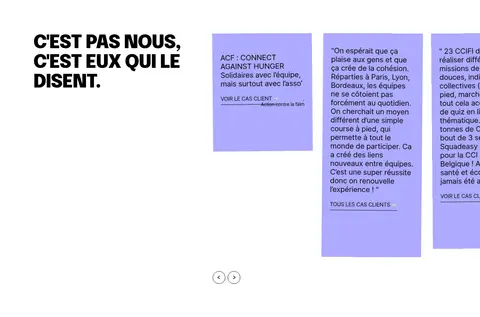
Horizontally browsable square-cornered lavender cards with black copy, compact links and simple circular arrow controls.
Employee engagement feature
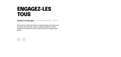
Split feature content and people imagery on white, with uppercase black heading, short copy and a secondary text link.
Primary CTA
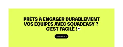
Electric-lime background or pill surface paired with black text; compact demo actions may instead use a black pill with white uppercase type.
Awards strip
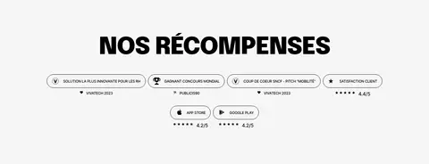
Pale grey recognition band with a prominent centered heading and compact award and app-rating labels.
Imagery · Use candid employee photography as the core visual material. In the hero, treat portraits like loose, slightly rotated snapshots around the central headline; elsewhere, pair people or app imagery with explanatory copy and colour panels. Product screenshots and phone mockups support the story but do not define the palette. Avoid glossy stock-photo staging or decorative illustration that competes with the human focus.
Use oversized uppercase black headings as the strongest typographic element.
Keep the page canvas white and spend colour on selected hero, proof and CTA areas.
Pair candid employee portraits with the warm sand hero.
Use Electric Lime for prominent calls to action.
Preserve generous white intervals between major content blocks.
Make testimonial cards flat, lavender and easy to scan.
✕ 不该做
Do not turn every section into a coloured band.
Do not use heavy shadows or layered card effects.
Do not replace the human photography with generic product decoration.
Do not use delicate display typography where the page calls for heavy uppercase type.
Do not crowd the page with dense copy or tight section spacing.
Do not add unmeasured colour values to the brand palette.
给 AI 的提示词
想快速出一个同风格的新页面,把这段话连同 DESIGN.md 一起发给 AI。
Build a new SquadEasy-style SaaS page around candid employee imagery, oversized uppercase headings and generous white space. Use Team Ink (#000000) for display type and most copy on a Gallery White (#ffffff) canvas. Reserve Warm Sand (#e1c19e) for a people-led hero, Electric Lime (#e4ff60) for strong CTA moments, Playful Lilac (#adabff) for testimonials or stats, Open Sky (#7fb6e6) for occasional customer proof, and Soft Mist (#f6f6f6) for quiet recognition content. Keep headlines heavy and tightly tracked; make supporting copy compact and plain. Mix centered colour panels with split editorial features and horizontal testimonial cards. Keep surfaces flat, use pill CTAs and restrained borders, and maintain spacious transitions instead of adding colour to every section.