North star · Let an atmospheric real-world business image carry the page, and keep typography, navigation, and actions crisp and restrained.
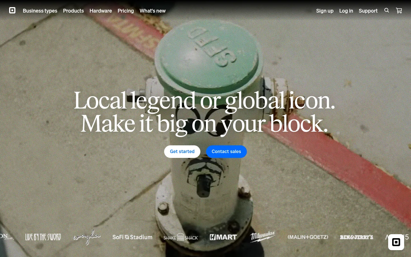
The first viewport is built around an atmospheric, full-bleed photograph or video frame of a sidewalk utility fixture. Its subdued olive, stone, and charcoal tones come from the imagery, not the measured brand palette; the brand system itself is stark black and white, with Signal Blue (#006aff) reserved for emphasis. White navigation and headline text sit directly over the image, creating contrast without enclosing the content in panels. Exact Block supplies the oversized, tightly tracked editorial serif headline, while Cash Sans and Square Sans Text VF keep navigation and actions crisp and practical. The headline is centered over the central image, with compact pill-shaped CTAs beneath it. A narrow customer-logo strip anchors the bottom edge. Spacing feels open and deliberate: the hero gets the canvas, and supporting elements remain visually subordinate. Hairlines and muted grays are secondary interface details rather than prominent decoration.
Major section headings on supporting page content.
Square
56px
500
1
-0.03em
三级标题
Secondary section or feature headings.
Square
40px
400
1.13
-0.02em
四级标题
Compact feature titles and subsection labels.
The quick brown fox 敏捷的狐狸
24px
500
1.2
-0.01em
正文
Explanatory copy in supporting content.
The quick brown fox 敏捷的狐狸
14px
400
1.5
0.02em
按钮
Primary and secondary CTA labels.
The quick brown fox 敏捷的狐狸
14px
500
normal
0
导航
Top-level site navigation.
The quick brown fox 敏捷的狐狸
14px
500
1.5
0
链接
Inline and supporting navigation links.
The quick brown fox 敏捷的狐狸
14px
400
1.5
0.02em
眉题
Uppercase, tracked section kicker or label.
The quick brown fox 敏捷的狐狸
14px
500
1.5
0.1em
代码
Monospaced uppercase technical or metadata text.
const style = 1;
14px
500
1.5
0.1em
间距与布局
基准单位 2px · 密度:适中
80px版块间距
20px元素间距
—卡片内边距
—内容最大宽度
3px
4px
10px
18px
20px
30px
40px
60px
80px
120px
The viewport prioritizes one edge-to-edge hero image, with a slim navigation row overlaid along the top. Center the main headline over the scene and place paired CTAs directly beneath it; keep the customer logos in a low horizontal strip near the bottom. The layout is intentionally sparse, with no visible card grid or boxed text panels. Measured spacing suggests a comfortable rhythm, but no page maximum width is established by the data. Let the hero occupy most of the first viewport and keep secondary UI compact.
圆角与层次
按钮 · 4px
输入框 · 10px
徽标 · 5px
导航 · 4px
链接 · 9999px
inset · input
md · button
The hero is largely flat: navigation and copy overlay the image without card containers. Measured borders are restrained and belong mostly to footer or secondary details. Buttons may use subtle depth, but avoid prominent shadows, stacked panels, or decorative elevation that competes with the photography.
组件
下面的预览按实测的按钮、输入框、徽标、卡片样式重建(字体用替代字体)。
Overlay navigation
A compact top row with the Square mark, business/product links, and account, support, search, and cart actions; white labels sit over the hero image.
Hero headline
Large centered Exact Block serif text in white, arranged across two lines over the central photographic subject.
Primary CTA
A compact rounded action with white fill and blue text, visually distinct from the blue-filled secondary action.
Secondary CTA
Signal Blue (#006aff) pill-shaped action with white text, placed immediately beside the primary CTA.
Customer logo strip
A low horizontal row of white customer wordmarks over the image, reinforcing social proof without enclosing each logo.
Imagery · Use a full-bleed, cinematic real-world business or street scene, framed close enough to feel tactile and recognizable. The screenshot’s muted green-gray pavement and fixture colors are photographic content, not brand palette tokens. Keep imagery subdued and slightly atmospheric so white text remains readable; place customer wordmarks in a thin overlay strip rather than building a separate card gallery.
该做与不该做
✓ 该做
Use a full-bleed real-world business image as the hero canvas.
Set the main headline in a high-contrast editorial serif.
Keep navigation and hero copy white over darkened imagery.
Reserve Signal Blue (#006aff) for a prominent action or focus state.
Center the hero message and keep the CTA pair close beneath it.
Treat customer marks as a restrained horizontal strip.
✕ 不该做
Do not turn the hero into a boxed card or panel.
Do not treat photographic olive and stone colors as brand tokens.
Do not introduce gradients as a dominant visual signature.
Do not crowd the hero with dense copy or extra controls.
Do not use heavy shadows or layered card stacks.
Do not replace the editorial serif headline with generic bold sans-serif.
给 AI 的提示词
想快速出一个同风格的新页面,把这段话连同 DESIGN.md 一起发给 AI。
Build a new Square-style page with a cinematic, full-bleed real-world business image as its visual anchor. Use Gallery White (#ffffff) for overlaid navigation and headline text, Canvas Black (#000000) for the underlying monochrome system, and Signal Blue (#006aff) sparingly for the primary action or focus state. Set the central headline in a high-contrast editorial serif similar to Exact Block, with tight tracking; use a clean sans-serif like Cash Sans for body copy and a compact sans-serif for navigation and buttons. Keep the top navigation slim, center the hero message, and place a compact pair of rounded CTAs beneath it. If social proof is needed, use an unboxed horizontal logo strip. Avoid cards, heavy shadows, and treating image colors as brand colors.