North star · Keep the interface almost entirely monochrome and let the working audio experience—not decoration—earn the single amber accent.
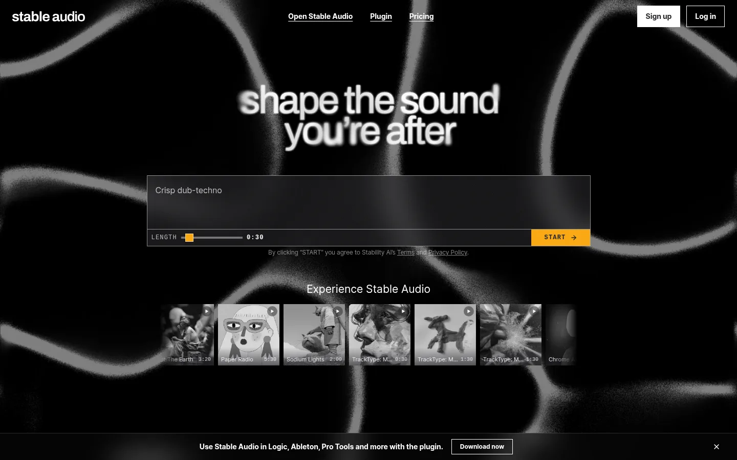
The page is built on a near-black canvas, with white headings and controls carrying the strongest contrast. Muted grays keep supporting copy, borders, and card details legible without competing with the content; amber is reserved for the primary START action. Inter is used throughout, with bold, tightly tracked display text and compact navigation and button labels. The opening experience layers a large, blurred monochrome sound-wave visual behind a centered generation interface and a horizontal strip of audio examples. Below, broad black section bands and generous vertical gaps separate product cards, partner proof, workflow content, and community posts. Cards stay dark and restrained, relying on thin gray outlines and subtle inset highlights rather than heavy shadows. The final newsletter area shifts slightly warmer and lighter than the main canvas, while retaining the same compact, understated visual language.
配色
点色块复制色值。用途说明来自对页面的实测位置(背景、文字、描边、按钮)与截图判读。
品牌色
强调色
表层色
中性色
功能色
页面底色 · Studio Black表层 · Panel Black表层 2 · Near Black主文字 · Signal White次要文字 · Soft White弱文字 · Quiet Silver描边 · Divider Charcoal强调 · Signal Amber
Headings, body copy, navigation, buttons, links, and labels across the page.
Aa 设计
ui-monospace
系统字体 · 字重 400 / 700 · 占比 1%
免费替代:IBM Plex Mono
Small technical-style hero action label.
角色
示例
字号
字重
行高
字距
一级标题
Large hero message, set bold with close tracking.
Stable Audio
36px
700
1.56
-0.024em
二级标题
Section headings and card-level feature titles.
The quick brown fox 敏捷的狐狸
20px
700
1.6
-0.017em
正文
Main explanatory copy and product-card descriptions.
The quick brown fox 敏捷的狐狸
16px
500
1.38
-0.011em
辅助文字
Fine print, helper text, and supporting labels.
The quick brown fox 敏捷的狐狸
11px
400
1.5
0
按钮
Compact bold calls to action and prompt controls.
The quick brown fox 敏捷的狐狸
11px
700
1.27
0
导航
Bold primary navigation links.
The quick brown fox 敏捷的狐狸
14px
700
1.71
-0.006em
链接
Small secondary links, including footer links.
The quick brown fox 敏捷的狐狸
12px
400
1.33
-0.015em
代码
Compact monospace technical labels.
const style = 1;
10px
400
1.5
0
间距与布局
基准单位 4px · 密度:宽松
96px版块间距
4px元素间距
—卡片内边距
915px内容最大宽度
1px
2px
4px
6px
8px
12px
16px
20px
24px
Use a spacious, section-led vertical flow on a centered page with a measured maximum width of 915px. The hero is centered around the prompt tool and horizontal example rail; later content mixes centered introductions with three-column product cards and narrower partner or community groupings. Keep the main content density low and give sections generous separation. The newsletter and footer form a distinct closing band. The measured section rhythm is spacious, with a 96px section gap and a 4px base spacing unit.
圆角与层次
按钮 · 4px
输入框 · 4px
徽标 · 9999px
链接 · 12px
hairline · button
inset · link, card
inset · other
The design is mostly flat: black canvas, dark panels, and fine gray borders create separation without prominent drop shadows. Cards and links show subtle inset white highlights, while some media controls use a restrained layered shadow. Use thin outlines and contrast, not raised glossy surfaces, to establish hierarchy.
组件
下面的预览按实测的按钮、输入框、徽标、卡片样式重建(字体用替代字体)。
Primary navigation
Compact white wordmark and bold links across the top, with distinct sign-up and login controls.
Audio prompt composer
Wide dark prompt field with fine gray outline, a length slider, time readout, and amber START button.
Audio example rail
Horizontal row of monochrome rectangular example thumbnails with small play and track details.
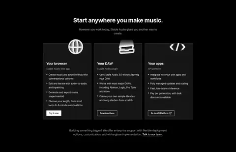
Product pathway cards
Three dark browser, DAW, and app cards with iconography, compact bullet lists, and restrained action links.
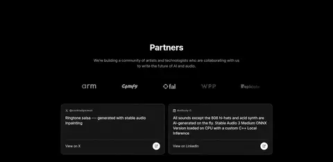
Partner and community cards
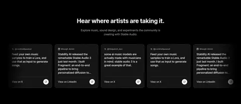
Dark social proof cards with thin outlines, small attribution text, short content, and compact outbound links.
Pill badges
Small rounded genre labels using white text and a fine #333333 border.
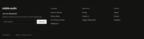
Newsletter footer
Slightly lifted dark footer band with an email field, light subscribe button, and grouped utility links.
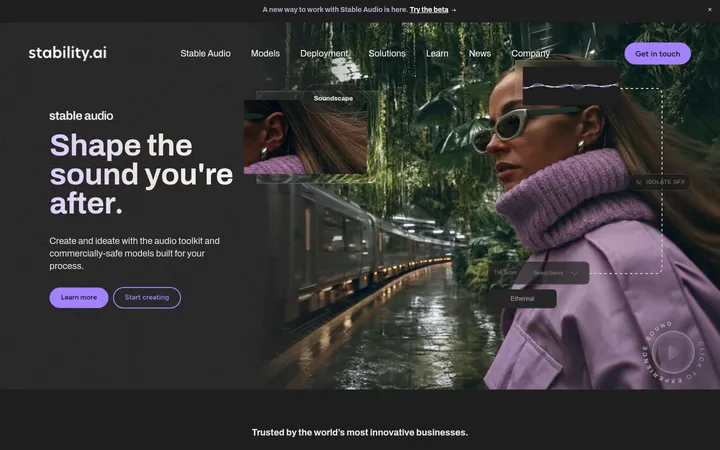
Imagery · The hero uses a full-width, blurred monochrome waveform-like visual behind the interface; treat it as atmospheric media rather than a color source. Small rectangular audio-example thumbnails sit in a horizontal strip. Lower sections favor compact dark cards, partner marks, and social posts. Keep imagery predominantly grayscale and contained in its card or rail, with no invented colorful illustration style.
Reserve #f8a815 for the primary action and small control emphasis.
Keep supporting text gray and lower contrast than headings.
Use thin borders to define cards and controls.
Keep the hero interface centered over atmospheric monochrome media.
Allow generous vertical separation between major sections.
✕ 不该做
Do not introduce additional saturated accent colors.
Do not make cards bright or heavily elevated.
Do not let hero artwork obscure readable interface controls.
Do not use oversized decorative gradients as section backgrounds.
Do not crowd the page with dense layouts or excessive copy.
Do not apply the amber accent to ordinary links and body text.
给 AI 的提示词
想快速出一个同风格的新页面,把这段话连同 DESIGN.md 一起发给 AI。
Build a new page in Stable Audio’s visual style: use Studio Black (#000000) as the main canvas, Signal White (#ffffff) for headings and controls, and Soft White (#e6e6e6) or Quiet Silver (#b3b3b3) for secondary copy. Reserve Signal Amber (#f8a815) for one primary action. Use Inter throughout, with compact bold navigation and button labels; use a restrained monospace face only for technical control labels. Organize content into spacious, clearly separated sections inside a centered content area. Favor thin Divider Charcoal (#333333) or Control Gray (#808080) outlines, dark panels, and subtle inset highlights over prominent shadows. If the page includes audio media, use grayscale thumbnails or atmospheric monochrome imagery and keep the controls legible. Maintain a clean, product-led hierarchy and avoid decorative color noise.