North star · Keep the interface nearly black and typographically restrained; let portfolio imagery provide variety and violet signal the next action.
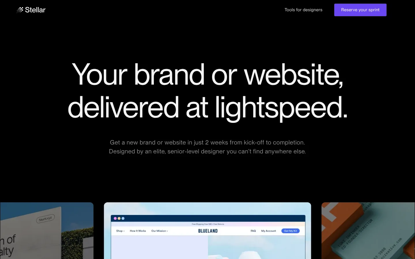
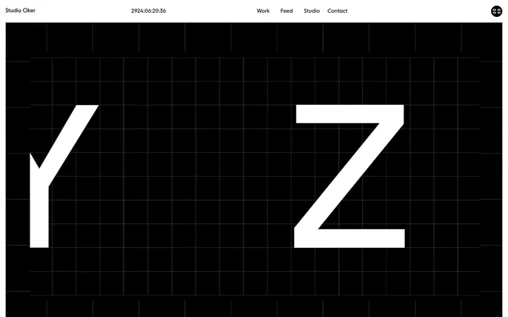
The page is anchored by a true-black canvas, with charcoal cards and footer areas creating subtle shifts rather than pronounced alternating bands. White and near-white Neue Montreal headlines carry the visual hierarchy; muted gray supporting copy stays understated, while saturated violet is reserved for primary actions and occasional small accents. The opening is spacious and centered, pairing a large two-line headline with restrained supporting text before a horizontal, image-led work strip. Below, the rhythm alternates between centered introductions, designer and project galleries, and asymmetric service or process splits. Large vertical gaps separate these blocks, making the long homepage feel deliberate rather than crowded. Portfolio imagery supplies most of the color and texture, displayed in dark, softly rounded frames. The footer consolidates links and newsletter fields on a charcoal surface. Keep the interface itself quiet: color belongs mainly to CTAs, while the work imagery carries variety.
Display and section headings, navigation, body copy, captions, and button labels throughout the page.
角色
示例
字号
字重
行高
字距
特大标题
Oversized hero display headline.
Stellar
104px
400
1.1
-0.02em
一级标题
Primary page and section headlines.
Stellar
72px
400
1.1
-0.01em
二级标题
Large service and content section headings.
Stellar
70.5px
400
1.1
-0.01em
三级标题
Smaller prominent headings and designer or project labels.
The quick brown fox 敏捷的狐狸
22px
500
1.5
0.025em
四级标题
Supporting subsection headings.
The quick brown fox 敏捷的狐狸
21px
400
1.5
0.025em
正文
Service descriptions and explanatory paragraphs.
The quick brown fox 敏捷的狐狸
15px
400
1.5
0.035em
辅助文字
Image captions, card labels, and compact supporting details.
The quick brown fox 敏捷的狐狸
14px
400
1.5
0.03em
按钮
Primary sprint actions and secondary controls.
The quick brown fox 敏捷的狐狸
15px
400
1.5
0.03em
导航
Header navigation and links.
The quick brown fox 敏捷的狐狸
15px
400
1.2
0.035em
间距与布局
基准单位 4px · 密度:宽松
200px版块间距
20px元素间距
20px卡片内边距
1325px内容最大宽度
3px
5px
10px
12px
15px
16px
20px
24px
30px
32px
50px
58px
64px
158px
200px
A spacious, vertically flowing homepage on a dark canvas, with content generally centered within the measured 1325px maximum width. The hero centers its headline and copy above a horizontally clipped work strip. Later blocks alternate centered introductions, two-column service and proof sections, and a four-column process row. Gallery cards form dense image-led runs within otherwise open sections. A 200px section gap and 20px element gap define the measured rhythm; retain generous negative space rather than compressing the long page.
圆角与层次
按钮 · 9999px
输入框 · 6px
卡片 · 6px
md · other
The interface is mostly flat against black, with little reliance on conventional drop shadows. Separate cards through charcoal fills and thin same-tone borders; measured cards use a 6px radius and 20px padding. Mockup imagery can provide its own depth and layered composition. Primary buttons are pill-shaped, while secondary controls use smaller rounded corners.
组件
下面的预览按实测的按钮、输入框、徽标、卡片样式重建(字体用替代字体)。
Primary sprint CTA
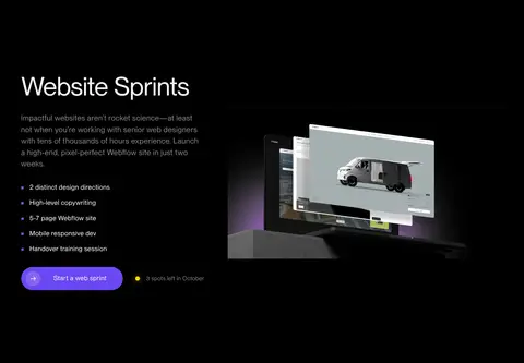
Use a violet #6a48f2 fill, white label, and pill silhouette. The main measured button has a 50px radius; compact variants have measured 4px rounding.
Portfolio cards
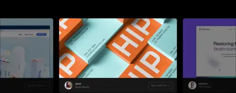
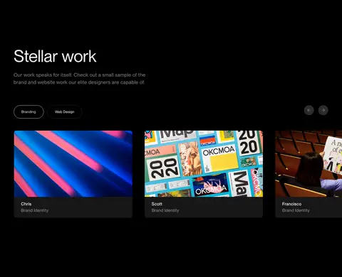
Place project imagery in dark cards with charcoal #171718 framing, a 6px radius, and a compact caption area for designer and discipline.
Designer cards
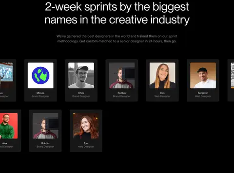
Show designer portraits or artwork in a gallery run, with muted gray metadata and dark card surfaces; keep the grid visually subordinate to the imagery.
Service split
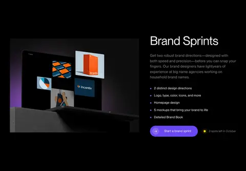
Pair a large brand or website mockup with a heading, short description, concise feature list, violet CTA, and a small availability note.
Process cards
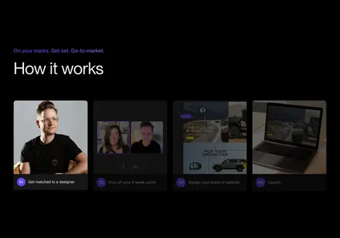
Arrange four image-backed steps in a row, each with a compact numbered violet marker and a short caption.
Footer newsletter
Set newsletter copy and input fields on the charcoal footer band alongside compact navigation columns and a secondary Learn More action.
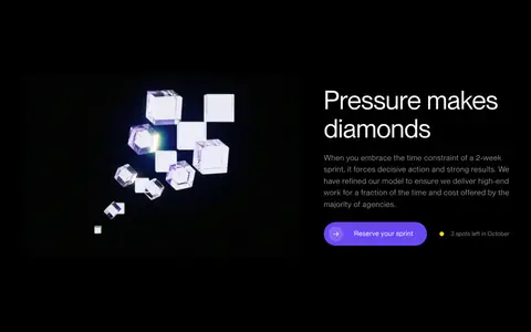
Imagery · Use portfolio photography, brand identity work, website mockups, designer portraits, and process imagery as the main source of visual variety. Present images in dark cards or floating mockup-like compositions, with softly rounded corners and restrained framing. Horizontal strips can clip at viewport edges; service splits pair a large visual with concise copy. The closing CTA uses a violet-to-pale gradient backdrop.
Reserve #6a48f2 for primary actions and restrained emphasis.
Set large, sentence-case headlines in Neue Montreal or a close substitute.
Give sections generous vertical breathing room.
Let portfolio images supply most of the page's color.
Use charcoal cards and subdued borders instead of heavy shadows.
✕ 不该做
Don't introduce bright section backgrounds across the page.
Don't use violet as a large, persistent interface fill.
Don't crowd the centered hero with extra controls.
Don't apply heavy shadows to every card.
Don't make body copy compete with the large headings.
Don't force every section into the same alignment or grid.
给 AI 的提示词
想快速出一个同风格的新页面,把这段话连同 DESIGN.md 一起发给 AI。
Build a new page in Stellar's dark design-agency style. Use Stellar Black (#000000) as the continuous canvas, Carbon Panel (#171718) for card and footer surfaces, and Quiet Gray (#888888) for restrained supporting copy. Set headlines in Neue Montreal, using DM Sans as a free substitute; keep headings large, light-weight, sentence case, and tightly tracked. Use Sprint Violet (#6a48f2) sparingly for the primary CTA and small accents, with white button text. Create a spacious vertical rhythm with centered introductory content, asymmetric image-and-copy splits, and image-led gallery cards. Let portfolio work and portraits provide color; frame them subtly instead of adding decorative UI. Keep borders quiet, corners softly rounded, and shadows minimal. Make each section distinct through alignment and content structure, not loud background changes.