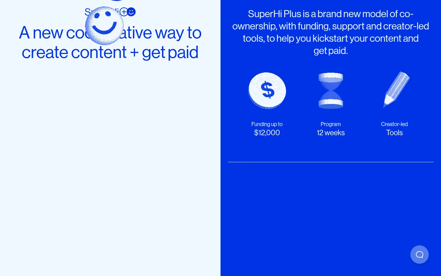
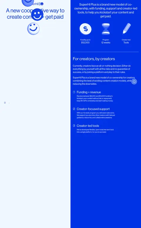
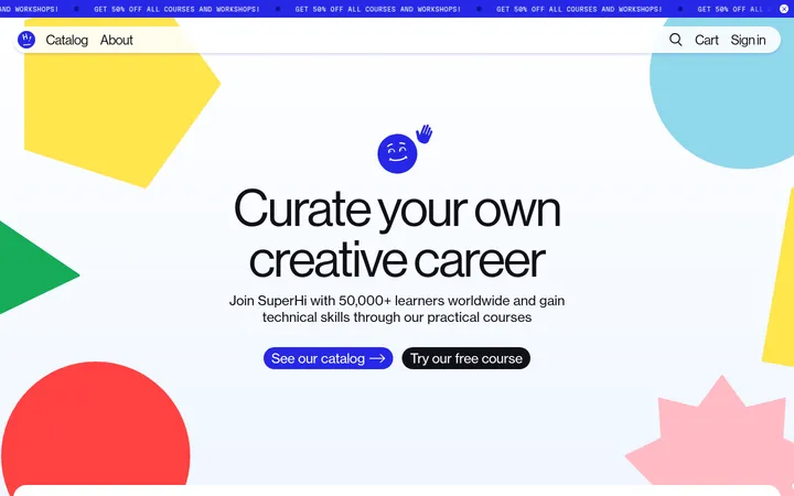
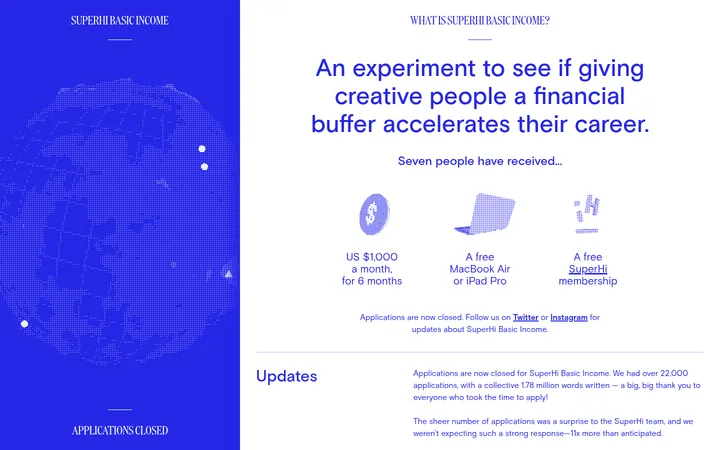
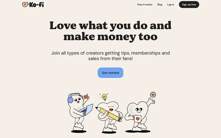
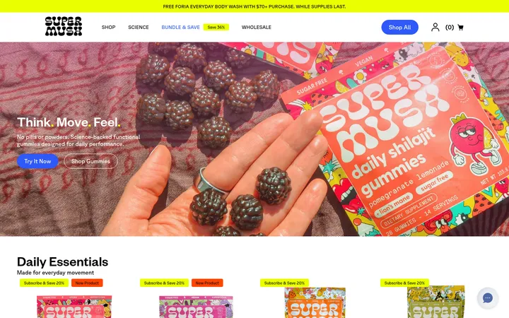
SuperHi Plus 用高饱和蓝色与浅色区块呈现面向创作者的资助和支持项目。超大字号搭配俏皮的3D图形,让长页面兼具编辑感与鲜明个性。
North star · Let saturated blue and pale split panels frame oversized, regular-weight typography, with playful 3D graphics used only as supporting accents.
The page is built around a strict two-colour conversation: saturated Signal Blue (#0033e5) carries most of the canvas, while Frosted Blue (#f0f7ff) forms contrasting panels, text, and occasional full-height split-screen areas. Type stays in one family, Haas Grot Disp Web, with regular-weight forms and oversized display headlines that feel direct rather than ornamental. The opening places headline and introductory content in opposing halves, then the same blue field continues through explanatory sections, separated by thin pale rules. Long-form copy is broken into compact groups, numbered points, and bordered controls so the dense content remains scannable. Small 3D smiley and plus-sign illustrations add personality; they are accents, not a replacement for the typography-led layout. Rounded outlined links and buttons provide the main interactive affordances, while elevation remains restrained and the overall effect is spacious, graphic, and high contrast.
配色
点色块复制色值。用途说明来自对页面的实测位置(背景、文字、描边、按钮)与截图判读。
品牌色
强调色
表层色
页面底色 · Signal Blue表层 · Frosted Blue主文字 · Frosted Blue描边 · Frosted Blue强调 · Signal Blue强调 2 · Periwinkle Accent
All page typography, from display headings and body copy to buttons and links.
角色
示例
字号
字重
行高
字距
特大标题
Oversized opening statement and prominent editorial headlines.
SuperHi Plus
85px
400
1.13
0
一级标题
Primary page and major section headings.
SuperHi Plus
56px
400
1.14
0
二级标题
Section titles and large content headings.
SuperHi Plus
42px
400
1.14
0
三级标题
Feature and subsection headings.
SuperHi Plus
32px
400
1.25
0
四级标题
Compact card and FAQ headings.
The quick brown fox 敏捷的狐狸
24px
400
1.33
0
正文
Explanatory paragraphs and supporting descriptions.
The quick brown fox 敏捷的狐狸
18px
400
1.33
0
辅助文字
Small labels, metadata, and secondary notes.
The quick brown fox 敏捷的狐狸
16px
400
1.5
0
按钮
Button and pill-control labels.
The quick brown fox 敏捷的狐狸
16px
400
normal
0
链接
Prominent text links and navigation-style link labels.
The quick brown fox 敏捷的狐狸
24px
400
1.33
0
间距与布局
基准单位 8px · 密度:宽松
96px版块间距
24px元素间距
—卡片内边距
1248px内容最大宽度
4px
6px
8px
16px
22px
24px
32px
40px
48px
96px
Use a spacious, responsive editorial grid with a measured page maximum width of 1248px. The opening uses a strong side-by-side split, with oversized headline content on a pale panel and supporting copy on blue. Later sections retain the blue canvas but vary between aligned text columns, centered content, and pale-panel splits. The measured section rhythm is generous; keep copy groups concise, align headings consistently, and use thin rules to break up long stretches without adding dense card grids.
圆角与层次
按钮 · 16px
输入框 · 2px
卡片 · 24px
链接 · 9999px
inset · link, button
sm · other
inset · link
The page is mostly flat: solid colour fields, pale panels, and fine contrasting borders do the structural work. Avoid card shadows and layered surfaces. The measured interface uses subtle inset outlines on selected controls and a restrained soft shadow on a minor element; keep illustration depth confined to the artwork.
组件
下面的预览按实测的按钮、输入框、徽标、卡片样式重建(字体用替代字体)。
Split opening
Pair a pale headline panel with a Signal Blue content panel; keep oversized type and introductory copy as the main focus.
Outlined category controls
Use pale text and a thin pale outline on the blue canvas, with rounded corners and arrow-led labels where shown.
Primary action
A compact Signal Blue fill with pale text and a pill-like silhouette; reserve this treatment for the main action.
Numbered feature list
Present funding, support, and tools as separated numbered points with short headings and concise supporting copy.
Editorial content card
Alternate flat pale cards with blue text and blue sections with pale text; avoid adding unmeasured elevation.
FAQ rows
Keep questions readable as compact text rows, divided by thin pale rules and integrated into the blue page field.
Imagery · There is no conventional photography in the measured sections. Use playful, glossy 3D smiley faces, plus signs, and simple money, hourglass, or pencil motifs as supporting illustrations. Keep them isolated against the blue and pale backgrounds; preserve the strong colour contrast and let typography and negative space remain dominant.
Keep typography regular-weight and consistently sans-serif.
Use a split-panel composition to establish hierarchy.
Break long content into short sections and numbered points.
Reserve 3D motifs for small illustrative accents.
✕ 不该做
Do not introduce unmeasured colours as brand tokens.
Do not add gradients or decorative background textures.
Do not use heavy shadows to separate content.
Do not make every section a rounded card.
Do not let illustrations overpower the headline and copy.
Do not use all-caps styling or heavy display weights.
给 AI 的提示词
想快速出一个同风格的新页面,把这段话连同 DESIGN.md 一起发给 AI。
Build a new responsive page in the SuperHi Plus visual style. Use Signal Blue (#0033e5) as the dominant canvas and Frosted Blue (#f0f7ff) for contrasting panels, reversed text, and fine outlines; apply Periwinkle Accent (#527ceb) sparingly to secondary actions. Set all text in Haas Grot Disp Web or a close Inter substitute, regular weight, with clear oversized headings and readable compact body copy. Start with a bold split-panel composition, then organize content into spacious editorial sections with thin rules and numbered feature groups. Use simple glossy 3D smiley or plus-sign artwork as occasional supporting imagery, not as page backgrounds. Keep surfaces flat, controls clearly outlined or pill-like, and hierarchy driven by colour, typography, and generous spacing rather than shadows.