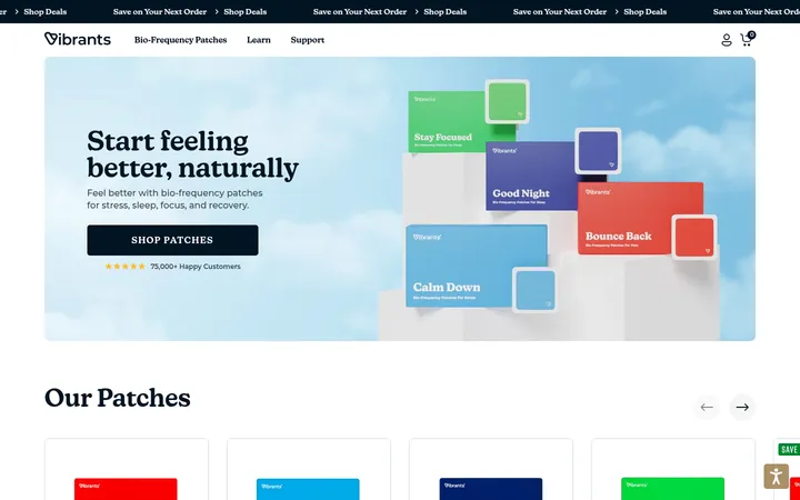
North star · Keep the storefront grounded in warm neutrals, and use vivid product imagery and blue shopping actions to create the energy.
The page is built on a warm off-white canvas (#f5f4f1), interrupted by clean white product areas and a black footer that gives the long storefront a decisive close. Electric blue (#2f59f8) marks the main shopping actions and occasional borders; fluorescent yellow (#eaff00) is reserved for the top offer strip and product badges. Black typography anchors the interface, while coral tones mostly echo the packaging and photography rather than define the interface palette. Founders Grotesk supplies the prominent, compact-feeling headings and body copy; GT Planar handles uppercase navigation, small labels, and buttons. The page moves from a full-bleed lifestyle hero into a dense product grid, then alternates feature imagery, ingredient cards, proof points, testimonials, and a final lifestyle CTA. Consistent left alignment and repeated card patterns keep the long page easy to scan. Rounded blue CTAs contrast with mostly flat, lightly outlined cards, while generously open section bands prevent the retail density from feeling cluttered.
Headings, body copy, product titles, and larger editorial links.
Aa 设计
GT Planar
网络字体 · 字重 400 / 500 / 700 · 占比 36%
免费替代:Space Grotesk
Uppercase navigation, small captions, promotional labels, and button text.
角色
示例
字号
字重
行高
字距
一级标题
Hero headline and the primary statement on a page.
SuperMush
48px
500
1.04
0
二级标题
Major section headings such as Daily Essentials.
SuperMush
43px
500
1.04
0
三级标题
Subsection titles and prominent feature statements.
SuperMush
40px
500
1.05
0
四级标题
Smaller editorial or card-level headings.
SuperMush
36px
500
1
0
正文
Product descriptions, supporting copy, and section text.
The quick brown fox 敏捷的狐狸
14px
500
1.4
0
辅助文字
Small product badges, fine print, and compact labels.
The quick brown fox 敏捷的狐狸
11px
400
1
0
按钮
Shopping and secondary action labels.
The quick brown fox 敏捷的狐狸
16px
400
1
0
导航
Uppercase header navigation and compact utility links.
The quick brown fox 敏捷的狐狸
14px
400
1.29
0
链接
Larger clickable product names and editorial links.
The quick brown fox 敏捷的狐狸
20px
500
1
0
间距与布局
基准单位 4px · 密度:适中
48px版块间距
16px元素间距
28px卡片内边距
1344px内容最大宽度
2px
4px
6px
8px
10px
12px
14px
16px
20px
22px
28px
48px
80px
Use a wide, centered storefront with a measured maximum content width of 1344px. Keep the announcement and header as narrow horizontal bands, followed by a full-bleed hero. Product merchandising uses a five-column measured grid, while supporting content shifts between two-, three-, and four-column arrangements. Headings generally align left; the final lifestyle CTA centers its message. Preserve a comfortable rhythm with measured 48px section gaps and 16px element gaps, using broad open bands between dense retail modules.
圆角与层次
按钮 · 9999px
输入框 · 9999px
卡片 · 4px
图片 · 4px
徽标 · 4px
导航 · 4px
没有测到阴影:页面是扁平的,层次靠底色和描边区分。
The interface is mostly flat, with no measured shadow system. Product and media cards use restrained, measured 4px corner radii; many content blocks sit directly on the canvas. Use crisp section boundaries and occasional blue borders for emphasis. The dark image gradient is an overlay for contrast, while the black footer creates the clearest surface shift.
组件
下面的预览按实测的按钮、输入框、徽标、卡片样式重建(字体用替代字体)。
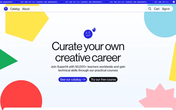
Announcement strip
A full-width fluorescent yellow offer band with small, centered uppercase promotion text.
Store header
White horizontal header with black logo and navigation, a blue pill-shaped Shop All action, and compact account and cart icons.
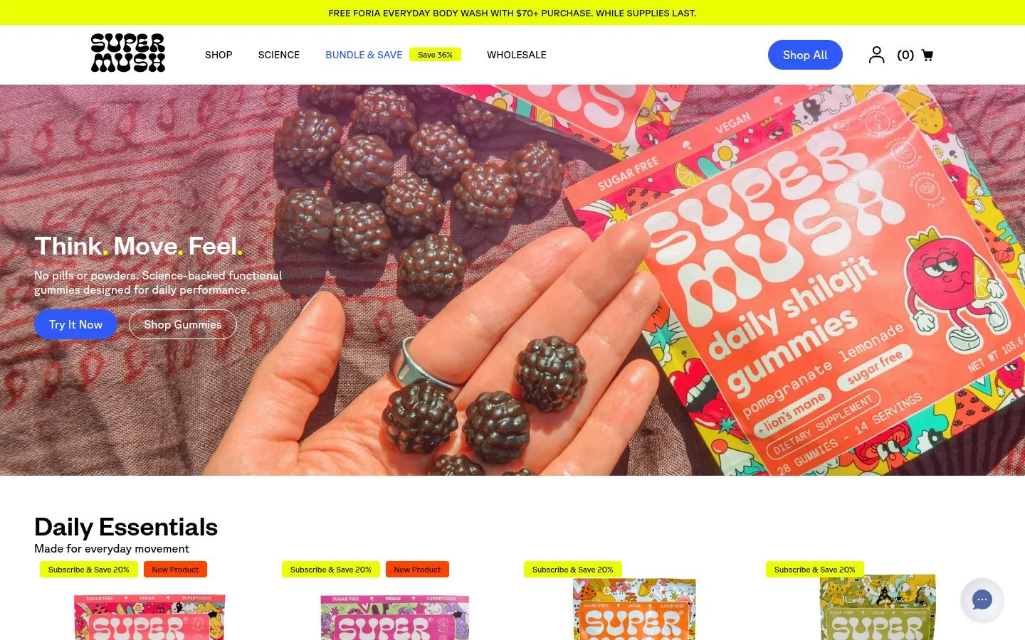
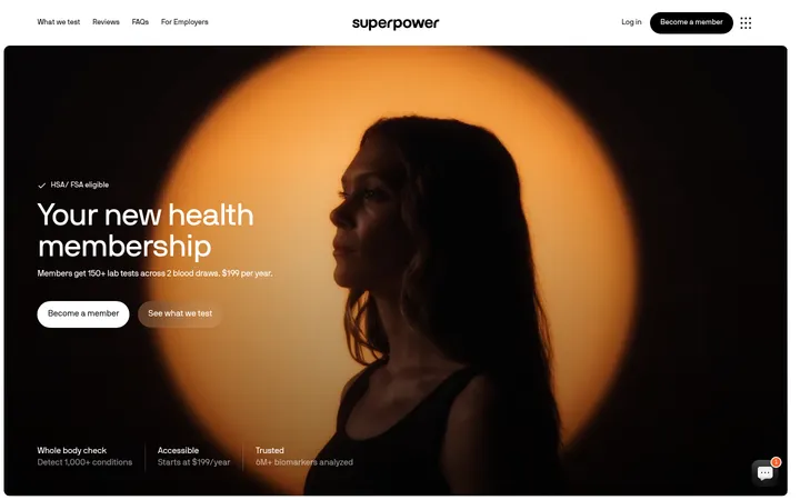
Lifestyle hero
Full-bleed product-in-use image with left-aligned white headline and copy, blue primary CTA, and white outlined secondary CTA.
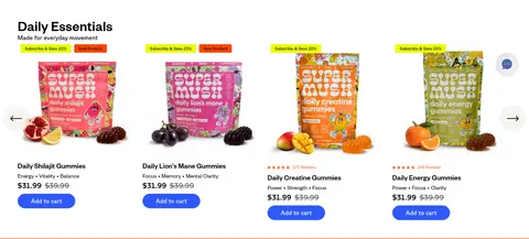
Product cards
Dense product grid with bright package images, fluorescent savings and orange new-product badges, product names, pricing, and blue cart actions.
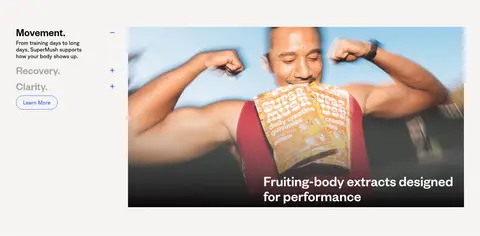
Feature and ingredient panels
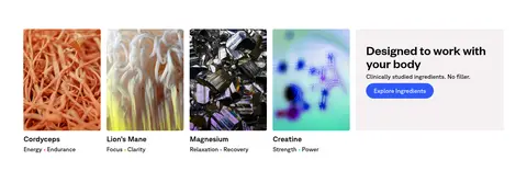
Alternating image-led editorial modules and compact ingredient cards, using clear labels and short explanatory copy.
Proof carousels
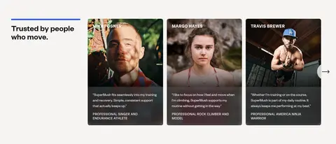
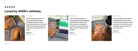
Athlete testimonial cards and customer review imagery provide social proof within structured, horizontally browsable rows.
Newsletter footer
Black footer groups shop, science, about, community, and contact links, with a white rounded email input and large brand mark.
Imagery · Use candid, full-bleed lifestyle photography for the hero and final CTA, with product packaging clearly visible and people shown in active, everyday contexts. Product cards use isolated package photography with ingredient cues. Supporting ingredient tiles, athlete portraits, and customer review images add variety. Images are rectangular and closely cropped; dark gradient overlays help white hero copy remain legible. Packaging colors are vivid but belong to photography, not the core UI palette.
Use Warm Canvas (#f5f4f1) as the principal page ground.
Reserve Electric Blue (#2f59f8) for high-priority shopping actions.
Use Neon Citron (#eaff00) for compact promotional emphasis.
Pair product packaging photography with clear product names and prices.
Keep primary headlines and section titles left aligned unless the block is a closing CTA.
Use Founders Grotesk for editorial hierarchy and GT Planar for utility labels.
Create contrast over full-bleed imagery with a dark overlay and light text.
✕ 不该做
Do not turn packaging coral or ingredient colors into broad interface backgrounds.
Do not make every section a card or add unmeasured shadows.
Do not use fluorescent yellow for large text-heavy content areas.
Do not compete with the product imagery using multiple simultaneous accent colors.
Do not flatten the entire page into one uninterrupted product grid.
Do not use oversized navigation that crowds the logo and shopping controls.
给 AI 的提示词
想快速出一个同风格的新页面,把这段话连同 DESIGN.md 一起发给 AI。
Build a new SuperMush-style storefront page with a warm, confident wellness-retail feel. Use Warm Canvas (#f5f4f1) as the main ground, Clean White (#ffffff) for bright product surfaces, and Soft Ink (#000000) for core text. Keep Electric Blue (#2f59f8) for primary shopping actions, Neon Citron (#eaff00) for small promotions, and Hot Tangerine (#ff4500) only for new-item markers. Set editorial headings and product copy in a Founders Grotesk-like sans; use a GT Planar-like face for uppercase navigation and compact labels. Pair a full-bleed lifestyle hero with clear CTAs, then build scannable product merchandising and varied proof or ingredient modules. Favor open, flat layouts, restrained card corners, and image-led storytelling; finish with a black footer and newsletter form. Keep the interface palette distinct from colorful package photography.