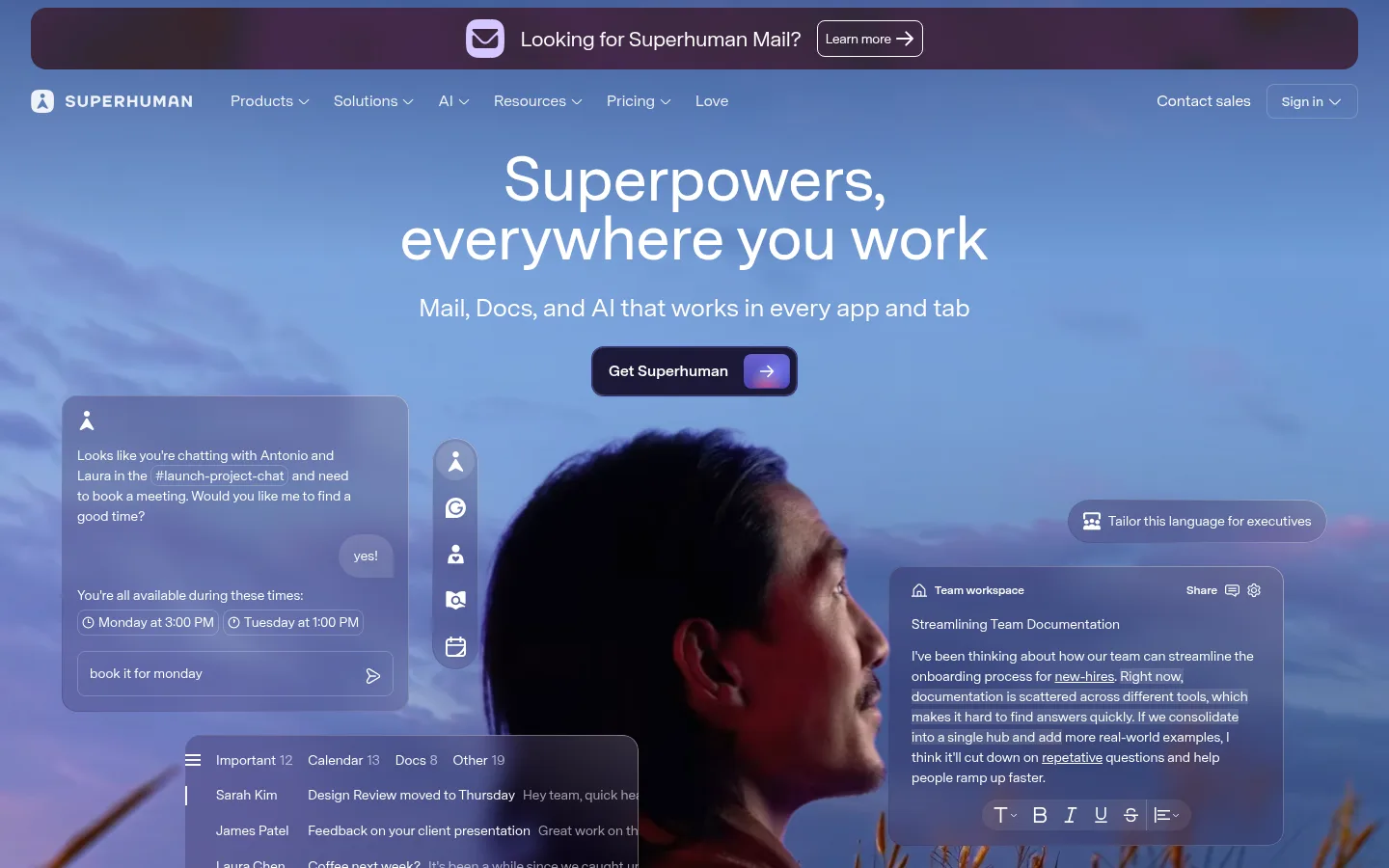
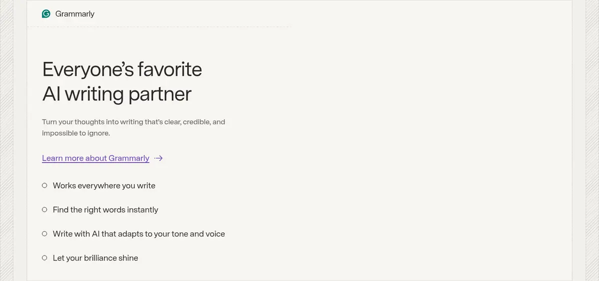
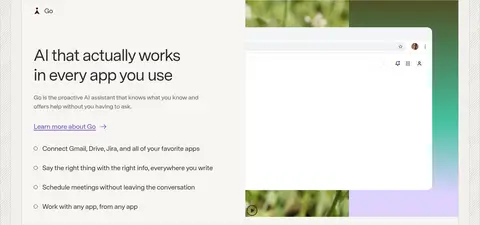
这是一个介绍 Superhuman Go、Mail 和 Docs 的生产力套件首页,以宽松的编辑式布局搭配鲜明的产品界面演示。暖调米白底色、淡紫强调色与深色区块共同串联长页面,产品画面则为页面注入活力。
North star · Keep the page calm and readable, then use a strong background shift and authentic interface imagery to make each product story feel distinct.
The page balances a quiet, light canvas with product-led contrast. White frames the navigation and opening content, while #f7f5f2 carries the long sequence of feature sections; lilac accents mark calls to action and links, and pale lavender gives the testimonial a distinct pause. Deep plum and burgundy anchor enterprise content and the footer. Super Sans VF provides a unified voice: large, lightly weighted headings with tight tracking sit above compact body copy and restrained navigation. Sections alternate between centered introductions, wide split layouts, and compact feature cards, with consistent alignment and clear changes in background tone rather than ornamental dividers. Product interface imagery is the main visual material, shown in broad panels and cards with soft gradients and layered app windows. Measured spacing is compact in controls but generous between major content blocks, giving the long homepage a calm, scannable rhythm.
配色 点色块复制色值。用途说明来自对页面的实测位置(背景、文字、描边、按钮)与截图判读。
品牌色
Superhuman Violet
#714cb6
Primary purple action buttons, text links, and selective product-card accents.
Deep Teal
#0c4243
Teal half and gradient endpoint in the hero and selected product media; not a general page surface.
Burgundy Ink
#421d24
Deep burgundy surfaces in selected product cards and the full footer.
Plum Night
#281647
Enterprise section background and related dark product surfaces.
强调色
Lilac Signal
#d4c7ff
Light-lilac CTA fills and secondary links, especially where dark or saturated sections need contrast.
表层色
Pure Canvas
#ffffff
Primary page canvas, navigation background, and text on dark hero or CTA surfaces.
Warm Parchment
#f7f5f2
Dominant warm-neutral band behind customer logos, product features, Mail, and Docs content.
Lavender Haze
#e8e0ff
Testimonial band and selected pale-lavender navigation or card surfaces.
Oat Card
#f2f0eb
Occasional warm feature-card fill, including the writing-assistant card.
中性色
Soft Charcoal
#292827
Main heading, body, and navigation text on light backgrounds; also dark CTA text.
Quiet Graphite
#636360
Muted supporting copy and secondary descriptions on light surfaces.
Warm Hairline
#dddbd8
Subtle card and component outlines against pale backgrounds.
Dusty Rose Gray
#d9d2d3
Occasional muted navigation or small text detail; secondary to the primary text palette.
Silver Edge
#e3e3e2
Light navigation border detail, separating controls without visual weight.
Muted Slate
#5e5b65
Sparse supporting text tone, including occasional copy within product content.
功能色
Near-Black
#141413
Near-black half and gradient endpoint behind the opening hero product presentation.
文字 背景 对比度 WCAG #292827 Soft Charcoal#ffffff Pure Canvas14.72:1 AAA #292827 Soft Charcoal#f7f5f2 Warm Parchment13.52:1 AAA #292827 Soft Charcoal#421d24 Burgundy Ink1:1 不达标 #292827 Soft Charcoal#281647 Plum Night1.1:1 不达标 #636360 Quiet Graphite#ffffff Pure Canvas6.03:1 AA #636360 Quiet Graphite#f7f5f2 Warm Parchment5.54:1 AA
字体 字号阶梯:Major Third(比例约 1.284,正文 18px)。示例用免费替代字体渲染,数值为实测。
Aa 设计
Super Sans VF 网络字体 · 字重 460 / 540 / 600 / 700 · 占比 100%
免费替代:Inter
All measured headings, body copy, navigation, captions, and controls.
角色 示例 字号 字重 行高 字距 一级标题 Opening hero statement; largest message in the first viewport.
Superhuman
49px 460 1.2 -0.027em 二级标题 Major product-section titles and testimonial quotation.
Superhuman
39px 460 1.2 -0.027em 三级标题 Feature-card headings and supporting product-story titles.
Superhuman
28px 540 1.14 -0.022em 四级标题 Smaller product feature or subsection headings.
The quick brown fox 敏捷的狐狸
25px 460 1.2 -0.027em 正文 Product explanations, supporting descriptions, and promotional copy.
The quick brown fox 敏捷的狐狸
18px 540 1.5 -0.007em 辅助文字 Compact labels, testimonial attribution, and supporting interface text.
The quick brown fox 敏捷的狐狸
16px 460 1.5 0 导航 Main navigation links and utility navigation.
The quick brown fox 敏捷的狐狸
16px 460 1.5 0
间距与布局 基准单位 8px · 密度:紧凑
32px 版块间距
4px 元素间距
32px 卡片内边距
1280px 内容最大宽度
4px
6px
8px
12px
16px
20px
24px
32px
40px
96px
The measured content max width is 1280px, with desktop sections arranged as centered single-column introductions, broad split hero or enterprise layouts, and compact card grids. The opening hero aligns its headline and product interface side by side; the long warm-neutral middle uses centered introductions followed by wide feature panels. Major section changes rely on full-width background bands, not heavy dividers. Spacing follows an 8px base system, with a compact component density and larger pauses between stories.
圆角与层次 md · card
inset · button
inset · link
Most sections and cards feel flat, with separation supplied by background bands and thin warm-gray borders. Cards use a restrained measured shadow rather than pronounced depth. Product mockups create the strongest layering through overlapping windows and assistant popovers; rounded corners soften cards and controls.
组件 下面的预览按实测的按钮、输入框、徽标、卡片样式重建(字体用替代字体)。
Primary CTA A violet #714cb6 button with white text for primary actions such as Try Go; the measured button uses a 12px radius.
Light CTA A pale-lilac #d4c7ff fill with charcoal text for secondary or dark-section actions; measured variants use 8px or 12px radii.
Text link Semibold violet Learn more links on light sections; pale-lilac links appear on dark sections, with no filled background.
Feature card Warm pale card with a restrained border or shadow, rounded corners, and compact copy; some product cards instead use plum or burgundy fills.
Product media panel Wide interface demonstration combining app screenshots, assistant overlays, and occasional gradient color fields.
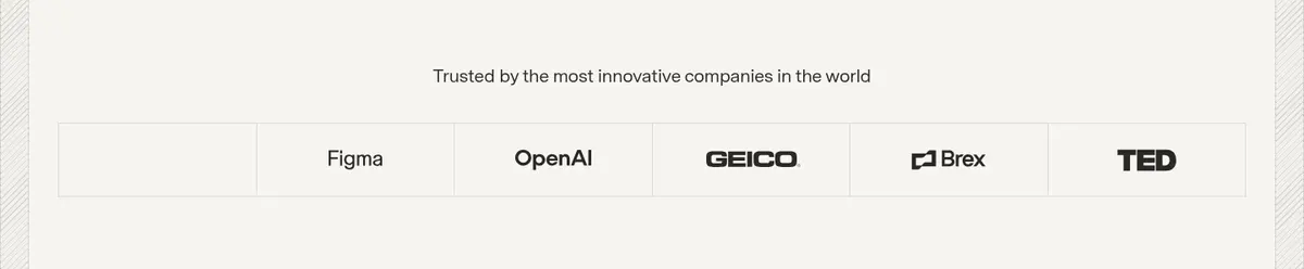
Customer logo strip A row of customer marks on the warm-neutral background, contained in subtly divided cells.
Imagery · The page relies on product-interface imagery and video rather than lifestyle photography. Browser and app windows appear inside broad, carefully cropped panels, often paired with text or layered assistant popovers. Selected media uses vivid purple, teal, or soft multicolor gradients, while screenshots retain pale, readable interface surfaces. Customer logos form a restrained, evenly spaced strip.
页面版块 共 14 个版块,按页面从上到下排列,每个都标了类型、布局和交互套路。
该做与不该做 ✓ 该做 Use warm off-white as the primary long-form content surface. Reserve violet and lilac for actions, links, and selective emphasis. Give every major product story a clear section-level layout. Pair feature copy with recognizable, detailed product interfaces. Use deep plum or burgundy for intentional dark contrast. Keep typography in sentence case with understated navigation. ✕ 不该做 Do not turn every section into a dark panel. Do not add unmeasured colors, sizes, spacing, or corner radii. Do not make gradients the default background treatment. Do not replace product interfaces with generic lifestyle imagery. Do not overuse borders or heavy drop shadows. Do not use decorative all-caps headlines. 给 AI 的提示词 想快速出一个同风格的新页面,把这段话连同 DESIGN.md 一起发给 AI。
复制 Build a new Superhuman-style productivity page with a calm editorial foundation and product-led storytelling. Use Pure Canvas (#ffffff) for clean framing and Warm Parchment (#f7f5f2) for the main content flow; use Soft Charcoal (#292827) for primary text and Quiet Graphite (#636360) for supporting copy. Reserve Superhuman Violet (#714cb6) for key actions and Lilac Signal (#d4c7ff) for light CTA fills or dark-section links. Use Lavender Haze (#e8e0ff) as an occasional soft pause, and Plum Night (#281647) or Burgundy Ink (#421d24) only for deliberate dark chapters. Set all copy in a clean sans-serif similar to Inter, with lightly weighted, tightly tracked headings. Alternate centered introductions, split product stories, and feature cards. Show real-feeling interface mockups with restrained shadows, subtle borders, and selective teal or purple media gradients. Preserve generous section rhythm and compact controls.
DESIGN.md Tailwind v4 CSS 变量 Design Tokens
---
title: "Superhuman design system"
variant: extended
source: https://superhuman.com/
captured_at: 2026-10-12
theme: light
industry: productivity
generator: Design DNA (https://four.wiralomi.com/style/superhuman-com)
ai_generated: true
ai_label: "本文件由 AI 辅助生成:数值取自公开网页的实测样式,命名、用途说明与建议为模型解读。商标归原所有者。 / AI-assisted content"
---
# Superhuman · Design System
> Calm, focused software with vivid product moments
**Theme:** light · **Industry:** productivity · **Source:** https://superhuman.com/ · **Captured:** 2026-10-12 (1440×900 desktop)
_AI-assisted content: values are measured from the public page at capture time; names, roles and guidance are model-written interpretations. Trademarks belong to their owners._
A spacious productivity-suite homepage that introduces Superhuman Go, Mail, and Docs through a mix of restrained editorial layouts and vivid interface demonstrations. Warm off-white sections, lilac accents, and deep contrasting bands keep a long page coherent while the product visuals provide the energy.
## North star
Keep the page calm and readable, then use a strong background shift and authentic interface imagery to make each product story feel distinct.
## Overview
The page balances a quiet, light canvas with product-led contrast. White frames the navigation and opening content, while ## Colors
| Name | Hex | Token | Group | Role |
|---|---|---|---|---|
| Pure Canvas | ` | `--color-pure-canvas` | surface | Primary page canvas, navigation background, and text on dark hero or CTA surfaces. |
| Warm Parchment | ` | `--color-warm-parchment` | surface | Dominant warm-neutral band behind customer logos, product features, Mail, and Docs content. |
| Soft Charcoal | ` | `--color-soft-charcoal` | neutral | Main heading, body, and navigation text on light backgrounds; also dark CTA text. |
| Quiet Graphite | ` | `--color-quiet-graphite` | neutral | Muted supporting copy and secondary descriptions on light surfaces. |
| Superhuman Violet | ` | `--color-superhuman-violet` | brand | Primary purple action buttons, text links, and selective product-card accents. |
| Warm Hairline | ` | `--color-warm-hairline` | neutral | Subtle card and component outlines against pale backgrounds. |
| Deep Teal | ` | `--color-deep-teal` | brand | Teal half and gradient endpoint in the hero and selected product media; not a general page surface. |
| Dusty Rose Gray | ` | `--color-dusty-rose-gray` | neutral | Occasional muted navigation or small text detail; secondary to the primary text palette. |
| Near-Black | ` | `--color-near-black` | semantic | Near-black half and gradient endpoint behind the opening hero product presentation. |
| Lilac Signal | ` | `--color-lilac-signal` | accent | Light-lilac CTA fills and secondary links, especially where dark or saturated sections need contrast. |
| Burgundy Ink | ` | `--color-burgundy-ink` | brand | Deep burgundy surfaces in selected product cards and the full footer. |
| Plum Night | ` | `--color-plum-night` | brand | Enterprise section background and related dark product surfaces. |
| Lavender Haze | ` | `--color-lavender-haze` | surface | Testimonial band and selected pale-lavender navigation or card surfaces. |
| Silver Edge | ` | `--color-silver-edge` | neutral | Light navigation border detail, separating controls without visual weight. |
| Oat Card | ` | `--color-oat-card` | surface | Occasional warm feature-card fill, including the writing-assistant card. |
| Muted Slate | ` | `--color-muted-slate` | neutral | Sparse supporting text tone, including occasional copy within product content. |
### Semantic aliases
`--color-canvas` → ` (Pure Canvas) · `--color-surface` → ` (Warm Parchment) · `--color-surface-2` → ` (Burgundy Ink) · `--color-surface-3` → ` (Plum Night) · `--color-surface-4` → ` (Lavender Haze) · `--color-text` → ` (Soft Charcoal) · `--color-text-muted` → ` (Quiet Graphite) · `--color-text-subtle` → ` (Pure Canvas) · `--color-border` → ` (Warm Hairline) · `--color-accent` → ` (Superhuman Violet) · `--color-accent-2` → ` (Lilac Signal) · `--color-on-accent` → ` (Pure Canvas)
### Contrast (WCAG 2.x)
| Text | Background | Ratio | Level |
|---|---|---|---|
| ` | ` | 14.72:1 | AAA |
| ` | ` | 13.52:1 | AAA |
| ` | ` | 1:1 | fail |
| ` | ` | 1.1:1 | fail |
| ` | ` | 6.03:1 | AA |
| ` | ` | 5.54:1 | AA |
| ` | ` | 2.43:1 | fail |
| ` | ` | 2.69:1 | fail |
| ` | ` | 1.09:1 | fail |
| ` | ` | 14.66:1 | AAA |
### Gradients
- `linear-gradient(to right, rgb(20, 20, 19) 0px, rgb(20, 20, 19) 50%, rgb(12, 66, 67) 50%, rgb(12, 66, 67))`
- `linear-gradient(to right, rgb(20, 20, 19), rgb(12, 66, 67))`
- `linear-gradient(90deg, color(srgb 1 1 1 / 0) 0%, color(srgb 1 1 1 / 0.06) 10%, color(srgb 1 1 1 / 0.06) 100%)`
## Typography
| Family | Token | Source | Weights | Role | Free substitute |
|---|---|---|---|---|---|
| Super Sans VF | `--font-body` | webfont | 460, 540, 600, 700 | All measured headings, body copy, navigation, captions, and controls. | Inter |
- **Super Sans VF:** Use a clean sans-serif with light-to-medium headline weights, tight negative heading tracking, and sentence case; navigation remains understated.
### Type scale — Major Third (ratio ≈ 1.284, base 18px)
| Role | Size | Weight | Line height | Letter spacing | Case | Family | Used for |
|---|---|---|---|---|---|---|---|
| h1 | 49px | 460 | 1.2 | -0.027em | — | Super Sans VF | Opening hero statement; largest message in the first viewport. |
| h2 | 39px | 460 | 1.2 | -0.027em | — | Super Sans VF | Major product-section titles and testimonial quotation. |
| h3 | 28px | 540 | 1.14 | -0.022em | — | Super Sans VF | Feature-card headings and supporting product-story titles. |
| h4 | 25px | 460 | 1.2 | -0.027em | — | Super Sans VF | Smaller product feature or subsection headings. |
| body | 18px | 540 | 1.5 | -0.007em | — | Super Sans VF | Product explanations, supporting descriptions, and promotional copy. |
| caption | 16px | 460 | 1.5 | 0 | — | Super Sans VF | Compact labels, testimonial attribution, and supporting interface text. |
| nav | 16px | 460 | 1.5 | 0 | — | Super Sans VF | Main navigation links and utility navigation. |
## Spacing & layout
- Base unit **8px**, density **compact**.
- Scale (most used values): 4, 6, 8, 12, 16, 20, 24, 32, 40, 96 px.
- Section rhythm 32px · element gap 4px · card padding 32px · max content width 1280px.
The measured content max width is 1280px, with desktop sections arranged as centered single-column introductions, broad split hero or enterprise layouts, and compact card grids. The opening hero aligns its headline and product interface side by side; the long warm-neutral middle uses centered introductions followed by wide feature panels. Major section changes rely on full-width background bands, not heavy dividers. Spacing follows an 8px base system, with a compact component density and larger pauses between stories.
## Shape & elevation
- Radius: button `12px` · card `12px` · link `8px` · xs `8px` · sm `12px`
- Shadow `md` (card): `color(srgb 0.278431 0.270588 0.262745 / 0.04) 0px 0px 0px 1px, color(srgb 0.278431 0.270588 0.262745 / 0.06) 0px 4px 8px -2px, color(srgb 0.278431 0.270588 0.262745 / 0.04) 0px 2px 4px 0px, color(srgb`
- Shadow `inset` (button): `color(srgb 0.45098 0.443137 0.427451 / 0.2) 0px 0px 0px 1px inset`
- Shadow `inset-2` (link): `rgb(212, 199, 255) 0px 0px 0px 1px inset`
- Motion: standard transition `0.2s ease` on interactive elements.
Most sections and cards feel flat, with separation supplied by background bands and thin warm-gray borders. Cards use a restrained measured shadow rather than pronounced depth. Product mockups create the strongest layering through overlapping windows and assistant popovers; rounded corners soften cards and controls.
## Imagery
The page relies on product-interface imagery and video rather than lifestyle photography. Browser and app windows appear inside broad, carefully cropped panels, often paired with text or layered assistant popovers. Selected media uses vivid purple, teal, or soft multicolor gradients, while screenshots retain pale, readable interface surfaces. Customer logos form a restrained, evenly spaced strip.
## Components
### Primary CTA
A violet ### Light CTA
A pale-lilac ### Text link
Semibold violet Learn more links on light sections; pale-lilac links appear on dark sections, with no filled background.
### Feature card
Warm pale card with a restrained border or shadow, rounded corners, and compact copy; some product cards instead use plum or burgundy fills.
### Product media panel
Wide interface demonstration combining app screenshots, assistant overlays, and occasional gradient color fields.
### Customer logo strip
A row of customer marks on the warm-neutral background, contained in subtly divided cells.
### Measured component styles
- **Primary button** (“Try Go”): background ## Do
- Use warm off-white as the primary long-form content surface.
- Reserve violet and lilac for actions, links, and selective emphasis.
- Give every major product story a clear section-level layout.
- Pair feature copy with recognizable, detailed product interfaces.
- Use deep plum or burgundy for intentional dark contrast.
- Keep typography in sentence case with understated navigation.
## Don't
- Do not turn every section into a dark panel.
- Do not add unmeasured colors, sizes, spacing, or corner radii.
- Do not make gradients the default background treatment.
- Do not replace product interfaces with generic lifestyle imagery.
- Do not overuse borders or heavy drop shadows.
- Do not use decorative all-caps headlines.
## Agent prompt
Build a new Superhuman-style productivity page with a calm editorial foundation and product-led storytelling. Use Pure Canvas (## Page sections (top to bottom)
| # | Type | Layout | UX patterns | UI patterns |
|---|---|---|---|---|
| 1 | hero | Two-column hero with headline and product selector on the left, interface demonstration on the right. | Primary action, Secondary learn-more link, Product tabs | Dark split gradient, White headline, Interface video |
| 2 | logo-cloud | A centered trust statement above a single horizontal row of customer logos. | Social proof | Warm-neutral band, Divided logo cells |
| 3 | feature-split | Centered introduction followed by a broad, single-panel feature demonstration. | Try action, Learn-more link | Centered heading, Wide product panel |
| 4 | product-showcase | Single wide feature panel pairing concise copy with an interface screenshot. | Inline assistance | Text over media, Teal-tinted panel |
| 5 | feature-grid | Two side-by-side product cards beneath the preceding wide demonstration. | Context-aware chat, Multi-task management | Two-card row, Contrasting card fills |
| 6 | feature-grid | Feature category navigation above a dense, multi-column card grid. | Category tabs, Featured state | Card thumbnails, Warm neutral cards |
| 7 | testimonials | Centered quotation and attribution within a full-width lavender band. | Customer quote, Customer-stories link | Lavender background, Centered typography |
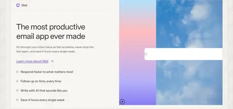
| 8 | product-showcase | Centered Mail introduction followed by a two-column mosaic of product features. | Get Mail action, Learn-more link | Feature mosaic, Interface mockups |
| 9 | product-showcase | Centered Docs introduction above a wide product demonstration. | Try Docs action, Learn-more link | Centered heading, Wide interface panel |
| 10 | feature-split | Wide single feature row with text aligned beside a Docs product visual. | Single-source-of-truth explanation | Split text and interface, Soft neutral card |
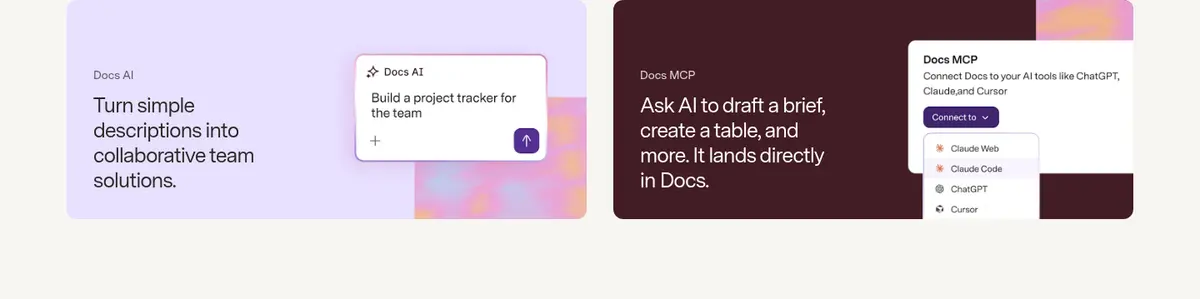
| 11 | feature-grid | Two side-by-side feature panels, each combining a short description and interface example. | Describe-to-build workflow, AI-assisted drafting | Two-card row, Contrasting product visuals |
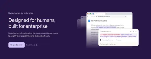
| 12 | feature-split | Two-column enterprise story with text and CTA on the left, product visual on the right. | Request-demo action, Learn-more link | Plum background, Light CTA, Layered interface |
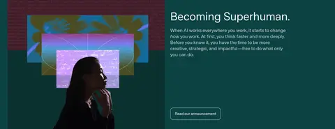
| 13 | cta | Full-bleed media strip with a short statement and action. | Get-started action | Vivid teal and purple media, Overlay text |
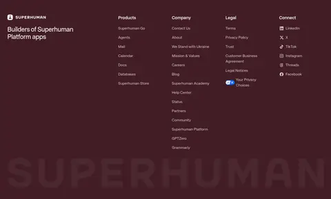
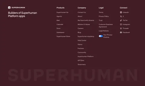
| 14 | footer | Deep burgundy footer with a brand column, multiple link columns, and oversized background wordmark. | Grouped navigation, Social links, Privacy choices | Burgundy surface, Light text, Large low-contrast wordmark |
---
本文件由 AI 辅助生成:数值取自公开网页的实测样式,命名、用途说明与建议为模型解读。商标归原所有者。
Generated by Design DNA · https://four.wiralomi.com/style/superhuman-com