North star · Let cinematic product imagery lead, and use a quiet dark editorial frame with precise violet accents to keep the story legible.
The visual system is led by a cinematic, near-black canvas (#1a1a1a) and an even darker navigation and hero surface (#05050b). White and cool gray system text keeps long product explanations readable, while pale lavender marks emphasized copy and brighter violet anchors the Mastodon explainer band. A saturated blue-to-pink gradient appears as a selective graphic treatment, not a general background rule. Typography uses the Apple system sans-serif, with light, large headings and compact, low-weight body copy. The page is a long, single-column editorial sequence: full-bleed product imagery punctuates centered text, alternating dark and gray platform showcases, then a two-column feature list. Screenshots and polished 3D mascots carry most of the visual personality; surrounding layouts stay relatively flat and restrained. Spacious section breaks give each product story room, while rounded download and support links provide small, clear actions.
All page typography, including headings, body copy, navigation, and action links.
角色
示例
字号
字重
行高
字距
一级标题
Lightweight primary product or page headline.
Tapbots
36px
300
1.2
0
二级标题
Strong section headline, including feature and explainer titles.
Tapbots
32px
600
0.84
0
三级标题
Subsection titles within platform and feature content.
Tapbots
28px
600
1.1
0
四级标题
Light supporting heading or secondary product statement.
The quick brown fox 敏捷的狐狸
24px
300
1.4
0
正文
Light descriptive copy and product explanations.
The quick brown fox 敏捷的狐狸
18px
300
1.4
0
按钮
Medium-weight support and action labels.
The quick brown fox 敏捷的狐狸
18px
500
1.4
0
导航
Lightweight brand and navigation text.
The quick brown fox 敏捷的狐狸
24px
300
1.4
0
链接
Inline links and prominent download or community actions.
The quick brown fox 敏捷的狐狸
20px
400
1.7
0
间距与布局
基准单位 1px · 密度:宽松
216px版块间距
—元素间距
—卡片内边距
640px内容最大宽度
10px
12px
15px
17px
20px
25px
27px
29px
30px
34px
40px
48px
80px
144px
Build a long, spacious, mostly single-column narrative with a measured content max width of 640px for text. Alternate centered copy and full-bleed or broad product media; platform showcase sections use offset image-and-copy compositions, including a right-aligned macOS block. The feature section is a two-column list, while the footer divides into four columns. Section gaps are generous, with notably large breaks around major story transitions. Keep text compact within each section and let media provide the scale.
圆角与层次
按钮 · 9999px
图片 · 50%
链接 · 9999px
没有测到阴影:页面是扁平的,层次靠底色和描边区分。
The measured page has no defined shadows. Keep sections predominantly flat, using distinct background bands rather than cards or borders to separate content. Create depth through large product mockups, overlapping devices, full-bleed mascot artwork, and contrast between dark surfaces and the violet explainer section. Round action controls into pill shapes.
组件
下面的预览按实测的按钮、输入框、徽标、卡片样式重建(字体用替代字体)。
Product hero
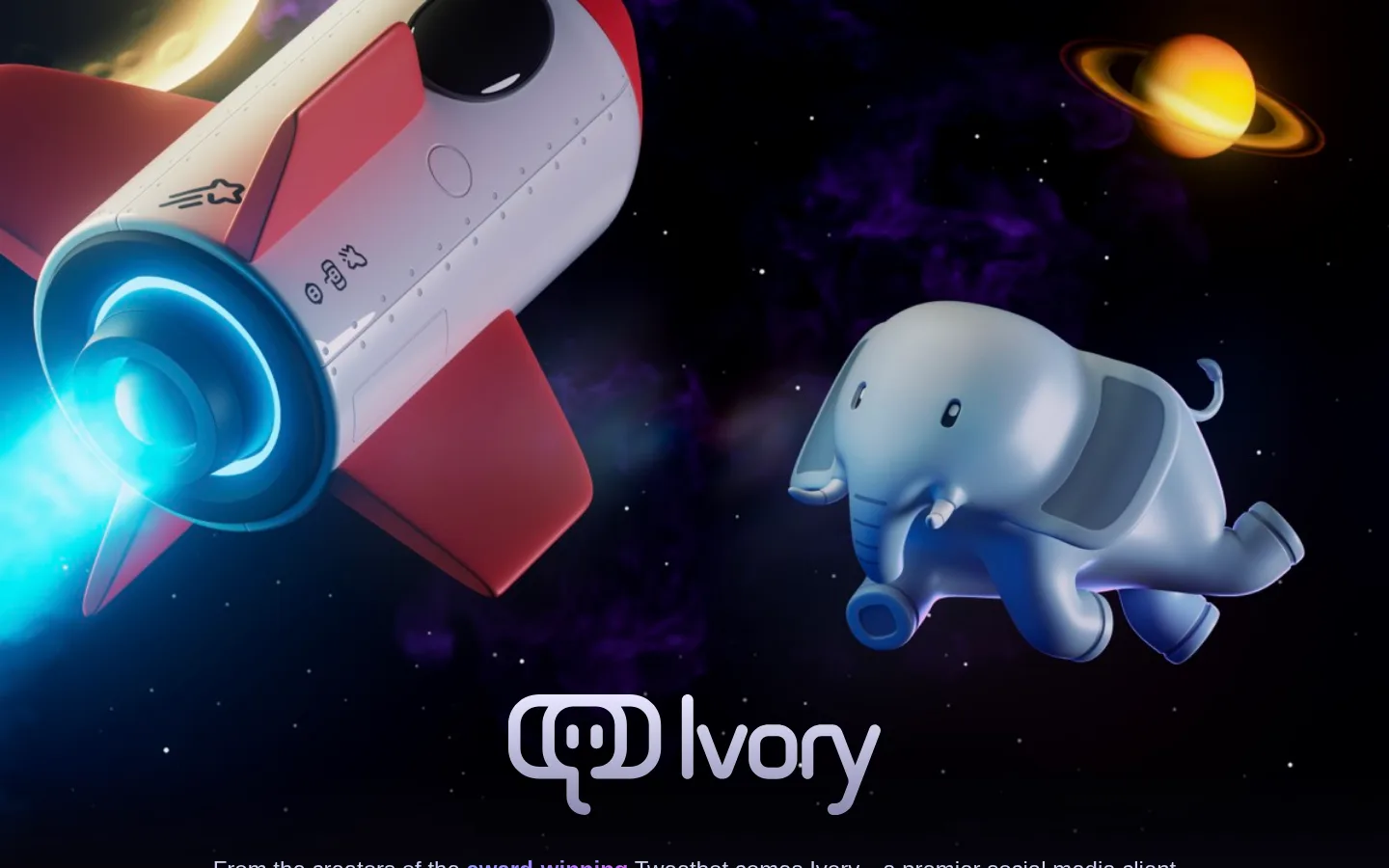
Full-bleed cinematic artwork on #05050b, followed by a centered Ivory identity and restrained, highlighted product copy.
Download block
Centered App Store link with system-requirements copy and a rounded help action; lilac is the key text accent.
Mastodon explainer
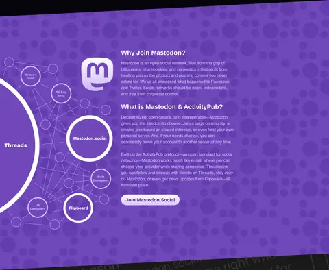
Solid #7047ba band pairing explanatory copy with a network diagram and a prominent rounded community link.
Platform showcases
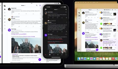
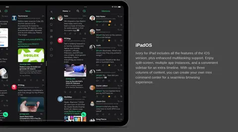
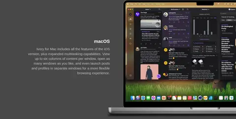
Large iPad and Mac interface imagery alternates with short text on a shared #484848 background band.
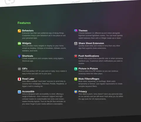
Feature list
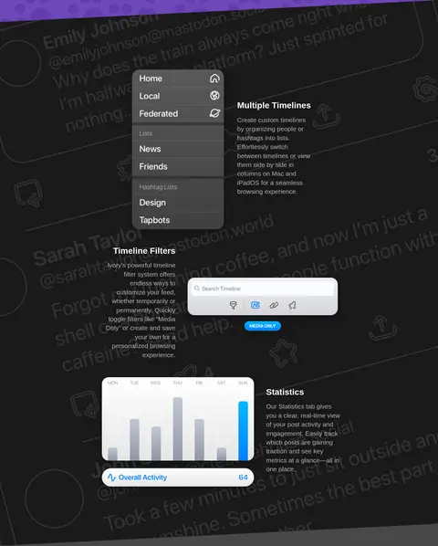
Two-column feature content on #2c2c2c, combining small illustrative icons, headings, and compact supporting text.
Review showcase
Centered testimonial text and attribution layered visually over oversized mascot imagery on a dark background.
Company footer
Compact #111111 footer with centered brand identity and company description, followed by multi-column links.
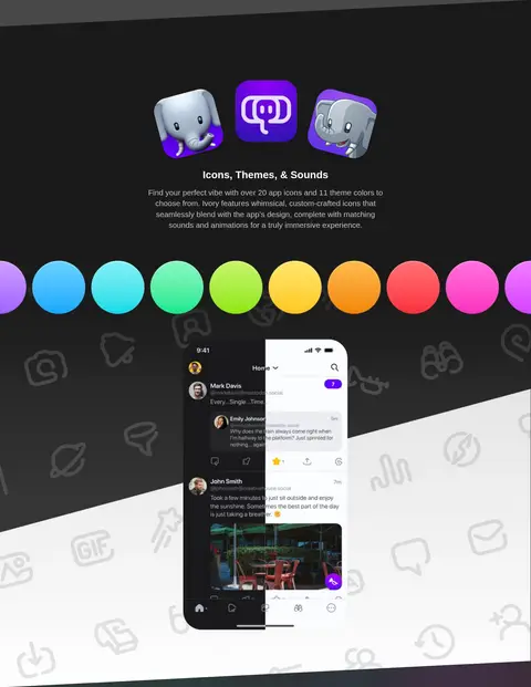
Imagery · Use polished product screenshots on phone, tablet, and desktop hardware, mixed with distinctive 3D Ivory elephant mascots and branded app icons. The opening artwork and testimonial backdrop are cinematic, dark, and edge-to-edge; platform images are large framed previews. Feature illustrations and UI captures sit alongside concise copy. Treat colorful interface details as image content, not as the page’s core color palette.
Keep the main canvas dark and the section transitions clearly differentiated.
Use #05050b for the opening product atmosphere and download areas.
Reserve #7047ba for a distinct Mastodon explainer band.
Set product copy in a clean system sans-serif with light weights.
Make screenshots and 3D mascots the dominant visual moments.
Use generous section spacing and concise supporting copy.
✕ 不该做
Do not turn every section into a raised card.
Do not use the gradient as a universal background treatment.
Do not let colorful mockup pixels redefine the site palette.
Do not crowd full-width product imagery with extra decoration.
Do not replace the long editorial flow with a dense dashboard layout.
Do not add borders or shadows without a measured visual need.
给 AI 的提示词
想快速出一个同风格的新页面,把这段话连同 DESIGN.md 一起发给 AI。
Create a new product-story page in Tapbots’ Ivory style. Use a near-black #05050b opening and download surface, with #1a1a1a as the main canvas and a separate #111111 footer. Set headings and body in a system sans-serif close to Inter, favoring light weights and clear contrast between heading and supporting copy. Organize the page as a spacious, long editorial sequence: centered product introduction, large device showcases, a distinct #7047ba explainer band, alternating platform features, a two-column feature list, testimonial imagery, and a compact footer. Make polished screenshots and expressive 3D product artwork the primary visual assets. Use #deccff, #ba94ff, and white sparingly for emphasis and actions. Keep the layout flat, avoid invented shadows, and reserve gradients for selective graphic accents.