North star · Let neutral fashion photography and open white space lead, using cobalt blue as a precise brand anchor rather than a general decoration.
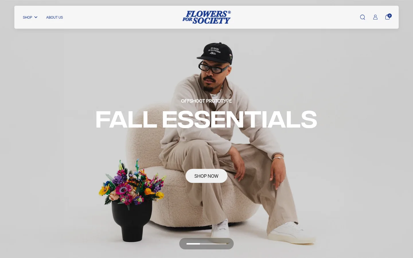
The visual strategy balances an editorial fashion mood with a straightforward shopping journey. White is the dominant interface surface: it frames the hero, product grid, brand story, reviews and footer content, allowing campaign photography to carry much of the visual character. The hero itself uses a soft, neutral-toned photograph with large white uppercase display text and a pill-shaped pale CTA. Cobalt blue (#203b90) is the defining brand signal, visible in the wordmark, navigation and links, and used as a full-width vision section that interrupts the white page rhythm. Integral supplies oversized, direct display headings; Soehne handles navigation, product details and body copy with a restrained sans-serif voice. Content shifts between centered campaign moments and left-aligned product browsing, with a five-column arrivals grid and varied split or multi-column lower sections. Keep surfaces mostly flat, use fine blue borders sparingly, and preserve generous breathing room around imagery and text.
Body copy, navigation, product names, prices, links, captions and secondary headings.
Aa 设计
Integral
网络字体 · 字重 400 · 占比 8%
免费替代:Oswald
Display, hero and emphatic section headings.
角色
示例
字号
字重
行高
字距
特大标题
Oversized campaign display text, such as the hero headline.
Flowers for Society
82px
400
1
0
一级标题
Uppercase hero or primary page headline.
Flowers for Society
61.5px
400
1
0
二级标题
Section headings and prominent editorial statements.
Flowers for Society
41px
400
1.3
0
三级标题
Product-group headings and emphatic section titles.
Flowers for Society
31px
400
1.15
0
四级标题
Supporting headings within brand and content sections.
Flowers for Society
28px
400
1.3
0
正文
Brand narrative, review text and general explanatory copy.
The quick brown fox 敏捷的狐狸
18px
400
1.3
0
辅助文字
Small labels, product notes and understated metadata.
The quick brown fox 敏捷的狐狸
14px
400
1.1
0
导航
Header navigation and compact utility links.
The quick brown fox 敏捷的狐狸
14px
400
1.3
0
链接
Product titles and inline shopping or editorial links.
The quick brown fox 敏捷的狐狸
18px
400
1.3
0
间距与布局
基准单位 2px · 密度:适中
50px版块间距
6px元素间距
—卡片内边距
1340px内容最大宽度
1px
3px
5px
6px
8px
10px
12px
15px
20px
22px
30px
40px
45px
50px
56px
90px
The page uses a comfortable, editorial rhythm with a measured maximum content width of 1340px. The first viewport is a full-bleed photographic hero beneath a floating, inset navigation bar. Product arrivals use a five-column grid, while brand storytelling moves into two-column content and reviews into a multi-column block. A full-width cobalt vision band provides a strong break between white sections. Headings are centered for campaigns and brand moments, while product headings and lower content align left. Preserve generous section spacing and avoid making the interface feel crowded.
圆角与层次
按钮 · 9999px
图片 · 2px
徽标 · 9999px
导航 · 5px
md · nav
Most content is flat, with whitespace and background changes doing the structural work. The header floats as a rounded white navigation panel with a restrained soft shadow. Use thin blue hairlines sparingly, most notably in the footer. Buttons and badges are pill-shaped; media corners are only subtly rounded. Avoid heavy card shadows or layered panels.
组件
下面的预览按实测的按钮、输入框、徽标、卡片样式重建(字体用替代字体)。
Floating navigation
Inset white rounded bar over the hero, with left-side shop and about links, centered blue wordmark, and search, account and bag icons at right; use restrained shadow.
Campaign hero
Full-bleed fashion photo with a small uppercase campaign label, oversized white Integral headline and pale pill-shaped SHOP NOW button.
Product arrivals grid
Five-column image-led product presentation on white, with left-aligned section title, linked product names, prices and compact NEW badges.
Vision band
Full-width Society Cobalt section with a short brand statement, explanatory copy and a single editorial link.
Outline CTA
Uppercase Soehne label inside a fully rounded outline button; use a pale border and text when placed on a dark blue section.
Review block
Centered review heading and rating above multi-column customer testimonials, with compact controls and minimal card framing.
Multi-column footer
White lower section with purpose-led content, image tiles, grouped support and brand links, newsletter form and restrained blue details.
Imagery · Large fashion and footwear photography is the main expressive device, not illustration or 3D. The hero shows a seated model against a pale, softly textured setting, framed full-bleed with flowers as a vivid detail. Product listings rely on image-led tiles with little surrounding decoration. Keep photography natural, softly lit and neutral-toned so clothing and products remain prominent; the images may introduce colors outside the interface palette.
Use #203b90 for brand navigation, links and the defining vision band.
Keep white surfaces and generous whitespace as the default page structure.
Use Integral for bold campaign headlines and Soehne for functional copy.
Let neutral-toned fashion photography dominate the hero and product listings.
Use pale, fully rounded buttons with uppercase labels for primary shopping actions.
Switch between centered campaign content and left-aligned shopping details.
✕ 不该做
Do not turn every section into a blue or dark panel.
Do not add decorative gradients absent from the measured visual language.
Do not use heavy card shadows or prominent boxed-in product tiles.
Do not crowd the hero with extra interface copy or controls.
Do not use display typography for product descriptions or body text.
Do not mistake colors inside product photography for interface brand colors.
给 AI 的提示词
想快速出一个同风格的新页面,把这段话连同 DESIGN.md 一起发给 AI。
Build a new fashion-store page in the Flowers for Society visual style. Use Gallery White (#ffffff) as the primary surface and Society Cobalt (#203b90) for the wordmark, navigation links and one deliberate brand statement band. Keep interface colors restrained; Soft Chalk (#f1f1f1) and Soft Black (#181817) suit pale shopping buttons and their labels, while Border Blue (#4158a1) is for subtle hairlines. Set campaign headlines in Integral or a close geometric display substitute, and use Soehne or Inter for navigation, product details and copy. Pair a full-width, natural fashion photograph with bold white uppercase hero text and a pill CTA. Follow with image-led product browsing, open white editorial sections and compact reviews. Keep surfaces flat, spacing comfortable, and photography—not extra ornament—the main source of visual richness.