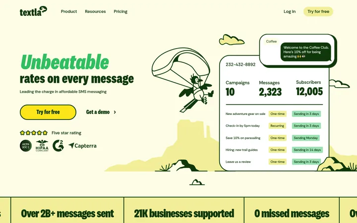
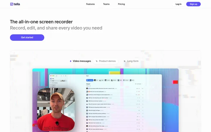
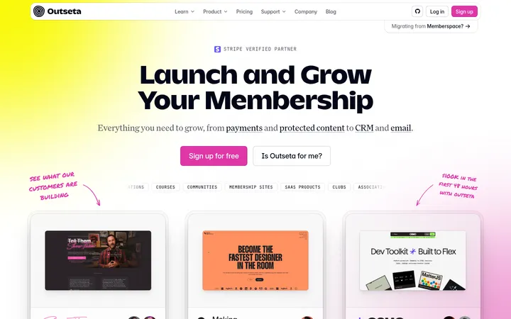
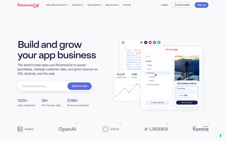
North star · Pair editorial serif statements and spacious lilac fields with precise product UI, reserving vivid purple for meaningful actions.
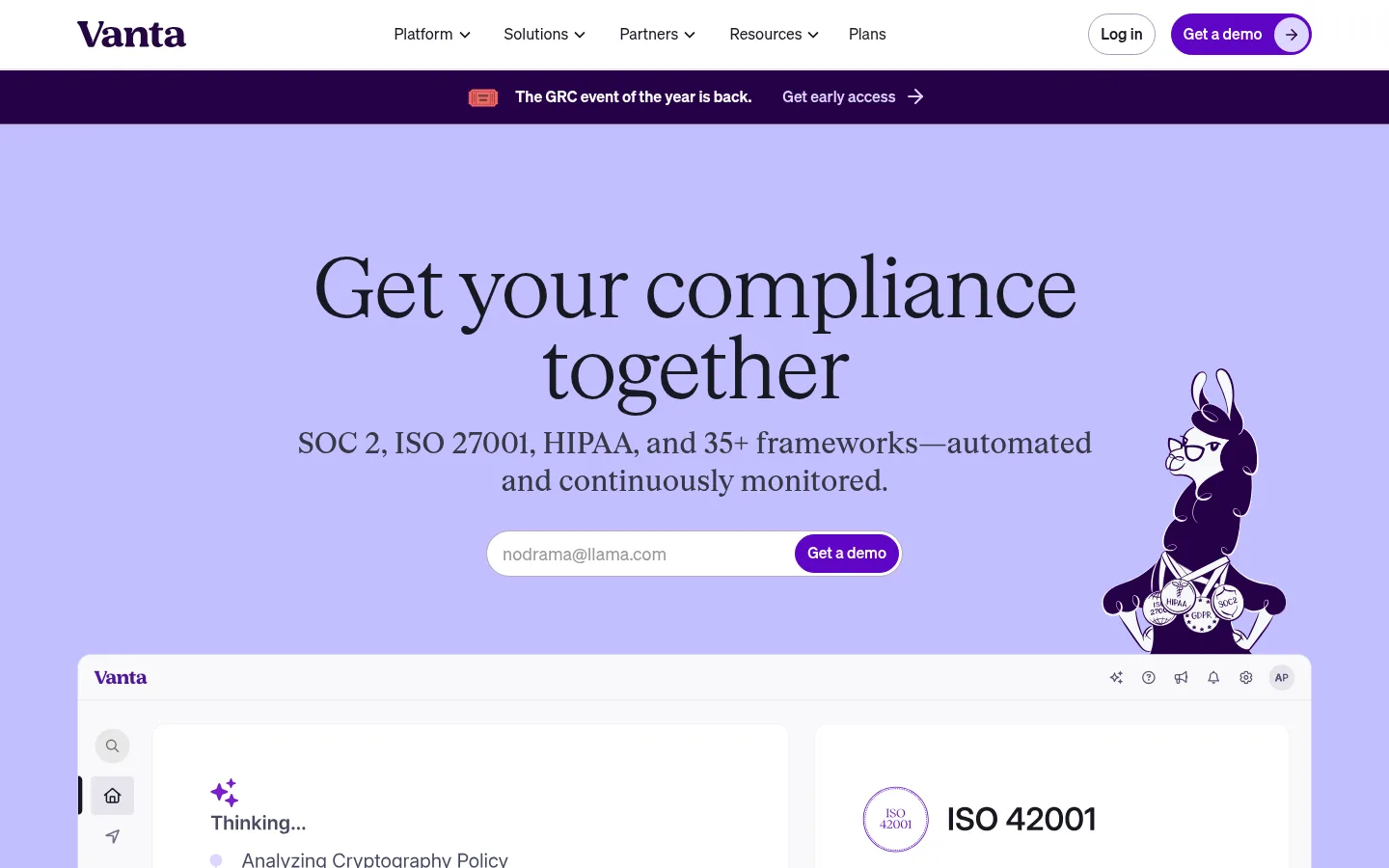
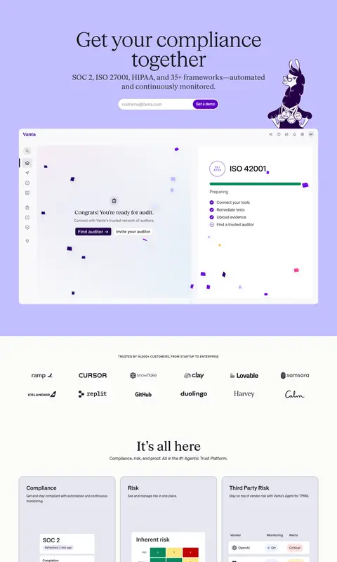
The page uses a pale, near-white canvas as its main field, interrupted by a broad lilac hero and deep plum announcement and footer bands. Saturated purple is reserved for primary actions and small interface accents, while dark ink text keeps the large statements crisp. SC Ripley gives display and heading text a delicate editorial character: oversized, light-weight serif forms with tight tracking and compact line spacing. Soehne handles navigation, body copy, captions, and buttons in a practical sans serif. A centered, constrained content column supports a long sequence of distinct blocks: hero and product preview, customer logos, feature cards, testimonials, audience illustrations, and resource content. Rounded pill controls, pale gray-lilac cards, and restrained borders soften the interface without making it feel ornamental. Custom illustrations and product screenshots are prominent, with photography concentrated in customer proof cards. Generous whitespace separates sections, while card grids keep detailed product information scannable.
Navigation, body copy, buttons, captions, and utility text.
Aa 设计
SC Ripley
网络字体 · 字重 500 / 300 / 400 · 占比 17%
免费替代:Cormorant Garamond
Display and heading hierarchy, including editorial hero statements.
角色
示例
字号
字重
行高
字距
特大标题
Oversized editorial campaign statements and major page moments.
Vanta
96px
300
0.95
-0.031em
一级标题
Primary hero heading, set as a light serif statement.
Vanta
88px
300
0.95
-0.034em
二级标题
Section titles for features, proof, and content areas.
Vanta
56px
300
1.2
-0.018em
三级标题
Subsection and prominent feature-card headings.
Vanta
42px
500
1.2
-0.048em
四级标题
Smaller feature and content card titles.
Vanta
30px
500
1.35
-0.05em
正文
Explanatory copy, product descriptions, and supporting paragraphs.
The quick brown fox 敏捷的狐狸
14px
400
1.83
0
辅助文字
Compact uppercase labels and tightly scoped metadata.
The quick brown fox 敏捷的狐狸
12px
500
1.3
0.667em
按钮
CTA and action labels, set in the functional sans serif.
The quick brown fox 敏捷的狐狸
16px
400
1.6
0
导航
Primary navigation and menu labels.
The quick brown fox 敏捷的狐狸
16px
400
1.6
0
眉题
Small uppercase section labels above headings.
The quick brown fox 敏捷的狐狸
12px
500
1.3
0.667em
间距与布局
基准单位 8px · 密度:适中
80px版块间距
16px元素间距
—卡片内边距
1280px内容最大宽度
4px
8px
12px
16px
24px
32px
40px
48px
64px
80px
128px
Build a centered, wide desktop layout with a measured maximum content width of 1280px. The page is a long sequence of strongly differentiated bands: compact navigation and announcement, a full-width lilac hero, then spacious white sections with logo rows, card grids, split product stories, proof, and resources. Use comfortable density and generous section separation; the measured section gap is 80px and element gap is 16px. Keep headings centered in the hero and align detailed content to orderly card grids elsewhere.
圆角与层次
按钮 · 9999px
输入框 · 9999px
图片 · 16px
导航 · 50%
链接 · 8px
sm · media
The page favors flat color bands, thin measured borders, and softly differentiated pale cards over heavy shadows. Use rounded media and card surfaces to separate product previews from the canvas; the measured small media shadow is extremely subtle. Layer large screenshots and illustrations within the hero without adding dramatic depth or glossy effects.
组件
下面的预览按实测的按钮、输入框、徽标、卡片样式重建(字体用替代字体)。
Primary CTA
Use a Vanta Violet (#5e05c4) pill with white text, a thin matching border, and a small directional arrow where shown.
Hero signup field
A white pill-shaped email input paired with a purple demo action; keep the form centered beneath the hero copy.
Announcement strip
A narrow Deep Plum (#260048) band with compact announcement copy, a small illustrated icon, and a directional link.
Product preview
A large, pale rounded interface screenshot below the hero form, with believable app chrome and clear data panels.
Feature tiles
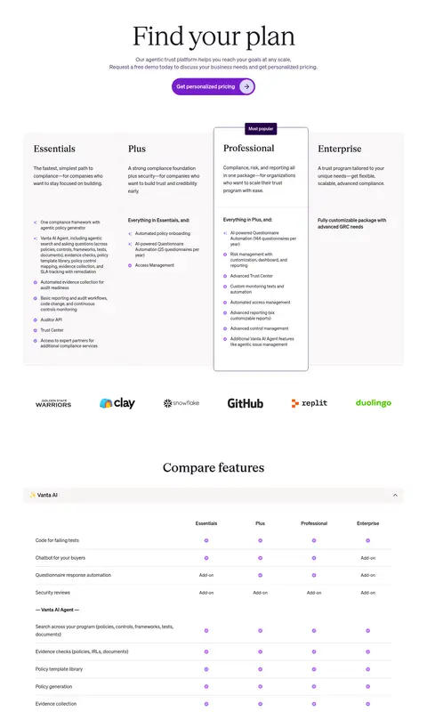
Pale Frosted Lilac (#efeff5) or Cloud Lilac (#e6e6f0) cards with concise titles, supporting copy, and product-interface imagery.
Proof cards
Rounded customer-photo panels placed on a dark Night Slate (#21222f) section, with restrained readable overlay text.
Imagery · Mix crisp product-interface previews with custom, dark-purple character illustrations that sit within or alongside the lilac hero and audience cards. Use customer photography in proof cards, cropped into vertical, rounded panels with a darkened treatment that keeps overlays legible. Product screenshots remain light and realistic, framed as large interface surfaces rather than decorative 3D objects. Keep illustration colors consistent with the purple-and-lilac palette.
Use SC Ripley-style serif for large editorial headlines.
Keep the main canvas near-white and reserve lilac for major hero moments.
Use Vanta Violet for primary actions, not broad decorative fills.
Separate long-form sections with generous whitespace.
Show product UI as legible, light interface previews.
Use rounded pills for buttons and rounded corners for media.
✕ 不该做
Do not turn the page into a dense dashboard.
Do not use gradients as a defining visual treatment.
Do not replace the editorial serif hierarchy with all-sans headings.
Do not spread vivid purple across every card or section.
Do not add heavy shadows or elaborate depth effects.
Do not use generic stock imagery in place of the distinctive character art.
给 AI 的提示词
想快速出一个同风格的新页面,把这段话连同 DESIGN.md 一起发给 AI。
Create a SaaS page in Vanta’s editorial, product-led visual style. Use Gallery White (#ffffff) as the principal canvas, Periwinkle Field (#c2beff) for a bold hero band, and Deep Plum (#260048) for compact announcement or inverse bands. Set major headlines in a light, tightly tracked serif similar to SC Ripley; use a clean sans like Inter for navigation, copy, and actions. Make primary pill CTAs Vanta Violet (#5e05c4) with white labels. Organize the page into spacious, centered sections with pale Cloud Lilac (#e6e6f0) and Frosted Lilac (#efeff5) cards, thin Lavender Gray (#9e9fb7) borders, and rounded product previews. Combine detailed interface screenshots with distinctive illustrated characters and occasional customer photography. Keep the hierarchy clear, calm, and scannable; avoid gradients, heavy shadows, and excessive color.