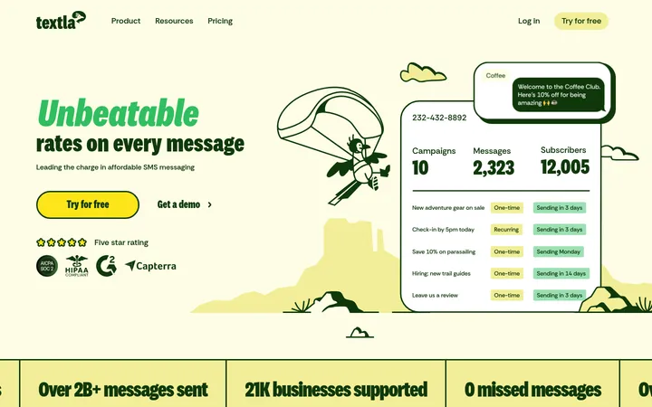
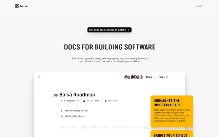
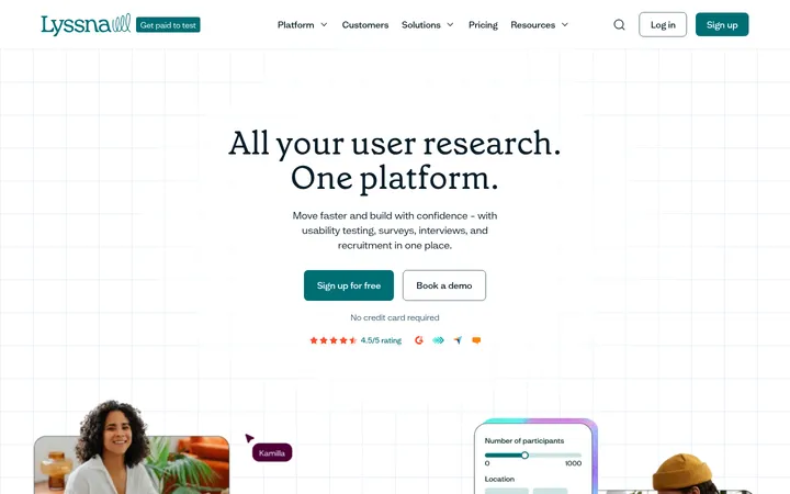
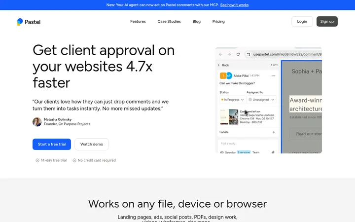
North star · Keep the page itself quiet and editorial; let violet actions and vivid product demonstrations provide the visual emphasis.
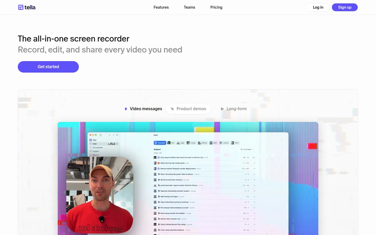
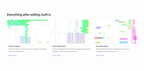
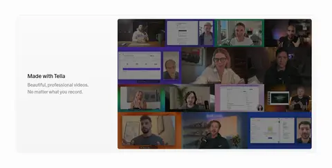
The page is built on a near-white canvas, with charcoal headings and muted gray supporting copy; violet is reserved for primary actions, links, and small interface accents. Oracle gives the page its distinctive editorial voice: headings are regular-weight, compactly tracked, and generously sized, while Inter appears in selected interface controls. The first viewport is deliberately open, with a concise left-aligned hero above a large product demonstration. Below, feature sections alternate copy and media positions, then move into multi-column feature cards, a comparison-style panel, video examples, FAQ, CTA, and footer. Section spacing keeps the long page breathable rather than dense. Product media carries most of the saturated color—glitch-like gradients, screen UI, and camera footage—so those vivid tones should remain inside demonstrations instead of becoming general page decoration. Rounded buttons, softly rounded media frames, and fine gray borders create a friendly, low-friction interface without heavy ornament.
Primary brand type for hero and section headings, body copy, links, navigation, and most page text.
Aa 设计
Inter
网络字体 · 字重 500 / 600 / 400 · 占比 27%
免费替代:Inter
Selected interface controls, buttons, captions, and compact product UI labels.
角色
示例
字号
字重
行高
字距
一级标题
Hero headline and prominent page-level statement.
Tella
52px
400
1.08
-0.02em
二级标题
Major feature section headings and closing CTA.
Tella
32px
400
1.2
-0.02em
三级标题
Feature-card titles and secondary content headings.
The quick brown fox 敏捷的狐狸
24px
400
1.2
-0.02em
四级标题
Small subheadings within feature or explanatory content.
The quick brown fox 敏捷的狐狸
20px
400
1.5
-0.02em
正文
Feature descriptions and standard explanatory copy.
The quick brown fox 敏捷的狐狸
16px
400
1.5
-0.02em
辅助文字
Compact labels and supporting interface details.
The quick brown fox 敏捷的狐狸
13px
500
1.33
-0.02em
按钮
Primary and secondary action labels.
The quick brown fox 敏捷的狐狸
18px
400
1.56
0
链接
Inline Learn more links and navigation links.
The quick brown fox 敏捷的狐狸
16px
400
1.5
-0.02em
间距与布局
基准单位 2px · 密度:适中
64px版块间距
10px元素间距
—卡片内边距
1300px内容最大宽度
2px
4px
6px
7px
8px
10px
12px
16px
18px
20px
24px
32px
48px
64px
Use a centered content area capped at the measured 1300px maximum, with a comfortable density and consistent section rhythm. The navigation spans the top; the hero and most feature sections are left-aligned, while the closing CTA is centered. Alternate two-column copy-and-media feature splits, then use three- and four-column arrangements for feature summaries and video examples. Maintain generous whitespace around media and headings, with the measured section gap of 64px and compact element spacing of 10px as the underlying rhythm.
圆角与层次
按钮 · 9999px
卡片 · 28px
图片 · 50%
徽标 · 50%
导航 · 4px
链接 · 4px
sm · button, other, card
inset · section
lg · card
md · card, media
The page relies on flat white surfaces and delicate #eaeaea hairlines rather than pronounced card elevation. Product demonstrations may layer interface windows, webcam tiles, and controls to show workflow depth. Keep shadows soft and localized, especially around floating UI panels; buttons remain pill-shaped and visually clear without heavy depth effects.
组件
下面的预览按实测的按钮、输入框、徽标、卡片样式重建(字体用替代字体)。
Top navigation
Clean horizontal wordmark and links on white; navigation uses oracle at 16px, with a compact outlined Log in action and violet pill Sign up CTA.
Primary CTA
Violet #5e51f8 pill with white text; Get started is measured at 16px oracle with generous horizontal padding.
Feature split
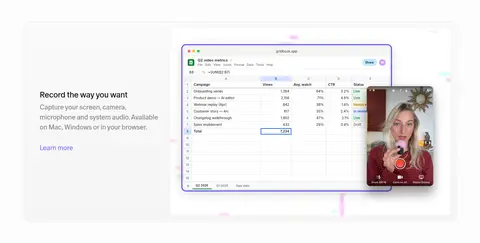
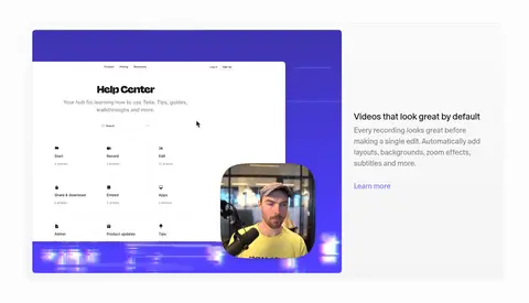
Alternating left-right copy and large product media, with a concise heading, muted explanatory text, and a violet Learn more link.
Product showcase
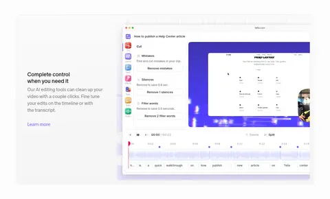
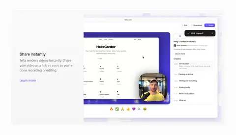
Layered screen-recording UI and webcam footage inside a large rounded frame, with product colors kept within the media.
Feature cards
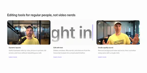
Three-column feature summaries with short headings, explanatory copy, and Learn more links; avoid heavy card chrome.
FAQ accordion
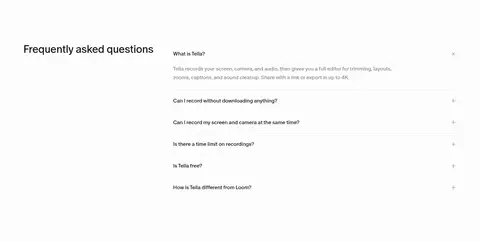
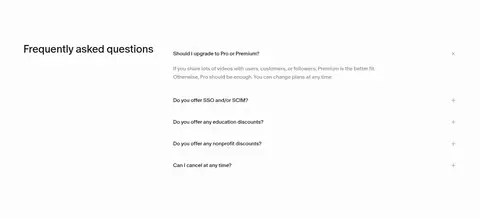
Two-column FAQ area with a section heading and stacked questions, plus/minus controls, and fine separators.
Footer
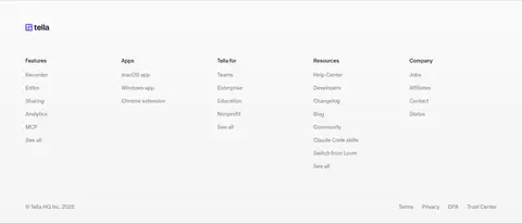
Pale, spacious multi-column link directory with grouped headings, compact links, brand mark, and legal links.
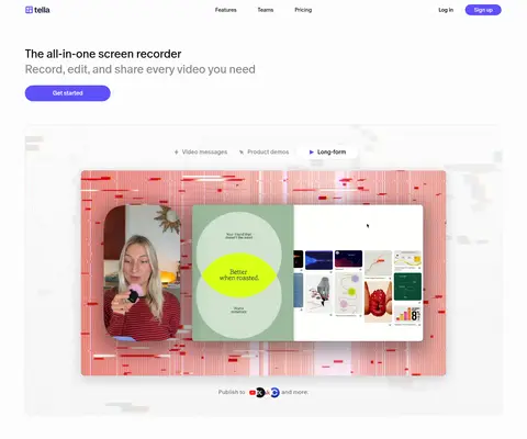
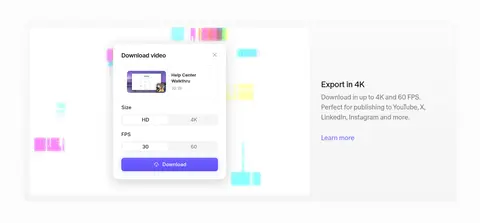
Imagery · Product demonstrations are the main visual content: screen captures of the editor, sharing, export, and recording interfaces sit alongside webcam footage. Frame media in large rounded panels with subtle borders and occasional soft shadows. Glitch-like color fields and bright gradients appear within the showcased product visuals, while the page canvas stays restrained. Use authentic-looking video and interface imagery rather than generic stock photography or decorative illustration.
Keep the canvas predominantly white and visually quiet.
Use violet for primary actions and restrained link accents.
Let product screenshots and video provide the saturated color.
Alternate media and copy positions across feature sections.
Use editorial, left-aligned headings with compact tracking.
Separate sections with generous whitespace and fine hairlines.
✕ 不该做
Do not turn the full page into a dark interface.
Do not use vivid product-art colors as broad background fills.
Do not crowd the hero with extra copy or controls.
Do not add heavy shadows to every card or media panel.
Do not replace product demonstrations with generic stock imagery.
Do not overuse violet outside actions and small accents.
给 AI 的提示词
想快速出一个同风格的新页面,把这段话连同 DESIGN.md 一起发给 AI。
Build a new Tella-style SaaS page with a calm, near-white canvas and editorial product-led layout. Use Gallery White (#ffffff) for the main surface, Near Black (#111111) for strong headings, Quiet Gray (#878787) for supporting copy, Hairline Gray (#eaeaea) for subtle borders, and Tella Violet (#5e51f8) for primary pill CTAs; reserve Soft Violet (#8278fa) for text links. Use the measured Oracle-like editorial font for most content and Inter for selected controls. Create a concise left-aligned hero above a prominent recording-product demonstration. Follow with alternating copy/media feature splits, compact multi-column summaries, video examples, FAQ, centered closing CTA, and a grouped footer. Keep spacing comfortable, media rounded, shadows soft, and vivid gradients confined to product imagery.