North star · Keep the interface almost unstyled so oversized typography and full-bleed cultural photography carry the identity.
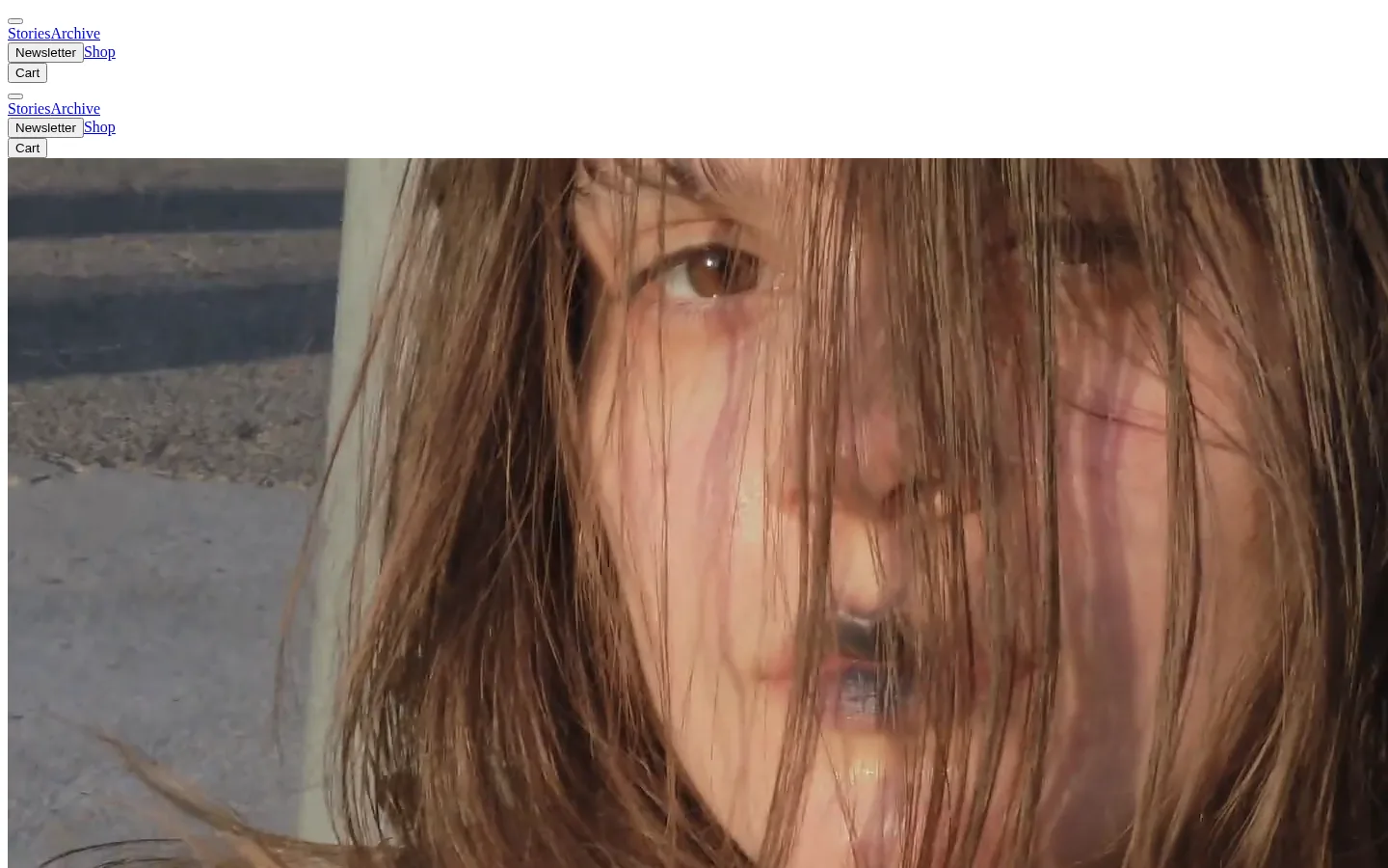
The visual strategy is deliberately spare: #ffffff fills the page, while #000000 provides the oversized manifesto lettering, button text, and structural contrast. #0000ee appears as conventional link blue in navigation and story links; it is a small interface accent, not a broad brand wash. The header is compact and loosely arranged, with plain text links and native-looking Newsletter and Cart controls. A large, heavy sans-serif title interrupts the image-led flow, while Times New Roman carries navigation and story text with a distinctly editorial, almost unstyled character. Long, full-bleed photographs dominate the lower page, using close crops and candid portraiture to supply warm, varied colour that is part of the imagery rather than the interface palette. White gaps separate the title and story visuals, but the page otherwise avoids card treatments, shadows, rounded corners, and ornamental framing. The overall effect is independent, raw, and image-first.
The measured page max width is 1424px, with a single-column, image-led sequence and no visible card grid. At the captured viewport, navigation sits at the top left in two repeated compact clusters, followed by a large hero image. The oversized title occupies a broad white break before another full-bleed visual. Subsequent stories continue vertically as edge-to-edge media with small linked labels. Spacing feels comfortable and open around the title, while the header itself remains notably dense and plain.
圆角与层次
没有测到阴影:页面是扁平的,层次靠底色和描边区分。
The interface is flat: measured shadows and gradients are absent, and the page relies on white space and contrast rather than layered surfaces. Buttons retain a native, square-cornered appearance with a black outset border. Story media sits directly on the white canvas without card framing.
组件
下面的预览按实测的按钮、输入框、徽标、卡片样式重建(字体用替代字体)。
Compact navigation
Plain Times New Roman links at 16px; selected Stories links use #0000ee, while other navigation text is black.
Newsletter control
Native-looking Arial button around 13.5px, with #efefef fill, black text, square corners, and a 2px outset black border.
Hero media
Large, edge-to-edge editorial image immediately beneath the compact header.
Manifesto title
Oversized, heavy black sans-serif display lettering on a white field, broken across lines.
Story link
Small conventional blue serif link associated with a full-bleed editorial image.
Full-bleed story media
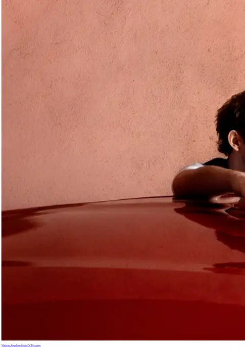
Tall, single-column photographs fill the available width, with no visible card background or framing.
Imagery · Large photographic and video-like editorial frames dominate the page, including close portrait crops and candid scenes. Media spans the content width and is presented without decorative borders or card containers. Warm browns, muted reds, and blue sky appear within the photos; these are image colours, not measured brand UI colours. The imagery feels intimate, documentary, and deliberately immersive.
Reserve #0000ee for navigation and editorial links.
Set the manifesto title in oversized, heavy black sans-serif type.
Let story photography run edge to edge.
Keep navigation compact, plain, and serif-led.
Use white space to separate major image and title moments.
✕ 不该做
Do not introduce a broad coloured interface palette.
Do not wrap stories in rounded cards.
Do not add decorative shadows or gradients.
Do not turn the navigation into a polished oversized toolbar.
Do not treat photo colours as brand tokens.
Do not crowd the manifesto title with surrounding UI.
给 AI 的提示词
想快速出一个同风格的新页面,把这段话连同 DESIGN.md 一起发给 AI。
Build a new editorial page in The Pop Manifesto’s image-first style. Use Gallery White (#ffffff) as the canvas, Ink Black (#000000) for emphatic display text, and Browser Blue (#0000ee) only for conventional links. Keep the header compact and plain, using serif navigation and small native-looking controls. Establish one oversized, heavy sans-serif title as a strong typographic interruption, then let full-width documentary photography dominate the content flow. Separate major moments with open white space rather than cards. Keep story labels small and understated. Avoid shadows, gradients, rounded containers, ornamental icons, and extra interface colour. The result should feel raw and editorial, with imagery—not UI decoration—providing most of the visual richness.