The Verge 首页以克制的白色底色、醒目的品牌字样和密集的新闻网格构成科技杂志式版面。衬线正文搭配紧凑的无衬线标签,形成鲜明的编辑节奏。
North star · Treat the homepage as a print-inspired news magazine: prioritize strong headlines, image-led stories, and precise purple accents over decorative UI.
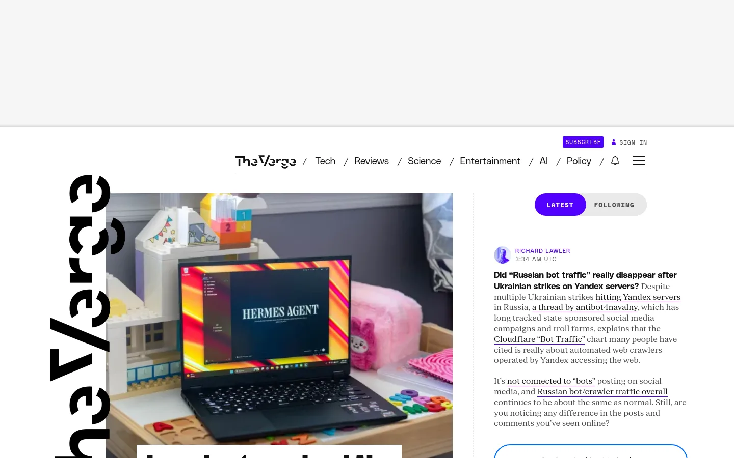
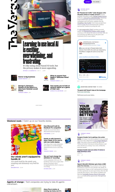
The page is built on a white canvas, with pale gray bands and panels separating the masthead from the long editorial feed. Near-black headlines and serif article text carry most of the visual weight; saturated purple marks active controls, link accents, and fine section rules, while lime appears sparingly on a subscribe control or within promotional artwork. A large, vertical Verge wordmark anchors the lead story, whose photograph is paired with a bold, compact headline. Below, the content shifts into a three-column magazine-like system: feature modules and ranked lists on the left, a narrow stream of updates on the right, and generous blank advertising areas that preserve separation. PolySans handles headlines, navigation, and metadata; fkRomanStandard gives article copy a literary texture. Thin gray dividers, minimal card framing, and restrained spacing keep the dense page legible without making it feel like a generic dashboard.
Headlines, navigation, links, labels, and metadata
角色
示例
字号
字重
行高
字距
特大标题
Oversized brand display wordmark beside the lead story.
The Verge
90px
900
0.8
0
一级标题
Primary lead-story headline.
The Verge
34px
700
1
0
二级标题
Major editorial section headings and feature titles.
The Verge
31px
700
1.3
-0.01em
三级标题
Secondary story headlines within feed modules.
The quick brown fox 敏捷的狐狸
26px
700
1.1
0
四级标题
Lighter-weight supporting headlines and editorial subheads.
The quick brown fox 敏捷的狐狸
24px
300
1.1
0.01em
正文
Article summaries and readable editorial copy.
The quick brown fox 敏捷的狐狸
16px
400
1.3
-0.01em
辅助文字
Compact uppercase author, date, and metadata labels.
The quick brown fox 敏捷的狐狸
11px
400
1.2
0.1em
导航
Top-level category navigation links.
The quick brown fox 敏捷的狐狸
19px
300
1.2
0
链接
Prominent story links and clickable headlines.
The quick brown fox 敏捷的狐狸
18px
700
1.2
0
眉题
Small uppercase category and section labels.
The quick brown fox 敏捷的狐狸
11px
400
1.2
0.1em
间距与布局
基准单位 2px · 密度:适中
40px版块间距
20px元素间距
2px卡片内边距
1100px内容最大宽度
4px
6px
8px
10px
12px
14px
16px
20px
24px
25px
30px
50px
A centered editorial shell uses a measured maximum width of 1100px. The top area separates a pale announcement band from a compact navigation row; the main feed then spreads across three columns, with a broad lead-story region and narrower update stream. Section headings align to the left and use thin violet rules. Long-form blocks alternate with ranked lists, image-led story grids, and large blank advertising slots. Spacing stays comfortable despite high story density, using clear gaps to distinguish modules rather than rounded cards.
圆角与层次
按钮 · 9999px
图片 · 3px
inset · link
inset · link
inset · button, text
lg · card
Most of the interface is flat, with no persistent card shadows. Separate content using thin gray hairlines, white space, and occasional purple rules. Reserve stronger layering for a featured story or embedded media card; keep corners nearly square and avoid a soft, rounded-dashboard appearance.
组件
下面的预览按实测的按钮、输入框、徽标、卡片样式重建(字体用替代字体)。
Masthead and navigation
Compact horizontal header with black category links, a thin bottom rule, Subscribe and Sign In actions, and utility icons.
Lead story
Large rectangular editorial photograph paired with an oversized, tight sans-serif headline and compact author/date metadata.
Latest switcher
Two-part pill control: purple Latest selection with white uppercase text, alongside a light-gray Following state in muted gray.
Section feed
Editorial blocks begin with a thin violet rule and a left-aligned section title, followed by image-led stories and supporting links.
Ranked list
Most Popular and Most Discussed lists use numbered pale markers, bold story links, and understated metadata.
Update stream
Narrow right-hand column of timestamped posts, link-heavy serif copy, small author markers, and occasional embedded media.
Imagery · Use editorial photography as the primary visual material: lead images are large and rectangular, while secondary stories use smaller crops or thumbnails. Images remain natural and largely unembellished, with no consistent color grading. Promotional artwork may introduce bright colors, including lime, but should read as an embedded ad rather than the core palette.
Keep the page canvas white and the upper band pale gray.
Use violet for active controls, link accents, and section rules.
Pair bold PolySans headlines with readable serif story copy.
Let editorial photographs lead major story modules.
Use thin dividers and whitespace instead of enclosing every story in a card.
Keep metadata small, uppercase, and visually subordinate.
✕ 不该做
Do not turn the layout into a rounded-card dashboard.
Do not use lime as a large page background.
Do not apply heavy shadows to ordinary story modules.
Do not replace the editorial hierarchy with uniform tiles.
Do not use colored gradients as the default page treatment.
Do not make metadata compete with headlines.
给 AI 的提示词
想快速出一个同风格的新页面,把这段话连同 DESIGN.md 一起发给 AI。
Build a new editorial page in The Verge's visual style. Use Gallery White (#ffffff) as the main canvas, with Masthead Mist (#f6f6f6) only for a quiet upper band. Set headlines and navigation in a bold, clean sans-serif close to PolySans, and use a literary serif close to fkRomanStandard for article copy. Use Press Ink (#131313) for headlines and primary text; reserve Signal Violet (#5200ff) for active controls, link accents, and thin section rules. Organize content in a centered magazine grid with a dominant image-led lead story, smaller supporting stories, ranked lists, and a narrow update column. Keep borders hairline-thin, cards mostly flat, and spacing generous enough to separate dense modules. Treat Electric Lime (#d6f31f) as a rare accent, not a background.