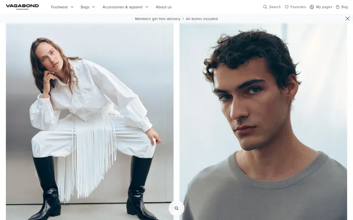
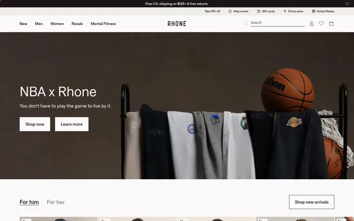
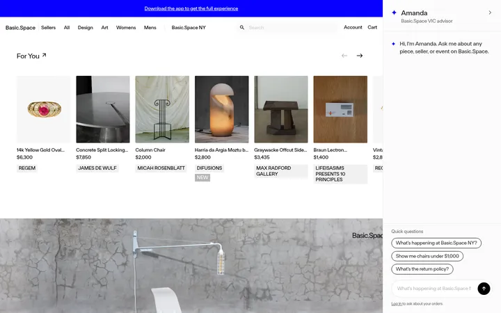
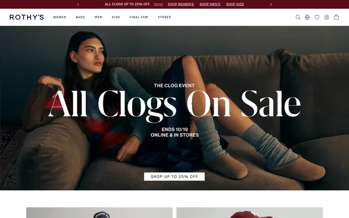
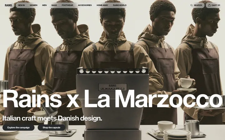
North star · Let campaign photography lead, while a quiet black-and-white interface keeps shopping navigation and product information immediate.
The page uses white as its continuous canvas, with black navigation, product text, and solid CTA buttons providing crisp contrast. A pale gray footer marks the main shift in surface colour; the warm beige, brown, and burgundy seen in the first viewport belong to campaign photography rather than the interface palette. Newtime R Book carries compact product details and body copy, while Newtime R handles navigation and controls. TimesNow gives campaign headlines a refined editorial contrast. The layout moves between wide, full-bleed campaign frames and four-column category or product rows, keeping merchandise visible without adding decorative UI. Consistent white gutters and restrained spacing separate the image-led blocks. Text overlays sit directly on photography, while product names and prices return to plain black on white. Buttons are square-cornered black rectangles with white labels. The overall effect depends on strong photography, clear type hierarchy, and flat, uncluttered surfaces rather than colour accents or ornamental effects.
Default body, product names and prices, and small supporting copy.
Aa 设计
Newtime R
网络字体 · 字重 400 / 500 · 占比 24%
免费替代:DM Sans
Navigation, section headings, buttons, and interactive labels.
Aa 设计
TimesNow
网络字体 · 字重 400 · 占比 14%
免费替代:Cormorant Garamond
Large campaign headlines and editorial display copy.
角色
示例
字号
字重
行高
字距
一级标题
Large serif campaign headline over full-bleed hero photography.
Reformation
48px
400
1.3
0
二级标题
Editorial section heading or prominent campaign copy.
Reformation
32px
400
0.75
0.04em
三级标题
Category and smaller feature headings.
The quick brown fox 敏捷的狐狸
18px
400
1.3
0
正文
Product details, descriptions, and general page copy.
The quick brown fox 敏捷的狐狸
14px
400
1.3
0
辅助文字
Small supporting labels and fine-print details.
The quick brown fox 敏捷的狐狸
11px
400
1.2
0
按钮
Primary shopping and form action labels.
The quick brown fox 敏捷的狐狸
16px
400
1.1
-0.01em
导航
Main category navigation and header utility links.
The quick brown fox 敏捷的狐狸
16px
400
1.1
-0.01em
间距与布局
基准单位 8px · 密度:适中
58px版块间距
8px元素间距
—卡片内边距
1392px内容最大宽度
1px
4px
8px
12px
16px
20px
24px
40px
A wide desktop composition uses a measured maximum content width of 1392px, with the header spanning the page and campaign sections running full bleed. Category and product content appears in four-column grids; editorial campaigns use broad image panels with overlaid copy. The measured base spacing is 8px, with a comfortable density and clear separation between major blocks. Alignment is mostly left-led, while product grids keep captions directly beneath imagery.
圆角与层次
没有测到阴影:页面是扁平的,层次靠底色和描边区分。
The interface is predominantly flat: no measured shadows or rounded component radii. White space and shifts between white and pale gray separate sections, while fine gray rules appear in the footer. Black buttons provide the strongest UI emphasis without relying on raised effects.
组件
下面的预览按实测的按钮、输入框、徽标、卡片样式重建(字体用替代字体)。
Announcement strip
A narrow black bar sits above the white navigation, carrying a short white shipping message.
Store navigation
A white horizontal header pairs lowercase black category links on the left with search, sustainability, account, and bag utilities on the right.
Campaign hero
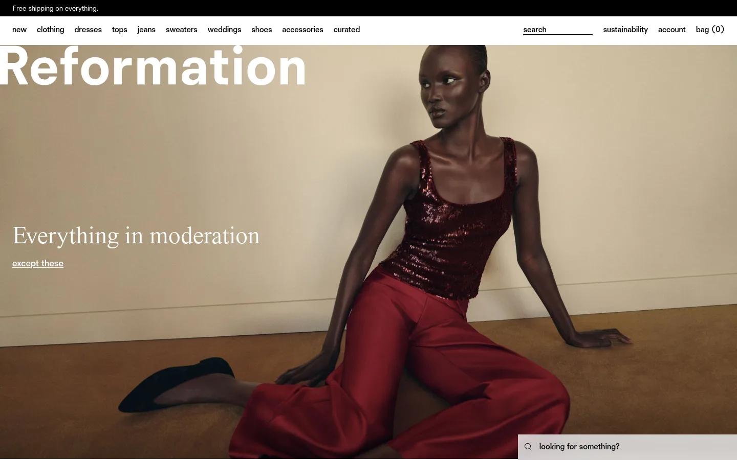
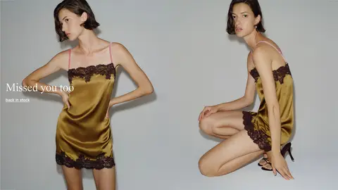
A full-bleed fashion image carries an oversized white brand wordmark and a TimesNow headline with a short underlined link.
Category tiles
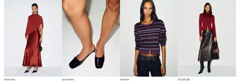
Four image-led category links form a compact row, with small lowercase labels beneath each image.
Product grid
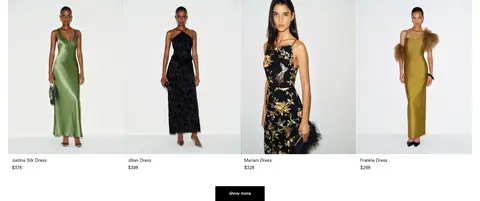
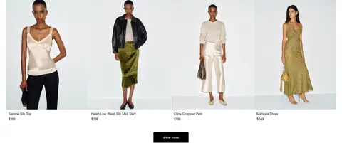
Four-column merchandise rows use product photography, black name and price text, and a square-cornered black show more button.
Search prompt
A pale search field overlays the lower-right edge of the hero, with a search icon and concise prompt.
Footer signup
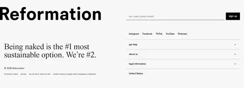
A pale gray two-column footer combines a large black wordmark and sustainability statement with email signup and utility links.
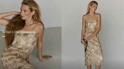
Imagery · The page is driven by fashion photography, not illustration or 3D. Full-width campaign images show models in styled environments, with short white headlines positioned over the image. Category and merchandise photography is cleaner and more evenly lit, presented in consistent grid cells against light backgrounds. The warm tones in the hero and other campaign panels come from the photographs rather than interface accents.
Keep the shopping canvas white and visually quiet.
Use full-bleed campaign photography for major editorial moments.
Set campaign headlines in an elegant serif display face.
Use compact sans-serif navigation and product details.
Keep category and merchandise layouts in four-column rows.
Use square black buttons with white labels.
Reserve pale gray for the footer and understated form surfaces.
✕ 不该做
Do not treat photographic beige or burgundy as interface accents.
Do not add rounded cards or decorative shadows.
Do not clutter campaign images with multiple controls.
Do not replace the simple product captions with oversized copy.
Do not introduce bright accent colours into the interface.
Do not use heavy, uppercase navigation styling.
给 AI 的提示词
想快速出一个同风格的新页面,把这段话连同 DESIGN.md 一起发给 AI。
Build a new fashion-commerce page using Reformation’s restrained editorial system. Use Gallery White (#ffffff) as the dominant canvas and Ink (#000000) for navigation, product copy, and square-cornered primary buttons. Set major campaign headlines in a TimesNow-like serif and use a clean Newtime R-like sans for navigation, controls, and product details. Let large fashion photographs carry the visual character; keep image colours photographic rather than turning them into UI accents. Alternate full-width campaign blocks with compact four-column category or product grids, leaving clear white separation between sections. Use Soft Fog (#f7f7f7) sparingly for a footer or input surface and Rule Gray (#acacac) only for subtle hairlines. Keep the page flat, avoid shadows and rounded cards, and make labels concise and lowercase where appropriate.