North star · Build every section like a legible, oversized event poster, using warm cream, signal blue, expressive type, and generous breathing room.
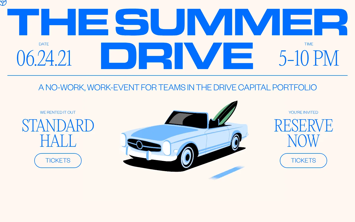
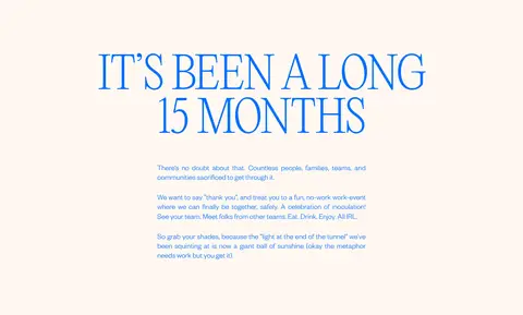
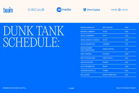
The page feels like a printed event poster expanded into a long-form web invitation. A warm cream canvas (#fff8f1) gives the saturated blue (#006eff) room to lead: it colours the oversized event title, supporting copy, fine rules, outlined ticket buttons, and the full-width schedule band. White (#ffffff) appears as a separate opening surface rather than a competing brand colour. The title pairs a very large, condensed-looking sans wordmark treatment with delicate editorial serif details for date, time, and section headings. Founders Grotesk handles functional and supporting text in uppercase. The hero is a carefully balanced poster composition: title above, event details at the sides, and a playful vintage convertible illustration in the center. Generous open space separates this from the centered welcome copy and small partner-logo row. The final saturated blue section reverses the palette for a large schedule heading and compact, ruled listings. Keep surfaces flat and use hairlines and pill outlines instead of shadows.
配色
点色块复制色值。用途说明来自对页面的实测位置(背景、文字、描边、按钮)与截图判读。
品牌色
表层色
中性色
页面底色 · Warm Paper表层 · Gallery White主文字 · Signal Blue次要文字 · Warm Paper描边 · Gallery White强调 · Signal Blue
Primary sans for body copy, uppercase supporting text, compact schedule listings, and ticket buttons.
Aa 设计
Editorial New
网络字体 · 字重 300 / 100 · 占比 8%
免费替代:Bodoni Moda
Display serif for event details and prominent editorial-style headings.
角色
示例
字号
字重
行高
字距
特大标题
Oversized uppercase event title and hero wordmark treatment.
Drive Capital
120px
100
1
-0.02em
一级标题
Large editorial uppercase welcome or section heading.
Drive Capital
77.5px
300
0.95
-0.02em
二级标题
Prominent secondary editorial heading, including the schedule title.
Drive Capital
62px
300
1
-0.02em
三级标题
Uppercase section labels and larger supporting headings.
Drive Capital
38px
300
1
-0.02em
四级标题
Small uppercase event-detail and supporting headings.
Drive Capital
28px
300
0.95
0
正文
Uppercase event information, partner context, and schedule copy.
The quick brown fox 敏捷的狐狸
18px
400
1.2
0
按钮
Large uppercase label inside outlined pill-shaped ticket controls.
Drive Capital
28px
300
0.95
0
间距与布局
基准单位 8px · 密度:适中
35px版块间距
—元素间距
—卡片内边距
1380px内容最大宽度
2px
7px
11px
14px
20px
29px
30px
35px
43px
144px
150px
A long, centered poster-like composition sits within a measured maximum width of 1380px. The hero uses a broad title, date and time at opposite sides, and a centered car illustration flanked by venue and ticket information. The next cream section shifts to centered welcome copy with a partner-logo row near its base. A full-width blue schedule band closes the page, splitting a large heading from dense listings. Generous vertical gaps keep the overall density comfortable.
圆角与层次
按钮 · 9999px
没有测到阴影:页面是扁平的,层次靠底色和描边区分。
The page is predominantly flat, with no measured shadows or gradients. Thin blue rules divide or organize content, and the ticket controls use a blue outline with a pill silhouette rather than a filled surface. The schedule band creates the strongest visual layering through a solid color reversal, not depth effects.
组件
下面的预览按实测的按钮、输入框、徽标、卡片样式重建(字体用替代字体)。
Hero event masthead
Oversized uppercase blue event title paired with date and time details, followed by a thin horizontal rule and centered event descriptor.
Ticket button
Uppercase blue label inside a transparent pill control with a 2px blue border and fully rounded ends.
Illustrated event centerpiece
A vintage convertible illustration sits between venue information and the reserve-ticket callout.
Event category strip
A slim row of event labels, separated from surrounding content by a horizontal rule.
Welcome copy and partner row
Centered editorial heading and concise explanatory copy above a horizontal row of portfolio-company marks.
Schedule band
Full-width Signal Blue section with a large display heading, compact lineup details, and fine horizontal dividers.
Imagery · The hero uses a single, playful flat illustration of a vintage convertible with a raised surfboard, not photography or realistic 3D. Keep it centrally framed and relatively small against the oversized lettering and open cream canvas. Partner logos are presented as a compact row of marks. Let illustration-specific colors remain within the artwork; the surrounding page identity stays anchored in blue and cream.
Use Signal Blue (#006eff) as the primary text and accent color.
Keep the main canvas warm with Warm Paper (#fff8f1).
Pair expressive editorial display type with practical sans-serif copy.
Make the hero feel like a composed event poster.
Use generous open space between major content blocks.
Prefer thin rules and outlined pill buttons for interface details.
✕ 不该做
Do not add gradients or decorative shadows.
Do not replace the cream canvas with a dark theme.
Do not make every section a card.
Do not let supporting copy compete with the display title.
Do not turn the car artwork into realistic photography.
Do not use filled, square-cornered primary buttons.
给 AI 的提示词
想快速出一个同风格的新页面,把这段话连同 DESIGN.md 一起发给 AI。
Build a new event landing page in a poster-like Drive Capital style. Use Warm Paper (#fff8f1) as the main canvas and Signal Blue (#006eff) for prominent typography, rules, links, and outlined controls; reserve white (#ffffff) for a distinct light surface or small details. Pair an expressive, light editorial serif display face with a clean uppercase sans for functional copy. Compose a bold hero with the event title, side-positioned details, a central playful illustration, and pill-shaped outlined ticket actions. Follow with centered explanatory content and a compact partner-mark row, then finish with a saturated blue information section organized by fine rules. Keep the layout flat, airy, and comfortable, with strong type scale contrast and clear reading order. Avoid gradients, shadows, card-heavy layouts, and photography-led styling.