North star · Let the oversized type, flat yellow-and-gray fields, and crisp black outlines define the page before adding imagery.
The page is built around a striking alternation: a full-bleed yellow hero followed by broad light-gray content areas. Ink-black text and hairline borders provide the only consistent contrast, while the yellow returns as a strong highlight in later calls to action and footer labels. Suisse is used throughout in a single regular weight; display text is very large, uppercase, and tightly tracked, while body copy remains compact and clear. The layout favors expansive, mostly open section bands, with content aligned to the left and occasional paired columns. Borders act as visible structural rules around stacked content and service rows rather than as decorative card chrome. Imagery is secondary to typography and structure: portfolio visuals appear within work and service content, while the first screen relies on color and a small centered headline. The overall effect is intentionally flat, graphic, and high-contrast.
配色
点色块复制色值。用途说明来自对页面的实测位置(背景、文字、描边、按钮)与截图判读。
品牌色
强调色
表层色
页面底色 · Studio Gray主文字 · Traffic Ink描边 · Traffic Ink
Display, headings, body copy, navigation, and links across the page.
角色
示例
字号
字重
行高
字距
特大标题
Oversized uppercase statements and service names.
Traffic Productions
108px
400
0.89
-0.04em
一级标题
Primary section headline or prominent page statement.
Traffic Productions
84px
400
0.93
-0.03em
二级标题
Section headings such as the about introduction.
Traffic Productions
54px
400
0.96
-0.03em
三级标题
Project and client headings within the work section.
Traffic Productions
30px
400
1
-0.02em
正文
Introductory copy and supporting service descriptions.
The quick brown fox 敏捷的狐狸
18px
400
1.17
-0.03em
导航
Uppercase navigation labels and compact footer links.
The quick brown fox 敏捷的狐狸
18px
400
1
-0.02em
间距与布局
基准单位 4px · 密度:适中
44px版块间距
20px元素间距
—卡片内边距
1400px内容最大宽度
2px
3px
4px
5px
6px
8px
12px
15px
18px
20px
34px
47px
The page uses a broad, centered composition with a measured maximum content width of 1400px. The opening is full bleed, with its small headline centered in a large yellow field; subsequent content is predominantly left aligned and arranged in one or two columns. Sections follow a comfortable rhythm, with roomy bands and clear separation rather than dense card layouts. The services area becomes a sequence of outlined rows, while the footer uses paired blocks and a long horizontal legal strip. Keep the structure open and graphic, not grid-heavy.
圆角与层次
按钮 · 50%
没有测到阴影:页面是扁平的,层次靠底色和描边区分。
The visual system is flat: no measured shadows or gradients. Use thin, crisp dark outlines to define large rows and content bands, keeping surfaces flush with the background. Layering comes from section order, image placement, and contrast between yellow and gray, not from raised cards.
组件
下面的预览按实测的按钮、输入框、徽标、卡片样式重建(字体用替代字体)。
Hero statement
A full-bleed Electric Lemon (#fff824) opening field with a compact, centered, dark typographic statement.
Section heading
Large Suisse text with tight negative tracking; use clear left alignment for content sections.
Work list
Client and project headings, supporting lists, and portfolio images arranged in a spacious two-column content area.
Service rows
Large uppercase service names sit in separate, thinly outlined horizontal bands on Studio Gray (#f3f3f3).
Play CTA
Electric Lemon (#fff824) media band with a centered circular Traffic Ink (#151515) button and light label.
Footer navigation
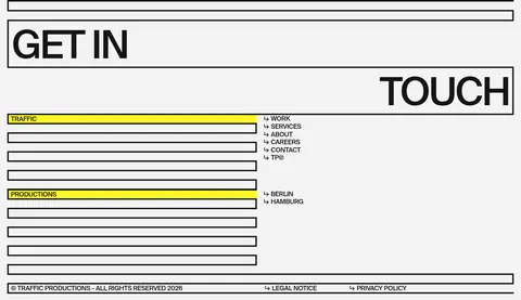
Large split contact lettering, compact uppercase link groups, yellow-highlighted labels, and a bordered legal strip.
Imagery · The opening viewport is typographic and color-led, with no visible photography. Work and services sections contain portfolio imagery, but it supports the content rather than replacing the strong type-and-border system. Preserve image assets as editorial project previews within the broader layout; avoid introducing ornamental illustrations, gradients, or 3D effects unsupported by the page.
Use Electric Lemon (#fff824) as a large, flat color field.
Set display statements in oversized, tightly tracked Suisse or a close substitute.
Keep body copy and navigation regular-weight and legible.
Use Traffic Ink (#151515) for text and crisp outlines.
Build service content as open, outlined rows rather than raised cards.
Let portfolio images support, not dominate, the typographic system.
✕ 不该做
Do not add gradients or drop shadows.
Do not introduce colors outside the measured palette as brand colors.
Do not use rounded cards; reserve the measured pill-like radius for the circular CTA.
Do not make the hero busy with imagery or extra controls.
Do not replace thin outlines with heavy filled panels.
Do not loosen the display typography into generic, widely tracked headings.
给 AI 的提示词
想快速出一个同风格的新页面,把这段话连同 DESIGN.md 一起发给 AI。
Build a new page in the Traffic Productions visual style. Use Electric Lemon (#fff824) for a bold, flat hero or key CTA field, Studio Gray (#f3f3f3) for the main canvas, and Traffic Ink (#151515) for all primary text and crisp outlines. Use Suisse if available, or Inter as a free substitute; keep weights regular, display text oversized and tightly tracked, and navigation uppercase. Favor broad open sections, left-aligned content, and occasional two-column layouts over dense cards. Structure services as outlined horizontal rows. Keep elevation flat with no shadows or gradients, and use project imagery as supporting editorial material rather than decoration. Make the strongest visual impression through color blocks, typography, and clean structural lines.