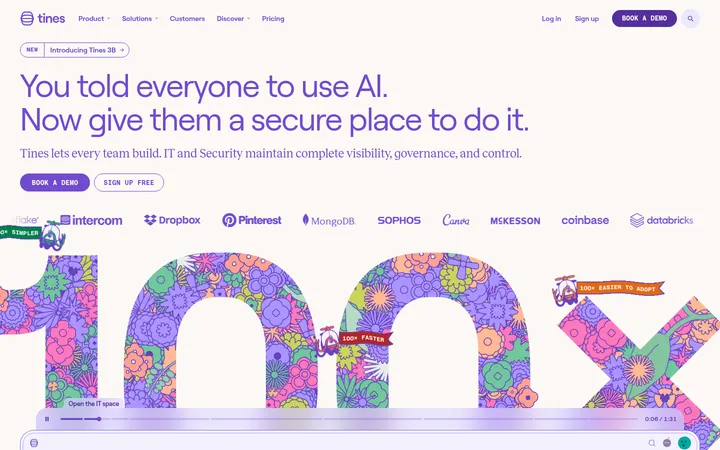
North star · Keep the page predominantly white and editorial, using oversized serif headlines, candid human imagery, and pink pill CTAs as its defining signals.
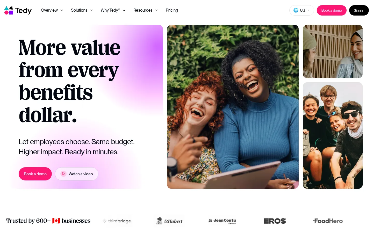
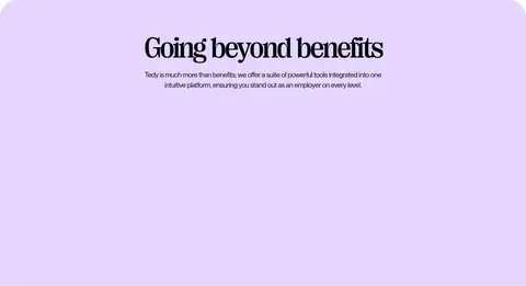
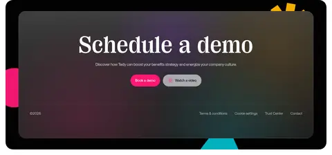
The page builds its identity around a clean white canvas, near-black text, and a restrained pink-and-lavender accent system. White space keeps the long landing page airy, while a lavender feature band and softly tinted product imagery create occasional visual pauses. Large PP Right Serif Casual headings bring an editorial, expressive character; Montreal Neue handles navigation, paragraphs, labels, and buttons in a compact, legible sans-serif voice. The hero pairs oversized stacked copy with a three-image lifestyle collage, and later sections alternate product visuals with concise explanatory text. Bright pink pill-shaped CTAs provide the clearest interaction cue. Rounded image frames and cards soften the otherwise crisp layout, while thin pale-gray borders define a few content elements without making the page feel boxed in. Dark inverse surfaces are concentrated in the closing demo treatment and selected UI imagery rather than used as the page-wide background.
Navigation, body copy, buttons, captions, and links
Aa 设计
PP Right Serif Casual
网络字体 · 字重 500 / 700 · 占比 14%
免费替代:DM Serif Display
Display and section headings
角色
示例
字号
字重
行高
字距
特大标题
Oversized editorial display headline treatment.
Tedy
103.5px
500
0.98
0
一级标题
Hero headline and primary page-level heading.
Tedy
85.5px
500
0.9
-0.05em
二级标题
Large feature-section and content-block headings.
Tedy
85px
700
1.02
-0.025em
三级标题
Prominent supporting section titles.
Tedy
80px
500
0.9
-0.065em
四级标题
Smaller editorial headings within the section hierarchy.
Tedy
61px
500
0.98
-0.045em
正文
Paragraphs describing platform benefits and features.
The quick brown fox 敏捷的狐狸
17px
400
1.4
-0.025em
辅助文字
Compact supporting copy and image/UI captions.
The quick brown fox 敏捷的狐狸
16.5px
400
1.4
-0.025em
按钮
Short CTA labels such as “Book a demo.”
The quick brown fox 敏捷的狐狸
15.5px
500
1
0
导航
Top navigation links and menu items.
The quick brown fox 敏捷的狐狸
16px
400
1.5
0
链接
Inline links and secondary navigation actions.
The quick brown fox 敏捷的狐狸
15.5px
400
1.5
-0.02em
间距与布局
基准单位 4px · 密度:适中
48px版块间距
20px元素间距
—卡片内边距
1392px内容最大宽度
7px
8px
10px
12px
13px
14px
16px
18px
20px
24px
28px
32px
40px
48px
72px
80px
The page follows a comfortable long-form rhythm within a measured maximum content width of 1392px. Its hero is a two-column composition, with headline and copy beside a multi-image collage; later content alternates image and text placement, while the logo row and some feature content span broad horizontal areas. Most section backgrounds stay white, with a distinct lavender band as a break. Content is generally left-aligned, with centered headings in the category and lavender feature sections. Use generous qualitative whitespace between blocks, rather than dense card stacking.
圆角与层次
按钮 · 9999px
卡片 · 45px
图片 · 32px
xl · card
lg · button
inset · other
The interface is mostly flat: whitespace, image crops, and pale hairlines establish structure more than shadows. Cards and media use generously rounded corners, while inverse demo artwork creates depth through layered dark surfaces and subtle lighting. Reserve pronounced shadow treatment for product imagery or focal UI, not ordinary text sections.
组件
下面的预览按实测的按钮、输入框、徽标、卡片样式重建(字体用替代字体)。
Top navigation
A compact horizontal header with logo, Montreal Neue links, country selector, pink “Book a demo” pill, and dark sign-in pill.
Hero collage
Pair an oversized serif headline and short supporting copy with a large lifestyle image and two smaller stacked image crops.
Primary CTA
Use a white-text “Book a demo” label on #fd1774 with a fully pill-shaped silhouette.
Logo strip
A restrained horizontal row of customer marks below a short trust statement, set on white.
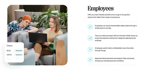
Feature split
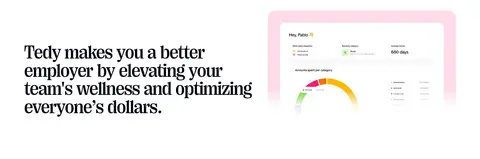
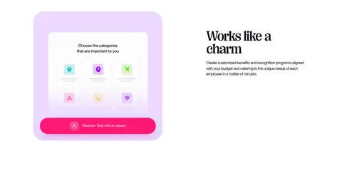
Combine concise text with product UI or lifestyle imagery; alternate which side carries the image across sections.
Lavender feature band
Use #e5d6ff as a full-width visual break for a centered heading and supporting feature content.
Closing demo panel
Place a prominent serif CTA over layered dark artwork, with pink action and small secondary links.
Imagery · Use candid lifestyle and workplace photography to keep the benefits product grounded in real people. The hero uses a prominent central portrait image flanked by smaller photos, all cropped into rounded rectangular frames. Later sections mix people-at-work images with product UI screenshots and category illustrations. Product visuals may carry pink, lavender, or warm neutral tints; keep those treatments within the imagery instead of allowing them to overwhelm the white page.
Keep the main canvas white and the section rhythm spacious.
Use the serif display face for major editorial headlines.
Use Montreal Neue for navigation, body copy, and controls.
Make pink pill buttons the clearest interaction cue.
Use lavender as a selective section-level color break.
Favor candid people photography in rounded crops.
✕ 不该做
Do not turn the whole page into a dark theme.
Do not use purple as the default CTA color.
Do not make every section a bordered card grid.
Do not replace the editorial serif headlines with generic sans-serif display type.
Do not let UI screenshots dominate the human photography.
Do not add unsupported colors, dimensions, or spacing values.
给 AI 的提示词
想快速出一个同风格的新页面,把这段话连同 DESIGN.md 一起发给 AI。
Build a new Tedy-style SaaS page with a bright editorial feel. Use Gallery White (#ffffff) for the main canvas and Midnight Ink (#030712) for primary text. Set major headings in an expressive serif similar to PP Right Serif Casual, and use a clean sans-serif like Inter for navigation, body copy, and controls. Create spacious split layouts with candid workplace photography in rounded crops, interspersed with product UI visuals. Reserve Tedy Pink (#fd1774) for pill-shaped primary CTAs and use Lavender Field (#e5d6ff) for an occasional broad section band. Keep secondary copy muted and borders subtle. Favor alternating text-image sections and a restrained logo row; finish with a dark, layered demo panel rather than making the whole page dark. Match the measured hierarchy without inventing unsupported measurements.