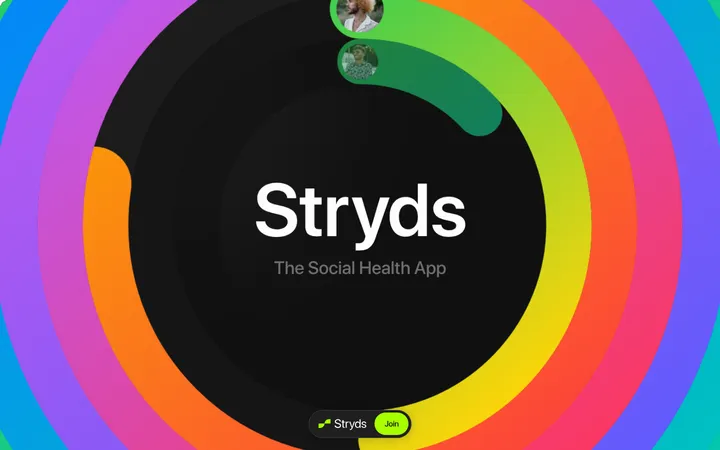
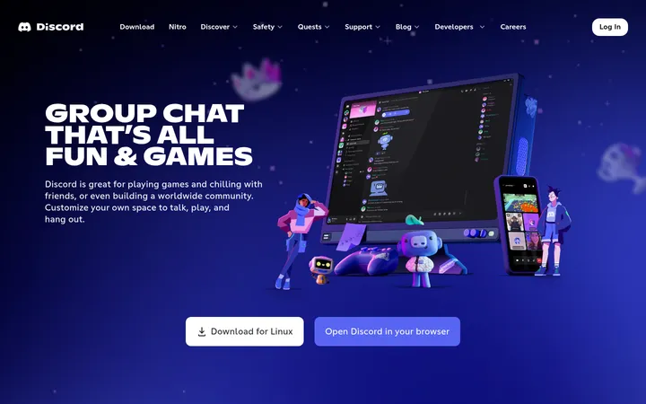
North star · Keep the interface quiet and monochrome so user posts—not ornamental UI—carry the visual focus.
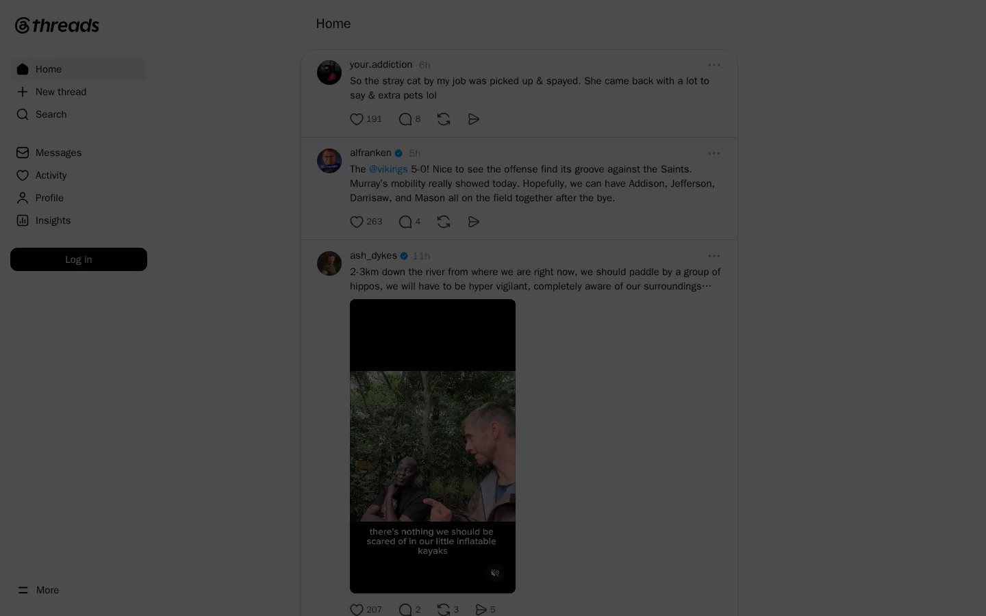
The page’s defining structure is an open, white interface organized around a narrow navigation rail and a centered feed. Black carries the brand mark, navigation icons, post text, and primary login action; the vivid blue accent appears selectively rather than becoming a large decorative field. Thin light-gray separators distinguish posts while keeping the stream visually continuous. System-ui typography creates a familiar, utilitarian social-product feel: compact metadata sits beside usernames, and body copy remains easy to scan. The feed mixes short text with user avatars, reaction controls, and portrait video, so the interface stays quiet around varied content. Spacing is comfortable for a dense stream, with repeated post rows providing rhythm instead of large marketing sections. The supplied screenshot has a dark overlay that suppresses contrast; treat it as a display condition, not the underlying brand palette.
配色
点色块复制色值。用途说明来自对页面的实测位置(背景、文字、描边、按钮)与截图判读。
品牌色
强调色
表层色
中性色
功能色
页面底色 · Overlay Graphite表层 · Feed White主文字 · Thread Ink描边 · Divider Silver强调 · Signal Blue
Brand-adjacent interface typography for navigation, post content, metadata, and controls.
角色
示例
字号
字重
行高
字距
一级标题
Small page or feed heading at the top of the main column.
The quick brown fox 敏捷的狐狸
20px
600
1.25
0
正文
Post copy, usernames, and primary interface text.
The quick brown fox 敏捷的狐狸
15px
400
1.4
0
辅助文字
Timestamps and compact secondary metadata.
The quick brown fox 敏捷的狐狸
13px
400
1.4
0
导航
Left-rail navigation labels and related controls.
The quick brown fox 敏捷的狐狸
15px
400
1.4
0
间距与布局
基准单位 2px · 密度:适中
—版块间距
4px元素间距
18px卡片内边距
—内容最大宽度
1px
3px
4px
6px
7px
8px
9px
10px
12px
15px
16px
20px
22px
24px
Use a broad white desktop canvas with a persistent left navigation rail and a narrower, centered content feed. Align the feed header and post stream on one vertical axis. Separate navigation groups with generous breathing room, while keeping feed posts relatively compact and vertically continuous. The screenshot shows a single viewport dominated by the shell and feed; no oversized hero or promotional section is present. Preserve a comfortable density and allow media to sit within the post rather than expanding into a full-bleed page section.
圆角与层次
按钮 · 50%
图片 · 50%
导航 · 8px
链接 · 50%
hairline · other
md · card
The interface is predominantly flat. Fine gray separators define feed rows, with subtle card shadowing reported for a post container; avoid strong elevation or layered panels. The screenshot’s dim appearance is an overlay condition, not a reason to darken the underlying surfaces.
组件
下面的预览按实测的按钮、输入框、徽标、卡片样式重建(字体用替代字体)。
Left navigation rail
Vertically stacked icon-and-label links for Home, New thread, Search, Messages, Activity, Profile, and Insights, with a login action below.
Feed header
A simple Home title aligned above the central stream, without a prominent colored banner.
Post row
User avatar, username, muted timestamp, post copy, and compact interaction controls arranged as a repeatable feed unit.
Feed divider
Thin light-gray horizontal rules separate adjacent posts while keeping the content column visually unified.
Login button
Black pill-shaped primary action with white semibold system-ui text.
Inline media
Portrait video or image sits within the post body, following the feed column rather than taking over the viewport.
Imagery · Feed content is user-generated: small circular profile photos accompany text posts, while portrait video appears inline within a post. Keep media framed by the post column and preserve its native portrait character. The interface itself uses simple monochrome line icons rather than decorative illustration or 3D imagery; individual post media may contain varied colors and should not define the brand palette.
Use black for primary text and core navigation icons.
Reserve blue for small interactive accents.
Separate feed entries with subtle gray rules.
Use compact, repeatable post layouts.
Let user-generated media provide visual variety.
✕ 不该做
Do not treat the screenshot’s dark overlay as the base theme.
Do not turn the feed into a large marketing hero.
Do not use saturated color for broad interface backgrounds.
Do not add heavy shadows around every post.
Do not let inline media overwhelm the feed column.
Do not introduce decorative display typography.
给 AI 的提示词
想快速出一个同风格的新页面,把这段话连同 DESIGN.md 一起发给 AI。
Build a new Threads-style social page with a clean white canvas and a restrained, content-first interface. Use Thread Ink (#000000) for primary text, navigation icons, and the main action; Feed White (#ffffff) for the page and button text; Divider Silver (#d5d5d5) for quiet feed separators; Metadata Gray (#999999) for timestamps; and Signal Blue (#0095f6) only for small interactive accents. Use system-ui with regular body and navigation text and semibold headings or primary controls. Create a persistent left navigation rail and a narrower centered feed with repeatable post rows, avatars, metadata, copy, actions, and inline portrait media. Keep surfaces mostly flat and spacing comfortable. Do not reproduce the screenshot’s darkened overlay as the actual page theme.